


 本文介绍了WPF中ComboBox的自定义样式和扩展,包括基础样式设计、可编辑与不可编辑文本的状态切换。此外,还详细讲解了如何创建自定义的多选控件MultiComboBox,提供了相关代码示例。
一.前言
申明:WPF自定义控件与样式是一个系列文章,前后是有些关联的,但大多是按照由简到繁的顺序逐步发布的等,若有不明白的地方可以参考本系列前面的文章,文末附有部分文章链接。
本文主要内容:
- 下拉选择控件ComboBox的自定义样式及扩展;
- 自定义多选控件MultiComboBox;
二.下拉选择控件ComboBox的自定义样式及扩展
2.1基本样式
先看看基础效果图:

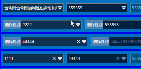
从功能上ComboBox有两种状态:
-
- 可编辑文本;
- 不可编辑文本。
从XAML的逻辑树结构上看,分为几个部分:
 最低0.47元/天 解锁文章


 9614
9614

 被折叠的 条评论
为什么被折叠?
被折叠的 条评论
为什么被折叠?
 到【灌水乐园】发言


