


一、背景
WPF中,Combobox下拉框需要带有CheckBox勾选框,且需要根据项目不同要求,支持单选或多选功能。
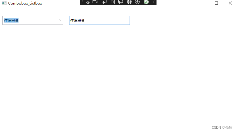
二、单选功能
<ComboBox x:Name="comboBox"
          IsEditable="True"
          IsReadOnly="True"
          IsDropDownOpen="False"
          Width="200" Height="30"
          HorizontalAlignment="Left" VerticalContentAlignment="Center"
          Margin="10">
    <ComboBox.ItemsPanel>
        <ItemsPanelTemplate>
            <StackPanel />
        </ItemsPanelTemplate>
    </ComboBox.ItemsPanel>
    <ComboBox.ItemTemplate>
        <DataTemplate>
            <CheckBox Content="{Binding}"
                      IsChecked="{Binding IsSelected, RelativeSource={RelativeSource AncestorType=ListBoxItem}}" />
        </DataTemplate>
    </ComboBox.ItemTemplate>
</ComboBox>
<TextBox x:Name="textBox"
         Text="{Binding ElementName=comboBox,Path=Text}"
         HorizontalAlignment="Left" VerticalContentAlignment="Center"
         Margin="10"
         Width="200" Height="30"
         IsReadOnly="True" />
public Combobox_Listbox()
{
InitializeComponent();
selectData();
}
public void selectData()
{
// 模拟获取数据源
SQLHelper db = new SQLHelper();
string sql = string.Format(@"select list from Listbox where content_one='纠纷投诉' and content_two='患者类别' ORDER BY ID");
DataSet num = db.GetDataSet(sql);
// 创建一个 DataTable 作为数据源
DataTable dt = num.Tables[0];
// 将 DataTable 中的数据转换成一个字符串数组
string[] items = dt.AsEnumerable().Select(row => row.Field<string>("list")).ToArray();
// 将字符串数组绑定到 ComboBox 的 ItemsSource 属性上
comboBox.ItemsSource = items;
}
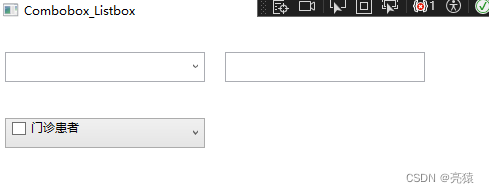
三、单选功能
<ComboBox x:Name="comboBox_p" Width="200" Height="30" HorizontalAlignment="Left" Margin="10">
    <ComboBox.ItemTemplate>
        <DataTemplate>
            <CheckBox Content="{Binding list}" IsChecked="{Binding IsSelected, RelativeSource={RelativeSource AncestorType=ComboBoxItem}}"/>
        </DataTemplate>
    </ComboBox.ItemTemplate>
</ComboBox>
public void selectData2()
{
SQLHelper db = new SQLHelper();
string sql = string.Format(@"select list from Listbox where content_one='纠纷投诉' and content_two='患者类别' ORDER BY ID");
DataSet result = db.GetDataSet(sql);
// 将查询结果作为 ComboBox 的数据源
comboBox_p.ItemsSource = result.Tables[0].DefaultView;
}


 3314
3314


 被折叠的 条评论
为什么被折叠?
被折叠的 条评论
为什么被折叠?
 到【灌水乐园】发言


