


<!DOCTYPE html>
<html lang="en">

<head>
    <meta charset="UTF-8">
    <meta http-equiv="X-UA-Compatible" content="IE=edge">
    <meta name="viewport" content="width=device-width, initial-scale=1.0">
    <title>Document</title>
    <style>
        .test-anim {
            font-size: 50px;
            line-height: 50px;
            font-weight: lighter;
            color: #4ea1d9;
            background-image: linear-gradient(-135deg, #418ae0, #56a0d8, #dc8bc3, #56a0d8, #418ae0, #56a0d8, #dc8bc3, #56a0d8, #418ae0); /*渐变颜色*/
            -webkit-text-fill-color: rgba(0, 0, 0, 0); /*指定文字的填充颜色。可以做出一些例如渐变文字和镂空文字的效果,这里是设置了透明色*/
            -webkit-background-clip: text;/* 以盒子内的文字作为裁剪区域向外裁剪,文字之外的区域都将被裁剪掉 */
            background-size: 200% 100%;
            -webkit-animation: masked-animation 3s infinite linear;
        }

        @keyframes masked-animation {

            0% {
                background-position: 0 -100%;
            }

            100% {
                background-position: -100% 0;
            }
        }
    </style>
</head>

<body>
    <div class="test-anim">
        <p style="white-space: pre-wrap;">2023年,美好生活更进一步</p>
        <p style="white-space: pre-wrap; text-align: right;">每天开心,乐开怀</p>
    </div>
</body>

</html>
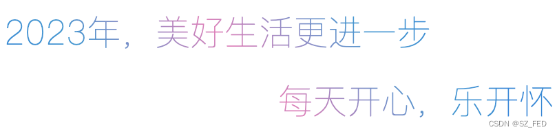
预览效果:
红色光影从文字左边到右边闪动。


 3万+
3万+


 被折叠的 条评论
为什么被折叠?
被折叠的 条评论
为什么被折叠?
 到【灌水乐园】发言


