


众所周知,数学建模的过程中,将复杂的数据和模型结果通过可视化图形呈现出来,不仅能够帮助我们更深入地理解问题,还能够有效地向评委展示我们的研究成果。
今天,作者将与大家分享8种强大的数学建模可视化图形及其在实际问题中的应用,包含如下图形:折线图、地图(点)、地图(线)、地图(多边形)、地图(密度)、环形图、环形柱状图、局部放大图。
如果阅者觉得此篇分享有效的的话,请点赞收藏再走!!!(还有第二部分后续更新)
1. 折线图:一种趋势分析的利器
折线图是最基本的可视化工具之一,适用于展示数据随时间或其他连续变量的变化趋势。
#绘制折线图代码如下:
import matplotlib.pyplot as plt
from matplotlib.lines import Line2D
import numpy as np
def plot(ax, colors, legends, legend_anchors, x, y, xlabel, ylabel, n_lengend_col=6):
"""
:param ax: 使用 fig, ax = plt.subplots 返回的 ax
:param colors: 折线对应的颜色,必须与折线个数相同
:param legends: 图例名称,必须与折线个数相同
:param legend_anchors: 图例显示的位置,(x, y) 其中x和y均为图例中心点在图中的相对位置,
例如:[0.5, 0.5] 表示图例中心点位于图的正中间,[0.5, 1]表示图例的中心点位于图的正上方,
[0.5, 1.1]表示图例的中心点位于图的正上方偏上位置
:param x: x轴数据,一维列表
:param y: y轴数据,多维列表,必须与颜色和图例数量相同,例如:[y1, y2]
:param xlabel: x轴标签
:param ylabel: y轴标签
:param n_lengend_col: 每行图例显示的个数,如果此值大于折线个数,则一行显示所有图例,如果设置为1,则按列显示图例
:return: 画布实例
"""
ax.yaxis.set_tick_params(length=0)
ax.xaxis.set_tick_params(length=0)
# 去除边框
ax.spines["left"].set_color("none")
ax.spines["right"].set_color("none")
ax.spines["top"].set_color("none")
# 显示y轴栅格
ax.grid(axis='y', alpha=0.4)
# 创建图例
handles = [
Line2D(
[], [], label=label,
lw=0, # there's no line added, just the marker
marker="o", # circle marker
markersize=10, # marker size
markerfacecolor=colors[idx], # marker fill color
)
for idx, label in enumerate(legends)
]
legend = ax.legend(
handles=handles,
bbox_to_anchor=legend_anchors, # Located in the top-mid of the figure.
fontsize=12,
handletextpad=0.6, # Space between text and marker/line
handlelength=1.4,
columnspacing=1.4,
loc="center",
ncol=n_lengend_col, # 每行图例显示的个数,如果设置为1,表示按列显示图例
frameon=False
)
for i in range(len(legends)):
handle = legend.legendHandles[i]
handle.set_alpha(0.7)
for i in range(len(colors)):
ax.plot(x, y[i], color=colors[i])
# 设置x轴 y轴标签
ax.set_xlabel(xlabel, fontdict={
'size': 12})
ax.set_ylabel(ylabel, fontdict={
'size': 12})
return ax
if __name__ == '__main__':
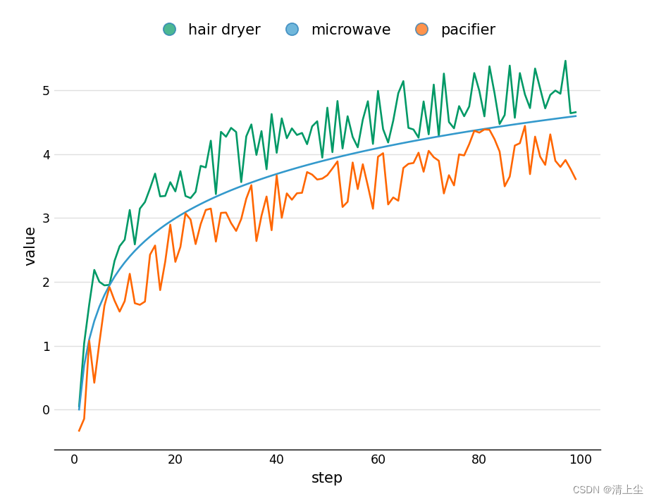
# 随机生成一些数据
x = list(range(100))
y1 = np.log(x) + np.random.rand(100)
y2 = np.log(x)
y3 = np.log(x) - np.random.rand(100)
colors = ["#009966", "#3399CC", "#FF6600"]
legends = ["hair dryer", "microwave", "pacifier"]
fig, ax = plt.subplots(figsize=(8, 6), ncols=1, nrows=1)
ax = plot(ax, colors, legends, [0.5, 1.03], x, [y1, y2, y3], 'step', 'value')
plt.show()
绘制折线图如下图1所示:
2 地图:地理空间数据的直观展示
地图可视化可以帮助我们理解地理空间数据的分布和模式。
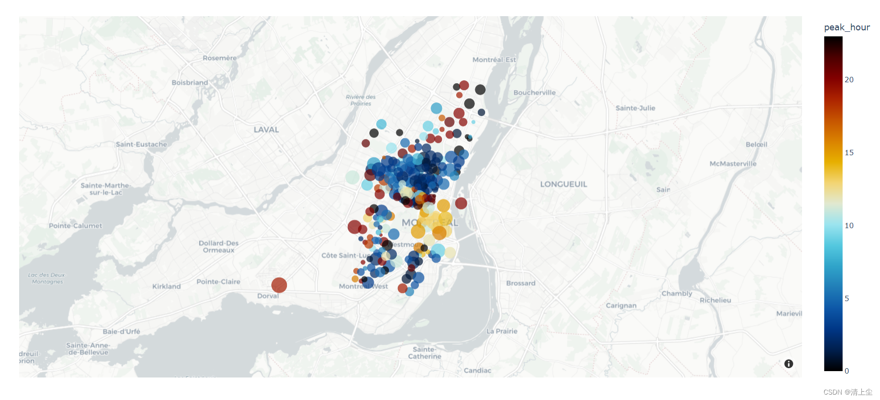
2.1 地图上绘制点
#地图上绘制点的代码
import plotly.io as pio
import plotly.graph_objs as go
import plotly.express as px
from plotly.subplots import make_subplots
import pandas as pd
import numpy as np

# can be `plotly`, `plotly_white`, `plotly_dark`, `ggplot2`, `seaborn`, `simple_white`, `none`
pio.templates.default = 'plotly_white'

# 加载数据
df = px.data.carshare()
print(df.head())

fig = px.scatter_mapbox(df,
                        lat="centroid_lat", lon="centroid_lon",
                        color="peak_hour",
                        size="car_hours",
                        color_continuous_scale=px.colors.cyclical.IceFire,
                        zoom=10)

# mapbox_style 可以为 `open-street-map`, `carto-positron`, `carto-darkmatter`,
# `stamen-terrain`, `stamen-toner`, `stamen-watercolor`
fig.update_layout(mapbox_style="carto-positron")

fig.write_html('test.html')
绘制地图(点)如下图2所示:
2.2 地图上绘制线
#地图上绘制线的代码
import plotly.io as pio
import plotly.graph_objs as go
import plotly.express as px
from plotly.subplots import make_subplots
import pandas as pd
import numpy as np

# pandas打印时显示所有列
pd.set_option('display.max_columns', None)

# can be `plotly`, `plotly_white`, `plotly_dark`, `ggplot2`, `seaborn`, `simple_white`, `none`
pio.templates.default = 'plotly_white'

fig = go.Figure()
fig.add_trace(go.Scattermapbox(
    mode='markers+lines',
    lon=[10, 20, 30],
    lat=[10, 20, 30],
    marker={
   'size': 10}
))
fig.add_trace(go.Scattermapbox(
    mode="markers+lines",
    lon=[-50, -60, 40],
    lat=[30, 10, -20],
    marker={
   'size': 10}
))
fig.update_layout(
    mapbox={

        'center': {
   'lon': 10, 'lat': 10
最低0.47元/天 解锁文章


 被折叠的 条评论
为什么被折叠?
被折叠的 条评论
为什么被折叠?
 到【灌水乐园】发言


