


项目场景:
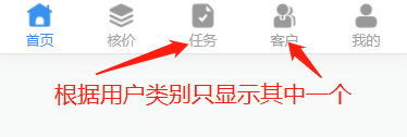
要求:根据用户登录的账号权限,底部tabBar显示不同的入口。
解决方案一:
提示:该方案需要Hbuilder是3.2.10+。这个版本以上在tabBar的list数组对象可以有visible属性用来控制显示和隐藏。
// page.json文件
"tabBar": {
		"color": "#7A7E83",
		"selectedColor": "#3992f0",
		"borderStyle": "black",
		"backgroundColor": "#ffffff",
		"list": [......, {
			"pagePath": "pages/tabbar/client",
			"iconPath": "static/images/kehu.png",
			"selectedIconPath": "static/images/select_kehu.png",
			"text": "客户",
			"visible":false
		}, ......]
	}
明白了这个属性,那么我们就可以通过uni.setTabBarItem(OBJECT)方法去操作tabBar来实现我们想要的效果,这个方法在App.vue调用一次所有的页面都会生效。
// 需要处理的文件
onShow() {
	if('你判断的方式'){
		uni.setTabBarItem({
			index: 2, // tabBar 的哪一项,从左边算起
			visible:true // 该项是否显示
		})
		// 状态切换的时候把刚才显示的给主动隐藏了,不然会一直显示
		uni.setTabBarItem({
			index: 3,
			visible:false
		})
	}else{
		uni.setTabBarItem({
			index: 2,
			visible:false
		})
		uni.setTabBarItem({
			index: 3,
			visible:true
		})
	}
},
解决方案二:
写一个tabBar组件,在Hbuilder版本3.2.10之前都是这样实现的,话不多说上代码。tabbar.vue组件文件:
<!-- tabbar.vue组件文件 -->

<template>
	<view class="tabbar" :style="{'padding-bottom': paddingBottomHeight + 'rpx'}">
		<view :class="['tabbar-item',isShow == index? 'is-show' : '']" v-for="(item, index) in list" :key="index" @click="tabbarChange(item.path)">
			<image class="item-img" :src="item.icon_a" v-if="current == index"></image>
			<image class="item-img" :src="item.icon" v-else></image>
			<view class="item-name" :class="{'tabbarActive': current == index}" v-if="item.text">{{item.text}}
			</view>
		</view>
	</view>
</template>

<script>
	export default {
		props: {
			current: Number,
			isShow: Number
		},
		data() {
			return {
				paddingBottomHeight: 0, //苹果X以上手机底部适配高度
				list: [{
					text: '首页',
					icon: '/static/images/home.png', //未选中图标
					icon_a: '/static/images/select_home.png', //选中图片
					path: "/pages/tabbar/index/index", //页面路径
				}, {
					text: '核价',
					icon: '/static/images/hejia.png',
					icon_a: '/static/images/select_hejia.png',
					path: "/pages/tabbar/dynamic/dynamic",
				}, {
					text: '任务',
					icon: '/static/images/task.png',
					icon_a: '/static/images/select_task.png',
					path: '/pages/tabbar/question/question',
				}, {
					text: '客户',
					icon: '/static/images/kehu.png',
					icon_a: '/static/images/select_kehu.png',
					path: "/pages/tabbar/client/client",
				}, {
					text: '我的',
					icon: '/static/images/me.png',
					icon_a: '/static/images/select_me.png',
					path: "/pages/tabbar/mine/mine",
				}, ]
			};
		},
		created() {
			let that = this;
			uni.getSystemInfo({
				success: function(res) {
					let model = ['X', 'XR', 'XS', '11', '12', '13', '14', '15'];
					model.forEach(item => {
						//适配iphoneX以上的底部,给tabbar一定高度的padding-bottom
						if (res.model.indexOf(item) != -1 && res.model.indexOf('iPhone') != -1) {
							that.paddingBottomHeight = 40;
						}
					})
				}
			});
		},
		methods: {
			tabbarChange(path) {
				uni.switchTab({
					url: path
				})
			}
		}
	};
</script>

<style lang="scss" scoped>
	.tabbarActive {
		color: #3992F0 !important;
	}

	.tabbar {
		position: fixed;
		bottom: 0;
		left: 0;
		right: 0;
		display: flex;
		justify-content: space-around;
		align-items: center;
		width: 100%;
		height: 100rpx;
		background-color: #ffffff;

		.tabbar-item {
			display: flex;
			flex-direction: column;
			align-items: center;
			justify-content: center;
			height: 100rpx;

			.item-img {
				margin-bottom: 4rpx;
				width: 46rpx;
				height: 46rpx;
			}

			.item-name {
				font-size: 26rpx;
				color: #A3A3A3;
			}
		}
	}

	.is-show{
		display: none !important;
	}
</style>
组件写好,然后再在page.json文件中写好底部的tabbar(如果没有配置需要把页面跳转的方法改成清空当前所有页的跳转)建议配置,这样页面效果会好一点。最后在需要的页面进行引入组件
<template>
	<view>
	......
	<!-- :current的值在那个页面用那个值 -->
		<tabbar :current="0" :isShow="isShow"></tabbar>
	.....
	</view>
</template>
<script>
import Tabbar from "@/components/tabbar.vue";
export default {
		components: {
			Tabbar
		},
		onShow() {
			uni.hideTabBar({
				animation: false
			})
		},
		data() {
			return {
				isShow:3,//进行处理来控制那个tabbar隐藏,
			}
		},
}
</script>
总结:
Ctrl+C Ctrl+V 梭哈


 4720
4720


 被折叠的 条评论
为什么被折叠?
被折叠的 条评论
为什么被折叠?
 到【灌水乐园】发言


