


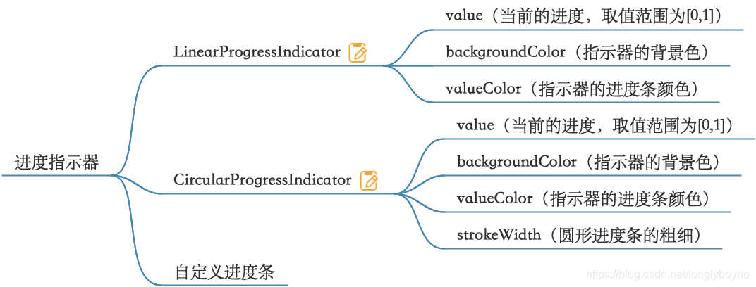
Material组件库中提供了两种进度指示器:LinearProgressIndicator和CircularProgressIndicator。
7.1LinearProgressIndicator
LinearProgressIndicator是一个线性进度条。
7.2构造函数
 const LinearProgressIndicator({
    Key key,
    double value,  //当前进度
    Color backgroundColor,  //进度条背景色
    Animation<Color> valueColor,  //进度颜色
    ……
  })
7.3 属性介绍
| 属性 | 作用 |
|---|---|
| value | value表示当前的进度,取值范围为[0,1];如果value为null时则指示器会执行一个循环动画(模糊进度);当value不为null时,指示器为一个具体进度的进度条。 |
| backgroundColor | 指示器的背景色。 |
| valueColor | 指示器的进度条颜色;值得注意的是,该值类型是Animation,这允许我们对进度条的颜色也可以指定动画。如果我们不需要对进度条颜色执行动画,换言之,我们想对进度条应用一种固定的颜色,此时我们可以通过AlwaysStoppedAnimation来指定。 |
7.4 LinearProgressIndicator基本用法
7.4.1 不加任何属性
LinearProgressIndicator()
效果:

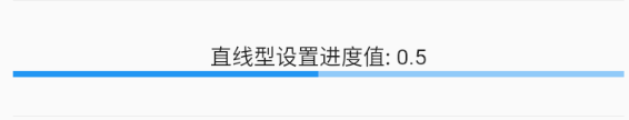
7.4.2 设置具体进度值value
value的值范围是0-1,设置为0.5
LinearProgressIndicator(
  value: 0.5,
)
效果:
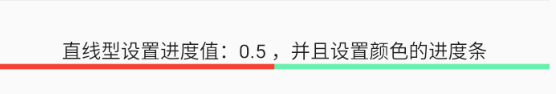
7.4.3 设置背景颜色及进度值
LinearProgressIndicator(
  value: 0.5,
  backgroundColor: Colors.greenAccent,
  valueColor: AlwaysStoppedAnimation<Color>(Colors.red),
)
效果:
7.5CircularProgressIndicator基本用法
CircularProgressIndicator 是圆形进度条,和LinearProgressIndicator用法一样
7.5.1 不加任何属性
CircularProgressIndicator()
效果:

7.5.2 设置进度值及颜色值
CircularProgressIndicator(
  value: 0.5,
  backgroundColor: Colors.greenAccent,
  valueColor: AlwaysStoppedAnimation<Color>(Colors.red),
)
效果:

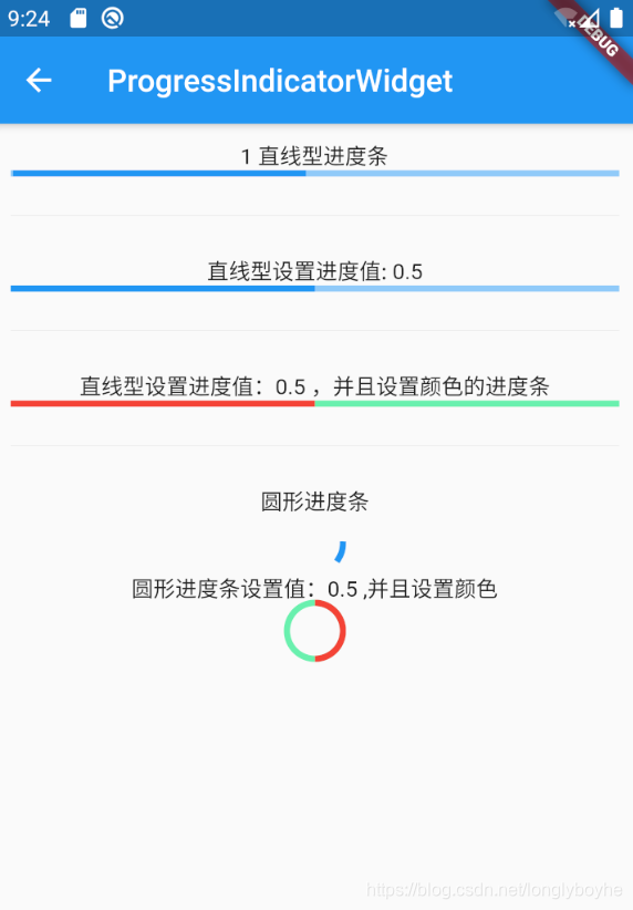
7.6 代码示例
import 'package:flutter/material.dart';

class ProgressIndicatorWidget extends StatefulWidget {
  ProgressIndicatorWidget({Key key}) : super(key: key);

  @override
  _ProgressIndicatorWidgetState createState() =>
      _ProgressIndicatorWidgetState();
}

class _ProgressIndicatorWidgetState extends State<ProgressIndicatorWidget> {
  @override
  Widget build(BuildContext context) {
    return Scaffold(
      appBar: AppBar(title: Text("ProgressIndicatorWidget")),
      body:  Padding(
        padding: EdgeInsets.all(10),
        child: Column(
          children: <Widget>[
            Text("1 直线型进度条"),
            LinearProgressIndicator(),
            Divider(height: 50),
            Text("直线型设置进度值: 0.5"),
            LinearProgressIndicator(
              value: 0.5, // 取值范围在 0~1 之间
            ),
            Divider(height: 50,),
            Text("直线型设置进度值:0.5 ,并且设置颜色的进度条"),
            LinearProgressIndicator(
              value: 0.5,
              backgroundColor: Colors.greenAccent, // 进度条背景颜色
              valueColor: AlwaysStoppedAnimation<Color>(Colors.red), // 设置值的颜色
            ),
            Divider(height: 50,),
            Text("圆形进度条"),
            CircularProgressIndicator(),
            Text("圆形进度条设置值:0.5 ,并且设置颜色"),
            CircularProgressIndicator(
              value: 0.5,
              backgroundColor: Colors.greenAccent, // 进度条背景颜色
              valueColor: AlwaysStoppedAnimation<Color>(Colors.red), // 设置值的颜色
            ),
          ],
        ),
      ),
    );
  }
}
效果:
github代码


 扫一扫
扫一扫


 743
743

 被折叠的 条评论
为什么被折叠?
被折叠的 条评论
为什么被折叠?
 到【灌水乐园】发言


