


转自:http://www.cnblogs.com/zhouyinhui/archive/2007/03/18/678892.html
作者:周银辉
WPF中的控件布局
周银辉
.Net3.0使用Panel来进行布局.其中继承于Panel的5中布局版面包括: Canvas, DockPanel, Grid, StackPanel, VirtualizingStackPanel, WrapPanel.
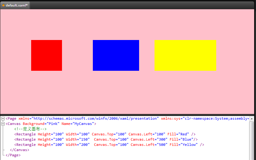
1, Cavas:简单地设置坐标值来布局
Canvas很单纯地设置其子控件相对于它的Top, Left, Bottom., Right值来进行定位其子控件. 那么请调用相关方法 public static void SetLeft (UIElement element,double length)等
假设border1是canvas1的Children, 那么我们应该这样设置border1在canvas1中的位置:
 Canvas.SetTop(border1, 100);Canvas.SetLeft(border1, 50);
注意这里有些奇怪的是调用Cavas的静态方法SetTop,SetLeft.
特别地, 当同时设置了Top与Bottom时,只有Top生效;同理同时设置了Left和Right时则只有Left生效,而不会拉伸控件.
要设置控件大小请使用控件的Width和Height属性.
以下是一个示例:
<
Page
xmlns
="http://schemas.microsoft.com/winfx/2006/xaml/presentation"
<
Canvas
Background
="Pink"
Name
="MyCanvas"
>
<!--
定义画布
-->
<
Rectangle
Height
="100"
Width
="100"
Canvas.Top
="100"
Canvas.Left
="100"
Fill
="Red"
/>
<
Rectangle
Height
="100"
Width
="150"
Canvas.Top
="100"
Canvas.Left
="300"
Fill
="Blue"
/>
<
Rectangle
Height
="100"
Width
="200"
Canvas.Top
="100"
Canvas.Left
="500"
Fill
="Yellow"
/>
</
Canvas
>
</
Page
>
如图:
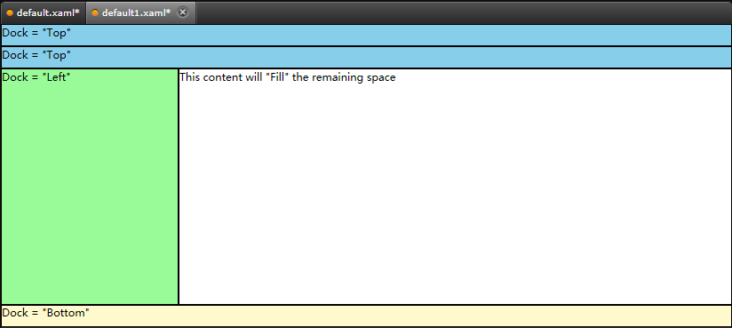
2, DockPanel: 与.net3.0之前的控件的Dock属性类似.
DockPanel为其子控件提供相对的停靠位置, 包括向左停靠(Dock.Left),向右停靠(Dock.Right),向下停靠(Dock.Bottom),向上停靠. 请调用DockPanel的静态方法SetDock(UIElement e, Dock dock)
假设border1是dockPanel1的子控件,那么我们可以这样来设置border1的位置:
DockPanel.SetDock(border1, Dock.Left|Dock.Top);
以下是一个示例:
<DockPanel LastChildFill="True">
<Border Height="25" Background="SkyBlue" BorderBrush="Black" BorderThickness="1" DockPanel.Dock="Top">
<TextBlock Foreground="Black">Dock = "Top"</TextBlock>
</Border>
<Border Height="25" Background="SkyBlue" BorderBrush="Black" BorderThickness="1" DockPanel.Dock="Top">
<TextBlock Foreground="Black">Dock = "Top"</TextBlock>
</Border>
<Border Height="25" Background="LemonChiffon" BorderBrush="Black" BorderThickness="1" DockPanel.Dock="Bottom,Right" >
<TextBlock Foreground="Black">Dock = "Bottom"</TextBlock>
</Border>
<Border Width="200" Background="PaleGreen" BorderBrush="Black" BorderThickness="1" DockPanel.Dock="Left">
<TextBlock Foreground="Black">Dock = "Left"</TextBlock>
</Border>
<Border Background="White" BorderBrush="Black" BorderThickness="1">
<TextBlock Foreground="Black">This content will "Fill" the remaining space</TextBlock>
</Border>
</DockPanel>
</Page>
如图:
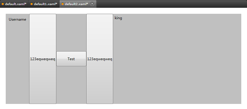
3, StackPanel :按照水平线方向或垂直线方向排列控件
StackPanel允许你按照指定的方向(HorizontalAlignment, VerticalAlignment)向其中添加子控件.
关于StackPanel与DockPanel的区别SDK中是这样阐述的:” Although you can use either DockPanel or StackPanel to stack child elements, the two controls do not always produce the same results. For example, the order that you place child elements can affect the size of child elements in a DockPanel but not in a StackPanel. This different behavior occurs because StackPanel measures in the direction of stacking at Double.PositiveInfinity; however, DockPanel measures only the available size.”
以下是一个示例:
<
Page
xmlns
="http://schemas.microsoft.com/winfx/2006/xaml/presentation"
<
Grid
>
<
StackPanel
Orientation
="Horizontal"
Background
="silver"
Margin
="20"
>
<
Label
Margin
="5"
Content
="Username"
/>
<
Button
Content
="123eqweqweq"
/>
<
Button
Name
="test"
Width
="100"
Height
="50"
Content
="Test"
/>
<
Button
Content
="123eqweqweq"
/>
<
Label
Name
="testlabel"
Content
="king"
/>
</
StackPanel
>
</
Grid
>
</
Page
>
如图:
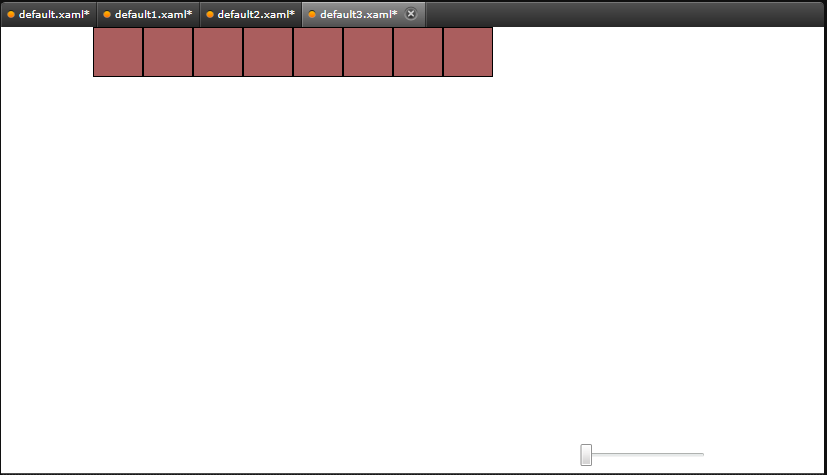
4,WrapPanel: 自动换行子控件的布局
当子一行(或一列)不足以放置新控件时,WrapPanel将自动地将子控件放置到新行(或新列,这取决于Orientation属性)
以下是一个示例:
<Page
xmlns
="http://schemas.microsoft.com/winfx/2006/xaml/presentation"
xmlns:x
="http://schemas.microsoft.com/winfx/2006/xaml"
xml:lang
="zh-CN"
x:Name
="Window"
Title
="Window1"
Width
="640"
Height
="480"
xmlns:d
="http://schemas.microsoft.com/expression/blend/2006"
xmlns:mc
="http://schemas.openxmlformats.org/markup-compatibility/2006"
mc:Ignorable
="d"
>
<
Grid
x:Name
="LayoutRoot"
>
<
Grid
.RowDefinitions
>
<
RowDefinition
Height
="0.83*"
/>
<
RowDefinition
Height
="0.17*"
/>
</
Grid.RowDefinitions
>
<
WrapPanel
x:Name
="wrapPanel1"
>
<
Rectangle
Fill
="#FFAA5E5E"
Stroke
="#FF000000"
Width
="{Binding Path=Value, ElementName=slider1, Mode=Default}"
Height
="{Binding Path=Value, ElementName=slider1, Mode=Default}"
/>
<
Rectangle
Fill
="#FFAA5E5E"
Stroke
="#FF000000"
Width
="{Binding Path=Value, ElementName=slider1, Mode=Default}"
Height
="{Binding Path=Value, ElementName=slider1, Mode=Default}"
/>
<
Rectangle
Fill
="#FFAA5E5E"
Stroke
="#FF000000"
Width
="{Binding Path=Value, ElementName=slider1, Mode=Default}"
Height
="{Binding Path=Value, ElementName=slider1, Mode=Default}"
/>
<
Rectangle
Fill
="#FFAA5E5E"
Stroke
="#FF000000"
Width
="{Binding Path=Value, ElementName=slider1, Mode=Default}"
Height
="{Binding Path=Value, ElementName=slider1, Mode=Default}"
/>
<
Rectangle
Fill
="#FFAA5E5E"
Stroke
="#FF000000"
Width
="{Binding Path=Value, ElementName=slider1, Mode=Default}"
Height
="{Binding Path=Value, ElementName=slider1, Mode=Default}"
/>
<
Rectangle
Fill
="#FFAA5E5E"
Stroke
="#FF000000"
Width
="{Binding Path=Value, ElementName=slider1, Mode=Default}"
Height
="{Binding Path=Value, ElementName=slider1, Mode=Default}"
/>
<
Rectangle
Fill
="#FFAA5E5E"
Stroke
="#FF000000"
Width
="{Binding Path=Value, ElementName=slider1, Mode=Default}"
Height
="{Binding Path=Value, ElementName=slider1, Mode=Default}"
/>
<
Rectangle
Fill
="#FFAA5E5E"
Stroke
="#FF000000"
Width
="{Binding Path=Value, ElementName=slider1, Mode=Default}"
Height
="{Binding Path=Value, ElementName=slider1, Mode=Default}"
/>
</
WrapPanel
>
<
Slider
d:LayoutOverrides
="Margin"
HorizontalAlignment
="Right"
Margin
="0,19.01,24,29"
x:Name
="slider1"
Width
="128"
Grid.Row
="1"
Maximum
="300"
Minimum
="50"
Value
="50"
/>
</
Grid
>
</
Page
>
如图:
5 Grid:表格布局
Grid允许我们通过自定义行列来进行布局,这类似于表格. 我们可以通过表格来进行交复杂框架的布局,然后再在表格内部利用其他布局方式或嵌套表格个方式进行布局.
可以通过设置Columns和Rows的属性,通过定义Grid的ColumnDifinitions和RowDifinitions来实现对于表格的定义,然后根据Grid.Column和Grid.Row的对象来制定位置的方式实现布局.
这里是一个示例:
<
Page
xmlns
="http://schemas.microsoft.com/winfx/2006/xaml/presentation"
WindowTitle
="Grid Sample"
>
<
Grid
VerticalAlignment
="Top"
HorizontalAlignment
="Left"
ShowGridLines
="True"
Width
="250"
Height
="100"
>
<
Grid
.ColumnDefinitions
>
<
ColumnDefinition
/>
<
ColumnDefinition
/>
<
ColumnDefinition
/>
</
Grid.ColumnDefinitions
>
<
Grid
.RowDefinitions
>
<
RowDefinition
/>
<
RowDefinition
/>
<
RowDefinition
/>
<
RowDefinition
/>
</
Grid.RowDefinitions
>
<
TextBlock
FontSize
="20"
FontWeight
="Bold"
Grid.ColumnSpan
="3"
Grid.Row
="0"
>
2005 Products Shipped
</
TextBlock
>
<
TextBlock
FontSize
="12"
FontWeight
="Bold"
Grid.Row
="1"
Grid.Column
="0"
>
Quarter 1
</
TextBlock
>
<
TextBlock
FontSize
="12"
FontWeight
="Bold"
Grid.Row
="1"
Grid.Column
="1"
>
Quarter 2
</
TextBlock
>
<
TextBlock
FontSize
="12"
FontWeight
="Bold"
Grid.Row
="1"
Grid.Column
="2"
>
Quarter 3
</
TextBlock
>
<
TextBlock
Grid.Row
="2"
Grid.Column
="0"
>
50000
</
TextBlock
>
<
TextBlock
Grid.Row
="2"
Grid.Column
="1"
>
100000
</
TextBlock
>
<
TextBlock
Grid.Row
="2"
Grid.Column
="2"
>
150000
</
TextBlock
>
<
TextBlock
FontSize
="16"
FontWeight
="Bold"
Grid.ColumnSpan
="3"
Grid.Row
="3"
>
Total Units: 300000
</
TextBlock
>
</
Grid
>
</
Page
>

6, VirtualizingStackPanel
可视化是一种改善数据密集型应用程序性能的很好方式。可通过VirtualizingStackPanel控件获得 WPF 中的 UI 可视化。对于大量的项而言,这要比 StackPanel 快 70 倍。您也可以做到同样的事情 — 如果能避免将所有对象一直保持在树中,那么您很可能会看到回报。(关于VirtualizingStackPanel来自”WPF概述”,by Tim Sneath)


 354
354

 被折叠的 条评论
为什么被折叠?
被折叠的 条评论
为什么被折叠?
 到【灌水乐园】发言


