


文章目录
前言
接上文,接下来看一点稍微复杂的:具名插槽
一、具名插槽
子组件 MyComponent.vue:
<template>
  <div>
    <slot name="header"></slot>
    <slot></slot>
    <slot name="footer"></slot>
  </div>
</template>
父组件中使用 MyComponent:
<template>
  <MyComponent>
    <template v-slot:header>
      <h1>这是标题</h1>
    </template>
    <p>这是主要内容</p>
    <template #footer>
      <p>这是页脚</p>
    </template>
  </MyComponent>
</template>
不多啰嗦,不过注意我#footer的写法,这是具名插槽的简写。
甚至插槽名还可以是动态的:
    <template v-slot:[header]>
      <h1>这是标题</h1>
    </template>
一样可以缩写:
    <template #[header]>
      <h1>这是标题</h1>
    </template>
当一个组件同时接收默认插槽和具名插槽时,所有位于顶级的非 节点都被隐式地视为默认插槽的内容:
<p>这是主要内容</p>
然而在某些场景下插槽的内容可能想要同时使用父组件域内和子组件域内的数据。要做到这一点,我们需要一种方法来让子组件在渲染时将一部分数据提供给插槽。
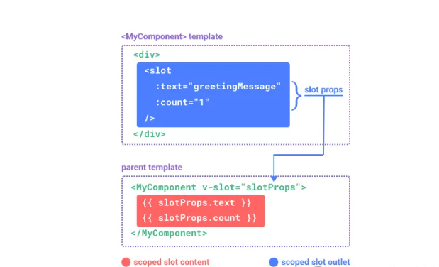
我们也确实有办法这么做!可以像对组件传递 props 那样,向一个插槽的出口上传递 attributes:
<!-- <MyComponent> 的模板 -->
<div>
  <slot :text="greetingMessage" :count="1"></slot>
</div>
当需要接收插槽 props 时,默认插槽和具名插槽的使用方式有一些小区别。下面我们将先展示默认插槽如何接受 props,通过子组件标签上的 v-slot 指令,直接接收到了一个插槽 props 对象:
<MyComponent v-slot="slotProps">
  {{ slotProps.text }} {{ slotProps.count }}
</MyComponent>
这个有点复杂了,看看官方的原理解释:
MyComponent({
  // 类比默认插槽,将其想成一个函数
  default: (slotProps) => {
    return `${slotProps.text} ${slotProps.count}`
  }
})

function MyComponent(slots) {
  const greetingMessage = 'hello'
  return `<div>${
    // 在插槽函数调用时传入 props
    slots.default({ text: greetingMessage, count: 1 })
  }</div>`
}
v-slot=“slotProps” 可以类比这里的函数签名,和函数的参数类似,我们也可以在 v-slot 中使用解构:
<MyComponent v-slot="{ text, count }">
  {{ text }} {{ count }}
</MyComponent>
具名作用域插槽的工作方式也是类似的,插槽 props 可以作为 v-slot 指令的值被访问到:v-slot:name=“slotProps”。当使用缩写时是这样:
<MyComponent>
  <template #header="headerProps">
    {{ headerProps }}
  </template>

  <template #default="defaultProps">
    {{ defaultProps }}
  </template>

  <template #footer="footerProps">
    {{ footerProps }}
  </template>
</MyComponent>
向具名插槽中传入 props:
<slot name="header" message="hello"></slot>
注意插槽上的 name 是一个 Vue 特别保留的 attribute,不会作为 props 传递给插槽。因此最终 headerProps 的结果是 { message: ‘hello’ }。
如果你同时使用了具名插槽与默认插槽,则需要为默认插槽使用显式的 标签。尝试直接为组件添加 v-slot 指令将导致编译错误。这是为了避免因默认插槽的 props 的作用域而困惑。举例:
<!-- 该模板无法编译 -->
<template>
  <MyComponent v-slot="{ message }">
    <p>{{ message }}</p>
    <template #footer>
      <!-- message 属于默认插槽,此处不可用 -->
      <p>{{ message }}</p>
    </template>
  </MyComponent>
</template>
为默认插槽使用显式的 标签有助于更清晰地指出 message 属性在其他插槽中不可用:
<template>
  <MyComponent>
    <!-- 使用显式的默认插槽 -->
    <template #default="{ message }">
      <p>{{ message }}</p>
    </template>

    <template #footer>
      <p>Here's some contact info</p>
    </template>
  </MyComponent>
</template>
二、高级列表组件示例
你可能想问什么样的场景才适合用到作用域插槽,这里我们来看一个 组件的例子。它会渲染一个列表,并同时会封装一些加载远端数据的逻辑、使用数据进行列表渲染、或者是像分页或无限滚动这样更进阶的功能。然而我们希望它能够保留足够的灵活性,将对单个列表元素内容和样式的控制权留给使用它的父组件。我们期望的用法可能是这样的:
<FancyList :api-url="url" :per-page="10">
  <template #item="{ body, username, likes }">
    <div class="item">
      <p>{{ body }}</p>
      <p>by {{ username }} | {{ likes }} likes</p>
    </div>
  </template>
</FancyList>
在 之中,我们可以多次渲染 并每次都提供不同的数据 (注意我们这里使用了 v-bind 来传递插槽的 props):
<ul>
  <li v-for="item in items">
    <slot name="item" v-bind="item"></slot>
  </li>
</ul>
总结
最后这个官方提供的高级示例一定要好好看看,这为我们封装列表组件提供了很完美的思路。今天内容有点多,反复阅读,封装个自己的table组件啥的,掌握插槽不在话下。
你的内心有一片宁静的海洋,无论外界如何波涛汹涌,都可以回归平静。


 1136
1136

 被折叠的 条评论
为什么被折叠?
被折叠的 条评论
为什么被折叠?
 到【灌水乐园】发言


