


需求:
本文记录了我尝试实现支付宝钱包样式带分割线GridView的过程。首先看一下高大上的支付宝钱包首页:

这里画红框的部分,给人的直观感觉就是一个GridView 。当然,这里很可能是支付宝同学自定义了一个GridView的子类 。相对于ListView的单列列表,GridView则是一种支持多行多列的网格形式。 当我们想要实现例如九宫格的效果时,GridView即是首选。
然而,与ListView可以方便的设置和自定义分割线不同不同,GridView貌似并不提供分割线属性。这样,只能开动劳动人民的智慧来尝试解决了。(今天进行了三次尝试,成功的方式在第三次尝试中。 欢迎大家提供更好的实现方法)第一次尝试:item的背景图
这个方法实际上是从网上看到的,使用最多的解决方案。 简而言之,就是对GridView的每个单元做背景图。代码说话:
<?xml version="1.0" encoding="utf-8"?>
<RelativeLayout xmlns:android="http://schemas.android.com/apk/res/android"
                android:layout_width="fill_parent"
                android:layout_height="fill_parent"
                android:layout_margin="0.0dip"
                 >

    <RelativeLayout
        android:layout_width="fill_parent"
        android:layout_height="fill_parent"
        android:layout_centerInParent="true"
        android:background="@drawable/item_gridview"
        android:padding="12.0dip" >

        <ImageView
            android:id="@+id/gridview_item_icon"
            android:layout_width="58.0dip"
            android:layout_height="58.0dip"
            android:layout_centerHorizontal="true"
            android:contentDescription="@string/app_name" />

        <TextView
            android:id="@+id/gridview_item_name"
            android:layout_width="wrap_content"
            android:layout_height="wrap_content"
            android:layout_below="@id/gridview_item_icon"
            android:layout_centerHorizontal="true"
            android:layout_marginTop="5.0dip"
            android:maxLines="1"
            android:textSize="14.0sp" />
    </RelativeLayout>

</RelativeLayout>
在item_gridview中,已矩形框为背景:
<selector xmlns:android="http://schemas.android.com/apk/res/android">

        <item android:state_pressed="true"><shape android:shape="rectangle">
            <stroke android:width="1px" android:color="@color/pink" />

            <gradient android:angle="270.0" android:endColor="#ffe8ecef" android:startColor="#ffe8ecef" />
        </shape></item>
        <item android:state_focused="true"><shape android:shape="rectangle">
            <gradient android:angle="270.0" android:endColor="#ffe8ecef" android:startColor="#ffe8ecef" />

            <stroke android:width="1px" android:color="@color/pink" />
        </shape></item>
        <item><shape android:shape="rectangle">
            <gradient android:angle="270.0" android:endColor="#ffffffff" android:startColor="#ffffffff" />

            <stroke android:width="1px" android:color="@color/pink" />
        </shape></item>

</selector>
在Activity中对GridView设置Adapter,充入对象,效果如下图所示。(目前仅探究gridview,其他部分还比较丑)
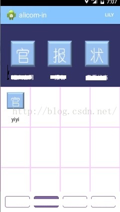
虽然在xml中设置的是最小值 1px , 然而看起来还是比支付宝钱包的效果粗很多。 因为后者才是 真·1px ,前者的分割线实际上是相邻单元的边框合并在了一起,所以看起来要粗很多。
第二次尝试:相邻单元只有一个背景
上面的问题已经可以看出,是相邻的单元格背景框相邻使分割线变粗。 那么可以提出相应的解决办法:相邻单元格只有一个有背景。
以当前4列的情况为例,实际上,可以去掉:
第一行的第二,第四个单元
第二行的第一,第三个单元
第三行的第二,第四个单元
。。。
可以总结出规律,通过去掉行列数奇偶性不同的单元,可以使相邻的单元(包括上下相邻和左右相邻)不同时具有边框。在adapter的getView方法中加入如下代码:
if(position/4%2!=position%2){
				RelativeLayout layout=(RelativeLayout)convertView.findViewById(R.id.layout_gridview);
				layout.setBackgroundResource(R.drawable.item_gridview2);
}
其中item_gridview2是边框为空白的背景
效果图:
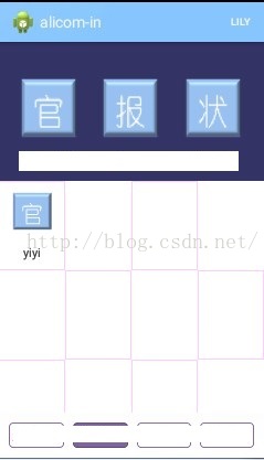
这是才发现,我犯了一个很2的错误:小看了1px的误差
当相邻单元的边框去除后,成对角方向的单元框对不齐了。。
第三次尝试:暴力加框
这一次比较直接和暴力,最终达到了预想的效果。但是显得不是那么聪明和巧妙,这里抛砖引玉,希望路过的大牛能给出更好的实现方法。
这一次,通过在单元格xml中插入两个宽度为1px的ImageView做边框,来实现gridview的伪分割线:
<?xml version="1.0" encoding="utf-8"?>
<LinearLayout xmlns:android="http://schemas.android.com/apk/res/android"
              android:orientation="vertical"
              android:layout_width="match_parent"
              android:layout_height="match_parent">

    <LinearLayout
        android:layout_width="match_parent"
        android:layout_height="match_parent"
        android:orientation="horizontal">


    <LinearLayout
        android:layout_width="wrap_content"
        android:layout_height="fill_parent"
        android:layout_weight="1"
        android:gravity="center"
        android:id="@+id/layout_gridview_item"
        android:orientation="vertical"
         >

        <ImageView
            android:layout_marginTop="12dp"
            android:id="@+id/gridview_item_icon"
            android:layout_width="38.0dip"
            android:layout_height="38.0dip"
            android:layout_centerHorizontal="true"
            android:background="@drawable/guan"
            android:contentDescription="@string/app_name" />

        <TextView
            android:id="@+id/gridview_item_name"
            android:layout_width="wrap_content"
            android:layout_height="wrap_content"
            android:layout_below="@id/gridview_item_icon"
            android:layout_centerHorizontal="true"
            android:maxLines="1"
            android:text="标题"
            android:textColor="@color/darkblue"
            android:layout_marginBottom="12dp"
            android:textSize="14.0sp" />

        <ImageView
            android:layout_width="match_parent"
            android:id="@+id/line_bottom"
            android:layout_height="1dp"
            android:background="@color/lightgray"
            android:layout_gravity="bottom"/>


    </LinearLayout>

        <ImageView
            android:layout_width="1dp"
            android:layout_weight="0"
            android:layout_height="match_parent"
            android:background="@color/lightgray"
            android:layout_gravity="bottom"
            />

    </LinearLayout>

</LinearLayout>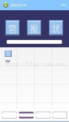
第四次尝试:重写dispatchDraw 方法
这里我们可以对gridview进行重绘, 重写父类的dispatchDraw方法。
思路基本跟方法三一致,对每个子item画两条框。不同之处在于,当我们采用动态绘制(而不是写死在xml)时,可以针对不同的情况进行判断和定制,使最后的效果更完美。 在这里,可以考虑到左右上下的对称性和gridview的item数不是列数的整数倍时的情况。 重写代码如下:
@Override
    protected void dispatchDraw(Canvas canvas) {
        super.dispatchDraw(canvas);
        View localView1 = getChildAt(0);
        int column = getWidth() / localView1.getWidth();
        int childCount = getChildCount();
        Paint localPaint= new Paint();
        localPaint.setStyle(Paint.Style.STROKE);
        localPaint.setColor(getContext().getResources().getColor(R.color.lightgray));
        for(int i = 0;i < childCount;i++){
            View cellView = getChildAt(i);
            if((i + 1) % column == 0){ //最右侧只画底部边框
                canvas.drawLine(cellView.getLeft(), cellView.getBottom(), cellView.getRight(), cellView.getBottom(), localPaint);
            }else if((i + 1) > (childCount - (childCount % column))){//最下部只画右侧边框
                canvas.drawLine(cellView.getRight(), cellView.getTop(), cellView.getRight(), cellView.getBottom(), localPaint);
            }else{//画底部和右侧边框
                canvas.drawLine(cellView.getRight(), cellView.getTop(), cellView.getRight(), cellView.getBottom(), localPaint);
                canvas.drawLine(cellView.getLeft(), cellView.getBottom(), cellView.getRight(), cellView.getBottom(), localPaint);
            }
        }
        //如果最后一行不足,则补全缺省item的右侧竖线。
        if(childCount % column != 0){
            for(int j = 0 ;j < (column-childCount % column) ; j++){
                View lastView = getChildAt(childCount - 1);
                canvas.drawLine(lastView.getRight() + lastView.getWidth() * j, lastView.getTop(), lastView.getRight() + lastView.getWidth()* j, lastView.getBottom(), localPaint);
            }
        }
    }
效果与第三种方法相同。


 2621
2621


 被折叠的 条评论
为什么被折叠?
被折叠的 条评论
为什么被折叠?
 到【灌水乐园】发言


