


Flex布局
弹性盒子布局
基本概念:首先将元素设置为display:flex; 元素会变为一个flex容器
容器内部的元素为flex元素或者叫flex项目(flex-item)
之前学过:Display:none 设置元素隐藏
Display:block;可以转换成块元素
Display:inline; 设置成行内元素
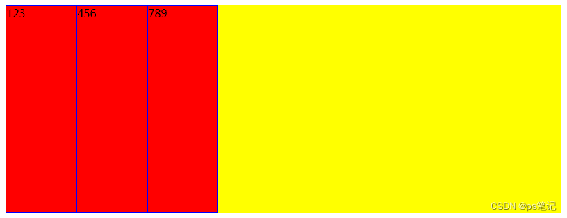
<style>
    .container {
        display: flex;
        background-color: yellow;
        width: 800px;
        height: 300px;
    }
    .item{
        width: 100px;
        /* height: 100px; */
        background-color: red;
        border: 1px solid blue;
    }
</style>
<body>
    <div class="container">
        <div class="item">123</div>
        <div class="item">456</div>
        <div class="item">789</div>
    </div>
</body>
</html>
Main axis:主轴
Cross axis:交叉轴
默认:
Flex项目在flex容器中延主轴排列
Flex项目高度适应flex容器高度(同行内元素)
设置flex容器:
Flex-direction: 设置flex项目排列方向
Jusrif-content: flex项目主轴排列方式
Align-items: flex项目交叉轴的排列方式
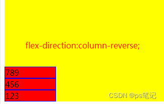
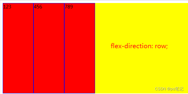
Flex-direction:
Row(默认值):主轴为水平方向,起点在左端
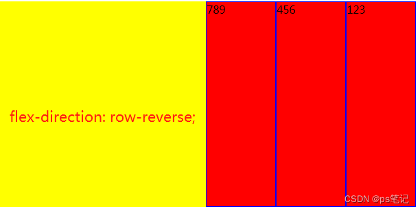
Row-reverse: 主轴为水平方向,起点在右端
Column:主轴为垂直方向,起点在上沿
Column-reverse:主轴为垂直方向,起点在下沿
<style>
    .container {
        display: flex;
        /* flex-direction: column;往左上方横向 */
        /* flex-direction:column-reverse; 往左下方横向*/
        /* flex-direction: row;往左边纵轴 */
        /* flex-direction: row-reverse;往右边纵轴 */
        background-color: yellow;
        width: 800px;
        height: 300px;
    }
    .item{
        width: 100px;
        /* height: 100px; */
        background-color: red;
        border: 1px solid blue;
    }
</style>
<body>
    <div class="container">
        <div class="item">123</div>
        <div class="item">456</div>
        <div class="item">789</div>
    </div>
</body>
</html>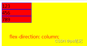
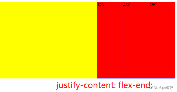
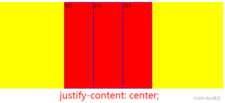
Justif-content: 、 主要用来控制flex对齐效果的。
flex-start(默认):左对齐
flex-end:右对齐
center:居中
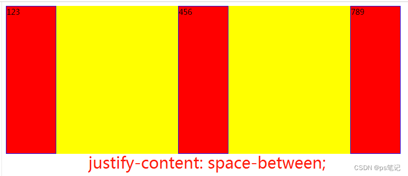
space-between:两端对齐,项目之间的间隙隔都相等
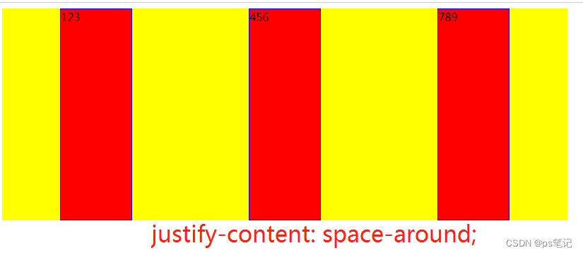
space-around:每个项目两侧的间隔相等,所以项目之间的间隔比项目与边框的间隔大一倍。
<style>
    .container {
        display: flex;
        background-color: yellow;
        width: 800px;
        height: 300px;
        justify-content: flex-start;
        /* justify-content: flex-end; */
        /* justify-content: center; */
        /* justify-content: space-between; */
        /* justify-content: space-around; */
    }
    .item{
        width: 100px;
        /* height: 100px; */
        background-color: red;
        border: 1px solid blue;
    }
</style>
<body>
    <div class="container">
        <div class="item">123</div>
        <div class="item">456</div>
        <div class="item">789</div>


    </div>
</body>
</html>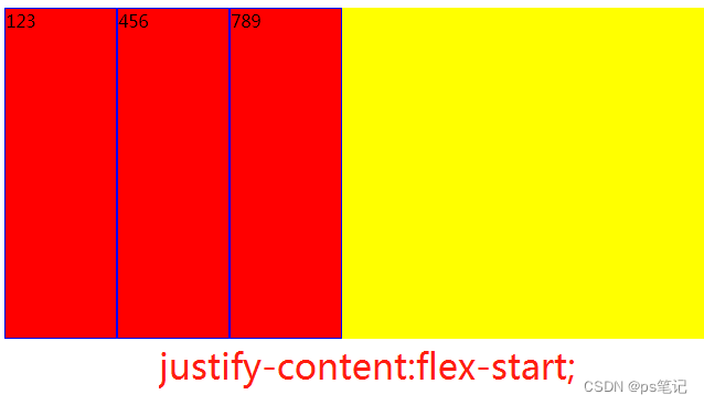
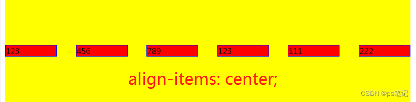
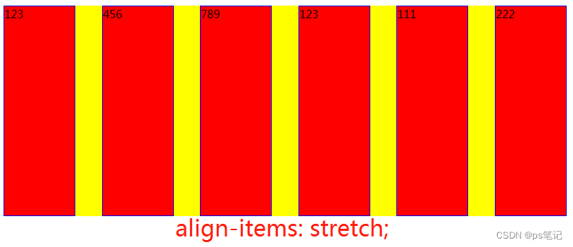
Align-items:
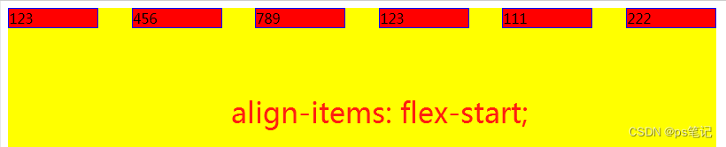
flex-start:交叉轴的起点对齐;
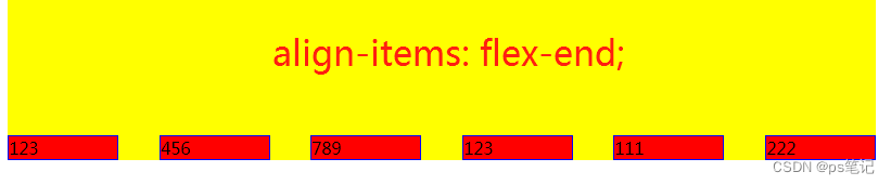
flex-end:交叉轴的终点对齐:
center:交叉轴的中点对齐;
stretch:(延伸)(默认值):如果项目未设置高度或设为auto,将占满整个容器的高度。
<style>
    .container {
        display: flex;
        background-color: yellow;
        width: 800px;
        height: 300px;
        justify-content: flex-start;
        justify-content: space-between;
        /* align-items: flex-start; */
        /* align-items: flex-end; */
        /* align-items: center; */
        align-items: stretch;

    }
    .item{
        width: 100px;
        /* height: 100px; */
        background-color: red;
        border: 1px solid blue;
    }
</style>
<body>
    <div class="container">
        <div class="item">123</div>
        <div class="item">456</div>
        <div class="item">789</div>
        <div class="item">123</div>
        <div class="item">111</div>
        <div class="item">222</div>
    </div>
</body>
</html>
flex项目:
flex-grow:属性定义项目的放大比例,默认0,空间充足,等比例补全。
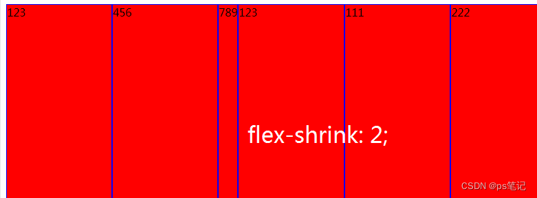
flex-shrink:定义了项目的缩小比例,默认1,即如果空间不足,该项目将缩小
flex-basis:主轴排列为宽度,交叉轴排列为高度,设置px,默认值是auto。
flex:综合上面三个样式。flex: 0 1 auto ;
align-self:flex项目的对其方式(auto、flex-start 、 flex-end 、center 、 baseline 、 stretch)
<style>
    .container {
        display: flex;
        background-color: yellow;
        width: 800px;
        height: 300px;
    }
    .item{

        background-color: red;
        border: 1px solid blue;
        flex-grow: 1;
    }
    .big{
        flex-grow: 3;
    }
</style>
<body>
    <div class="container">
        <div class="item">123</div>
        <div class="item">456</div>
        <div class="item big">789</div>
        <div class="item">123</div>
        <div class="item">111</div>
        <div class="item">222</div>
    </div>
</body>
</html>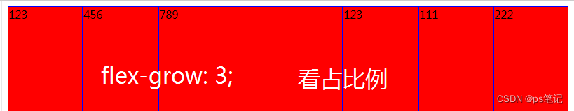
.big{
width: 300px;
/* 如果整个flex项目的话都是等比例缩小的话,那flex-shrink的值就越大,缩小的程度也就越大,越小 ,用的不多了解*/
flex-shrink: 2;
}
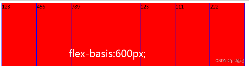
.big{
/* flex-basis的作用就是在主轴排列时设置宽度600px,不常用了解一下 */
flex-basis:600px;
}
<style>
    .container {
        display: flex;
        background-color: yellow;
        width: 800px;
        height: 300px;
    }
    .item{

        background-color: red;
        border: 1px solid blue;
        /* 设置默认值 */
        /* flex: 0 1 auto ; */    这里补充一下,0是flex-grow、1是flex-shrink、auto是flex-basis的意思。
        /* flex-shrink: 2;可以简写一下: */
        flex:1;

    }
    .big{
        /*   flex-basis:600px;可以简写一下: */
        flex:2;
    }
</style>
<body>
    <div class="container">
        <div class="item">123</div>
        <div class="item">456</div>
        <div class="item big">789</div>
        <div class="item">123</div>
        <div class="item">111</div>
        <div class="item">222</div>
    </div>
</body>
</html>
案例:设置一个元素在容器中垂直水平居中:
<style>
    *{
        margin: 0px;
        padding: 0px;

    }
    body,html{
        height: 100%;
    }
    .container {
        background-color: yellow;
        height: 100%;
        display:flex;
        justify-content: center;
        /* align-items: center;水平居中 */
    }
    .box{
        width: 100px;
        height: 100px;
        background-color: blue;
        /* align-self: center;=align-items: center;水平居中 */
        align-self: center;
    }

</style>
<body>
    <div class="container">
        <div class="box"></div>
    </div>
</body>
</html>
案例制作右侧网页的底部菜单:
</head>
<style>
    *{
        margin: 0px;
        padding: 0px;
    }

   .menu{
        position: fixed;
        background-color: yellow;
        bottom: 0px;
        display: flex;
        width:100%;
        height: 70px;
        align-items: center;
    }
    .sub{
        flex:1;
        text-align: center;
    }
    .sub img{
        height: 30px;

    }

</style>
<body>
    <div class="menu">
        <div class="sub">
            <img src="images/open.png" alt="">
            <p>首页</p>
        </div>
        <div class="sub">
            <img src="images/error.png" alt="">
            <p>首页</p>
        </div>
        <div class="sub">
            <img src="images/success.png" alt="">
            <p>首页</p>
        </div>
        <div class="sub">
            <img src="images/open.png" alt="">
            <p>首页</p>
        </div>
        <div class="sub">
            <img src="images/close.png" alt="">
            <p>首页</p>
        </div>
    </div>

</body>
</html>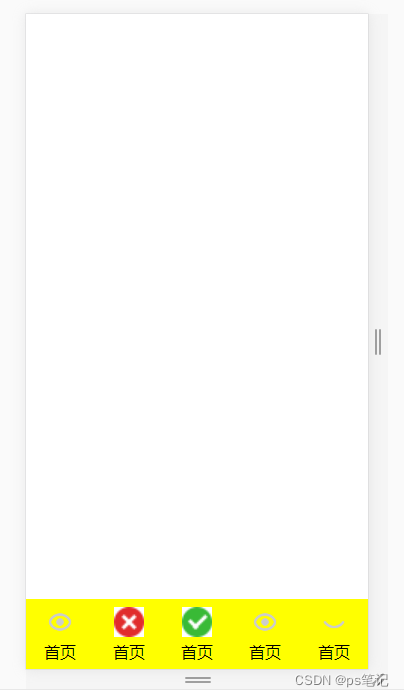


 5054
5054


 被折叠的 条评论
为什么被折叠?
被折叠的 条评论
为什么被折叠?
 到【灌水乐园】发言


