


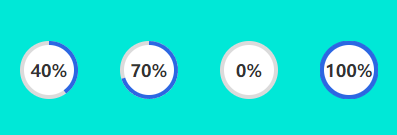
先看看我做出来的效果
人狠话不多 直接上代码
html部分
<div id="box"></div>
css部分
  #box{

        width: 400px;
        height: 400px;
        background-color: #00E8D7;
        display: flex;
  }

  .circleBox{

    width: 33.333%;
    display: flex;
    flex-direction: column;
    align-items: center;
    justify-content: center;
  }
  .circleContent{

    height: 58px;
    position: relative;
    width: 58px;
  }
  .circleContent + div{

    font-size: 14px;
    color: #333333;
    font-weight: 600;
    margin-top: 10px;
  }
  .smallCircle{

    font-size: 17px;
    color: #333333;
    font-weight: 600;
    text-align: center;
    width: 50px;
    height: 50px;
    line-height: 50px;
    background-color: #ffffff;
    position: absolute;
    top: 4px;
    left: 4px;
    border-radius: 50%;
    z-index: 3;
  }
  .bigCircle{

    width: 58px;
    height: 58px;
    background-color: #dbdbdb;
    position: absolute;
    border-radius: 50%;
    z-index: 1;
  }
js部分
 最低0.47元/天 解锁文章


 1715
1715

 被折叠的 条评论
为什么被折叠?
被折叠的 条评论
为什么被折叠?
 到【灌水乐园】发言


