


动画
属性 | 值 | 描述 |
| animation-name | animation2 | 引用自定义的动画 |
| animation-duration | 2s | 一次动画完成的时间 |
| animation-timing-function | linear | 动画的速度曲线 |
| animation-fill-mode | forwards(保留动画完成后的样式) | 动画停止后的样式 |
| animation-iteration-count | 6(默认是1,infinite无限循环) | 动画播放次数 |
| animation-delay | 1s | 延时执行动画的时间 |
| animation-direction | alternate-reverse (reverse 反向播放, alternate(1,3,5奇数正向,偶数反向), alternate-reverse 偶数正向,奇数反向) | 动画的播放方向 |
动画的简写:
animation: animation2 2s infinite; /* 按上面的顺序,有的就加上,没有的就省略 */
过渡
transition-property 过渡的属性
- all是所有属性都有过渡
transition-duration 过渡的时间
- 1s
transition-timing-function 动画的类型
- linear 匀速动画
- ease 先慢后快
transition-delay 过渡延时的时间
- 1s
transition: all 1s; 过渡的简写
应用

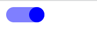
先把CheckBox隐藏,用label代替
 <div>

        <input type="checkbox" id="ck1" hidden>

        <label for="ck1" ></label>

    </div>
label {
position: relative;
display: block;
width: 50px;
height: 20px;
background-color: #ccc;
border-radius: 10px;
transition: all 0.5s;
}
label::after {
position: absolute;
left: 0;
content: '';
display: inline-block;
width: 20px;
height: 20px;
background-color: black;
border-radius: 50%;
transition: all 0.5s;
}
input:checked+label{
background-color: rgba(0, 0, 255,0.5);
}
input:checked+label::after{
left: 30px;
background-color: blue;
}


 418
418


 被折叠的 条评论
为什么被折叠?
被折叠的 条评论
为什么被折叠?
 到【灌水乐园】发言


