


实现各种进度条,正常进度条、圆形进度条、分步进度等各种进度条组件,并添加特定的样式效果。
一、效果预览:

二、下载地址:

三、实现效果:
1. 基础进度条的实现
2. 圆形进度条的实现
3. 分步进度条的实现
4. 添加操作方法
5. 背景填充颜色及渐变实现
6. 添加过渡动画效果
四、实现思路:
1. 基础进度条的实现思路:
使用div作为背景,颜色可指定。使用绝对定位将有值的部分悬浮到背景上,通过width的百分比控制有值部分的宽度。
2. 圆形进度条的实现思路:
使用canvas进行圆环的绘制,使用参数设置对应的颜色、尺寸等。
3. 分步进度条的实现思路:
使用背景色作为中间的进入展示,使用文字和需要展示每步的文字信息。
4. 背景填充颜色及渐变实现思路:
通过参数传递颜色或者渐变色的配置,组件自动识别,环状图时自动通过参数的方式传递回调函数,设置背景渐变色
5. 添加操作方法实现思路:
通过传入的value值控制当前进度,调用组件时通过改变参数的value值,实现进度条的更新。
6. 添加过渡动画效果实现思路:
bar/step使用css动画实现,通过控制宽度的方式实现动画效果。pie时使用动态重新绘制的方式实现动画效果。
五、参数说明:
1. 参数说明:
| 序号 | 参数 | 是否必填 | 说明 |
|---|---|---|---|
| 1 | type | 否 | 字符串,默认"bar",表示普通进度条,具体类型定义如下:1. bar表示普通进度条。2. pie表示圆形的进度条。3. step表示分布进度条。 |
| 2 | value | 否 | 数字,进度值,百分比,必填 |
| 3 | width | 否 | 字符串,整体的宽度,选填,默认300px,type=pie时,此值表示圆环的尺寸 |
| 4 | height | 否 | 字符串,整体的高度,选填,默认30px,type=pie时,此值表示圆环的宽度 |
| 5 | bgcolor | 否 | 对象,背景颜色,type='pie’的时候可通过回调函数的方式设置背景色,其它类型时可直接传递css的背景色样式,选填,默认#c1c1c1, |
| 6 | bgvaluecolor | 否 | 对象,已完成部分的背景色,type='pie’的时候可通过回调函数的方式设置背景色,其它类型时可直接传递css的背景色样式,选填,默认#FF5252 |
| 6 | bgbarcolor | 否 | 对象,拖块的颜色,type='pie’的时候可通过回调函数的方式设置背景色,其它类型时可直接传递css的背景色样式,选填,默认#FF5252 |
| 7 | textcolor | 否 | 字符串,进度值文本的颜色,选填,默认#000 |
| 8 | showtext | 否 | 布尔值,是否显示进度值得文字,选填,默认true |
| 9 | textpositionx | 否 | 字符串,文字x轴的位置,left左边、valuecenter已完成部分居中、valuetop未完成成部分居中、center居中、right右侧、其它自定义(如传入具体的px或者%位置等)选填,默认valuetop,type='step’时此属性不生效 |
| 10 | textpositiony | 否 | 字符串,文字y轴的位置,top上边、center中间、bottom下方、其它自定义(如传入具体的px或者%位置等)选填,默认center,type='step’时此属性的center不生效 |
| 11 | showbar | 否 | 布尔值,是否显示拖块,选填,默认true,type='step’时此属性不生效 |
| 12 | radius | 否 | 字符串,圆角尺寸,选填,默认5%,type=pie时,0px或0%时表示直角,其它时表示圆角,type='step’时此属 |
| 13 | barstyle | 否 | 字符串,设置拖块的样式:rect矩形、circle圆形,reat圆角矩形、自定义图片,选填,默认rect,type='step’时此属性不生效 |
| 14 | items | 否 | 字符串数组,类型时step时,此参数必须传递,标识各个节点的名称,类型为其它时此属性不生效。 |
六、使用说明:
引入ProgressBar组件,并且设置对应参数即可:
import ProgressBar from "../components/ProgressBar.vue"
<ProgressBar ref="demo1_1" :value="64"></ProgressBar>
七、开发说明:
本组件使用VUE3实现,开发工具为HBuilder X。
八、开发视频:
VUE3实用组件开发合集三:进度条组件
九、项目代码:
9.1 ProgressBar.vue
1. html代码
<template>
	<template v-if="type == 'pie'">
		<div class="pie" ref="container">
			<canvas ref="canvas" :width="width_" :height="width_"></canvas>
			<template v-if="showtext">
				<template v-if="istextpopsitonxcustomer() && istextpopsitonycustomer()">
					<div class="value_text" :class="[textpositionx,textpositiony]">{{value}}%</div>
				</template>
				<template v-else-if="!istextpopsitonxcustomer() && istextpopsitonycustomer()">
					<div class="value_text" :style="{'left':textpositionx}" :class="[textpositiony]">{{value}}%</div>
				</template>
				<template v-else-if="istextpopsitonxcustomer() && !istextpopsitonycustomer()">
					<div class="value_text" :style="{'top':textpositiony}" :class="[textpositionx]">{{value}}%</div>
				</template>
				<template v-else>
					<div class="value_text" style="line-height: 1;" :style="{'left':textpositionx,'top':textpositiony}">
						{{value}}%
					</div>
				</template>
			</template>
		</div>
	</template>
	<template v-else-if="type == 'step'">
		<div class="step" :class="{'top':textpositiony=='top'}">
			<div class="bg"></div>
			<div class="value"></div>
			<div class="titleitems" :class="{'top':textpositiony=='top'}">
				<template v-for="(item,index) in items">
					<div class="titleitem" :class="{'titleitemselected':index<=value}"
						:style="{'left':((index)*(1/(items.length-1))*width_ - (height_*0.75))+'px'}">
						<div class="title">
							<span>{{item}}</span>
						</div>
					</div>
				</template>
			</div>
			<div class="indexitems">
				<template v-for="(item,index) in items">
					<div class="indexitem" :class="{'indexitemselected':index<=value}"
						:style="{'left':((index)*(1/(items.length-1))*width_ - (height_*1.5/2))+'px'}">
						<div class="index">
							<template  v-if="showtext">
								{{index+1}}
							</template>
						</div>
					</div>
				</template>
			</div>
		</div>
	</template>
	<template v-else>
		<div class="bar">
			<div class="bg"></div>
			<div class="value"></div>
			<template v-if="showbar && barstyle=='circle'">
				<div class="value_bar value_bar_circle" style="border-radius: 100%;" :style="{'width':(height_)+'px'}">
				</div>
			</template>
			<template v-else-if="showbar && barstyle=='reat'">
				<div class="value_bar" style="border-radius: 5px;"></div>
			</template>
			<template v-else-if="showbar && barstyle=='rect'">
				<div class="value_bar"></div>
			</template>
			<template v-else-if="showbar">
				<img :src="barstyle" class="value_bar_img" />
			</template>

			<template v-if="showtext">
				<template v-if="istextpopsitonxcustomer() && istextpopsitonycustomer()">
					<div class="value_text" :class="[textpositionx,textpositiony]">{{value}}%</div>
				</template>
				<template v-else-if="!istextpopsitonxcustomer() && istextpopsitonycustomer()">
					<div class="value_text" :style="{'left':textpositionx}" :class="[textpositiony]">{{value}}%</div>
				</template>
				<template v-else-if="istextpopsitonxcustomer() && !istextpopsitonycustomer()">
					<div class="value_text" :style="{'top':textpositiony}" :class="[textpositionx]">{{value}}%</div>
				</template>
				<template v-else>
					<div class="value_text" :style="{'left':textpositionx,'top':textpositiony}">{{value}}%</div>
				</template>
			</template>


			<div class="value_text right" v-else-if="showtext && textpositionx =='right'">{{value}}%</div>
			<div class="value_text valuetop" v-else-if="showtext && textpositionx =='valuetop'">{{value}}%</div>
			<div class="value_text " v-else-if="showtext" :style="{'left':textpositionx}">{{value}}%</div>
		</div>
	</template>
</template>
2. JS代码
<script setup>
	import {
		ref,
		watch,
		defineExpose,
		onMounted
	} from 'vue'

	//外部传递的参数
	const option = defineProps({
		type: { //类型,bar、pie、step三种样式
			type: String,
			required: false,
			default: "bar"
		},
		value: { //进度值
			type: Number,
			required: true,
			default: 0
		},
		width: { //宽度
			type: String,
			required: false,
			default: '300px'
		},
		height: { //高度
			type: String,
			required: false,
			default: '20px'
		},
		bgcolor: { //暗部的背景色
			type: String,
			required: false,
			default: '#c1c1c1'
		},
		bgvaluecolor: { //亮部的背景色
			type: Object,
			required: false,
			default: '#FF5252'
		},
		bgbarcolor: { //滑块的颜色
			type: String,
			required: false,
			default: '#FF5252'
		},
		textcolor: { //文字的颜色
			type: String,
			required: false,
			default: '#000'
		},
		showtext: { //是否显示文字
			type: Boolean,
			required: false,
			default: true
		},
		textpositionx: { //文字显示的位置:left,valuecenter,valuetop,center,right,指定位置
			type: String,
			required: false,
			default: 'valuetop'
		},
		textpositiony: { //文字显示的位置:top,center,bottom,指定位置
			type: String,
			required: false,
			default: 'center'
		},
		showbar: { //是否显示拖块
			type: Boolean,
			required: false,
			default: true
		},
		radius: { //圆角尺寸
			type: String,
			required: false,
			default: "5%"
		},
		barstyle: { //设置拖块的样式:rect矩形、circle圆形,reat圆角矩形、自定义图片
			type: String,
			required: false,
			default: "rect"
		},
		items: { //分步组件时的数据列表,type=step时必传
			type: Array,
			required: false
		}
	});

	//监听外部参数的变动
	watch(() => option.type, (newvalue, oldvalue) => {
		if (option.type == 'pie') {
			draw();
		}
	});
	watch(() => option.items, (newvalue, oldvalue) => {
		if (option.items.length > 1) {
			stepvaluewidth = option.value * 100 * (1 / (option.items.length - 1));
		}
	});
	watch(() => option.value, (newvalue, oldvalue) => {
		if (option.items.length > 1) {
			stepvaluewidth = option.value * 100 * (1 / (option.items.length - 1));
		}
		if (option.type == 'pie') {
			draw();
		}
	});
	watch(() => option.width, (newvalue, oldvalue) => {
		width_ = newvalue.replace('px', '').replace('rem', '').replace('vh', '').replace('vw', '').replace('%',
			'') * 1.0;
		if (option.type == 'pie') {
			draw();
		}
	});
	watch(() => option.height, (newvalue, oldvalue) => {
		//将高度转换为数字
		height_ = newvalue.replace('px', '').replace('rem', '').replace('vh', '').replace('vw', '').replace('%',
			'') * 1.0;
		if (option.type == 'pie') {
			draw();
		}
	});
	watch(() => option.bgcolor, (newvalue, oldvalue) => {
		if (option.type == 'pie') {
			draw();
		}
	});
	watch(() => option.bgvaluecolor, (newvalue, oldvalue) => {
		if (option.type == 'pie') {
			draw();
		}
	});
	watch(() => option.bgbarcolor, (newvalue, oldvalue) => {
		if (option.type == 'pie') {
			draw();
		}
	});
	watch(() => option.textcolor, (newvalue, oldvalue) => {
		if (option.type == 'pie') {
			draw();
		}
	});
	watch(() => option.showtext, (newvalue, oldvalue) => {
		if (option.type == 'pie') {
			draw();
		}
	});
	watch(() => option.textpositionx, (newvalue, oldvalue) => {
		if (option.type == 'pie') {
			draw();
		}
	});
	watch(() => option.textpositiony, (newvalue, oldvalue) => {
		if (option.type == 'pie') {
			draw();
		}
	});
	watch(() => option.showbar, (newvalue, oldvalue) => {
		if (option.type == 'pie') {
			draw();
		}
	});
	watch(() => option.radius, (newvalue, oldvalue) => {
		if (option.type == 'pie') {
			draw();
		}
	});
	watch(() => option.barstyle, (newvalue, oldvalue) => {
		if (option.type == 'pie') {
			draw();
		}
	});

	//将高度转换为数字
	let height_ = option.height.replace('px', '').replace('rem', '').replace('vh', '').replace('vw', '').replace('%', '') ;
		1.0;
	let width_ = option.width.replace('px', '').replace('rem', '').replace('vh', '').replace('vw', '').replace('%', '') ;
		1.0;
	let stepvaluewidth = 0;
	if (option.items && option.items.length > 1) {
		stepvaluewidth = option.value * 100 * (1 / (option.items.length - 1));
	}
	//文字的x是否是指定的范围内的
	const istextpopsitonxcustomer = () => {
		return option.textpositionx == 'left' || option.textpositionx == 'valuecenter' || option.textpositionx ==
			'valuetop' || option.textpositionx == 'right' || option.textpositionx == 'center';
	}
	//文字的y是否是指定的范围内的
	const istextpopsitonycustomer = () => {
		return option.textpositiony == 'top' || option.textpositiony == 'centery' || option.textpositiony == 'bottom';
	}

	onMounted(() => {
		if (option.type == 'pie') {
			draw();
		}
	});
	const canvas = ref();
	let stepvalue = 0;
	const draw = () => {

		stepvalue = 0;
		requestAnimationFrame(draw_);
	}
	const draw_ = () => {
		let w = canvas.value.width;
		let h = canvas.value.height;
		canvas.value.width = w;
		canvas.value.height = h;

		let centerx = width_ / 2;
		let centery = width_ / 2;
		let r = (width_) / 2 - height_;

		if (option.textpositionx == 'valuecenter') {
			textx.value = centerx + (r) * Math.sin(2 * Math.PI / 360 * 3.6 * (stepvalue / 2.0));
			texty.value = centery - (r) * Math.cos(2 * Math.PI / 360 * 3.6 * (stepvalue / 2.0));
		}
		if (option.textpositionx == 'valuetop') {
			textx.value = centerx + (r) * Math.sin(2 * Math.PI / 360 * 3.6 * (stepvalue));
			texty.value = centery - (r) * Math.cos(2 * Math.PI / 360 * 3.6 * (stepvalue));
		}

		const ctx = canvas.value.getContext("2d");

		//****画出背景色
		ctx.beginPath();
		ctx.strokeStyle = option.bgcolor;
		ctx.lineWidth = height_;
		ctx.arc(centerx, centery, r, 0, 2 * Math.PI);
		ctx.stroke();
		ctx.closePath();

		ctx.beginPath();
		if (option.bgvaluecolor instanceof Function) {
			let linex = centerx + (r) * Math.sin(2 * Math.PI / 360 * 3.6 * stepvalue);
			let liney = centery - (r) * Math.cos(2 * Math.PI / 360 * 3.6 * stepvalue);

			let gradient = ctx.createLinearGradient(0, 0, linex, liney);
			gradient = option.bgvaluecolor(gradient);

			ctx.strokeStyle = gradient;
		} else {
			ctx.strokeStyle = option.bgvaluecolor;
		}
		// if(option.bgvaluecolor.indexOf(";")!=-1){
		// 	let colors = option.bgvaluecolor.split(";");
		// 	let gradient=ctx.createLinearGradient(0,0,170,0);
		// 	gradient.addColorStop("0","magenta");
		// 	gradient.addColorStop("0.5","blue");
		// 	gradient.addColorStop("1.0","red");
		// }
		if (!(option.radius == '0px' || option.radius == '0%')) {
			ctx.lineCap = "round";
		}
		//x/2 = value/100
		//x = value/100*2
		ctx.arc(centerx, centery, r, -0.5 * Math.PI, ((stepvalue / 100) * 2 - 0.5) * Math.PI);
		ctx.stroke();
		ctx.closePath();

		if (option.showbar) {
			ctx.beginPath();
			//x/360 = value / 100;
			// x = value/100*360;
			let linex = centerx + (r) * Math.sin(2 * Math.PI / 360 * 3.6 * (stepvalue));
			let liney = centery - (r) * Math.cos(2 * Math.PI / 360 * 3.6 * (stepvalue));
			console.log('x=' + linex + ',y=' + liney);
			ctx.lineWidth = 0.1;
			if (option.bgbarcolor instanceof Function) {
				let gradient = ctx.createRadialGradient(linex, liney, 0, linex, liney, height_ / 2 + 5);
				gradient = option.bgbarcolor(gradient);
				ctx.fillStyle = gradient;
			} else {
				ctx.fillStyle = option.bgbarcolor;
			}

			ctx.arc(linex, liney, height_ / 2 + 5, 0, 2 * Math.PI);
			ctx.fill();
			ctx.stroke();
			ctx.closePath();
		}

		stepvalue++;
		if (stepvalue < option.value) {
			requestAnimationFrame(draw_);
		} else {
			stepvalue = option.value;
		}
	}

	let textx = ref(0);
	let texty = ref(0);
</script>
3. 样式代码
<style scoped>
	.bar {
		position: relative;
		height: v-bind(height);
		line-height: v-bind(height);
		width: v-bind(width);
	}

	.bar .bg {
		background: v-bind(bgcolor);
		height: 100%;
		border-radius: v-bind(radius);
		background-size: 100% 100%;
	}

	.bar .value {
		background: v-bind(bgvaluecolor);
		position: absolute;
		left: 0;
		top: 0;
		width: 0;
		height: 100%;
		border-radius: v-bind(radius);
		animation: barmove 1s;
		animation-fill-mode: forwards;
	}

	/* Chrome, Safari, Opera */
	@-webkit-keyframes barmove {
		100% {
			width: v-bind(value+'%');
		}
	}

	/* Standard syntax */
	@keyframes barmove {
		100% {
			width: v-bind(value+'%');
			;
		}
	}

	.bar .value_bar {
		background: v-bind(bgbarcolor);
		position: absolute;
		left: 0;
		top: -5px;
		width: calc(1% + v-bind(radius));
		height: calc(100% + 10px);
		animation: barvalue_barmove 1s;
		animation-fill-mode: forwards;
	}

	/* Chrome, Safari, Opera */
	@-webkit-keyframes barvalue_barmove {
		100% {
			left: calc(v-bind(value+'%') - v-bind(radius));
		}
	}

	/* Standard syntax */
	@keyframes barvalue_barmove {
		100% {
			left: calc(v-bind(value+'%') - v-bind(radius));
		}
	}

	.bar .value_bar_circle {
		left: calc(v-bind(value+'%') - v-bind(height_*0.8+'px'));
		top: -2px;
		height: calc(100% + 4px);
		box-shadow: 0 0 20px v-bind(bgbarcolor);
	}

	.bar .value_bar_img {
		position: absolute;
		left: calc(v-bind(value+'%') - v-bind(radius));
		top: 0px;
		width: calc(2% + v-bind(radius));
		height: calc(100%);
	}

	.bar .value_text {
		position: absolute;
		top: 0;
		color: v-bind(textcolor);
	}

	.bar .left {
		left: 0;
	}

	.bar .center {
		left: 0;
		width: 100%;
		text-align: center;
	}

	.bar .valuecenter {
		left: calc(v-bind(value+'%') / 2);
	}

	.bar .valuetop {
		left: calc(v-bind(value+'%') + 10px);
	}

	.bar .right {
		left: 100%;
	}

	.bar .top {
		top: -100%;
	}

	.bar .center {
		top: 0;
	}

	.bar .bottom {
		top: 100%;
	}

	.pie {
		position: relative;
		height: v-bind(width);
		line-height: v-bind(width);
		width: v-bind(width);
	}

	.pie .value_text {
		position: absolute;
		top: 0;
		color: v-bind(textcolor);
	}

	.pie .left {
		left: 0;
	}

	.pie .center {
		left: 0;
		width: v-bind(width);
		text-align: center;
	}

	.pie .valuecenter {
		left: v-bind(textx-15+'px');
		top: v-bind(texty+'px') !important;
		line-height: 1;
		width: auto;
	}

	.pie .valuetop {
		left: v-bind(textx-15+'px');
		top: v-bind(texty+15+'px') !important;
		line-height: 1;
		width: auto;
	}

	.pie .right {
		left: 0;
		text-align: right;
		width: 100%;
	}

	.pie .top {
		top: 0;
		line-height: 1;
	}

	.pie .centery {
		top: 0;
	}

	.pie .bottom {
		top: 100%;
		line-height: 1;
	}

	.step {
		position: relative;
		height: v-bind(height);
		line-height: v-bind(height);
		width: v-bind(width);
		margin-top: v-bind(height_/2+'px');
		margin-left: v-bind(height_/2+'px');
		margin-bottom: v-bind(height_*1.5+'px');
		margin-right: v-bind(height_/2+'px');
	}
	.step.top {
		margin-top: v-bind(height_*1.5+'px');
		margin-bottom: v-bind(height_/2+'px');
	}

	.step .bg {
		background: v-bind(bgcolor);
		height: 100%;
		border-radius: v-bind(radius);
		background-size: 100% 100%;
	}

	.step .value {
		background: v-bind(bgvaluecolor);
		position: absolute;
		left: 0;
		top: 0;
		height: 100%;
		width: 0;
		border-radius: v-bind(radius);
		animation: stepmove 1s;
		animation-fill-mode: forwards;
	}

	/* Chrome, Safari, Opera */
	@-webkit-keyframes stepmove {
		100% {
			width: v-bind(stepvaluewidth+'%');
		}
	}

	/* Standard syntax */
	@keyframes stepmove {
		100% {
			width: v-bind(stepvaluewidth+'%');
			;
		}
	}

	.step .indexitems {
		position: absolute;
		left: 0;
		top: 0;
		width: 100%;
		height: 100%;
	}

	.step .indexitems .indexitem {
		text-align: center;
		position: absolute;
	}

	.step .indexitems .indexitem .index {
		color: v-bind(textcolor);
		background: v-bind(bgcolor);
		border-radius: 100%;
		width: v-bind(height_*1.5+'px');
		height: v-bind(height_*1.5+'px');
		position: relative;
		top: v-bind(-height_*0.25+'px');
		text-align: center;
		line-height: v-bind(height_*1.5+'px');
		margin: 0 auto;
	}

	.step .indexitems .indexitemselected .index {
		background: v-bind(bgvaluecolor);
	}

	.step .titleitems {
		position: absolute;
		left: 0;
		top: calc(100% + v-bind(height_*0.5+'px'));
		width: 100%;
		height: 100%;
	}
	.step .titleitems.top {
		top: calc((-100% - v-bind(height_*0.5+'px')));
	}

	.step .titleitems .titleitem {
		text-align: center;
		position: absolute;
	}

	.step .titleitems .titleitem .title {
		/* color: v-bind(textcolor); */
		/* width: v-bind(height_*1.5+'px'); */
		height: v-bind(height_*1.5+'px');
		position: relative;
		top: v-bind(-height_*0.25+'px');
		text-align: center;
		line-height: v-bind(height_*1.5+'px');
		margin: 0 auto;
		white-space: nowrap;
	}
	.step .titleitems .titleitem .title span{
		white-space: nowrap;
		display: inline-block;
		position: relative;
		left: calc(-50% + v-bind(height_*0.75+'px'));
	}
	.step .titleitems .titleitemselected .title {
		color: v-bind(bgvaluecolor);
	}
</style>
十、示例代码:
<template>
<div class="container">
<div class="content">
<h1 style="text-align: center;">VUE3实用组件开发合集三:进度条组件</h1>
<div class="flex">
<div class="menus">
<div class="menuitem">一、实现效果</div>
<div class="menuitem">二、实现思路</div>
<div class="menuitem">三、参数说明</div>
<div class="menuitem">四、方法说明</div>
<div class="menuitem">五、事件说明</div>
<div class="menuitem">六、效果预览</div>
</div>
<div class="contentdetail" style="padding: 10px;padding-bottom: 200px;">
<div style="text-indent: 2em;line-height: 30px;">
实现各种进度条,正常进度条、圆形进度条、分步进度等各种进度条组件,并添加特定的样式效果。
</div>
<div>
<div class="header_title"><b>一、实现效果:</b></div>
<div style="text-indent: 2em;line-height: 30px;">
<div>1.基础进度条的实现</div>
<div>2.圆形进度条的实现 </div>
<div>3.分步进度条的实现 </div>
<div>4.添加操作方法 </div>
<div>5.背景填充颜色及渐变实现 </div>
<div>6.添加过渡动画效果 </div>
</div>
</div>
<div>
<div class="header_title"><b>二、实现思路:</b></div>
<div>
<div style="text-indent: 2em;">
<div class="header_title">1.基础进度条的实现思路:</div>
<div class="content_text" style="text-indent: 4em;">
使用div作为背景,颜色可指定。使用绝对定位将有值的部分悬浮到背景上,通过width的百分比控制有值部分的宽度。
</div>
</div>
<div style="text-indent: 2em;">
<div class="header_title">2.圆形进度条的实现思路:</div>
<div class="content_text" style="text-indent: 4em;">
使用canvas进行圆环的绘制,使用参数设置对应的颜色、尺寸等。
</div>
</div>
<div style="text-indent: 2em;">
<div class="header_title">3.分步进度条的实现思路:</div>
<div class="content_text" style="text-indent: 4em;">
使用背景色作为中间的进入展示,使用文字和需要展示每步的文字信息。
</div>
</div>
<div style="text-indent: 2em;">
<div class="header_title">4.背景填充颜色及渐变实现思路:</div>
<div class="content_text" style="text-indent: 4em;">
通过参数传递颜色或者渐变色的配置,组件自动识别,环状图时自动通过参数的方式传递回调函数,设置背景渐变色
</div>
</div>
<div style="text-indent: 2em;">
<div class="header_title">5.添加操作方法实现思路:</div>
<div class="content_text" style="text-indent: 4em;">
通过传入的value值控制当前进度,调用组件时通过改变参数的value值,实现进度条的更新。
</div>
</div>
<div style="text-indent: 2em;">
<div class="header_title">6.添加过渡动画效果实现思路:</div>
<div class="content_text" style="text-indent: 4em;">
bar/step使用css动画实现,通过控制宽度的方式实现动画效果。pie时使用动态重新绘制的方式实现动画效果。
</div>
</div>
</div>
</div>
<div>
<div class="header_title"><b>三、参数说明:</b></div>
<div>
<table class="table" cellspacing="0" cellpadding="0">
<tr>
<th style="width:60px;">序号</th>
<th style="width:100px;">参数</th>
<th style="width:100px;">是否必填</th>
<th>说明</th>
</tr>
<tr>
<td style="text-align:center">2</td>
<td>type</td>
<td>否</td>
<td>
<div>字符串,默认"bar",表示普通进度条,具体类型定义如下:</div>
<div style="text-indent: 2em;">
<div>1. bar表示普通进度条。</div>
<div>2. pie表示圆形的进度条。</div>
<div>3. step表示分布进度条。</div>
</div>
</td>
</tr>
<tr>
<td style="text-align:center">3</td>
<td>value</td>
<td>否</td>
<td>
<div>数字,进度值,百分比,必填</div>
</td>
</tr>
<tr>
<td style="text-align:center">4</td>
<td>width</td>
<td>否</td>
<td>
<div>字符串,整体的宽度,选填,默认300px,type=pie时,此值表示圆环的尺寸</div>
</td>
</tr>
<tr>
<td style="text-align:center">5</td>
<td>height</td>
<td>否</td>
<td>
<div>字符串,整体的高度,选填,默认30px,type=pie时,此值表示圆环的宽度</div>
</td>
</tr>
<tr>
<td style="text-align:center">6</td>
<td>bgcolor</td>
<td>否</td>
<td>
<div>对象,背景颜色,type='pie'的时候可通过回调函数的方式设置背景色,其它类型时可直接传递css的背景色样式,选填,默认#c1c1c1,</div>
</td>
</tr>
<tr>
<td style="text-align:center">7</td>
<td>bgvaluecolor</td>
<td>否</td>
<td>
<div>对象,已完成部分的背景色,type='pie'的时候可通过回调函数的方式设置背景色,其它类型时可直接传递css的背景色样式,选填,默认#FF5252</div>
</td>
</tr>
<tr>
<td style="text-align:center">8</td>
<td>bgbarcolor</td>
<td>否</td>
<td>
<div>对象,拖块的颜色,type='pie'的时候可通过回调函数的方式设置背景色,其它类型时可直接传递css的背景色样式,选填,默认#FF5252</div>
</td>
</tr>
<tr>
<td style="text-align:center">9</td>
<td>textcolor</td>
<td>否</td>
<td>
<div>字符串,进度值文本的颜色,选填,默认#000</div>
</td>
</tr>
<tr>
<td style="text-align:center">10</td>
<td>showtext</td>
<td>否</td>
<td>
<div>布尔值,是否显示进度值得文字,选填,默认true</div>
</td>
</tr>
<tr>
<td style="text-align:center">11</td>
<td>textpositionx</td>
<td>否</td>
<td>
<div>字符串,文字x轴的位置,left左边、valuecenter已完成部分居中、valuetop未完成成部分居中、center居中、right右侧、其它自定义(如传入具体的px或者%位置等)选填,默认valuetop,type='step'时此属性不生效</div>
</td>
</tr>
<tr>
<td style="text-align:center">12</td>
<td>textpositiony</td>
<td>否</td>
<td>
<div>字符串,文字y轴的位置,top上边、center中间、bottom下方、其它自定义(如传入具体的px或者%位置等)选填,默认center,type='step'时此属性的center不生效</div>
</td>
</tr>
<tr>
<td style="text-align:center">13</td>
<td>showbar</td>
<td>否</td>
<td>
<div>布尔值,是否显示拖块,选填,默认true,type='step'时此属性不生效</div>
</td>
</tr>
<tr>
<td style="text-align:center">14</td>
<td>radius</td>
<td>否</td>
<td>
<div>字符串,圆角尺寸,选填,默认5%,type=pie时,0px或0%时表示直角,其它时表示圆角,type='step'时此属性不生效</div>
</td>
</tr>
<tr>
<td style="text-align:center">15</td>
<td>barstyle</td>
<td>否</td>
<td>
<div>字符串,设置拖块的样式:rect矩形、circle圆形,reat圆角矩形、自定义图片,选填,默认rect,type='step'时此属性不生效</div>
</td>
</tr>
<tr>
<td style="text-align:center">16</td>
<td>items</td>
<td>否</td>
<td>
<div>字符串数组,类型时step时,此参数必须传递,标识各个节点的名称,类型为其它时此属性不生效。</div>
</td>
</tr>
</table>
</div>
</div>
<div>
<div class="header_title"><b>四、方法说明:</b></div>
<div>
无
</div>
</div>
<div>
<div class="header_title"><b>五、事件说明:</b></div>
<div>
无
</div>
</div>
<div>
<div class="header_title"><b>六、效果预览:</b></div>
<div>
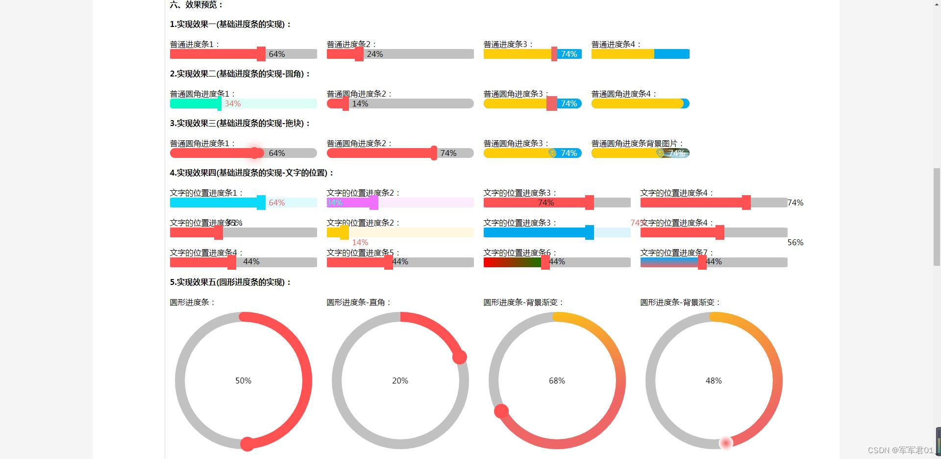
<div class="header_title">1.实现效果一(基础进度条的实现):</div>
<div>
<div class="item">
<span>普通进度条1:</span>
<ProgressBar ref="demo1_1" :value="64"></ProgressBar>
</div>
<div class="item">
<span>普通进度条2:</span>
<ProgressBar ref="demo1_1" :value="24"></ProgressBar>
</div>
<div class="item">
<span>普通进度条3:</span>
<ProgressBar ref="demo1_1" :value="74" width="200px" height="20px" bgcolor="#01AAED" bgvaluecolor="#fdcd0b" bgbarcolor="#ee6666" textcolor="#fff"></ProgressBar>
</div>
<div class="item">
<span>普通进度条4:</span>
<ProgressBar ref="demo1_1" :value="64" width="200px" height="20px" bgcolor="#01AAED" bgvaluecolor="#fdcd0b" :showtext="false" :showbar="false"></ProgressBar>
</div>
</div>
<div class="header_title">2.实现效果二(基础进度条的实现-圆角):</div>
<div>
<div class="item">
<span>普通圆角进度条1:</span>
<ProgressBar ref="demo1_1" :value="34" radius="5px" bgcolor="#00FAC122" bgvaluecolor="#00FAC1" bgbarcolor="#00FAC1" textcolor="#ee6666"></ProgressBar>
</div>
<div class="item">
<span>普通圆角进度条2:</span>
<ProgressBar ref="demo1_1" :value="14" radius="10px"></ProgressBar>
</div>
<div class="item">
<span>普通圆角进度条3:</span>
<ProgressBar ref="demo1_1" :value="74" width="200px" height="20px" bgcolor="#01AAED" bgvaluecolor="#fdcd0b" bgbarcolor="#ee6666" textcolor="#fff" radius="20px"></ProgressBar>
</div>
<div class="item">
<span>普通圆角进度条4:</span>
<ProgressBar ref="demo1_1" :value="94" width="200px" height="20px" bgcolor="#01AAED" bgvaluecolor="#fdcd0b" :showtext="false" :showbar="false" radius="20px"></ProgressBar>
</div>
</div>
<div class="header_title">3.实现效果三(基础进度条的实现-拖块):</div>
<div>
<div class="item">
<span>普通圆角进度条1:</span>
<ProgressBar ref="demo1_1" :value="64" radius="30px" barstyle="circle"></ProgressBar>
</div>
<div class="item">
<span>普通圆角进度条2:</span>
<ProgressBar ref="demo1_1" :value="74" radius="10px" barstyle="reat"></ProgressBar>
</div>
<div class="item">
<span>普通圆角进度条3:</span>
<ProgressBar ref="demo1_1" :value="74" width="200px" height="20px" bgcolor="#01AAED" bgvaluecolor="#fdcd0b" bgbarcolor="#ee6666" textcolor="#fff" radius="20px" barstyle="./src/components/icon-141.png"></ProgressBar>
</div>
<div class="item">
<span>普通圆角进度条背景图片:</span>
<ProgressBar ref="demo1_1" :value="74" width="200px" height="20px" bgcolor="url('https://img0.baidu.com/it/u=525954882,1049770024&fm=253&fmt=auto&app=138&f=JPEG?w=500&h=281')" bgvaluecolor="#fdcd0b" bgbarcolor="#ee6666" textcolor="#fff" radius="20px" barstyle="./src/components/icon-141.png"></ProgressBar>
</div>
</div>
<div class="header_title">4.实现效果四(基础进度条的实现-文字的位置):</div>
<div>
<div class="item">
<span>文字的位置进度条1:</span>
<ProgressBar ref="demo1_1" :value="64" bgcolor="#0adbfa22" bgvaluecolor="#0adbfa" bgbarcolor="#0adbfa" textcolor="#ee6666"></ProgressBar>
</div>
<div class="item">
<span>文字的位置进度条2:</span>
<ProgressBar ref="demo1_1" :value="34" textpositionx="left" bgcolor="#f071ff22" bgvaluecolor="#f071ff" bgbarcolor="#f071ff" textcolor="#00FAC1"></ProgressBar>
</div>
<div class="item">
<span>文字的位置进度条3:</span>
<ProgressBar ref="demo1_1" :value="74" textpositionx="valuecenter"></ProgressBar>
</div>
<div class="item">
<span>文字的位置进度条4:</span>
<ProgressBar ref="demo1_1" :value="74" textpositionx="right"></ProgressBar>
</div>
</div>
<div>
<div class="item">
<span>文字的位置进度条1:</span>
<ProgressBar ref="demo1_1" :value="35" textpositiony="top"></ProgressBar>
</div>
<div class="item">
<span>文字的位置进度条2:</span>
<ProgressBar ref="demo1_1" :value="14" textpositiony="bottom" bgcolor="#fdcd0b22" bgvaluecolor="#fdcd0b" bgbarcolor="#fdcd0b" textcolor="#ee6666"></ProgressBar>
</div>
<div class="item">
<span>文字的位置进度条3:</span>
<ProgressBar ref="demo1_1" :value="74" textpositionx="right" textpositiony="top" bgcolor="#01AAED22" bgvaluecolor="#01AAED" bgbarcolor="#01AAED" textcolor="#ee6666"></ProgressBar>
</div>
<div class="item">
<span>文字的位置进度条4:</span>
<ProgressBar ref="demo1_1" :value="56" textpositionx="right" textpositiony="bottom"></ProgressBar>
</div>
</div>
<div>
<div class="item">
<span>文字的位置进度条4:</span>
<ProgressBar ref="demo1_1" :value="44" textpositionx="50%" textpositiony="-11%"></ProgressBar>
</div>
<div class="item">
<span>文字的位置进度条5:</span>
<ProgressBar ref="demo1_1" :value="44" textpositionx="center" textpositiony="-11%"></ProgressBar>
</div>
<div class="item">
<span>文字的位置进度条6:</span>
<ProgressBar ref="demo1_1" :value="44" textpositionx="center" textpositiony="-11%" bgvaluecolor="linear-gradient(to right, red, green)"></ProgressBar>
</div>
<div class="item">
<span>文字的位置进度条7:</span>
<ProgressBar ref="demo1_1" :value="44" textpositionx="center" textpositiony="-11%" bgvaluecolor="linear-gradient(to top, #ee6666, #01AAFF)"></ProgressBar>
</div>
</div>
<div class="header_title">5.实现效果五(圆形进度条的实现):</div>
<div>
<div class="item">
<span>圆形进度条:</span>
<ProgressBar ref="demo1_1" :value="50" type="pie" textpositionx="center"></ProgressBar>
</div>
<div class="item">
<span>圆形进度条-直角:</span>
<ProgressBar ref="demo1_1" :value="20" type="pie" textpositionx="center" radius="0%"></ProgressBar>
</div>
<div class="item">
<span>圆形进度条-背景渐变:</span>
<ProgressBar ref="demo1_1" :value="68" type="pie" textpositionx="center" :bgvaluecolor="bgcolor"></ProgressBar>
</div>
<div class="item">
<span>圆形进度条-背景渐变:</span>
<ProgressBar ref="demo1_1" :value="48" type="pie" textpositionx="center" :bgvaluecolor="bgcolor" :bgbarcolor="bgbarcolor"></ProgressBar>
</div>
</div>
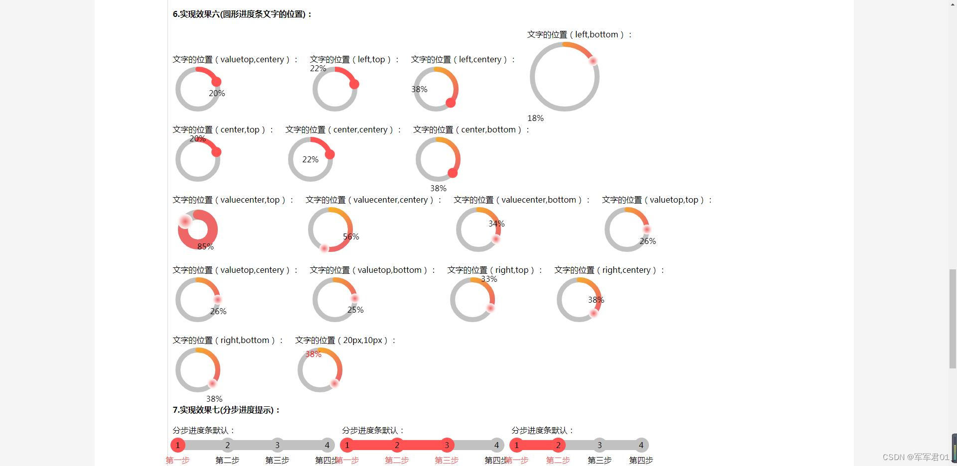
<div class="header_title">6.实现效果六(圆形进度条文字的位置):</div>
<div>
<div class="item">
<span>文字的位置(valuetop,centery):</span>
<ProgressBar ref="demo1_1" :value="20" type="pie" width="100px" height="10px"></ProgressBar>
</div>
<div class="item">
<span>文字的位置(left,top):</span>
<ProgressBar ref="demo1_1" :value="22" type="pie" textpositionx="left" textpositiony="top" radius="0%" width="100px" height="10px"></ProgressBar>
</div>
<div class="item">
<span>文字的位置(left,centery):</span>
<ProgressBar ref="demo1_1" :value="38" type="pie" textpositionx="left" textpositiony="centery" :bgvaluecolor="bgcolor" width="100px" height="10px"></ProgressBar>
</div>
<div class="item">
<span>文字的位置(left,bottom):</span>
<ProgressBar ref="demo1_1" :value="18" type="pie" textpositionx="left" textpositiony="bottom" :bgvaluecolor="bgcolor" :bgbarcolor="bgbarcolor" width="150px" height="10px"></ProgressBar>
</div>
</div>
<div>
<div class="item">
<span>文字的位置(center,top):</span>
<ProgressBar ref="demo1_1" :value="20" type="pie" textpositionx="center" textpositiony="top" width="100px" height="10px"></ProgressBar>
</div>
<div class="item">
<span>文字的位置(center,centery):</span>
<ProgressBar ref="demo1_1" :value="22" type="pie" textpositionx="center" textpositiony="centery" radius="0%" width="100px" height="10px"></ProgressBar>
</div>
<div class="item">
<span>文字的位置(center,bottom):</span>
<ProgressBar ref="demo1_1" :value="38" type="pie" textpositionx="center" textpositiony="bottom" :bgvaluecolor="bgcolor" width="100px" height="10px"></ProgressBar>
</div>
</div>
<div>
<div class="item">
<span>文字的位置(valuecenter,top):</span>
<ProgressBar ref="demo1_1" :value="85" type="pie" textpositionx="valuecenter" textpositiony="top" :bgvaluecolor="bgcolor" :bgbarcolor="bgbarcolor" width="100px" height="20px"></ProgressBar>
</div>
<div class="item">
<span>文字的位置(valuecenter,centery):</span>
<ProgressBar ref="demo1_1" :value="56" type="pie" textpositionx="valuecenter" textpositiony="centery" :bgvaluecolor="bgcolor" :bgbarcolor="bgbarcolor" width="100px" height="10px"></ProgressBar>
</div>
<div class="item">
<span>文字的位置(valuecenter,bottom):</span>
<ProgressBar ref="demo1_1" :value="34" type="pie" textpositionx="valuecenter" textpositiony="bottom" :bgvaluecolor="bgcolor" :bgbarcolor="bgbarcolor" width="100px" height="10px"></ProgressBar>
</div>
<div class="item">
<span>文字的位置(valuetop,top):</span>
<ProgressBar ref="demo1_1" :value="26" type="pie" textpositionx="valuetop" textpositiony="top" :bgvaluecolor="bgcolor" :bgbarcolor="bgbarcolor" width="100px" height="10px"></ProgressBar>
</div>
</div>
<div>
<div class="item">
<span>文字的位置(valuetop,centery):</span>
<ProgressBar ref="demo1_1" :value="26" type="pie" textpositionx="valuetop" textpositiony="centery" :bgvaluecolor="bgcolor" :bgbarcolor="bgbarcolor" width="100px" height="10px"></ProgressBar>
</div>
<div class="item">
<span>文字的位置(valuetop,bottom):</span>
<ProgressBar ref="demo1_1" :value="25" type="pie" textpositionx="valuetop" textpositiony="bottom" :bgvaluecolor="bgcolor" :bgbarcolor="bgbarcolor" width="100px" height="10px"></ProgressBar>
</div>
<div class="item">
<span>文字的位置(right,top):</span>
<ProgressBar ref="demo1_1" :value="33" type="pie" textpositionx="right" textpositiony="top" :bgvaluecolor="bgcolor" :bgbarcolor="bgbarcolor" width="100px" height="10px"></ProgressBar>
</div>
<div class="item">
<span>文字的位置(right,centery):</span>
<ProgressBar ref="demo1_1" :value="38" type="pie" textpositionx="right" textpositiony="centery" :bgvaluecolor="bgcolor" :bgbarcolor="bgbarcolor" width="100px" height="10px"></ProgressBar>
</div>
</div>
<div>
<div class="item">
<span>文字的位置(right,bottom):</span>
<ProgressBar ref="demo1_1" :value="38" type="pie" textpositionx="right" textpositiony="bottom" :bgvaluecolor="bgcolor" :bgbarcolor="bgbarcolor" width="100px" height="10px"></ProgressBar>
</div>
<div class="item">
<span>文字的位置(20px,10px):</span>
<ProgressBar ref="demo1_1" :value="38" type="pie" textpositionx="20px" textpositiony="10px" :bgvaluecolor="bgcolor" :bgbarcolor="bgbarcolor" width="100px" height="10px" textcolor="red"></ProgressBar>
</div>
</div>
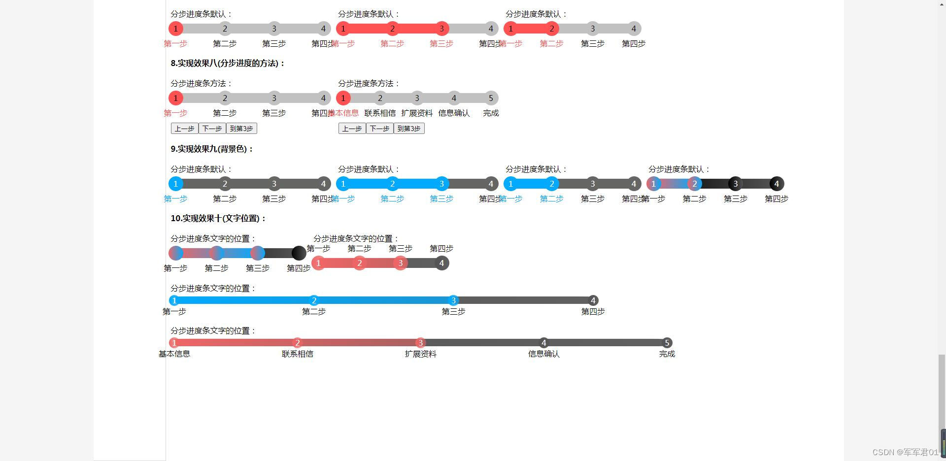
<div class="header_title">7.实现效果七(分步进度提示):</div>
<div>
<div class="item">
<span>分步进度条默认:</span>
<ProgressBar ref="demo1_1" type="step" :items="items" style=""></ProgressBar>
</div>
<div class="item">
<span>分步进度条默认:</span>
<ProgressBar ref="demo1_1" type="step" :value="2" :items="items" style="ight: 15px;"></ProgressBar>
</div>
<div class="item">
<span>分步进度条默认:</span>
<ProgressBar ref="demo1_1" type="step" :value="1" :items="items" style="" width="250px" height="20px"></ProgressBar>
</div>
</div>
<div class="header_title">8.实现效果八(分步进度的方法):</div>
<div>
<div class="item">
<span>分步进度条方法:</span>
<ProgressBar ref="demo8_1" type="step" :value="value8_1" :items="items" style=""></ProgressBar>
<div style="padding-top: 10px;">
<button @click="predemo8_1()">上一步</button>
<button @click="nextdemo8_1()">下一步</button>
<button @click="todemo8_1()">到第3步</button>
</div>
</div>
<div class="item">
<span>分步进度条方法:</span>
<ProgressBar ref="demo8_1" type="step" :value="value8_2" :items="items1" style=""></ProgressBar>
<div style="padding-top: 10px;">
<button @click="predemo8_2()">上一步</button>
<button @click="nextdemo8_2()">下一步</button>
<button @click="todemo8_2()">到第3步</button>
</div>
</div>
</div>
<div class="header_title">9.实现效果九(背景色):</div>
<div>
<div class="item">
<span>分步进度条默认:</span>
<ProgressBar ref="demo1_1" type="step" :items="items" bgcolor="#656562" bgvaluecolor="#01AAFF" textcolor="#fff"></ProgressBar>
</div>
<div class="item">
<span>分步进度条默认:</span>
<ProgressBar ref="demo1_1" type="step" :value="2" :items="items" bgcolor="#656562" bgvaluecolor="#01AAFF" textcolor="#fff"></ProgressBar>
</div>
<div class="item">
<span>分步进度条默认:</span>
<ProgressBar ref="demo1_1" type="step" :value="1" :items="items" bgcolor="#656562" bgvaluecolor="#01AAFF" textcolor="#fff" width="250px" height="20px"></ProgressBar>
</div>
<div class="item">
<span>分步进度条默认:</span>
<ProgressBar ref="demo1_1" type="step" :value="1" :items="items" bgcolor="linear-gradient(to right, #000, #555)" bgvaluecolor="linear-gradient(to right, #ee6666, #01AAFF)" textcolor="#fff" width="250px" height="20px"></ProgressBar>
</div>
</div>
<div class="header_title">10.实现效果十(文字位置):</div>
<div>
<div class="item">
<span>分步进度条文字的位置:</span>
<ProgressBar ref="demo1_1" type="step" :value="2" :items="items" bgcolor="linear-gradient(to right, #000, #555)" bgvaluecolor="linear-gradient(to right, #ee6666, #01AAFF)" textcolor="#fff" width="250px" height="20px" :showtext="false"></ProgressBar>
</div>
<div class="item">
<span>分步进度条文字的位置:</span>
<ProgressBar ref="demo1_1" type="step" :value="2" :items="items" bgcolor="linear-gradient(to right, #555, #555555ee)" bgvaluecolor="linear-gradient(to right, #ee6666, #ee6666bb)" textcolor="#fff" width="250px" height="20px" textpositiony="top"></ProgressBar>
</div>
</div>
<div>
<div class="item">
<span>分步进度条文字的位置:</span>
<ProgressBar ref="demo1_1" type="step" :value="2" :items="items" bgcolor="linear-gradient(to right, #555, #555555ee)" bgvaluecolor="linear-gradient(to right, #01AAFF, #01AAFFbb)" textcolor="#fff" width="850px" height="15px" textpositiony="bottom"></ProgressBar>
</div>
</div>
<div>
<div class="item">
<span>分步进度条文字的位置:</span>
<ProgressBar ref="demo1_1" type="step" :value="2" :items="items1" bgcolor="linear-gradient(to right, #555, #555555ee)" bgvaluecolor="linear-gradient(to right, #ee6666, #ee666688)" textcolor="#fff" width="1000px" height="15px" textpositiony="bottom"></ProgressBar>
</div>
</div>
</div>
</div>
</div>
</div>
</div>
</div>
</template>
<script setup>
import {
ref,
reactive,
onMounted,
onBeforeUnmount
} from 'vue'
import ProgressBar from "../components/ProgressBar.vue"
const bgcolor = function(gradient){
gradient.addColorStop("0","#fdcd0b");
gradient.addColorStop("1.0","#ee6666");
return gradient;
}
const bgbarcolor = function(gradient){
gradient.addColorStop("0","#ee6666");
gradient.addColorStop("1.0","#fff");
return gradient;
}
const items = ['第一步','第二步','第三步','第四步'];
const items1 = ['基本信息','联系相信','扩展资料','信息确认','完成'];
let value8_1 = ref(0);
let value8_2 = ref(0);
const demo8_1 = ref();
const predemo8_1 = ()=>{
value8_1.value --;
if(value8_1.value<=0){
value8_1.value = 0;
}
console.log(value8_1.value);
}
const nextdemo8_1 = ()=>{
value8_1.value ++;
if(value8_1.value>items.length-1){
value8_1.value = items.length-1;
}
console.log(value8_1.value);
}
const todemo8_1 = ()=>{
value8_1.value = 2;
console.log(value8_1.value);
}
const predemo8_2 = ()=>{
value8_2.value --;
if(value8_2.value<=0){
value8_2.value = 0;
}
}
const nextdemo8_2 = ()=>{
value8_2.value ++;
if(value8_2.value>items1.length-1){
value8_2.value = items1.length-1;
}
}
const todemo8_2 = ()=>{
value8_2.value = 2;
}
</script>
<style scoped="scoped">
.container {
background-color: whitesmoke;
}
.container .content {
width: 80%;
background-color: #fff;
margin: 0 auto;
}
.flex{
display: flex;
}
.container .content .menus {
width: 200px;
border-bottom: 1px solid #d9d9d9;
border-top: 1px solid #d9d9d9;
border-right: 1px solid #d9d9d9;
}
.menuitem{
height: 45px;
line-height: 45px;
padding: 0 10px;
cursor: pointer;
border-bottom: 1px solid #d9d9d9;
}
.menuitem:hover{
background: #FF5252;
color: #fff;
}
.menuitemselected{
background: #FF5252;
color: #fff;
}
.header_title {
font-weight: bold;
line-height: 40px;
}
.content_text {
text-indent: 2em;
line-height: 30px;
color: #222;
}
.table {
margin-left: 2em;
border-top: 1px solid #d9d9d9;
border-left: 1px solid #d9d9d9;
}
.table th,
td {
border-bottom: 1px solid #d9d9d9;
border-right: 1px solid #d9d9d9;
padding: 3px;
}
.item {
display: inline-block;
margin-right: 20px;
padding-top: 10px;
padding-bottom: 10px;
}
</style>


 3万+
3万+


 被折叠的 条评论
为什么被折叠?
被折叠的 条评论
为什么被折叠?
 到【灌水乐园】发言


