


 本文详细介绍了在CSS Flex布局中使用justify-content属性控制列表水平对齐的方式,并针对最后一行不满时的对齐问题提出三种解决方案:模拟space-between、根据个数动态设置margin和使用Grid布局。每种方法都通过实例代码进行了演示,旨在帮助开发者实现列表的最后一行左对齐。
一、justify-content
在CSS flex布局中,justify-content属性定义了浏览器之间,如何分配顺着弹性容器主轴 (或者网格行轴) 的元素之间及其周围的空间,可以控制列表的水平对齐方式,
justify-content: center;     /* 居中排列 */
justify-content: start;      /* Pack items from the start */
justify-content: end;        /* Pack items from the end */
justify-content: flex-start; /* 从行首起始位置开始排列 */
justify-content: flex-end;   /* 从行尾位置开始排列 */
justify-content: left;       /* Pack items from the left */
justify-content: right;      /* Pack items from the right */
但是,如果最后一行的列表的个数不满,则就会出现最后一行没有垂直对齐的问题。
.el-checkbox-group {
  display: flex;
  justify-content: space-between;
  flex-wrap: wrap;
}
.el-checkbox {
  width: 14%;
  margin-top: 15px;
}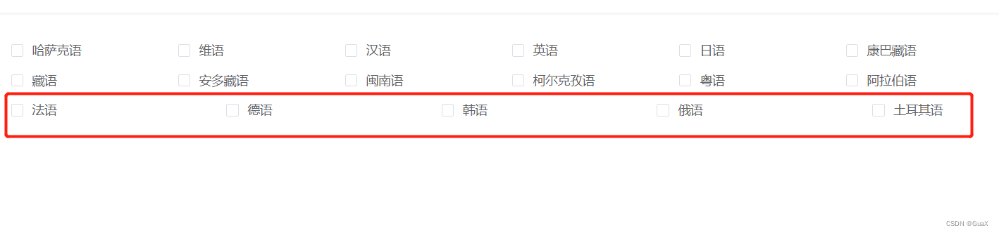
二、每一行列数是固定
如果每一行列数是固定的,实现最后一行左对齐。
方法一:模拟space-between和间隙
不利用justify-content:space-between对齐方式,使用margin设置间距
.el-checkbox-group {
  display: flex;
  flex-wrap: wrap;
}
.el-checkbox {
  width: 16%;
  background-color: skyblue;
  margin-top: 15px;
  margin-right: 0px;
}
.el-checkbox:not(:nth-child(5n)) {
  margin-right: calc(20% / 4);
}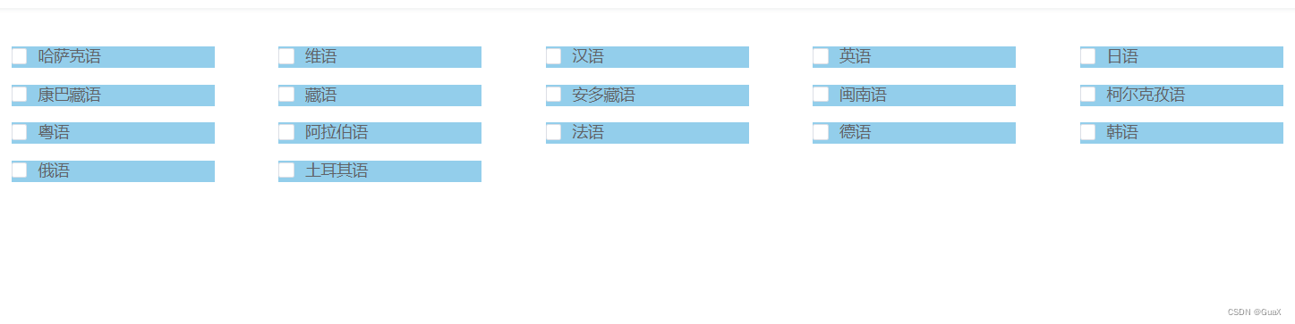
方法二:根据个数最后一个元素动态margin
每一列的数目都是固定的,计算出不同个数列表应当多大的margin值才能保证完全左对齐。如果每行5个元素,当最后一行只有4个元素时,则最后一个元素的margin-right大小是“列表宽度+间隙大小”,这时左侧可以对齐
例如:
.list:last-child:nth-child(5n - 1)最后一行,4个元素.list:last-child:nth-child(5n - 2)最后一行,3个元素.list:last-child:nth-child(5n - 3)最后一行,2个元素
在本例中,一行就5个元素,因此,我们可以有如下CSS设置:
.el-checkbox-group {
  display: flex;
  /* 两端对齐 */
  justify-content: space-between;
  flex-wrap: wrap;
}
.el-checkbox {
  width: 18%;
  background-color: skyblue;
  margin-top: 15px;
  margin-right: 0;
}
/* 如果最后一行是4个元素 */
.el-checkbox:last-child:nth-child(5n - 1) {
  margin-right: calc(18% + 10% / 4);
}
/* 如果最后一行是3个元素 */
.el-checkbox:last-child:nth-child(5n - 2) {
  margin-right: calc(36% + 20% / 4);
}
/* 如果最后一行是2个元素 */
.el-checkbox:last-child:nth-child(5n - 3) {
  margin-right: calc(54% + 30% / 4);
}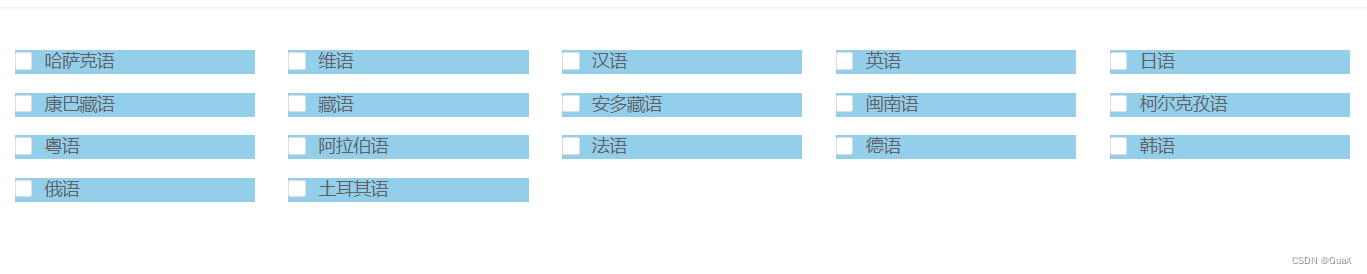
方法三: 如果列数不固定HTML又不能调整
Grid布局
.el-checkbox-group {
  display: grid;
  justify-content: space-between;
  grid-template-columns: repeat(auto-fill, 200px);
  grid-gap: 10px;
}
.el-checkbox {
  width: 200px;
  background-color: skyblue;
  margin-top: 5px;
}


 扫一扫
扫一扫


 1904
1904

 被折叠的 条评论
为什么被折叠?
被折叠的 条评论
为什么被折叠?
 到【灌水乐园】发言


