


 本文深入解析Android ConstraintLayout的特性与用法,包括相对定位、边距处理、圆形定位、尺寸约束等高级技巧,以及Guideline、Barrier、Group和Placeholder等工具类的使用方法。
前言:回廊一寸相思地,落月成孤,背灯和月花阴,已是十年踪迹十年心。 —— 虞美人
一、概述
AndroidStudio3.0之前默认的根布局是RelativeLayout,但是3.0之后默认的根布局是ConstraintLayout(约束布局),它作为一款强大的调整View位置和大小的ViewGroup被Google所推荐,ConstraintLayout能够以支持库的形式支持到最小的API 9,同时也在不断丰富API和功能,它能在复杂布局中有效降低布局层级,提高性能,使用更加灵活。
但是约束布局不要乱用,因为它在测量子view的相对位置相对大小的时候,它的onmeasure()方法会被多次调用。
我们来探讨一下ConstraintLayout的相关用法,新版的Android Studio在建立工程时会默认添加约束布局的依赖,如果没有添加则需要手动在build.gralde文件中添加依赖库:
implementation 'androidx.constraintlayout:constraintlayout:1.1.3'二、相关属性
2.1 相对定位
相对定位,其实这个跟RelativeLayout差不多,一个View相对另一个View的位置,常用属性如下:
- layout_constraintLeft_toLeftOf 左边左对齐;
- layout_constraintLeft_toRightOf 左边右对齐;
- layout_constraintRight_toLeftOf 右边左对齐;
- layout_constraintRight_toRightOf 右边右对齐;
- layout_constraintTop_toTopOf 上边顶部对齐;
- layout_constraintTop_toBottomOf 上边底部对齐;
- layout_constraintBottom_toTopOf 下边顶部对齐;
- layout_constraintBottom_toBottomOf 下边底部对齐;
- layout_constraintStart_toEndOf 起始边向尾部对齐;
- layout_constraintStart_toStartOf 起始边向起始边对齐;
- layout_constraintEnd_toStartOf 尾部向起始边对齐;
- layout_constraintEnd_toEndOf 尾部向尾部对齐;
- layout_constraintBaseline_toBaselineOf 文字的底部线对齐,用于含文本的控件对齐基线;
- layout_constraintDimensionRatio 宽高比"2:1"、"H,2:1"或"W,2:1"。
我们来简单实用ConstraintLayout来实现下面的布局,tv_1位于水平居中位置,tv_2位于tv_1的右侧,tv_3位于tv_1的下方,
<?xml version="1.0" encoding="utf-8"?>
<androidx.constraintlayout.widget.ConstraintLayout xmlns:android="http://schemas.android.com/apk/res/android"
    xmlns:app="http://schemas.android.com/apk/res-auto"
    android:layout_width="match_parent"
    android:layout_height="match_parent">

    <TextView
        ......
        android:id="@+id/tv_1"
        android:text="tv_1"
        app:layout_constraintLeft_toLeftOf="parent"  tv_1的左边位于parent(父控件)的左边
        app:layout_constraintRight_toRightOf="parent"
        app:layout_constraintTop_toTopOf="parent" />

    <TextView
        ......
        android:id="@+id/tv_2"
        app:layout_constraintLeft_toRightOf="@id/tv_1"  tv_2的左边位于tv_1的右边
        app:layout_constraintRight_toRightOf="parent"
        app:layout_constraintTop_toTopOf="parent" />

    <TextView
        ......
        android:id="@+id/tv_3"
        android:text="tv_3"
        app:layout_constraintLeft_toLeftOf="@id/tv_1"
        app:layout_constraintTop_toBottomOf="@id/tv_1" />

</androidx.constraintlayout.widget.ConstraintLayout>
效果如下:
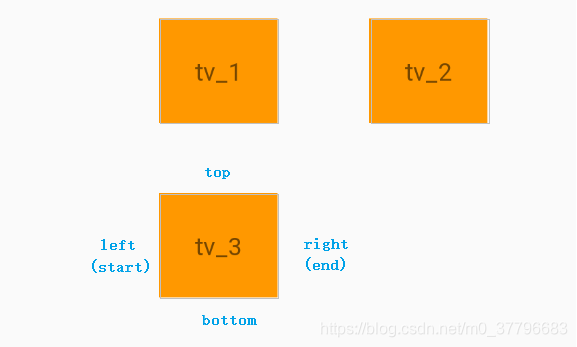
以tv_3的layout_constraintLeft_toLeftOf="@id/tv_1"来说,layout_constraintLeft表示tv_3的左边,toLeftOf表示tv_1的左边,意思就是说tv_3的左边位于tv_1的左边,如上图tv_3与tv_1左边对齐,那么tv_2的layout_constraintTop_toTopOf="parent"表示tv_2的顶部在parent(父控件)的的顶部。
那么constraintLeft、constraintRight、constraintTop、constraintBottom则分别表示自身控件的左、右、上、下四个位置,toLeftOf、toRightOf、toTopOf、toBottomOf表示位于哪一个控件(后接控件ID)左、右、上、下。大致来说,constrainXXX表示自身的约束边,toXXXOf表示另一个View的边。
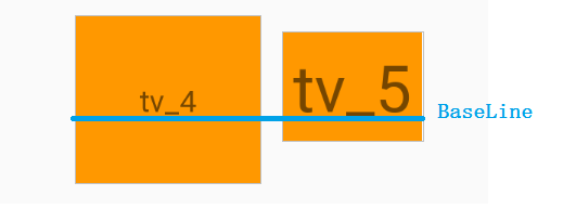
那么控件1和控件2文字对齐怎么办,layout_constraintBaseline_toBaselineOf表示文字基线对齐,什么是Baseline,就是文字底部基线
    <TextView
        android:id="@+id/tv_4"
        ......
        android:text="tv_4"
        app:layout_constraintLeft_toLeftOf="parent"
        app:layout_constraintRight_toRightOf="parent"
        app:layout_constraintTop_toTopOf="parent" />

    <TextView
        android:id="@+id/tv_5"
        ......
        android:text="tv_5"
        app:layout_constraintBaseline_toBaselineOf="@+id/tv_4"
        app:layout_constraintLeft_toRightOf="@id/tv_4" />
效果如下图:
2.2 边距
(1)margin
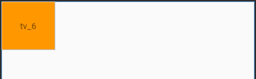
margin边距和平常使用的没有太大区别,但是要确定View的位置边距才能生效,如果没有确定位置设置边距是没有效果的,下面的tv_6没有确定View的位置,设置了android:layout_margin="20dp";
 <TextView
    android:id="@+id/tv_6"
    ......
    android:layout_margin="20dp"
    android:text="tv_6" />
但是margin并没有生效,效果如下:
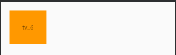
那么我们将tv_6的位置确定后,margin就生效了;
 <TextView
    android:id="@+id/tv_6"
    .....
    android:layout_margin="20dp"
    android:text="tv_6"
    app:layout_constraintLeft_toLeftOf="parent"
    app:layout_constraintTop_toTopOf="parent" />
tv_6确定在父控件的左上角,margin效果如下:
(2)goneMargin
- layout_goneMarginLeft 距离目标view左边,当前view与目标view绑定后,目标view设置Gone,当前view的goneMargin属性就会生效。
- layout_goneMarginRight 距离目标view右边,同上;
- layout_goneMarginTop 距离目标view上边,同上;
- layout_goneMarginBottom 距离目标view下边,同上。
ConstraintLayout提供了特殊的layout_goneMarginXXX属性,如果当前view与另一个view绑定后,当前view设置了goneMargin属性,当另一个view设置Gone(隐藏)后,goneMargin属性就会生效。但是注意,goneMargin属性只能作用于另一个view并且作用方向与goneMargin同一方向才会生效;当goneMarginXXX属性生效后,相对于的margin_XXX属性就会失效。
<?xml version="1.0" encoding="utf-8"?>
<androidx.constraintlayout.widget.ConstraintLayout .....>

    <TextView
        android:id="@+id/tv_7"
        ......
        android:layout_marginLeft="20dp"
        android:text="tv_7"
        app:layout_constraintLeft_toLeftOf="parent"
        app:layout_constraintTop_toTopOf="parent"
        app:layout_goneMarginTop="20dp" />

    <TextView
        android:id="@+id/tv_8"
        ......
        android:text="tv_8"
        app:layout_constraintLeft_toRightOf="@id/tv_7"
        app:layout_constraintTop_toTopOf="parent"
        app:layout_goneMarginTop="20dp" />

    <!--tv_9的app:layout_goneMarginLeft="20dp" 在tv_8设置了visibility="gone"才生效,因为tv_9在left方向绑定了tv_8 -->
    <TextView
        android:id="@+id/tv_9"
        ......
        android:text="tv_9"
        android:layout_marginLeft="50dp"
        app:layout_constraintLeft_toRightOf="@id/tv_8"
        app:layout_constraintTop_toTopOf="parent"
        app:layout_goneMarginLeft="20dp"
        app:layout_goneMarginTop="20dp" />

</androidx.constraintlayout.widget.ConstraintLayout>tv_7绑定于父控件,tv_8绑定于tv_7,tv_9绑定于tv_8;控件tv_7、tv_8、tv_9中都设置了layout_goneMarginTop="20dp",tv_9中还设置了android:layout_marginLeft="50dp"和 app:layout_goneMarginLeft="20dp"属性,效果如下:
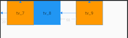
当我们将tv_8设置Gone(隐藏)后,效果如下:
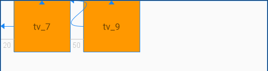
可以看到,只有tv_9中app:layout_goneMarginLeft="20dp"属性生效了,说明当前view(tv_9)于另一个view(tv_8)绑定后,当前view(tv_9)设置了goneMargin属性后,另一个view(tv_8)设置了Gone,当前view(tv_9)的goneMargin属性才会生效。
tv_9中android:layout_marginLeft="50dp"由于找不到tv_8(Gone)所以ayout_marginLeft="50dp"失效了,当tv_8显示后才生效。控件tv_7、tv_8、tv_9中的layout_goneMarginTop="20dp"都没有生效,他们三都是top方向绑定于父控件,所以不会生效。
(3)Centering positioning and bias
ConstraintLayout的居中是采用左右上下边的约束来居中,
<?xml version="1.0" encoding="utf-8"?>
<androidx.constraintlayout.widget.ConstraintLayout ......>
<!--垂直居中-->
<TextView
......
android:text="tv_10"
app:layout_constraintLeft_toLeftOf="parent"
app:layout_constraintRight_toRightOf="parent"/>
<!--水平居中-->
<TextView
......
android:text="tv_11"
app:layout_constraintBottom_toBottomOf="parent"
app:layout_constraintTop_toTopOf="parent" />
<!--中心-->
<TextView
......
android:text="tv_12"
app:layout_constraintBottom_toBottomOf="parent"
app:layout_constraintLeft_toLeftOf="parent"
app:layout_constraintRight_toRightOf="parent"
app:layout_constraintTop_toTopOf="parent"/>
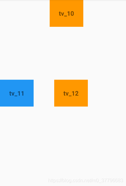
</androidx.constraintlayout.widget.ConstraintLayout>tv_10是垂直居中位置,tv_11是水平居中位置,tv_12是位于视图中间位置,效果如下:
ConstraintLayout也有类似LineraLayout的权重属性,在控件平分的基础上加入bias属性,可以按比例控制距离。
- layout_constraintHorizontal_bias 水平权重分布,取值范围0-1,0表示最左,1表示最右,0.5表示在中间;
- layout_constraintVertical_bias 垂直权重分布,取值范围0-1,0表示最上,1表示最下,0.5表示在中间。
  <!--垂直居中 app:layout_constraintHorizontal_bias="0.8"表示水平权重0.8
      tv_13相对于父控件横向偏差剩余空间的80%-->
    <TextView
        ......
        android:text="tv_13"
        app:layout_constraintHorizontal_bias="0.8"
        app:layout_constraintLeft_toLeftOf="parent"
        app:layout_constraintRight_toRightOf="parent"/>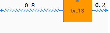
 <!--水平居中 app:layout_constraintVertical_bias="0.3"表示垂直权重0.3
     tv_14相对于父控件横向偏差剩余空间的30%-->
    <TextView
        ......
        android:text="tv_14"
        app:layout_constraintVertical_bias="0.3"
        app:layout_constraintBottom_toBottomOf="parent"
        app:layout_constraintLeft_toLeftOf="parent"
        app:layout_constraintTop_toTopOf="parent" />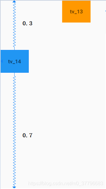
<!--配合使用,可以根据比例在视图的任何位置-->
    <TextView
        ......
        android:text="tv_15"
        app:layout_constraintVertical_bias="0.3"
        app:layout_constraintHorizontal_bias="0.3"
        app:layout_constraintBottom_toBottomOf="parent"
        app:layout_constraintLeft_toLeftOf="parent"
        app:layout_constraintRight_toRightOf="parent"
        app:layout_constraintTop_toTopOf="parent" />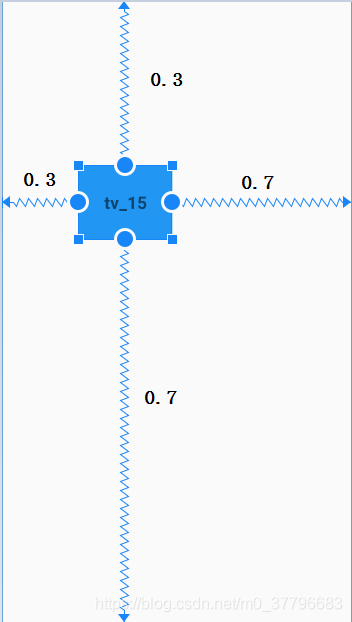
2.3 圆形定位
圆形定位是指View的中心点相对于另外View中心点的位置,设计三个属性:
- layout_constraintCircle 相对控件ID;
- layout_constraintCircleAngle 相对角度,逆时针方向,取值范围0~360;
- layout_constraintCircleRadius 圆的半径,相对控件的中心距离。
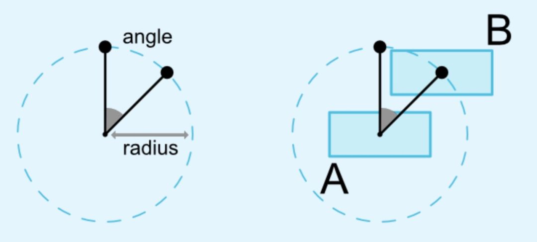
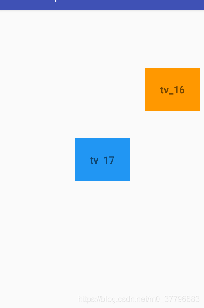
  <!--tv_16中心点位于tv_17中心点200dp逆时针45度位置-->
 <TextView
        .....
        android:text="tv_16"
        app:layout_constraintCircle="@id/tv_17"
        app:layout_constraintCircleAngle="45"
        app:layout_constraintCircleRadius="200dp" />

    <TextView
        ......
        android:text="tv_17"
        app:layout_constraintBottom_toBottomOf="parent"
        app:layout_constraintLeft_toLeftOf="parent"
        app:layout_constraintRight_toRightOf="parent"
        app:layout_constraintTop_toTopOf="parent" />
tv_16中心点位于tv_17中心点200dp逆时针45度位置,效果如下:
2.4 尺寸约束
(1)设置最大最小尺寸
当ConstraintLayout的宽高为warp_content时,可以通过以下属性设置最大最小尺寸,注意宽高为match_parent时不会生效。
- android:maxWidth 最大宽度;
- android:maxHeight 最大高度;
- android:minWidth 最小宽度;
- android:minHeight 最小高度。
(2)百分比约束
在ConstraintLayout中控件有四种方式制定尺寸大小
- 指定具体尺寸值,比如100dp;
- 使用wrap_content,内容自适配;
- 使用mactch_partent,填充父控件;
- 设置0dp,即MATCH_CONSTRAINT,拓充可用空间。
第一二三种情况和以前的使用没有区别,但是在ConstraintLayout中不推荐使用mactch_partent,而推荐使用MATCH_CONSTRAINT(0dp),第四种情况会根据控件的约束情况重新计算大小。我们来看看MATCH_CONSTRAINT(0dp)的使用:
<TextView
......
android:layout_width="0dp"
android:layout_height="wrap_content"
android:text="tv_18"
app:layout_constraintLeft_toLeftOf="parent"
app:layout_constraintRight_toRightOf="parent"
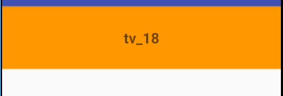
app:layout_constraintTop_toTopOf="parent" />layout_width="0dp",控件与parent左右对齐,控件会横向填充整个父视图空间,效果如下:
在1.1版本之前,控件尺寸设置为warp_content,控件默认由组件文本大小控制,其他约束是不生效的,可以通过以下属性设置是否生效:
- app:layout_constrainedWidth="true|false"
- app:layout_constrainedHeight="true|false"
在1.1版本后,控件设置MATCH_CONSTRAINT(0dp)时,控件大小会拓展所有可用空间,可以通过以下属性改变控件的行为:
- layout_constraintWidth_default="percent" 指定宽度是默认百分比;
- layout_constraintWidth_percent="1" 宽度占parent的百分比,取值范围0-1,百分数形式,1表示 100%;
- layout_constraintHeight_default 指定高度是默认百分比;
- layout_constraintHeight_percent 高度占parent的百分比,取值范围0-1,百分数形式,1表示 100%;
- layout_constraintWidth_min 最小宽度;
- layout_constraintHeight_min 最小高度;
- layout_constraintWidth_max 最大宽度;
- layout_constraintHeight_max 最大高度。
当ConstraintLayout子控件的宽高设置为MATCH_CONSTRAINT,即0dp,可以对宽高设置百分比,例如控件的宽度是屏幕宽度的50%,可以这样处理:
 <!--layout_constraintWidth_default指定按照百分比
    layout_constraintWidth_percent百分比值,控件宽度占父控件的比值-->
    <TextView
        ......
        android:layout_width="0dp"
        android:layout_height="wrap_content"
        app:layout_constraintWidth_default="percent"
        app:layout_constraintWidth_percent="0.5"
        android:text="tv_19"
        app:layout_constraintLeft_toLeftOf="parent"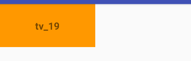
app:layout_constraintTop_toTopOf="parent" />layout_constraintWidth_default设置为percent,layout_constraintWidth_percent设置为0.5,表示占父控件空间50%,效果如下:
(3)宽高比例约束
控件的宽高比,要求宽或者高至少有一个为0dp,然后设置如下属性,能根据已知值计算另一个值。
- layout_constraintDimensionRatio 宽高比,比如,如果值为2:1,则表示宽高比例为2:1,如果值为w,2:1,也表示宽高比为2:1,也可以这样写,h,1:2,表示高宽比例为1:2。
<!--layout_constraintDimensionRatio,指定宽高比,2:1表示宽高比为2:1,
也可以表示为w,2:1 或者表示为h,1:2 高宽比为1:2 -->
<TextView
......
android:layout_width="300dp"
android:layout_height="0dp"
app:layout_constraintDimensionRatio="2:1"
app:layout_constraintLeft_toLeftOf="parent"
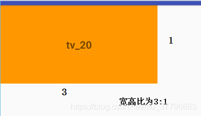
app:layout_constraintTop_toTopOf="parent" />这里宽度为300dp,宽高比为2:1,那么高度为150dp,如下图:
如果宽和高都为0dp,系统会根据实际已知的宽高来计算,比如宽高都为0dp,宽高比例为1:1,但是宽度为屏幕宽度的一半,那么高度也是屏幕宽度的一半,如下图:
  <TextView
        ......
        android:layout_width="0dp"
        android:layout_height="0dp"
        app:layout_constraintHeight_default="percent"
        app:layout_constraintWidth_percent="0.5"
        app:layout_constraintDimensionRatio="h,1:1"
        android:text="tv_21"
        app:layout_constraintLeft_toLeftOf="parent"
        app:layout_constraintTop_toTopOf="parent" />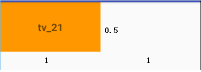
2.5 链(chains)
在横轴或竖轴上的控件相互约束时,可以组成一个链式约束,这个属性有点像LinearLayout的weight平分布局。链在水平或者垂直方向提供一组类似行为。
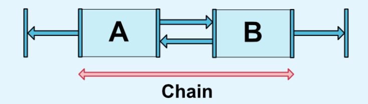
上图为横向链,A与parent的左边缘约束,B与parent的右边缘约束,A的左边与右边之间约束,才能使用一条链。多个元素之间也是如此,最左和最右与parent约束,元素与元素之间约束,不然链式永远无法生效。
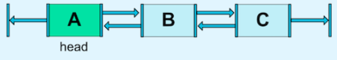
横向链最左边的控件,垂直链最顶端的控件称为链头,如下图:
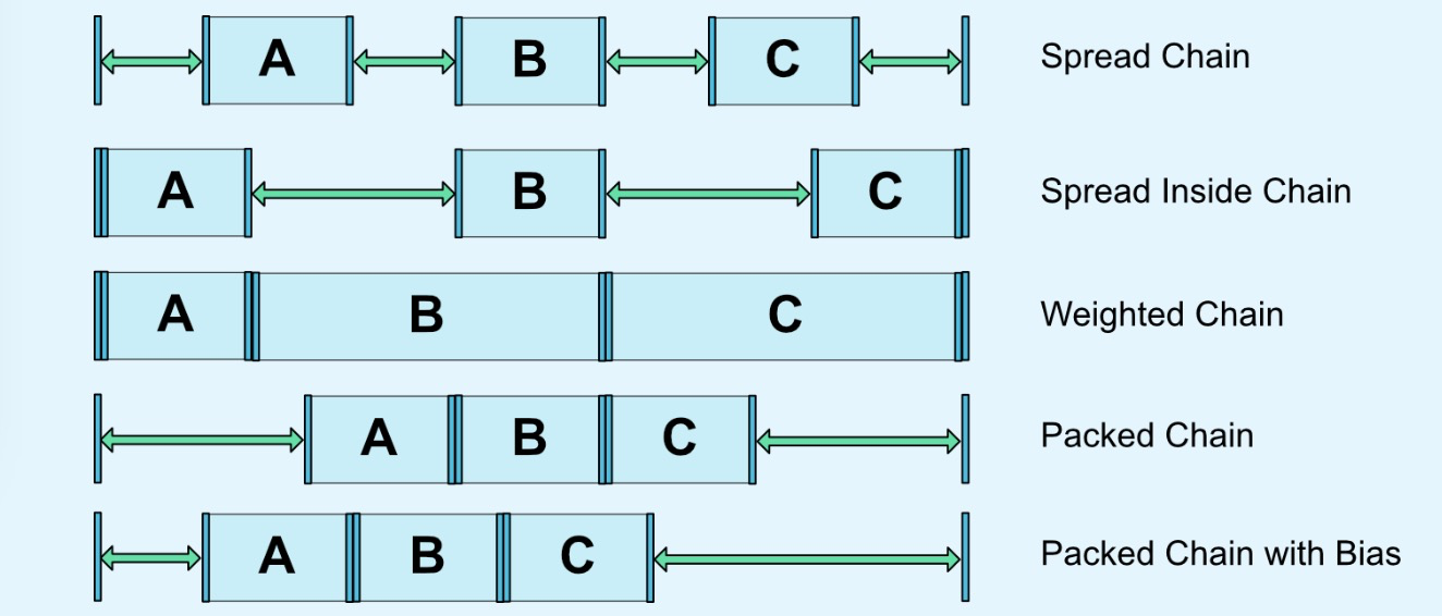
可以通过两个属性链头统一制定链的样式:
- layout_constraintVertical_chainStyle 水平方向链式;
- layout_constraintHorizontal_chainStyle 垂直方向链式。
链式的样式的值有几个可选属性:
- CHAIN_SPREAD 展开样式,默认为展开;
- Weighted chain 在CHAIN_SPREAD 样式,部分控件设置了MATCH_CONSTRAINT,那他们将拓展可用空间;
- CHAIN_SPREAD_INSIDE 展开样式,但是两端不展开;
- CHAIN_PACKED 抱团(打包)样式,控件抱团一起,通过偏移bias,可以改变packed元素的位置。
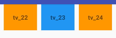
如下例子:
    <TextView
        ......
        android:text="tv_22"
        app:layout_constraintHorizontal_chainStyle="spread"
        app:layout_constraintLeft_toLeftOf="parent"
        app:layout_constraintRight_toLeftOf="@+id/tv_23"
        app:layout_constraintTop_toTopOf="parent" />

    <TextView
        ......
        android:text="tv_23"
        app:layout_constraintLeft_toRightOf="@id/tv_22"
        app:layout_constraintRight_toLeftOf="@id/tv_24"
        app:layout_constraintTop_toTopOf="parent" />

    <TextView
        ......
        android:text="tv_24"
        app:layout_constraintLeft_toRightOf="@id/tv_23"
        app:layout_constraintRight_toRightOf="parent"
        app:layout_constraintTop_toTopOf="parent" />
效果如下:
在链中,剩余空间默认平均给各元素,但是有时可以通过权重属性layout_constraintVertical_weight,来指定分配空间的大小。1.1版本之后,在链中使用边距时,边距是相加的,先除去边距在分配空间的大小。假设tv_22的右边距时10,tv_23的左边距是20,那么他们之间的边距就是30,在链式中,边距先从剩余空间中减去,再用剩余空间在元素之间进行定位。
2.6 优化器
在1.1之后公开了优化器,通过下的属性进行优化
- layout_optimizationLevel 决定控件在哪方面进行优化。
优化的类型有一下几种:
- none 不进行优化;
- standard 默认方式,仅仅优化direct和direct 约束;
- direct 优化direct约束;
- barrier 优化barrier约束;
- chain 优化链约束;
- dimensions 优化尺寸,减少测量次数。
三、工具类
3.1 Guideline(参考线)
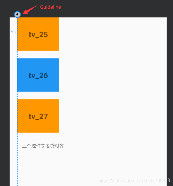
参考线实际不会在界面显示,只是在布局view的时候做一个参考。可以使用来部分控件与参考线对齐,设置Guideline的orientation来设置参考线是水平方向还是垂直方向,值为vertical和horizontal,可以通过三种方式来定位Guideline的位置:
- layout_constraintGuide_begin 从左边或者顶部指定的具体距离,水平方向为左右距离,垂直方向为顶部和底部距离;
- layout_constraintGuide_end 从右边或者底部指定的具体距离;
- layout_constraintGuide_percent 从开始方向起,占父控件的百分比距离,取值范围0~1,百分比值,比如水平方向,取值0.5,那么参考线在屏幕宽度50%的位置,即屏幕中间。
<?xml version="1.0" encoding="utf-8"?>
<androidx.constraintlayout.widget.ConstraintLayout ......>

    <!--layout_constraintGuide_begin:指定参考线起始位置,下面的控件于参考线对齐-->
    <androidx.constraintlayout.widget.Guideline
        android:id="@+id/guideLine"
        android:layout_width="wrap_content"
        android:layout_height="wrap_content"
        android:orientation="vertical"
        app:layout_constraintGuide_begin="20dp" />

    <TextView
        ......
        android:text="tv_25"
        app:layout_constraintLeft_toLeftOf="@+id/guideLine"
        app:layout_constraintTop_toTopOf="parent" />

    <TextView
        ......
        android:text="tv_26"
        app:layout_constraintLeft_toLeftOf="@+id/guideLine"
        app:layout_constraintTop_toBottomOf="@+id/tv_25" />

    <TextView
        ......
        android:text="tv_27"
        app:layout_constraintLeft_toLeftOf="@+id/guideLine"
        app:layout_constraintTop_toBottomOf="@id/tv_26" />

</androidx.constraintlayout.widget.ConstraintLayout>
参考线在左边起20dp的位置,三个控件与参考线左对齐,效果如下
3.2 Barrier(栅栏)
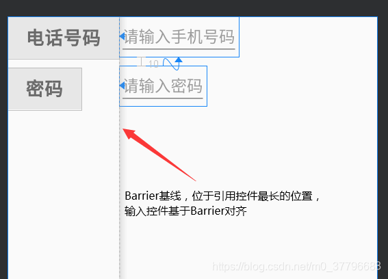
Barrier有点类似Guideline,但是Barrier会根据所引用的控件尺寸变化重新定位,例如登录界面,左边的EditText输入框总洗完与左边的Text提示框最长边缘对齐,两个TextView中的最长那个长度发生变化,Barrier会跟着变化,左边的EditText输入框随之变化。
- orientation Barrier的方向是平方向还是垂直方向,值为
vertical和horizontal; - barrierDirection Barrier所引用控件所对齐的位置,有bottom、end、left、right、start、top几个值可选;
- constraint_referenced_ids 所引用控件的id集合值,例如下面的Barrier以电话号码和密码为引用控件,则输入两个控件的id值,tv_phone,tv_password。
如下图:
代码如下:
<?xml version="1.0" encoding="utf-8"?>
<androidx.constraintlayout.widget.ConstraintLayout ......>

    <!--orientation: 指定Barrier的方向是平方向还是垂直方向
        barrierDirection: Barrier所引用控件所对齐的位置
        constraint_referenced_ids: 引用控件id集合-->

    <androidx.constraintlayout.widget.Barrier
        android:id="@+id/barrier"
        android:layout_width="wrap_content"
        android:layout_height="wrap_content"
        android:orientation="horizontal"
        app:barrierDirection="right"
        app:constraint_referenced_ids="tv_password,tv_phone" />

    <TextView
        ......
        android:id="@+id/tv_phone"
        android:text="电话号码"
        app:layout_constraintLeft_toLeftOf="parent"
        app:layout_constraintTop_toTopOf="parent" />

    <TextView
        ......
        android:id="@+id/tv_password"
        android:text="密码"
        app:layout_constraintLeft_toLeftOf="parent"
        app:layout_constraintTop_toBottomOf="@id/tv_phone" />

    <EditText
        ......
        android:id="@+id/et_phone"
        android:hint="请输入手机号码"
        app:layout_constraintLeft_toLeftOf="@+id/barrier" />

    <EditText
        ......
        android:id="@+id/et_password"
        android:hint="请输入密码"
        app:layout_constraintLeft_toLeftOf="@+id/barrier"
        app:layout_constraintTop_toBottomOf="@id/et_phone" />
</androidx.constraintlayout.widget.ConstraintLayout>
3.3 Group (组)
用来控制一组View的可见性,如果View被多个Group控制,则以最后定义的Group可见性为准,
- constraint_referenced_ids 需要操作的控件的id集合。
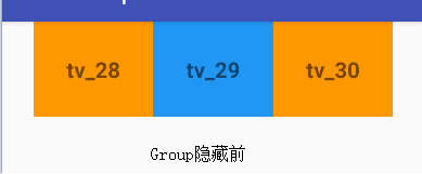
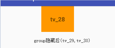
举个例子,tv_28,tv_29,tv_30三个控件,Group控制tv_29,tv_30,Group隐藏前后如下图:
<?xml version="1.0" encoding="utf-8"?>
<androidx.constraintlayout.widget.ConstraintLayout ......>

    <!--Group:用来控制一组view
    constraint_referenced_ids: 存放控件id集合-->
    <androidx.constraintlayout.widget.Group
        android:id="@+id/group"
        android:visibility="gone"
        android:layout_width="wrap_content"
        android:layout_height="wrap_content"
        app:constraint_referenced_ids="tv_29,tv_30" />

    <TextView
        ......
        android:id="@+id/tv_28"
        android:text="tv_28"
        app:layout_constraintHorizontal_chainStyle="packed"
        app:layout_constraintLeft_toLeftOf="parent"
        app:layout_constraintRight_toLeftOf="@+id/tv_29"
        app:layout_constraintTop_toTopOf="parent" />

    <TextView
        ......
        android:id="@+id/tv_29"
        android:text="tv_29"
        app:layout_constraintLeft_toRightOf="@+id/tv_28"
        app:layout_constraintRight_toLeftOf="@+id/tv_30"
        app:layout_constraintTop_toTopOf="parent" />

    <TextView
        ......
        android:id="@+id/tv_30"
        android:text="tv_30"
        app:layout_constraintLeft_toRightOf="@+id/tv_29"
        app:layout_constraintRight_toRightOf="parent"
        app:layout_constraintTop_toTopOf="parent" />

</androidx.constraintlayout.widget.ConstraintLayout>
效果如下:
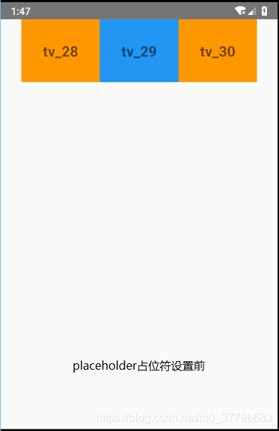
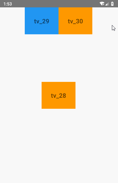
3.4 Placeholder(占位符)
一个view的占位符,当指定一个Placeholder的content属性为另一个view的id时,该view本身就会被gone掉,然后装载到Placeholder的位置。相当于把一个View当前位置移动到另外指定的位置。我们来看代码效果吧:
tv_28没有被设置到Placeholder时,显示在左上角;tv_28被设置到Placeholder后,显示在屏幕中央。
<?xml version="1.0" encoding="utf-8"?>
<androidx.constraintlayout.widget.ConstraintLayout ......>

    <!--content:占位符
    content: 替换控件的id-->
    <androidx.constraintlayout.widget.Placeholder
        android:id="@+id/placeholder"
        android:layout_width="wrap_content"
        android:layout_height="wrap_content"
        app:content="@id/tv_28"
        app:layout_constraintLeft_toLeftOf="parent"
        app:layout_constraintRight_toRightOf="parent"
        app:layout_constraintBottom_toBottomOf="parent"
        app:layout_constraintTop_toTopOf="parent" />

    <TextView
        ......
        android:id="@+id/tv_28"
        android:text="tv_28"
        app:layout_constraintHorizontal_chainStyle="packed"
        app:layout_constraintLeft_toLeftOf="parent"
        app:layout_constraintRight_toLeftOf="@+id/tv_29"
        app:layout_constraintTop_toTopOf="parent" />

    <TextView
        ......
        android:id="@+id/tv_29"
        android:text="tv_29"
        app:layout_constraintLeft_toRightOf="@+id/tv_28"
        app:layout_constraintRight_toLeftOf="@+id/tv_30"
        app:layout_constraintTop_toTopOf="parent" />

    <TextView
        ......
        android:id="@+id/tv_30"
        android:text="tv_30"
        app:layout_constraintLeft_toRightOf="@+id/tv_29"
        app:layout_constraintRight_toRightOf="parent"
        app:layout_constraintTop_toTopOf="parent" />

</androidx.constraintlayout.widget.ConstraintLayout>
也可以用代码设置:
Placeholder placeholder = findViewById(R.id.placeholder);
placeholder.setContentId(R.id.tv_28);
如下左图,tv_28没有被设置到Placeholder时,下右图,tv_28被设置到Placeholder后
另外ConstraintLayout还能通过拖拽来防止控件的位置,这里就不演示了,可以自己试一下。
点关注,不迷路
好了各位,以上就是这篇文章的全部内容了,能看到这里的人呀,都是人才。
我是suming,感谢各位的支持和认可,您的**点赞、评论、收藏**【一键三连】就是我创作的最大动力,我们下篇文章见!
如果本篇博客有任何错误,请批评指教,不胜感激 !
要想成为一个优秀的安卓开发者,这里有必须要掌握的知识架构,一步一步朝着自己的梦想前进!Keep Moving!


 扫一扫
扫一扫


 被折叠的 条评论
为什么被折叠?
被折叠的 条评论
为什么被折叠?
 到【灌水乐园】发言


