


This article provides examples of codes for K-means clustering visualization in R using the factoextra and the ggpubr R packages. You can learn more about the k-means algorithm by reading the following blog post: K-means clustering in R: Step by Step Practical Guide.
library(ggpubr)
library(factoextra)
data("iris")
df <- iris
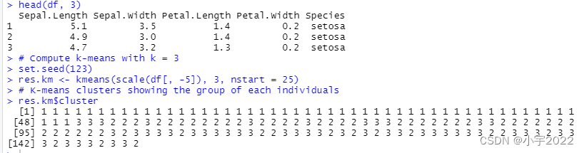
head(df, 3)
# Compute k-means with k = 3
set.seed(123)
res.km <- kmeans(scale(df[, -5]), 3, nstart = 25)
# K-means clusters showing the group of each individuals
res.km$cluster
Plot k-means
Using the factoextra R package
The function fviz_cluster() [factoextra package] can be used to easily visualize k-means clusters. It takes k-means results and the original data as arguments. In the resulting plot, observations are represented by points, using principal components if the number of variables is greater than 2. It’s also possible to draw concentration ellipse around each cluster.
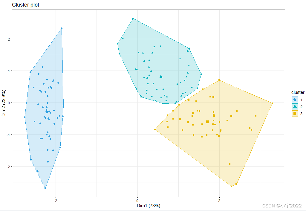
fviz_cluster(res.km, data = df[, -5],
             palette = c("#2E9FDF", "#00AFBB", "#E7B800"),
             geom = "point",
             ellipse.type = "convex",
             ggtheme = theme_bw()
             )
Using the ggpubr R package
If you want to adapt the k-means clustering plot, you can follow the steps below:
Compute principal component analysis (PCA) to reduce the data into small dimensions for visualization
Use the ggscatter() R function [in ggpubr] or ggplot2 function to visualize the clusters
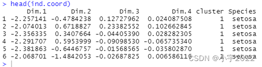
Compute PCA and extract individual coordinates
res.pca <- prcomp(df[, -5],  scale = TRUE)
# Coordinates of individuals
ind.coord <- as.data.frame(get_pca_ind(res.pca)$coord)
# Add clusters obtained using the K-means algorithm
ind.coord$cluster <- factor(res.km$cluster)
# Add Species groups from the original data sett
ind.coord$Species <- df$Species
# Data inspection
head(ind.coord)
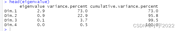
# Percentage of variance explained by dimensions
eigenvalue <- round(get_eigenvalue(res.pca), 1)
variance.percent <- eigenvalue$variance.percent
head(eigenvalue)
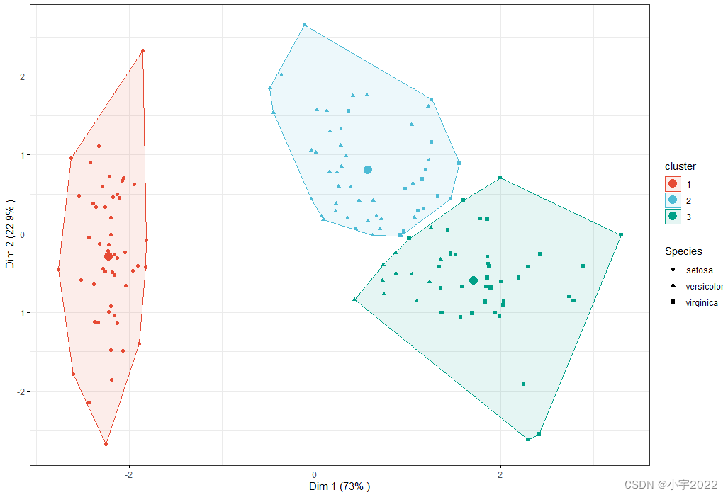
Visualize k-means clusters
Color individuals according to the cluster groups
Change point shapes according to the Species groups (ground truth of grouping)
Add concentration ellipses
Add cluster centroid using the stat_mean() [ggpubr] R function
library(ggpubr)
library(factoextra)
data("iris")
df <- iris
head(df, 3)
# Compute k-means with k = 3
set.seed(123)
res.km <- kmeans(scale(df[, -5]), 3, nstart = 25)
# K-means clusters showing the group of each individuals
res.km$cluster
res.pca <- prcomp(df[, -5],  scale = TRUE)
# Coordinates of individuals
ind.coord <- as.data.frame(get_pca_ind(res.pca)$coord)
# Add clusters obtained using the K-means algorithm
ind.coord$cluster <- factor(res.km$cluster)
# Add Species groups from the original data sett
ind.coord$Species <- df$Species
# Data inspection
head(ind.coord)
# Percentage of variance explained by dimensions
eigenvalue <- round(get_eigenvalue(res.pca), 1)
variance.percent <- eigenvalue$variance.percent
head(eigenvalue)
ggscatter(
  ind.coord, x = "Dim.1", y = "Dim.2",
  color = "cluster", palette = "npg", ellipse = TRUE, ellipse.type = "convex",
  shape = "Species", size = 1.5,  legend = "right", ggtheme = theme_bw(),
  xlab = paste0("Dim 1 (", variance.percent[1], "% )" ),
  ylab = paste0("Dim 2 (", variance.percent[2], "% )" )
) +
  stat_mean(aes(color = cluster), size = 4)
参考资料:
https://www.datanovia.com/en/blog/k-means-clustering-visualization-in-r-step-by-step-guide/


 1491
1491


 被折叠的 条评论
为什么被折叠?
被折叠的 条评论
为什么被折叠?
 到【灌水乐园】发言


