


前言
一、首页Echarts图
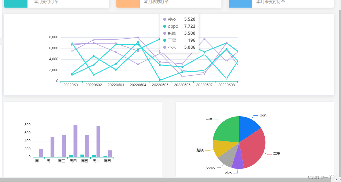
绘制折线图,柱状图和饼图。将折线图放在一个el-card里,将柱状图和饼图放在一个div容器里的两个不同的el-card,实现鼠标滑过会出现阴影的效果。
1.下载echarts并引入
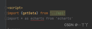
控制台 npm i echarts@5.1.2并在Home.vue引入
2.初始化实例
初始化实例并配置数据,处理x轴数据最后应用
Home.vue代码如下
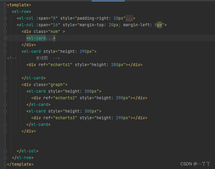
<template>
  <el-row>
    <el-col :span="8" style="padding-right: 10px">
      <el-card class="box-card" style="margin-top: 20px;margin-right: 10px">
        <div class="user">
          <img src="../assets/images/user.png" alt="">
          <div class="userinfo">
            <p class="name">Admin</p>
            <p class="access">超级管理员</p>
          </div>
        </div>
        <div class="login-info">
          <p>上次登录的时间:<span>2024-7-19</span></p>
          <p>上次登录的地点:<span>济南</span></p>
        </div>
      </el-card>
      <el-card style="margin-top:80px;height: 460px;margin-right: 10px">
        <el-table
            :data="tableData"
            style="width: 100%">
<!--                <el-table-column-->
<!--                    prop="name"-->
<!--                    label="课程">-->
<!--                </el-table-column>-->
<!--                <el-table-column-->
<!--                    prop="todayBuy"-->
<!--                    label="今日购买">-->
<!--                </el-table-column>-->
<!--                <el-table-column-->
<!--                    prop="monthBuy"-->
<!--                    label="本月购买">-->
<!--                </el-table-column>-->
<!--                <el-table-column-->
<!--                    prop="totalBuy"-->
<!--                    label="总购买">-->
<!--                </el-table-column>-->
        <el-table-column v-for="(val,key) in tableLabel" :prop="key" :label="val"/>
        </el-table>

      </el-card>
    </el-col>
    <el-col :span="16" style="margin-top: 20px; margin-left: 0px">
      <div class="num" >
        <el-card
            v-for="item in countData"
            :key="item.name"
            :body-style="{ display: 'flex', padding: 0 }">
          <i
              class="icon"
              :class="`el-icon-${item.icon}`"
              :style="{ background: item.color }"
          ></i>
          <div class="detail">
            <p class="num">¥{{ item.value }}</p>
            <p class="txt">{{ item.name }}</p>
          </div>
        </el-card>
      </div>
      <el-card style="height: 290px">
<!--        折线图  -->
        <div ref="echarts1" style="height: 280px"></div>

      </el-card>
      <div class="graph">
        <el-card style="height: 300px">
          <div ref="echarts2" style="height: 290px"></div>
        </el-card>
        <el-card style="height: 300px">
          <div ref="echarts3" style="height: 290px"></div>
        </el-card>
      </div>


    </el-col>
  </el-row>
</template>

<script>
import {getData} from '../api'
import * as echarts from 'echarts'

export default {

  data(){
    return{
      tableData:[
        // {
        //   name: 'oppo',
        //   todayBuy: 100,
        //   monthBuy: 300,
        //   totalBuy: 800
        // },
        // {
        //   name: 'vivo',
        //   todayBuy: 100,
        //   monthBuy: 300,
        //   totalBuy: 800
        // },
        // {
        //   name: '苹果',
        //   todayBuy: 100,
        //   monthBuy: 300,
        //   totalBuy: 800
        // },
        // {
        //   name: '小米',
        //   todayBuy: 100,
        //   monthBuy: 300,
        //   totalBuy: 800
        // },
        // {
        //   name: '三星',
        //   todayBuy: 100,
        //   monthBuy: 300,
        //   totalBuy: 800
        // },
        // {
        //   name: '魅族',
        //   todayBuy: 100,
        //   monthBuy: 300,
        //   totalBuy: 800
        // }
      ],
      tableLabel:{
        name:'课程',
        todayBuy:'今日购买',
        monthBuy:'本月购买',
        totalBuy:'总购买'
      },
      countData: [
        {
          name: "今日支付订单",
          value: 1234,
          icon: "success",
          color: "#2ec7c9",
        },
        {
          name: "今日收藏订单",
          value: 210,
          icon: "star-on",
          color: "#ffb980",
        },
        {
          name: "今日未支付订单",
          value: 1234,
          icon: "s-goods",
          color: "#5ab1ef",
        },
        {
          name: "本月支付订单",
          value: 1234,
          icon: "success",
          color: "#2ec7c9",
        },
        {
          name: "本月收藏订单",
          value: 210,
          icon: "star-on",
          color: "#ffb980",
        },
        {
          name: "本月未支付订单",
          value: 1234,
          icon: "s-goods",
          color: "#5ab1ef",
        },
      ]
    }
  },
  mounted() {
    getData().then(({data}) => {
      const {tableData} = data.data
      console.log(data.data)
      this.tableData = tableData
      // console.log(tableData)

      // 基于准备好的dom,初始化echarts实例
      const echarts1 = echarts.init(this.$refs.echarts1)
      // 指定图表的配置项和数据
      var echarts1Option = {}
      // 处理数据xAxis
      const {orderData,userData,videoData} = data.data
      const xAxis = Object.keys(orderData.data[0])
      const xAxisData = {
        data:xAxis
      }
      echarts1Option.xAxis=xAxisData
      echarts1Option.yAxis={}
      echarts1Option.legend = xAxisData
      echarts1Option.series=[]
      xAxis.forEach(key => {
        echarts1Option.series.push({
          name: key,
          data: orderData.data.map(item => item[key]),
          type: 'line'
        })

      })
      console.log(echarts1Option)
      // // 使用刚指定的配置项和数据显示图表
      echarts1.setOption(echarts1Option)

      //柱状图
      const echarts2 = echarts.init(this.$refs.echarts2)
      const echarts2Option = {
        user: {
          legend: {
            // 图例文字颜色
            textStyle: {
              color: "#333",
            },
          },
          grid: {
            left: "20%",
          },
          // 提示框
          tooltip: {
            trigger: "axis",
          },
          xAxis: {
            type: "category", // 类目轴
            data: userData.map(item => item.date),
            axisLine: {
              lineStyle: {
                color: "#17b3a3",
              },
            },
            axisLabel: {
              interval: 0,
              color: "#333",
            },
          },
          yAxis: [
            {
              type: "value",
              axisLine: {
                lineStyle: {
                  color: "#17b3a3",
                },
              },
            },
          ],
          color: ["#2ec7c9", "#b6a2de"],
          series: [
            {
              name:'新增用户',
              data:userData.map(item => item.new),
              type:'bar'
            },
            {
              name:'活跃用户',
              data:userData.map(item => item.active),
              type:'bar'
            }
          ],
        },
      }
      echarts2.setOption(echarts2Option)

      //饼图
      const echarts3=echarts.init(this.$refs.echarts3)
      const echarts3Option={
        tooltip: {
          trigger: "item",
        },
        color: [
          "#0f78f4",
          "#dd536b",
          "#9462e5",
          "#a6a6a6",
          "#e1bb22",
          "#39c362",
          "#3ed1cf",
        ],
        series: [
          {
            data: videoData,
            type:'pie'
          }
        ],
      }
      echarts3.setOption(echarts3Option)
    })
  }
}


</script>

<style lang="less" scoped>
.user{
  padding-bottom: 20px;
  margin-bottom: 20px;
  border-bottom:1px solid #ccc;
  display: flex;
  align-items: center;
  img {
    margin-right: 40px;
    width: 150px;
    height: 150px;
    border-radius: 50%;
  }
  .userinfo{

    .name{
      font-size: 32px;
      margin-bottom: 10px;
    }
    .access{
      color: #999999;
    }
  }
}
.login-info{
  p{
    line-height: 28px;
    font-size:14px;
    color:#999999;
    span{
      color:#666666;
      margin-left: 60px;
    }

  }
}
.num{
  display: flex;
  flex-wrap: wrap;
  justify-content: space-between;
  .el-card{
    width: 32%;
    margin-bottom: 10px;
  }
  .icon{
    width: 80px;
    height: 80px;
    font-size:30px;
    text-align: center;
    line-height: 80px;
    color:#fff;
  }
  .detail{
    margin-left: 15px;
    display: flex;
    flex-direction: column;
    justify-content: center;
    .num {
      font-size: 30px;
      margin-bottom: 10px;
    }
    .txt {
      font-size: 14px;
      text-align: center;
      color: #999999;
    }

  }
  .price{
    font-size: 30px;
    margin-bottom: 10px;
    line-height: 30px;
    height: 30px;
  }
  .desc{
    font-size: 14px;
    color:#999;
    text-align: center;

  }
}
.graph {
  margin-top: 20px;
  display: flex;
  justify-content: space-between;

  .el-card {
    width: 48%;
  }
}
</style>


 2062
2062

 被折叠的 条评论
为什么被折叠?
被折叠的 条评论
为什么被折叠?
 到【灌水乐园】发言


