<!DOCTYPE html>
<html lang="en">
<head>
<meta charset="UTF-8" />
<meta name="viewport" content="width=device-width, initial-scale=1.0" />
<title>加载效果</title>
<link rel="stylesheet" href="./style.css" />
</head>
<body>
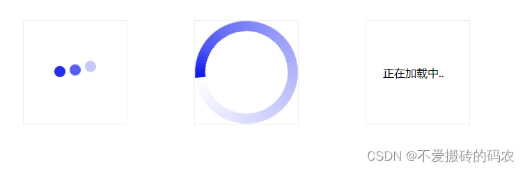
<div class="bouncing-loader">
<div class="bouncing-loader-item"></div>
<div class="bouncing-loader-item"></div>
<div class="bouncing-loader-item"></div>
</div>
<div class="spin-loading">
<div class="loading"></div>
</div>
<span class="dot">正在加载中<span class="dotted"></span></span>
</body>
</html>
* {
margin: 0;
padding: 0;
box-sizing: border-box;
}
html,
body {
display: flex;
}
.bouncing-loader,
.spin-loading,
.dot {
display: flex;
justify-content: center;
align-items: center;
width: 150px;
border: 1px solid #efefef;
margin: 3rem;
}
.bouncing-loader-item {
width: 16px;
height: 16px;
margin: 3rem 0.2rem;
background-color: #0b16f1;
border-radius: 50%;
animation: bouncingLoader 0.6s infinite alternate;
}
.bouncing-loader-item:nth-child(2) {
animation-delay: 0.2s;
}
.bouncing-loader-item:nth-child(3) {
animation-delay: 0.4s;
}
@keyframes bouncingLoader {
to {
opacity: 0.1;
transform: translate3d(0, -10px, 0);
}
}
.spin-loading .loading {
width: 100%;
aspect-ratio: 1;
border-radius: 100%;
background-image: conic-gradient(#0b16f1, 30%, #fff);
-webkit-mask-image: radial-gradient(closest-side, transparent 80%, black 80%);
animation: spin 1s linear infinite reverse;
}
@keyframes spin {
from {
transform: rotate(0deg);
}
to {
transform: rotate(360deg);
}
}
.dotted {
display: inline-block;
width: 20px;
}
.dotted::after {
content: '';
animation: dotted 2s infinite;
}
@keyframes dotted {
0% {
content: '...';
}
25% {
content: '';
}
50% {
content: '.';
}
75% {
content: '..';
}
100% {
content: '...';
}
}


 278
278


 被折叠的 条评论
为什么被折叠?
被折叠的 条评论
为什么被折叠?
 到【灌水乐园】发言


