


-
-
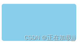
使盒子变成圆角
-
语法:border-radius:length;
-
radius半径原理:圆与边框交集形成的圆角效果
-
参数可以是数值或者百分比
-
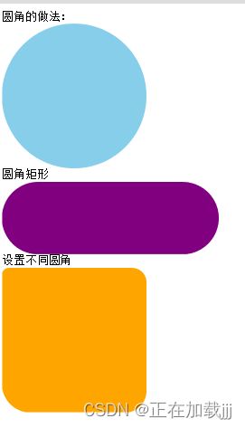
设置成圆形:把数值设置成宽度和高度的一半,或者直接设置成50%
-
设置成圆角矩形,设置为高度一半
-
代码
<!DOCTYPE html> <html lang="en"> <head> <meta charset="UTF-8"> <meta http-equiv="X-UA-Compatible" content="IE=edge"> <meta name="viewport" content="width=device-width, initial-scale=1.0"> <title>Document</title> <style> div { width: 300px; height: 150px; background-color: skyblue; /* 圆角边框 */ border-radius: 10px; } </style> </head> <body> <div></div> </body> </html> -
结果
-
代码
<!DOCTYPE html> <html lang="en"> <head> <meta charset="UTF-8"> <meta http-equiv="X-UA-Compatible" content="IE=edge"> <meta name="viewport" content="width=device-width, initial-scale=1.0"> <title>Document</title> <style> .yuanxing { width: 200px; height: 200px; background-color: skyblue; /* border-radius: 100px; */ /* 这个50%是宽度和高度的一半 */ border-radius: 50%; } .juxing { width: 300px; height: 100px; background-color: purple; /* 设置为高度的一半 */ border-radius: 50px; } .radius { width: 200px; height: 200px; background-color: orange; border-radius: 10px 20px 30px 40px; } </style> </head> <body> 圆角的做法: <div class="yuanxing"></div> 圆角矩形 <div class="juxing"></div> 设置不同圆角 <div class="radius"></div> </body> </html> -
结果
-
-
盒子阴影
-
box-shadow
-
语法:box-shadow:h-shadow v-shadow blur spread color inset
-
h-shadow:水平阴影
-
必需,允许负值(影子水平位置)
-
-
v-shadow:垂直阴影
-
必需,允许负值(影子垂直位置)
-
-
blur:模糊数值(影子虚实)
-
spread:阴影尺寸(影子大小)
-
color:阴影颜色
-
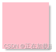
inset:外部阴影改为内部阴影(默认的是外阴影,不需要加outset)
-
影子不占用空间
-
代码
<!DOCTYPE html> <html lang="en"> <head> <meta charset="UTF-8"> <meta http-equiv="X-UA-Compatible" content="IE=edge"> <meta name="viewport" content="width=device-width, initial-scale=1.0"> <title>Document</title> <style> div { width: 200px; height: 200px; background-color: pink; margin: 100px auto; } /* 鼠标经过盒子添加阴影效果 */ div:hover { box-shadow: 10px 10px 10px -4px rgba(0, 0, 0, .3); } </style> </head> <body> <div></div> </body> </html> -
结果
-
-
文字阴影
-
text-shadow
-
语法:text-shadow:h-shadow v-shadow blur color;
-
h-shadow:水平阴影位置
-
必需,允许负值
-
-
v-shadow:垂直阴影位置
-
必需,允许负值
-
-
blur:模糊距离
-
color:阴影颜色
-
代码
<!DOCTYPE html> <html lang="en"> <head> <meta charset="UTF-8"> <meta http-equiv="X-UA-Compatible" content="IE=edge"> <meta name="viewport" content="width=device-width, initial-scale=1.0"> <title>Document</title> <style> div { font-size: 50px; color: skyblue; font-weight: 700; text-shadow: 5px 5px 6px rgba(0, 0, 0, .3); } </style> </head> <body> <div>文字阴影</div> </body> </html> -
结果

-
-
css浮动
-
网页布局准则
-
多个块级元素纵向排列使用标准流,多个块级元素横向排列使用浮动
-
-
布局方式
-
-
普通流
-
标签按照规定好的默认方式排列
-
块级元素独占一行。从上往下顺序方式排列
-
-
-
-
浮动
-
优点:可以让多个块级元素一行内排列显示
-
float属性用于创建浮动框,将其移动到一边,直到右边缘或者左边缘触及包含块或者另一个浮动边缘。
-
语法:选择器{ float:属性值}
-
属性值:none元素不浮动
-
属性值:left向左浮动
-
属性值:right向右浮动
-
代码
<!DOCTYPE html> <html lang="en"> <head> <meta charset="UTF-8"> <meta http-equiv="X-UA-Compatible" content="IE=edge"> <meta name="viewport" content="width=device-width, initial-scale=1.0"> <title>Document</title> <style> .left, .right { width: 200px; height: 200px; background-color: aqua; } .left { float: left; } .right { float: right; } </style> </head> <body> <div class="left">左边盒子</div> <div class="right">右边盒子</div> </body> </html> -
结果

-
-
浮动特性
-
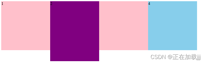
浮动元素会脱离标准流,不再保留原先的位置
-
浮动元素会一行内显示且元素顶部对齐
-
代码
<!DOCTYPE html> <html lang="en"> <head> <meta charset="UTF-8"> <meta http-equiv="X-UA-Compatible" content="IE=edge"> <meta name="viewport" content="width=device-width, initial-scale=1.0"> <title>Document</title> <style> div { float: left; width: 200px; height: 200px; background-color: pink; } .two { background-color: purple; height: 245px; } .four { background-color: skyblue; } </style> </head> <body> <div>1</div> <div class="two">2</div> <div></div> <div class="four">4</div> </body> </html> -
结果
-
-
-
-
-
-
-
浮动是紧贴在一起的,没有缝隙
-
代码
<!DOCTYPE html> <html lang="en"> <head> <meta charset="UTF-8"> <meta http-equiv="X-UA-Compatible" content="IE=edge"> <meta name="viewport" content="width=device-width, initial-scale=1.0"> <title>Document</title> <style> div { float: left; width: 150px; height: 200px; background-color: pink; /* display: inline-block; */ } </style> </head> <body> <div>1</div> <div>2</div> <div>3</div> </body> </html> -
结果
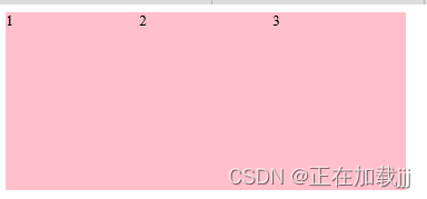
-
如果父级宽度装不下浮动盒子,则多出来的盒子会另起一行对齐
-
浮动元素具有行内块元素特性,
-
不管之前是什么模式元素,添加浮动之后都具有行内块元素特性
-
代码
<!DOCTYPE html> <html lang="en"> <head> <meta charset="UTF-8"> <meta http-equiv="X-UA-Compatible" content="IE=edge"> <meta name="viewport" content="width=device-width, initial-scale=1.0"> <title>Document</title> <style> span, div { /* 如果使用了浮动,则不需要在转换为块级元素或者行内块元素 */ float: left; width: 200px; height: 100px; background-color: pink; } </style> </head> <body> <span>1</span> <span>2</span> <div>1</div> </body> </html> -
结果

-
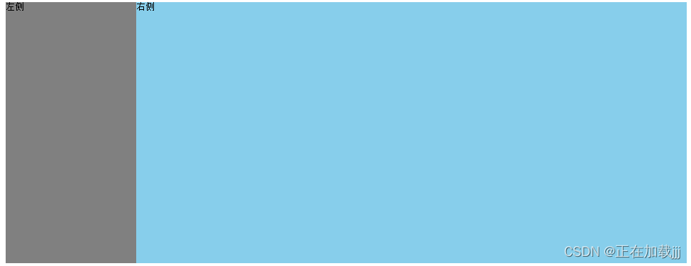
如果块级元素没有设置宽度,默认宽度和父级一样宽,但是浮动之后,大小根据内容来决定
-
代码
<!DOCTYPE html> <html lang="en"> <head> <meta charset="UTF-8"> <meta http-equiv="X-UA-Compatible" content="IE=edge"> <meta name="viewport" content="width=device-width, initial-scale=1.0"> <title>Document</title> <style> .box { width: 1200px; height: 460px; background-color: pink; margin: 0 auto; } .left { float: left; width: 230px; height: 460px; background-color: gray; } .right { float: right; width: 970px; height: 460px; background-color: skyblue; } </style> </head> <body> <div class="box"> <div class="left">左侧</div> <div class="right">右侧</div> </div> </body> </html> -
结果
-
-
-
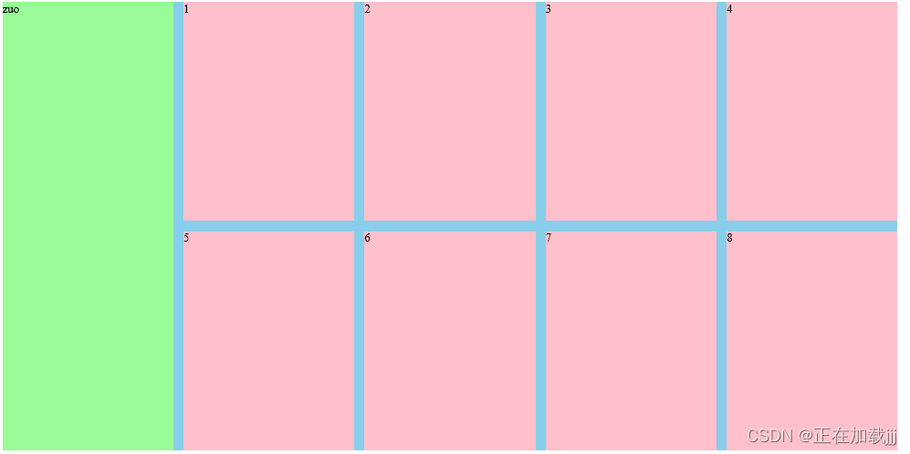
浮动搭配标准流父级元素使用
-
先用标准流上下排列,之后内部子元素采取浮动排列左右位置
-
一个元素浮动了,理论上其余的兄弟元素也要浮动
-
代码
<!DOCTYPE html> <html lang="en"> <head> <meta charset="UTF-8"> <meta http-equiv="X-UA-Compatible" content="IE=edge"> <meta name="viewport" content="width=device-width, initial-scale=1.0"> <title>Document</title> <style> * { margin: 0; padding: 0; } li { list-style: none; } .box { width: 1226px; height: 285px; background-color: pink; margin: 0 auto; } .box li { width: 296px; height: 285px; background-color: purple; float: left; margin-right: 14px; } /* 必须写.box .li,注意权重的问题 */ .box .last { margin-right: 0; } </style> </head> <body> <ul class="box"> <li>1</li> <li>2</li> <li>3</li> <li class="last">4</li> </ul> </body> </html> -
结果

-
代码
<!DOCTYPE html> <html lang="en"> <head> <meta charset="UTF-8"> <meta http-equiv="X-UA-Compatible" content="IE=edge"> <meta name="viewport" content="width=device-width, initial-scale=1.0"> <title>Document</title> <style> .box { width: 1226px; height: 615px; background-color: pink; margin: 0 auto; } .left { float: left; width: 234px; height: 615px; background-color: palegreen; } .right { float: left; width: 992px; height: 615px; background-color: skyblue; } .right>div { float: left; width: 234px; height: 300px; background-color: pink; margin-left: 14px; margin-bottom: 14px; } </style> </head> <body> <div class="box"> <div class="left">zuo</div> <div class="right"> <div>1</div> <div>2</div> <div>3</div> <div class="four">4</div> <div>5</div> <div>6</div> <div>7</div> <div class="last">8</div> </div> </div> </body> </html> -
结果
-
代码
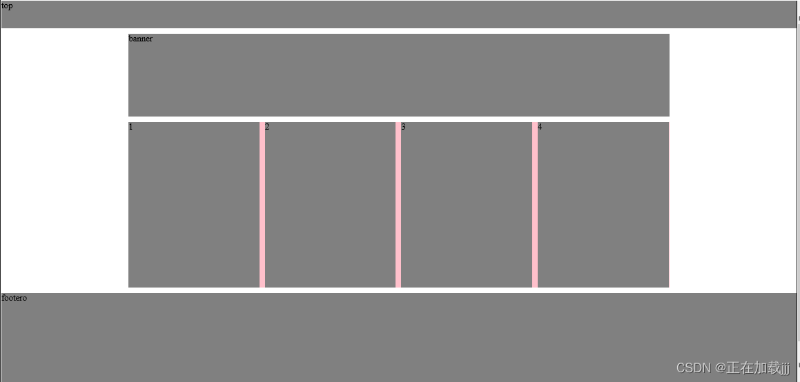
<!DOCTYPE html> <html lang="en"> <head> <meta charset="UTF-8"> <meta http-equiv="X-UA-Compatible" content="IE=edge"> <meta name="viewport" content="width=device-width, initial-scale=1.0"> <title>Document</title> <style> * { margin: 0; padding: 0; } li { list-style: none; } .top { height: 50px; background-color: gray; } .banner { width: 980px; height: 150px; background-color: gray; margin: 10px auto; } .box { width: 980px; height: 300px; margin: 10px auto; background-color: pink; } .box li { float: left; width: 237px; height: 300px; background-color: gray; margin-right: 10px; } .box .last { margin-right: 0; } /* 只要是通栏的盒子,不需要指定宽度 */ .footer { height: 200px; background-color: gray; margin-top: 10px; } </style> </head> <body> <div class="top">top</div> <div class="banner">banner</div> <div class="box"> <ul> <li>1</li> <li>2</li> <li>3</li> <li class="last">4</li> </ul> </div> <div class="footer">footer</footer>o</div> </body> </html> -
结果
-
-
-
-


12-01
 154
154
154
11-12
3966
3966
07-17
1716
1716
“相关推荐”对你有帮助么?
-

 非常没帮助
非常没帮助 -

 没帮助
没帮助 -

 一般
一般 -

 有帮助
有帮助 -

 非常有帮助
非常有帮助
提交

 被折叠的 条评论
为什么被折叠?
被折叠的 条评论
为什么被折叠?
 到【灌水乐园】发言


