


python学习 - 图标签用宋体&Times New Roman字体 + 规范的混淆矩阵绘制
只需复制下面一行代码即可获得效果
中文:宋体字号
英文和数字:Times New Roman字体
from matplotlib import rcParams

config = {
    "font.family": 'serif', # 衬线字体
    "font.size": 10, # 相当于小四大小
    "font.serif": ['SimSun'], # 宋体
    "mathtext.fontset": 'stix', # matplotlib渲染数学字体时使用的字体,和Times New Roman差别不大
    'axes.unicode_minus': False # 处理负号,即-号
}
rcParams.update(config)
下面以绘制一个混淆矩阵进行验证
#####----导入包----#
from sklearn.metrics import confusion_matrix
import matplotlib.pyplot as plt
import numpy as np
from matplotlib.colors import ListedColormap, LinearSegmentedColormap
from matplotlib.offsetbox import (TextArea, DrawingArea, OffsetImage,AnnotationBbox)
from matplotlib.cbook import get_sample_data
from matplotlib import rcParams

config = {
    "font.family": 'serif', # 衬线字体
    "font.size": 10, # 相当于小四大小
    "font.serif": ['SimSun'], # 宋体
    "mathtext.fontset": 'stix', # matplotlib渲染数学字体时使用的字体,和Times New Roman差别不大
    'axes.unicode_minus': False # 处理负号,即-号
}
rcParams.update(config)

# 定义混淆矩阵绘制函数
def plot_confusion_matrix(cm,cmap, title='混淆矩阵'):
    plt.imshow(cm, interpolation='nearest', cmap=cmap)
    plt.title(title, fontsize = 11)
    plt.colorbar()
    xlocations = np.array(range(len(labels)))
    plt.xticks(xlocations, labels, rotation=90, fontsize = 10)
    plt.yticks(xlocations, labels, fontsize=10)
    plt.ylabel('真实标签', fontsize=11)
    plt.xlabel('预测标签', fontsize = 11)


###---输入数据---###
# 这一块也是你需要按照自己需求要改的
test_true_label = [1,1,1,0,0,2,2,2,2,3,3,3,3,3]  #测试集真实标签
test_pre_label = [1,1,1,0,0,2,2,2,1,3,3,3,0,3]    #测试集预测标签

# 注意: 外圈故障:0, 内圈故障:1  滚动体故障:2  正常:3
# 因此是先将 test_true_label从0-3排列好,再与labels一一对应起来
labels = ['外圈故障', '内圈故障', '滚动体故障','正常']  #图片显示的横纵坐标标签
tick_marks = np.array(range(len(labels))) + 0.5

colors = [ "white", "orange"]  #颜色渐变色是从白到橘色
cmap1 = LinearSegmentedColormap.from_list("mycmap", colors)

###---转换成混淆矩阵---###
cm = confusion_matrix(test_true_label, test_pre_label)
np.set_printoptions(precision=2)
cm_normalized = cm.astype('float') / cm.sum(axis=1)[:, np.newaxis]
print('混淆矩阵:\n',cm)

###---绘图---###
plt.figure(figsize=(3, 3), dpi=500)
ind_array = np.arange(len(labels))
x, y = np.meshgrid(ind_array, ind_array)

for x_val, y_val in zip(x.flatten(), y.flatten()):
    c1 = cm_normalized[y_val][x_val]
    c2 = cm[y_val][x_val]
    if c1 > 0.0001:
        plt.text(x_val, y_val, "%d/%0.2f" % ( c2, c1), color='black', fontsize=10, va='center', ha='center')

plt.gca().set_xticks(tick_marks, minor=True)
plt.gca().set_yticks(tick_marks, minor=True)
plt.gca().xaxis.set_ticks_position('none')
plt.gca().yaxis.set_ticks_position('none')
plt.grid(True, which='minor', linestyle='-')
plt.gcf().subplots_adjust(bottom=0.15)

plot_confusion_matrix(cm_normalized, cmap=cmap1, title='混淆矩阵')
# save_file_path  = 'E:\研究生\pytorch\随机森林-混淆矩阵.png'
# plt.savefig(save_file_path, dpi=500,  bbox_inches='tight')
>>>结果输出
混淆矩阵:
 [[2 0 0 0]
 [0 3 0 0]
 [0 0 4 0]
 [0 0 0 5]]
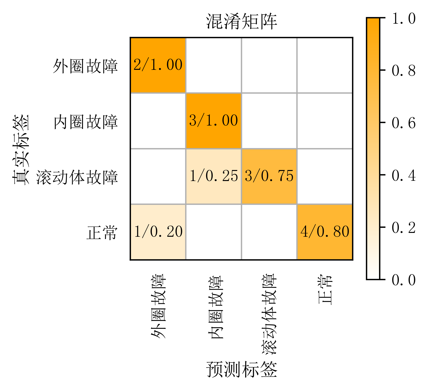
有读者不太理解混淆矩阵图是怎么看的,这里再细说一下。看横坐标和纵坐标,这里的横坐标就是代表预测标签,纵坐标代表真实标签。每一行的数字之和,就代表每一类真实标签数量有多少个。
第一行之和是2,第二行之和是3,第三行之和是1+3为4,第四行之和是1+4为5。对应真实标签有2个0,3个1,4个2,5个3。
那每个框里的数字代表什么意思呢?每个方框里的第一个数字k就代表,k个真实标签为A,被预测为标签B了。比如左上角第一个框2/1.00,就代表有两个真实标签为外圈故障,被预测成了2个外圈故障,因此它的准确率是100%,即1.0。第四行第一列的框为1/0.20,就代表有一个真实标签为正常的,被预测成了外圈故障,因此它的误判率是20%,即0.2。
test_true_label = [1,1,1,0,0,2,2,2,2,3,3,3,3,3] #测试集真实标签
test_pre_label = [1,1,1,0,0,2,2,2,1,3,3,3,0,3] #测试集预测标签
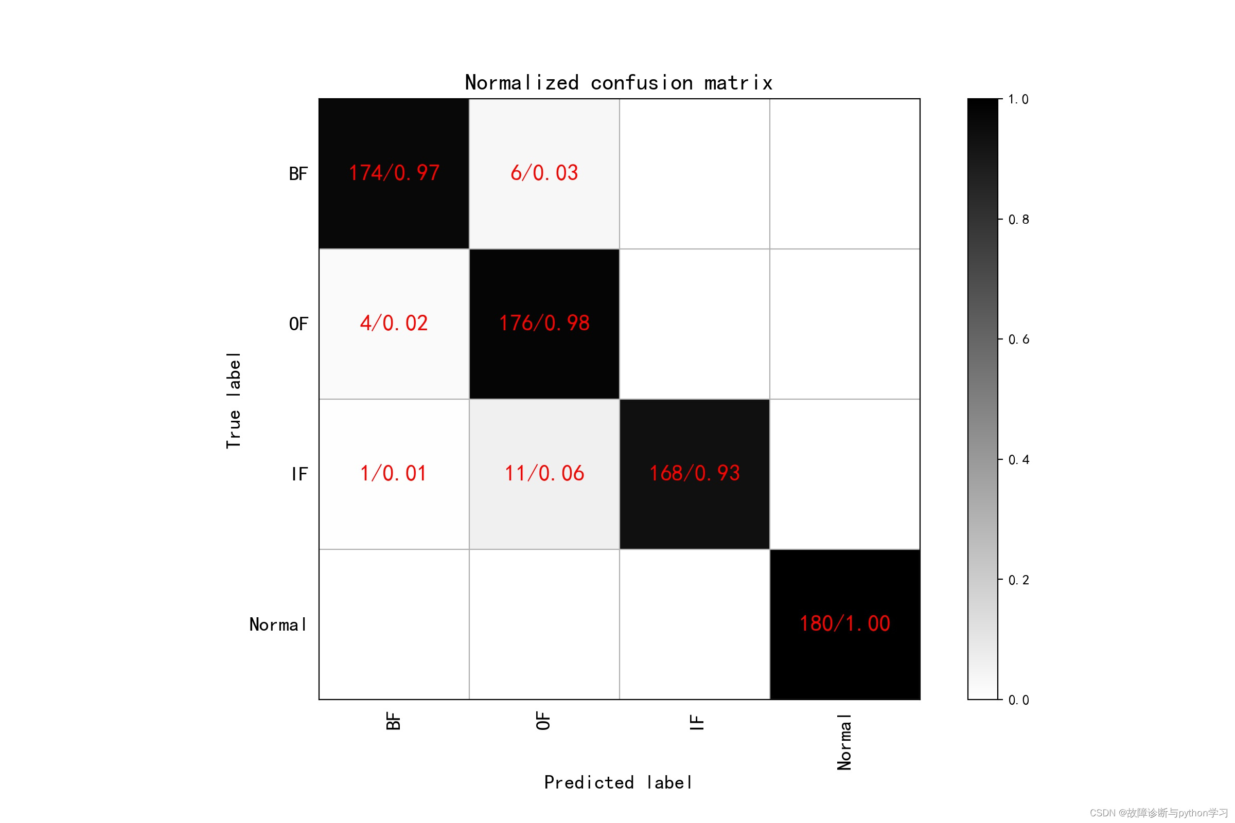
这样出的图是不是很好看,千万不要黑底红字!!!不然导师骂惨
下面是错误示范


 8710
8710

 被折叠的 条评论
为什么被折叠?
被折叠的 条评论
为什么被折叠?
 到【灌水乐园】发言


