


一、基础图:https://ant-design-charts.antgroup.com/ Ant Design Charts
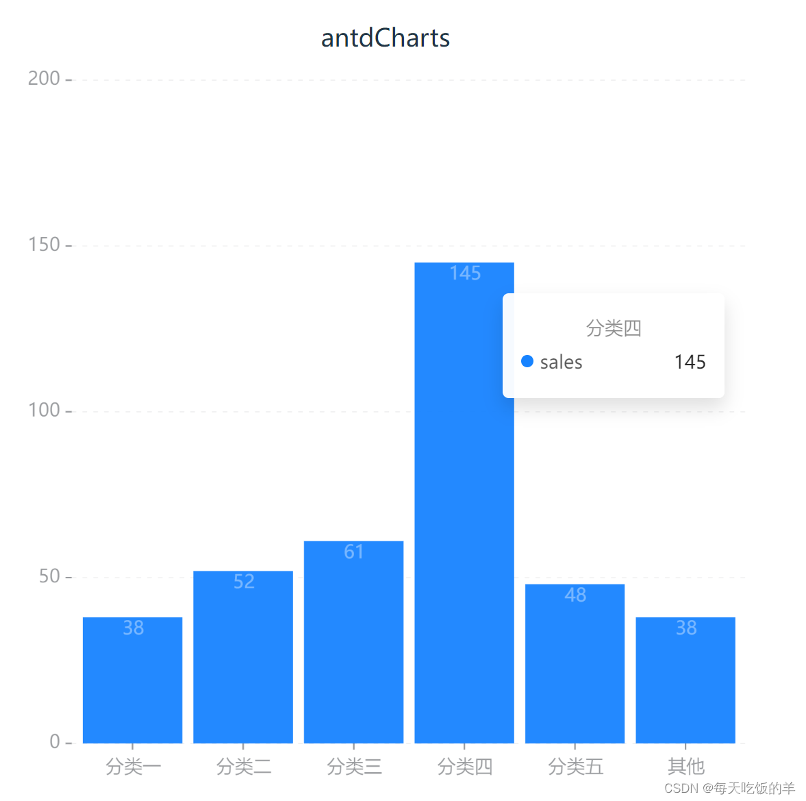
1. 首先要下载@ant-design/charts,然后在页面中添加如下柱状图代码:
import React from 'react';
import { Column } from '@ant-design/charts'

const DemoColumn: React.FC = () => {
  const data = [
    {
      type: '分类一',
      sales: 38
    },
    {
      type: '分类二',
      sales: 52
    },
    {
      type: '分类三',
      sales: 61
    },
    {
      type: '分类四',
      sales: 145
    }, {
      type: '分类五',
      sales: 48
    }, {
      type: '其他',
      sales: 38
    }
  ]
  const config = {
    data,
    xField: 'type',
    yField: 'sales',
    label: {
      // 可手动配置 label 数据标签位置
      // position: 'middle',
      // 'top', 'bottom', 'middle',
      // 配置样式
      style: {
        fill: '#FFFFFF',
        opacity: 0.6
      }
    },
    xAxis: {
      label: {
        autoHide: true,
        autoRotate: false
      }
    },
    meta: {
      type: {
        alias: '类别'
      },
      sales: {
        alias: '销售额(万)'
      }
    }
  }
  return <>antdCharts<Column {...config} /></>;
}
export default DemoColumn;
效果如下:
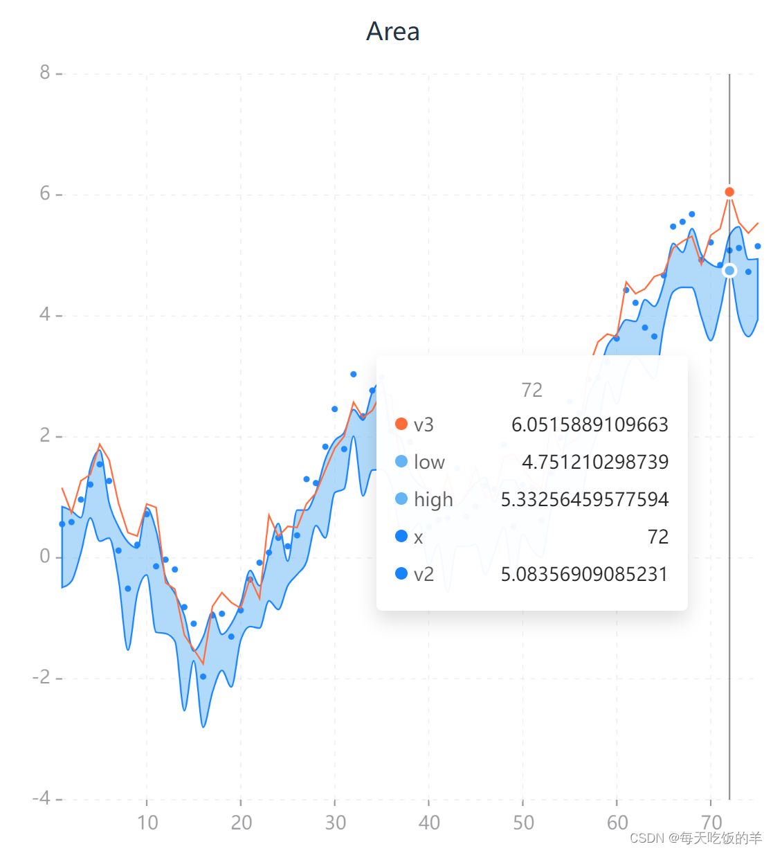
2.然后实现下这个案例区间曲线面积图 在柱庄图的基础上替换相关配置,代码如下:
import React from 'react';
import { Area} from '@ant-design/charts'

const DemoColumn: React.FC = () => {
    const config = {
        data: {
          type: 'fetch',
          value: 'https://assets.antv.antgroup.com/g2/range-spline-area.json',
          transform: [
            {
              type: 'map',
              callback: ([x, low, high, v2, v3]) => ({ x, low, high, v2, v3 }),
            },
          ],
        },
        xField: 'x',
        yField: ['low', 'high'],
        shapeField: 'smooth',
        style: {
          fillOpacity: 0.5,
          fill: '#64b5f6',
          lineWidth: 1,
        },
        axis: {
          y: { title: false },
        },
        scale: {
          x: { type: 'linear', tickCount: 10 },
        },
        point: {
          yField: 'v2',
          shapeField: 'point',
          sizeField: 2,
        },
        line: {
          yField: 'v3',
          style: {
            stroke: '#FF6B3B',
          },
        },
      };
  return <>Area<Area {...config} /></>;
}
export default DemoColumn;
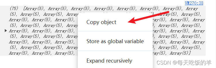
解决办法1:将https://assets.antv.antgroup.com/g2/range-spline-area.json在浏览器中打开就可以看到:

解决办法2:在示例代码中添加如下代码

控制台可见:右击 Copy object就复制了
二、高级图:蚂蚁数据可视化 - AntV G2,G6,F2,L7
实现vue3项目中老版的soybean中的antv/G2画的图安装下面的依赖(指定版本,最新版本有问题)
navie-ui官网
  "dependencies": {
    "@antv/data-set": "^0.11.8",
    "@antv/g2": "^4.2.10",
  },
  "devDependencies": {
    "naive-ui": "^2.38.2",
    "tailwindcss": "^3.4.4",
  }
然后把如下代码贴到页面中去就好了
<template>
  <n-space :vertical="true" :size="16">
    <n-card :bordered="false" class="rounded-16px shadow-sm">
      <div ref="lineRef" class="h-400px"></div>
    </n-card>
    1111
    <n-card :bordered="false" class="rounded-16px shadow-sm">
      <div ref="pieRef" class="h-400px"></div>
    </n-card>
    <n-card :bordered="false" class="rounded-16px shadow-sm">
      <div ref="lineRef" class="h-400px"></div>
    </n-card>
    <n-card :bordered="false" class="rounded-16px shadow-sm">
      <div ref="barRef" class="h-400px"></div>
    </n-card>
    <n-card :bordered="false" class="rounded-16px shadow-sm">
      <div ref="scatterRef" class="h-400px"></div>
    </n-card>
    <n-card :bordered="false" class="rounded-16px shadow-sm">
      <div ref="areaRef" class="h-400px"></div>
    </n-card>
    <n-card :bordered="false" class="rounded-16px shadow-sm">
      <div ref="radarRef" class="h-400px"></div>
    </n-card>
  </n-space>
</template>

<script setup lang="ts">
import { NSpace, NCard } from "naive-ui";
import { onMounted, ref } from "vue";
import DataSet from "@antv/data-set";
import { Chart } from "@antv/g2";

const pieRef = ref<HTMLElement>();
const lineRef = ref<HTMLElement>();
const barRef = ref<HTMLElement>();
const scatterRef = ref<HTMLElement>();
const areaRef = ref<HTMLElement>();
const radarRef = ref<HTMLElement>();

function renderPieChart() {
  if (!pieRef.value) return;

  const data = [
    { item: "rose 1", count: 40, percent: 0.4 },
    { item: "rose 2", count: 40, percent: 0.4 },
    { item: "rose 3", count: 40, percent: 0.4 },
    { item: "rose 4", count: 40, percent: 0.4 },
    { item: "rose 5", count: 21, percent: 0.21 },
    { item: "rose 6", count: 17, percent: 0.17 },
    { item: "rose 7", count: 13, percent: 0.13 },
    { item: "rose 8", count: 9, percent: 0.09 },
  ];

  const chart = new Chart({
    container: pieRef.value,
    autoFit: true,
  });

  chart.data(data);

  chart.coordinate("theta", {
    radius: 0.85,
  });

  chart.scale("percent", {
    formatter: (val: number) => `${val * 100}%`,
  });
  chart.tooltip({
    showTitle: false,
    showMarkers: false,
  });
  chart.legend({ position: "top" });
  chart.axis(false); // 关闭坐标轴
  chart
    .interval()
    .adjust("stack")
    .position("percent")
    .color("item")
    .label("percent", {
      offset: -40,
      style: {
        textAlign: "center",
        shadowBlur: 2,
        shadowColor: "rgba(0, 0, 0, .45)",
        fill: "#fff",
      },
    })
    .tooltip("item*percent", (item, percent) => {
      return {
        name: item,
        value: `${percent * 100}%`,
      };
    })
    .style({
      lineWidth: 1,
      stroke: "#fff",
    });
  chart.interaction("element-single-selected");
  chart.render();
}

function renderLineChart() {
  fetch("https://gw.alipayobjects.com/os/antvdemo/assets/data/terrorism.json")
    .then((res) => res.json())
    .then((data) => {
      const ds = new DataSet();
      if (!lineRef.value) return;

      const chart = new Chart({
        container: lineRef.value,
        autoFit: true,
        syncViewPadding: true,
      });

      chart.scale({
        Deaths: {
          sync: true,
          nice: true,
        },
        death: {
          sync: true,
          nice: true,
        },
      });

      const dv1 = ds.createView().source(data);
      dv1.transform({
        type: "map",
        callback: (row: any) => {
          const currentRow = { ...row };
          if (typeof row.Deaths === "string") {
            currentRow.Deaths = row.Deaths.replace(",", "");
          }
          currentRow.Deaths = parseInt(row.Deaths, 10);
          currentRow.death = row.Deaths;
          currentRow.year = row.Year;
          return currentRow;
        },
      });
      const view1 = chart.createView();
      view1.data(dv1.rows);
      view1.axis("Year", {
        subTickLine: {
          count: 3,
          length: 3,
        },
        tickLine: {
          length: 6,
        },
      });
      view1.axis("Deaths", {
        label: {
          formatter: (text) => {
            return text.replace(/(\d)(?=(?:\d{3})+$)/g, "$1,");
          },
        },
      });
      view1.line().position("Year*Deaths");

      const dv2 = ds.createView().source(dv1.rows);
      dv2.transform({
        type: "regression",
        method: "polynomial",
        fields: ["year", "death"],
        bandwidth: 0.1,
        as: ["year", "death"],
      });

      const view2 = chart.createView();
      view2.axis(false);
      view2.data(dv2.rows);
      view2
        .line()
        .position("year*death")
        .style({
          stroke: "#969696",
          lineDash: [3, 3],
        })
        .tooltip(false);
      view1.annotation().text({
        content: "趋势线",
        position: ["1970", 2500],
        style: {
          fill: "#8c8c8c",
          fontSize: 14,
          fontWeight: 300,
        },
        offsetY: -70,
      });
      chart.render();
    });
}

function renderBarChart() {
  if (!barRef.value) return;

  const data = [
    { type: "未知", value: 654, percent: 0.02 },
    { type: "17 岁以下", value: 654, percent: 0.02 },
    { type: "18-24 岁", value: 4400, percent: 0.2 },
    { type: "25-29 岁", value: 5300, percent: 0.24 },
    { type: "30-39 岁", value: 6200, percent: 0.28 },
    { type: "40-49 岁", value: 3300, percent: 0.14 },
    { type: "50 岁以上", value: 1500, percent: 0.06 },
  ];

  const chart = new Chart({
    container: barRef.value,
    autoFit: true,
    height: 500,
    padding: [50, 20, 50, 20],
  });
  chart.data(data);
  chart.scale("value", {
    alias: "销售额(万)",
  });

  chart.axis("type", {
    tickLine: {
      alignTick: false,
    },
  });
  chart.axis("value", false);

  chart.tooltip({
    showMarkers: false,
  });
  chart.interval().position("type*value");
  chart.interaction("element-active");

  // 添加文本标注
  data.forEach((item) => {
    chart
      .annotation()
      .text({
        position: [item.type, item.value],
        content: item.value,
        style: {
          textAlign: "center",
        },
        offsetY: -30,
      })
      .text({
        position: [item.type, item.value],
        content: `${(item.percent * 100).toFixed(0)}%`,
        style: {
          textAlign: "center",
        },
        offsetY: -12,
      });
  });
  chart.render();
}

function renderScatterChart() {
  const colorMap = {
    Asia: "#1890FF",
    Americas: "#2FC25B",
    Europe: "#FACC14",
    Oceania: "#223273",
  };

  fetch("https://gw.alipayobjects.com/os/antvdemo/assets/data/bubble.json")
    .then((res) => res.json())
    .then((data) => {
      if (!scatterRef.value) return;
      const chart = new Chart({
        container: scatterRef.value,
        autoFit: true,
        height: 500,
      });
      chart.data(data);
      // 为各个字段设置别名
      chart.scale({
        LifeExpectancy: {
          alias: "人均寿命(年)",
          nice: true,
        },
        Population: {
          type: "pow",
          alias: "人口总数",
        },
        GDP: {
          alias: "人均国内生产总值($)",
          nice: true,
        },
        Country: {
          alias: "国家/地区",
        },
      });
      chart.axis("GDP", {
        label: {
          formatter(value) {
            return `${(Number(value) / 1000).toFixed(0)}k`;
          }, // 格式化坐标轴的显示
        },
      });
      chart.tooltip({
        showTitle: false,
        showMarkers: false,
      });
      chart.legend("Population", false); // 该图表默认会生成多个图例,设置不展示 Population 和 Country 两个维度的图例
      chart
        .point()
        .position("GDP*LifeExpectancy")
        .size("Population", [4, 65])
        .color("continent", (val) => {
          const key = val as keyof typeof colorMap;
          return colorMap[key];
        })
        .shape("circle")
        .tooltip("Country*Population*GDP*LifeExpectancy")
        .style("continent", (val) => {
          const key = val as keyof typeof colorMap;
          return {
            lineWidth: 1,
            strokeOpacity: 1,
            fillOpacity: 0.3,
            opacity: 0.65,
            stroke: colorMap[key],
          };
        });
      chart.interaction("element-active");
      chart.render();
    });
}

function renderAreaChart() {
  if (!areaRef.value) return;

  const data = [
    { country: "Asia", year: "1750", value: 502 },
    { country: "Asia", year: "1800", value: 635 },
    { country: "Asia", year: "1850", value: 809 },
    { country: "Asia", year: "1900", value: 5268 },
    { country: "Asia", year: "1950", value: 4400 },
    { country: "Asia", year: "1999", value: 3634 },
    { country: "Asia", year: "2050", value: 947 },
    { country: "Africa", year: "1750", value: 106 },
    { country: "Africa", year: "1800", value: 107 },
    { country: "Africa", year: "1850", value: 111 },
    { country: "Africa", year: "1900", value: 1766 },
    { country: "Africa", year: "1950", value: 221 },
    { country: "Africa", year: "1999", value: 767 },
    { country: "Africa", year: "2050", value: 133 },
    { country: "Europe", year: "1750", value: 163 },
    { country: "Europe", year: "1800", value: 203 },
    { country: "Europe", year: "1850", value: 276 },
    { country: "Europe", year: "1900", value: 628 },
    { country: "Europe", year: "1950", value: 547 },
    { country: "Europe", year: "1999", value: 729 },
    { country: "Europe", year: "2050", value: 408 },
    { country: "Oceania", year: "1750", value: 200 },
    { country: "Oceania", year: "1800", value: 200 },
    { country: "Oceania", year: "1850", value: 200 },
    { country: "Oceania", year: "1900", value: 460 },
    { country: "Oceania", year: "1950", value: 230 },
    { country: "Oceania", year: "1999", value: 300 },
    { country: "Oceania", year: "2050", value: 300 },
  ];
  const chart = new Chart({
    container: areaRef.value,
    autoFit: true,
    height: 500,
  });

  chart.data(data);
  chart.scale("year", {
    type: "linear",
    tickInterval: 50,
  });
  chart.scale("value", {
    nice: true,
  });

  chart.tooltip({
    showCrosshairs: true,
    shared: true,
  });

  chart.area().adjust("stack").position("year*value").color("country");
  chart.line().adjust("stack").position("year*value").color("country");

  chart.interaction("element-highlight");

  chart.render();
}

function renderRadarChart() {
  if (!radarRef.value) return;

  const data = [
    { item: "Design", a: 70, b: 30 },
    { item: "Development", a: 60, b: 70 },
    { item: "Marketing", a: 50, b: 60 },
    { item: "Users", a: 40, b: 50 },
    { item: "Test", a: 60, b: 70 },
    { item: "Language", a: 70, b: 50 },
    { item: "Technology", a: 50, b: 40 },
    { item: "Support", a: 30, b: 40 },
    { item: "Sales", a: 60, b: 40 },
    { item: "UX", a: 50, b: 60 },
  ];
  const { DataView } = DataSet;
  const dv = new DataView().source(data);
  dv.transform({
    type: "fold",
    fields: ["a", "b"], // 展开字段集
    key: "user", // key字段
    value: "score", // value字段
  });

  const chart = new Chart({
    container: radarRef.value,
    autoFit: true,
    height: 500,
  });
  chart.data(dv.rows);
  chart.scale("score", {
    min: 0,
    max: 80,
  });
  chart.coordinate("polar", {
    radius: 0.8,
  });
  chart.tooltip({
    shared: true,
    showCrosshairs: true,
    crosshairs: {
      line: {
        style: {
          lineDash: [4, 4],
          stroke: "#333",
        },
      },
    },
  });
  chart.axis("item", {
    line: null,
    tickLine: null,
    grid: {
      line: {
        style: {
          lineDash: null,
        },
      },
    },
  });
  chart.axis("score", {
    line: null,
    tickLine: null,
    grid: {
      line: {
        type: "line",
        style: {
          lineDash: null,
        },
      },
    },
  });

  chart.line().position("item*score").color("user").size(2);
  chart.point().position("item*score").color("user").shape("circle").size(4).style({
    stroke: "#fff",
    lineWidth: 1,
    fillOpacity: 1,
  });
  chart.area().position("item*score").color("user");
  chart.render();
}

function init() {
  renderPieChart();
  renderLineChart();
  renderBarChart();
  renderScatterChart();
  renderAreaChart();
  renderRadarChart();
}

onMounted(() => {
  init();
});
</script>

<style scoped></style>


 1820
1820

 被折叠的 条评论
为什么被折叠?
被折叠的 条评论
为什么被折叠?
 到【灌水乐园】发言


