


一、明确需求
看到这个标题,相信不少没有见过哈罗单车APP主页的朋友都是懵的,下面我先放下哈罗单车APP的样式:

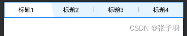
如上图所示,这个模块主要由标题和内容两部分组成,乍一看好像也没有什么难的,相信不少人马上就想到了解决的办法,比如最经典的TabLayout+ViewPager,如果这个图的标题固定,且标题的选中背景–就是上图中打车的样式的白色底图是正好占整个TabLayout的宽度的一半的时候,我们当然可以这样实现。
但在我们这次的需求中,我们选中时的背景的宽度不是这样的(如果是这么简单的话,怎么能展现UI设计师的实力呢 ),我们这次的需求如下图所示,可以发现选中标题1时的背景的弧形部分有一半在标题2的内容中:
根据上图我们可以提炼出三个具体的需求:
1、标题的数目在2-4个之间变换(不要问这个需求是怎么提炼出来的 )
2、标题选中时的背景分三种情况:
当选中的标题是最左边时:选中的背景对右边的标题有侵占;
当选中的标题是中间时:选中的背景对左右两边的标题都有侵占;
当选中的标题是最右边时:选中的背景对左边的标题有侵占;
以及压死Android开发的最后一个需求:
3、标题要和下面内容的滑动有联动效果
二、分析需求
现在我们分析下这个需求,我最先想到了两种实现方式:
1.使用常规的TabLayout+ViewPager来实现
我首先用这个方法简单写了一下,发现对于上面的需求二基本没有办法实现,TabLayout的指示器宽度最大只能等于每个均分的title,没有办法侵入其他标题,所以首先排除这种写法。
2、使用自定义View
我们可以将几个TextView拼接组成标题,再在这几个TextView下设置一个ImageView充当指示器(即背景),这样做的好处是,指示器的宽度可以由我们控制,使用约束布局,我们可以很轻易的做到背景侵入其他title,但这样的写法缺点也同样明显,首先是title数目的变化逻辑,滑动逻辑都由我们来控制,这样复杂的逻辑不利于后续扩展,且容易写出Bug,其次是我实现的效果不够流畅,且不能满足需求三,所以我也放弃了这种写法。(其实做完这个需求后,我对TabLayout的实现逻辑有了更多的理解,仔细想想这样写应该也能实现全部的需求)
关于第二中方法不是本次的重点,下面贴下我写的demo的代码(没有完全实现需求的版本),感兴趣的朋友可以看下:
<?xml version="1.0" encoding="utf-8"?>
<androidx.constraintlayout.widget.ConstraintLayout xmlns:android="http://schemas.android.com/apk/res/android"
    xmlns:app="http://schemas.android.com/apk/res-auto"
    xmlns:tools="http://schemas.android.com/tools"
    android:id="@+id/cl_main"
    android:layout_width="match_parent"
    android:layout_height="36dp"
    android:background="@drawable/shape_1a0c92ff_8_top">

    <ImageView
        android:id="@+id/iv_title_bg_left"
        android:layout_width="22dp"
        android:layout_height="36dp"
        android:background="@drawable/icon_left"
        app:layout_constraintBottom_toBottomOf="parent"
        app:layout_constraintEnd_toStartOf="@id/tv_title_bg"
        app:layout_constraintTop_toTopOf="parent" />

    <TextView
        android:id="@+id/tv_title_bg"
        android:layout_width="0dp"
        android:layout_height="0dp"
        android:background="@drawable/shape_ffffff_8_top_left"
        app:layout_constraintBottom_toBottomOf="parent"
        app:layout_constraintEnd_toEndOf="@id/tv_title_text1"
        app:layout_constraintStart_toStartOf="@id/tv_title_text1"
        app:layout_constraintTop_toTopOf="parent" />

    <ImageView
        android:id="@+id/iv_title_bg_right"
        android:layout_width="22dp"
        android:layout_height="36dp"
        android:background="@drawable/icon_right"
        app:layout_constraintBottom_toBottomOf="parent"
        app:layout_constraintStart_toEndOf="@id/tv_title_bg"
        app:layout_constraintTop_toTopOf="parent" />


    <TextView
        android:id="@+id/tv_title_text1"
        android:layout_width="0dp"
        android:layout_height="match_parent"
        android:gravity="center"
        android:text="标题1"
        android:textColor="@color/black"
        android:textSize="14sp"
        app:layout_constraintEnd_toStartOf="@id/v_title_divider1"
        app:layout_constraintHorizontal_chainStyle="spread"
        app:layout_constraintStart_toStartOf="parent"
        app:layout_constraintTop_toTopOf="parent" />

    <View
        android:id="@+id/v_title_divider1"
        android:layout_width="1dp"
        android:layout_height="12dp"
        android:background="#4D124C7B"
        android:visibility="gone"
        app:layout_constraintBottom_toBottomOf="parent"
        app:layout_constraintEnd_toStartOf="@id/tv_title_text2"
        app:layout_constraintStart_toEndOf="@id/tv_title_text1"
        app:layout_constraintTop_toTopOf="parent" />

    <TextView
        android:id="@+id/tv_title_text2"
        android:layout_width="0dp"
        android:layout_height="match_parent"
        android:gravity="center"
        android:text="标题2"
        android:textColor="@color/black"
        android:textSize="14sp"
        app:layout_constraintEnd_toStartOf="@id/v_title_divider2"
        app:layout_constraintStart_toEndOf="@id/v_title_divider1"
        app:layout_constraintTop_toTopOf="parent" />

    <View
        android:id="@+id/v_title_divider2"
        android:layout_width="1dp"
        android:layout_height="12dp"
        android:background="#4D124C7B"
        app:layout_constraintBottom_toBottomOf="parent"
        app:layout_constraintEnd_toStartOf="@id/tv_title_text3"
        app:layout_constraintStart_toEndOf="@id/tv_title_text2"
        app:layout_constraintTop_toTopOf="parent" />

    <TextView
        android:id="@+id/tv_title_text3"
        android:layout_width="0dp"
        android:layout_height="match_parent"
        android:gravity="center"
        android:text="标题3"
        android:textColor="@color/black"
        android:textSize="14sp"
        app:layout_constraintEnd_toStartOf="@id/v_title_divider3"
        app:layout_constraintStart_toEndOf="@id/v_title_divider2"
        app:layout_constraintTop_toTopOf="parent" />

    <View
        android:id="@+id/v_title_divider3"
        android:layout_width="1dp"
        android:layout_height="12dp"
        android:background="#4D124C7B"
        app:layout_constraintBottom_toBottomOf="parent"
        app:layout_constraintEnd_toStartOf="@id/tv_title_text4"
        app:layout_constraintStart_toEndOf="@id/tv_title_text3"
        app:layout_constraintTop_toTopOf="parent" />

    <TextView
        android:id="@+id/tv_title_text4"
        android:layout_width="0dp"
        android:layout_height="match_parent"
        android:gravity="center"
        android:text="标题4"
        android:textColor="@color/black"
        android:textSize="14sp"
        app:layout_constraintEnd_toEndOf="parent"
        app:layout_constraintStart_toEndOf="@id/v_title_divider3"
        app:layout_constraintTop_toTopOf="parent" />
</androidx.constraintlayout.widget.ConstraintLayout>
class CardPackTypeView @JvmOverloads constructor(
    context: Context,
    attrs: AttributeSet? = null,
    defStyle: Int = 0
) : ConstraintLayout(context, attrs, defStyle) {
    private var text1: TextView
    private var text2: TextView
    private var text3: TextView
    private var text4: TextView
    private var divider1: View
    private var divider2: View
    private var divider3: View
    private var bg_left: ImageView
    private var bg_middle: TextView
    private var bg_right: ImageView
    private var main: ConstraintLayout

    init {
        val inflater = LayoutInflater.from(context).inflate(R.layout.layout_title_item_text, this)
        text1 = inflater.findViewById(R.id.tv_title_text1)
        text2 = inflater.findViewById(R.id.tv_title_text2)
        text3 = inflater.findViewById(R.id.tv_title_text3)
        text4 = inflater.findViewById(R.id.tv_title_text4)
        divider1 = inflater.findViewById(R.id.v_title_divider1)
        divider2 = inflater.findViewById(R.id.v_title_divider2)
        divider3 = inflater.findViewById(R.id.v_title_divider3)
        bg_left = inflater.findViewById(R.id.iv_title_bg_left)
        bg_middle = inflater.findViewById(R.id.tv_title_bg)
        bg_right = inflater.findViewById(R.id.iv_title_bg_right)
        main = inflater.findViewById(R.id.cl_main)
        text1.setOnClickListener {
            setBackgroundLayout(R.id.tv_title_text1)
            divider1.visibility = View.INVISIBLE
            divider2.visibility = View.VISIBLE
            divider3.visibility = View.VISIBLE
            bg_middle.setBackgroundResource(R.drawable.shape_ffffff_8_top_left)
        }
        text2.setOnClickListener {
            setBackgroundLayout(R.id.tv_title_text2)
            divider1.visibility = View.INVISIBLE
            divider2.visibility = View.INVISIBLE
            divider3.visibility = View.VISIBLE
            bg_middle.setBackgroundColor(Color.parseColor("#ffffff"))
        }
        text3.setOnClickListener {
            setBackgroundLayout(R.id.tv_title_text3)
            divider1.visibility = View.VISIBLE
            divider2.visibility = View.INVISIBLE
            divider3.visibility = View.INVISIBLE
            bg_middle.setBackgroundColor(Color.parseColor("#ffffff"))
        }
        text4.setOnClickListener {
            setBackgroundLayout(R.id.tv_title_text4)
            divider1.visibility = View.VISIBLE
            divider2.visibility = View.VISIBLE
            divider3.visibility = View.INVISIBLE
            bg_middle.setBackgroundResource(R.drawable.shape_ffffff_8_top_right)
        }
    }

    private fun setLeftBackground() {
        bg_left.visibility = View.GONE
        bg_middle.visibility = View.VISIBLE
        bg_right.visibility = View.VISIBLE
    }

    private fun setMiddleBackground() {
        bg_left.visibility = View.VISIBLE
        bg_middle.visibility = View.VISIBLE
        bg_right.visibility = View.VISIBLE
    }

    private fun setRightBackground() {
        bg_left.visibility = View.VISIBLE
        bg_middle.visibility = View.VISIBLE
        bg_right.visibility = View.GONE
    }

    fun setData() {

    }

    private fun setBackgroundLayout(view: Int) {
        val constraintSet = ConstraintSet()
        constraintSet.clone(main)
        constraintSet.connect(R.id.tv_title_bg, ConstraintSet.START, view, ConstraintSet.START)
        constraintSet.connect(R.id.tv_title_bg, ConstraintSet.END, view, ConstraintSet.END)
        TransitionManager.beginDelayedTransition(main)
        when (view) {
            R.id.tv_title_text1 -> setLeftBackground()
            R.id.tv_title_text4 -> setRightBackground()
            else -> setMiddleBackground()
        }
        constraintSet.applyTo(main)
    }
}
在确定这两种方法都不能实现我的需求后,我开始在网上查找开源项目,然后发现了MagicIndicator这个开源项目,GitHub地址如下:https://github.com/hackware1993/MagicIndicator 作者也有自己的介绍博客,这里我给出第一篇的地址:MagicIndicator系列之一 —— 使用MagicIndicator打造千变万化的ViewPager指示器,接下来我们将使用这个框架来实现上面的需求,建议不了解这个框架的朋友先去看下作者的技术博客,方便阅读下文,我这里只简单介绍下MagicIndicator的自定义每个title部分。
三、自定义MagicIndicator
作者给我们提供了多种自定义MagicIndicator的方法,详情可看:MagicIndicator系列之三 —— MagicIndicator原理浅析及扩展MagicIndicator的4种方式,我们这里采用第四种使用 CommonPagerTitleView 加载自定义布局。
使用这种模式,我们可以将整个指示器看成一个个小的自定义View,而每个自定义View又包括展示在上层的文本部分,和文本下面的指示器部分,通过MagicIndicator的Adapter提供的**getTitleView()和getIndicator()**方法,我们可以分别自定义这两个部分,实现真正的千变万化。
四、使用MagicIndicator自定义我们的指示器
首先,我们先引入下所需的依赖:
implementation 'com.github.hackware1993:MagicIndicator:1.7.0'
然后我们先定义一个简单的页面,包括一个ViewPager和一个MagicIndicator:
<?xml version="1.0" encoding="utf-8"?>
<androidx.constraintlayout.widget.ConstraintLayout xmlns:android="http://schemas.android.com/apk/res/android"
    xmlns:app="http://schemas.android.com/apk/res-auto"
    xmlns:tools="http://schemas.android.com/tools"
    android:layout_width="match_parent"
    android:layout_height="match_parent"
    tools:context=".MainActivity">

    <net.lucode.hackware.magicindicator.MagicIndicator
        android:id="@+id/indicator"
        android:layout_width="match_parent"
        android:layout_height="30dp"
        app:layout_constraintTop_toTopOf="parent"
        android:background="#0C92ff"/>

    <androidx.viewpager.widget.ViewPager
        android:id="@+id/viewpager"
        android:layout_width="match_parent"
        android:layout_height="0dp"
        app:layout_constraintBottom_toBottomOf="parent"
        app:layout_constraintTop_toBottomOf="@id/indicator" />

</androidx.constraintlayout.widget.ConstraintLayout>
因为是作为总结博客,所以我这里剔除掉网络请求的部分,改为把数据写死,在MainActivity文件创建两个数组:
private val titles = arrayListOf("标题1", "标题2", "标题3", "标题4")
private val content = arrayListOf("标题1的内容", "标题2的内容", "标题3的内容", "标题4的内容")
然后是老生常谈的获取控件:
private var viewPager: ViewPager? = null
private var indicator: MagicIndicator? = null
override fun onCreate(savedInstanceState: Bundle?) {
    super.onCreate(savedInstanceState)
    setContentView(R.layout.activity_main)
    initView()
}

private fun initView() {
    viewPager = findViewById(R.id.viewpager)
    indicator = findViewById(R.id.indicator)
}
获取到控件后,我们来设置一下MagicIndicator:
    private fun setMagicIndicator() {
        val commonNavigator: CommonNavigator = CommonNavigator(this)
        commonNavigator.adapter = viewPager?.let {
            MagicIndicatorAdapter(
                titles,
                it
            )
        }
        commonNavigator.isAdjustMode = true
        indicator?.navigator = commonNavigator
        ViewPagerHelper.bind(indicator, viewPager)
    }
这是MagicIndicator的基础用法,这里几个重要的地方是:
1、commonNavigator.isAdjustMode = true
这是MagicIndicator的自适应模式,适用于数目固定的、少量的title,这里我们将其设置为true,使MagicIndicator充满我们设置的宽度,且不会滚动。
2、ViewPagerHelper.bind(indicator, viewPager)
这里是将MagicIndicator和ViewPager绑定,使他们能实现联动。
3、MagicIndicatorAdapter
这是我为了实现想要的效果,自定义了一个Adapter,它的代码如下:
class MagicIndicatorAdapter(
    data: List<String>,
    viewPager: ViewPager
) : CommonNavigatorAdapter() {
    val mData = data
    val mViewPager = viewPager

    override fun getCount(): Int {
        return mData.size
    }

    override fun getTitleView(context: Context?, index: Int): IPagerTitleView {
        val commonPagerTitleView = CommonPagerTitleView(context)
        commonPagerTitleView.setContentView(R.layout.item_tab_view)
        val tabTitle = commonPagerTitleView.findViewById<View>(R.id.tv_tab_text) as TextView
        tabTitle.text = (mData[index])

        commonPagerTitleView.setOnClickListener {
            mViewPager.currentItem = index
        }

        commonPagerTitleView.onPagerTitleChangeListener = object : OnPagerTitleChangeListener {
            override fun onSelected(index: Int, totalCount: Int) {
                tabTitle.setTextColor(Color.BLACK)
            }

            override fun onDeselected(index: Int, totalCount: Int) {
                tabTitle.setTextColor(Color.parseColor("#124C7B"))
            }

            override fun onLeave(index: Int, totalCount: Int, leavePercent: Float, leftToRight: Boolean) {

            }

            override fun onEnter(index: Int, totalCount: Int, enterPercent: Float, leftToRight: Boolean) {

            }
        }

        return commonPagerTitleView
    }

    override fun getIndicator(context: Context): IPagerIndicator {
        val cardPackIndicator = CardPackIndicator(context)
        cardPackIndicator.lineHeight = context.resources.getDimension(R.dimen.common_navigator_height)
        cardPackIndicator.xOffset = context.resources.getDimension(R.dimen.common_navigator_offset)
        return cardPackIndicator
    }
}
我们可以看到,这个adapter大体上和ViewPager的Adapter的方法差不多,重要的是如下几个部分:
 override fun getTitleView(context: Context?, index: Int): IPagerTitleView {
        val commonPagerTitleView = CommonPagerTitleView(context)
        commonPagerTitleView.setContentView(R.layout.item_tab_view)
        val tabTitle = commonPagerTitleView.findViewById<View>(R.id.tv_tab_text) as TextView
        tabTitle.text = (mData[index])

        commonPagerTitleView.setOnClickListener {
            mViewPager.currentItem = index
        }

		//设置滑动监听器
        commonPagerTitleView.onPagerTitleChangeListener = object : OnPagerTitleChangeListener {
        	//当选中title时
            override fun onSelected(index: Int, totalCount: Int) {
                tabTitle.setTextColor(Color.BLACK)
            }

			//当没有选中title时
            override fun onDeselected(index: Int, totalCount: Int) {
                tabTitle.setTextColor(Color.parseColor("#124C7B"))
            }

			//当离开title的范围时
            override fun onLeave(index: Int, totalCount: Int, leavePercent: Float, leftToRight: Boolean) {

            }

			//当进入title的范围时
            override fun onEnter(index: Int, totalCount: Int, enterPercent: Float, leftToRight: Boolean) {

            }
        }

        return commonPagerTitleView
    }
这里我简单自定义了一个title的样式,xml文件如下:
<?xml version="1.0" encoding="utf-8"?>
<androidx.constraintlayout.widget.ConstraintLayout xmlns:android="http://schemas.android.com/apk/res/android"
    xmlns:app="http://schemas.android.com/apk/res-auto"
    android:layout_width="match_parent"
    android:layout_height="match_parent">

    <TextView
        android:id="@+id/tv_tab_text"
        android:layout_width="match_parent"
        android:layout_height="36dp"
        android:gravity="center"
        android:text="标题1"
        android:textColor="#124C7B"
        android:textSize="14sp"
        app:layout_constraintTop_toTopOf="parent" />
</androidx.constraintlayout.widget.ConstraintLayout>
然后是getIndicator()方法,这里我为了实现指示器侵占内容,自定义了一个自己的Indicator,代码如下:
public class CardPackIndicator extends View implements IPagerIndicator {

    // 控制动画
    private Interpolator mStartInterpolator = new LinearInterpolator();
    private Interpolator mEndInterpolator = new LinearInterpolator();
    private float mXOffset;
    private float mLineHeight;

    private Paint mPaint;
    private List<PositionData> mPositionDataList;

    private Drawable leftBitmap;
    private Drawable middleBitmap;
    private Drawable rightBitmap;
    private Drawable currentDrawable;

    public CardPackIndicator(Context context) {
        super(context);
        init(context);
    }

    private void init(Context context) {
        mPaint = new Paint(Paint.ANTI_ALIAS_FLAG);
        mPaint.setStyle(Paint.Style.FILL);
        mPaint.setColor(Color.WHITE);
        //这里在初始化的时候加载了三个图片当作背景,
       //为了在title数目变化时背景依旧可以使用,这里将这三张图片画成了点9图
        leftBitmap = ContextCompat.getDrawable(context, R.drawable.icon_left);
        middleBitmap = ContextCompat.getDrawable(context, R.drawable.icon_middle);
        rightBitmap = ContextCompat.getDrawable(context, R.drawable.icon_right);
    }

    @Override
    protected void onDraw(Canvas canvas) {
        if (currentDrawable != null) {
            // 绘制缩放后的图片
            currentDrawable.draw(canvas);
        }
    }

	//在使用过程中,发现原本的判断逻辑有些问题,导致向右滑动时变化指示器图片变化不及时
	//所以我在这里自己进行判断,保证变换及时
    double offset = 0;
    double oldOffset = 0;

    @Override
    public void onPageScrolled(int position, float positionOffset, int positionOffsetPixels) {
    //这里可以理解为判断title的数量是否可以使用指示器
        if (mPositionDataList == null || mPositionDataList.isEmpty() || mPositionDataList.size() < 2) {
            return;
        }

        //通过输出Log发现positionOffset在滑动时呈0-1的线性变换
        //即从左向右滑动positionOffset从0-1,从右向左滑动positionOffset从1-0
        if (offset != positionOffset) {
            oldOffset = offset;
            offset = positionOffset;
        }
        int auxiliaryPosition = position;
        if (oldOffset != 0 && offset != 0) {
            if (oldOffset > offset) {
                //向左滑
            }
            if (oldOffset < offset) {
                //向右滑
                if (auxiliaryPosition < mPositionDataList.size() - 1) {
                    auxiliaryPosition = position + 1;
                }
            }
        }

        // 计算锚点位置
        PositionData current = FragmentContainerHelper.getImitativePositionData(mPositionDataList, position);
        PositionData next = FragmentContainerHelper.getImitativePositionData(mPositionDataList, position + 1);

		//这里通过MagicIndiator提供的FragmentContainerHelper.getImitativePositionData方法获取当前和下一个title的位置
		//然后计算出他们在X和Y轴的实际位置,然后通过mXOffset改变他们的位置实现侵占其他title的内容
        float leftX;
        float nextLeftX;
        float rightX;
        float nextRightX;
        if (position == 0) {
            leftX = current.mLeft;
            rightX = current.mRight + mXOffset;
        } else {
            if (position == mPositionDataList.size() - 1) {
                leftX = current.mLeft - mXOffset;
                rightX = current.mRight;
            } else {
                leftX = current.mLeft - mXOffset;
                rightX = current.mRight + mXOffset;
            }
        }
        int nextPosition = position + 1;
        if (nextPosition == mPositionDataList.size() - 1) {
            nextLeftX = next.mLeft - mXOffset;
            nextRightX = next.mRight;
        } else {
            if (nextPosition == 0) {
                nextLeftX = next.mLeft;
            } else {
                nextLeftX = next.mLeft - mXOffset;
            }
            nextRightX = next.mRight + mXOffset;
        }


        if (auxiliaryPosition == 0) {
            currentDrawable = leftBitmap;
        } else if (auxiliaryPosition == mPositionDataList.size() - 1) {
            currentDrawable = rightBitmap;
        } else {
            currentDrawable = middleBitmap;
        }
        //这里使用mStartInterpolator.getInterpolation获取偏移量,实现在滑动时实时获取当前指示器的位置
        float left = leftX + (nextLeftX - leftX) * mStartInterpolator.getInterpolation(positionOffset);
        float right = rightX + (nextRightX - rightX) * mEndInterpolator.getInterpolation(positionOffset);
        // 计算 Bitmap 对象的矩形区域
        currentDrawable.setBounds((int) left, 0, (int) right, getHeight());
        invalidate();
    }

    @Override
    public void onPageSelected(int position) {
    }

    @Override
    public void onPageScrollStateChanged(int state) {
    }

    @Override
    public void onPositionDataProvide(List<PositionData> dataList) {
        mPositionDataList = dataList;
    }

    public float getLineHeight() {
        return mLineHeight;
    }

    public void setLineHeight(float lineHeight) {
        mLineHeight = lineHeight;
    }

    public float getXOffset() {
        return mXOffset;
    }

    public void setXOffset(float xOffset) {
        mXOffset = xOffset;
    }


    public Paint getPaint() {
        return mPaint;
    }


    public Interpolator getStartInterpolator() {
        return mStartInterpolator;
    }

    public void setStartInterpolator(Interpolator startInterpolator) {
        mStartInterpolator = startInterpolator;
        if (mStartInterpolator == null) {
            mStartInterpolator = new LinearInterpolator();
        }
    }

    public Interpolator getEndInterpolator() {
        return mEndInterpolator;
    }

    public void setEndInterpolator(Interpolator endInterpolator) {
        mEndInterpolator = endInterpolator;
        if (mEndInterpolator == null) {
            mEndInterpolator = new LinearInterpolator();
        }
    }
}
写完这些代码后,我们就基本完成了这个功能,接下来我们回到MainActivity简单设置下ViewPager:
    private fun initSmartPlanViewPager() {
        contents.apply {
            viewPager?.offscreenPageLimit = size
            viewPager?.adapter = null

            viewPager?.addOnPageChangeListener(object : ViewPager.OnPageChangeListener {
                override fun onPageScrolled(
                    position: Int,
                    positionOffset: Float,
                    positionOffsetPixels: Int
                ) {
                    indicator?.onPageScrolled(position, positionOffset, positionOffsetPixels)
                }

                override fun onPageSelected(position: Int) {
                    indicator?.onPageSelected(position)
                }

                override fun onPageScrollStateChanged(state: Int) {
                    indicator?.onPageScrollStateChanged(state)
                }

            })
            viewPager?.adapter = object : PagerAdapter() {
                override fun getCount(): Int {
                    return size
                }

                override fun isViewFromObject(view: View, `object`: Any): Boolean {
                    return view == `object`
                }

                override fun instantiateItem(container: ViewGroup, position: Int): Any {
                    val view = TextView(this@MainActivity)
                    view.text = contents[position]
                    container.addView(view)
                    return view
                }

                override fun getPageTitle(position: Int): CharSequence {
                    return titles[position]
                }

                override fun getItemPosition(`object`: Any): Int {
                    return POSITION_NONE
                }

            }
        }
    }
并在MainActivity的onCreate()方法中调用这两个方法就大功告成了:
    override fun onCreate(savedInstanceState: Bundle?) {
        super.onCreate(savedInstanceState)
        setContentView(R.layout.activity_main)
        initView()
        setMagicIndicator()
        initSmartPlanViewPager()
    }
五、总结
通过这次实践,我们可以发现MagicIndicator确实可以实现千变万化,但是其还是有一些缺点,比如上面的右滑问题,还有Adapter的onPagerTitleChangeListener 监听器的onSelected方法会在初始化时触发多次,但是瑕不掩瑜,在定制一些自定义的指示器时还是非常好用的。


 1万+
1万+


 被折叠的 条评论
为什么被折叠?
被折叠的 条评论
为什么被折叠?
 到【灌水乐园】发言


