


 文章介绍了如何利用v-scale-screen组件在Vue2和Vue3中实现大屏项目的自适应布局,包括宽度、高度和宽高比例的自适应。同时提供了手动编写适配代码的方法,通过调整元素比例和窗口缩放事件处理来保持内容显示效果。
一、利用依赖 v-scale-screen
参考链接 https://github.com/Alfred-Skyblue/v-scale-screen
大屏自适应容器组件,可用于大屏项目开发,实现屏幕自适应,可根据宽度自适应,高度自适应,和宽高等比例自适应,全屏自适应(会存在拉伸问题)
下载依赖
vue2请使用1.x版本,vue3请使用2.0以上以上版本
npm install v-scale-screen # or yarn add v-scale-screen
vue中的导出
在vue2中使用插件方式导出,故而需要 Vue.use() 进行注册
// main.js
import Vue from "vue";
import VScaleScreen from 'v-scale-screen'
Vue.use(VScaleScreen)
vue3中以组件方式导出
<template>
  <v-scale-screen width="1920" height="1080">
    <div>
      <v-chart>....</v-chart>
      <v-chart>....</v-chart>
      <v-chart>....</v-chart>
      <v-chart>....</v-chart>
      <v-chart>....</v-chart>
    </div>
  </v-scale-screen>
</template>

<script>
import { defineComponent } from "vue"
import VScaleScreen from 'v-scale-screen'

export default defineComponent({
  name:'Demo',
  components:{
    VScaleScreen
  }
})
</script>
<v-scale-screen>标签包住所有东西
注:使用时请将 body 样式设置为 overflow: hidden;
注:使用时请将 body 样式设置为 overflow: hidden;
注:使用时请将 body 样式设置为 overflow: hidden;
<template>
  <div class="body">
    <v-scale-screen width="1920" height="1080">
      <MonitorTop></MonitorTop>
      <div class="content">
        <MonitorLeft></MonitorLeft>
        <MonitorCenter></MonitorCenter>
        <MonitorRight></MonitorRight>
        </div>
    </v-scale-screen>
  </div>
</template>
<style lang="scss" scoped>
.body {
  position: relative;
  background-position: center center;
  background-size: cover;
  background-attachment: fixed;
  height: 100vh;
  width: 100vw;
  overflow:hidden;  //划重点
}
</style>
二、手动写适配
参考文章https://juejin.cn/post/6966103143402700837
目录结构:
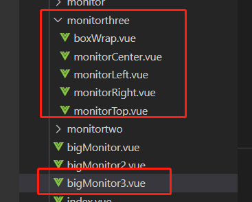
父组件 bigMonitor3.vue
<template>
  <div class="body">
    <boxWrap>
      <MonitorTop></MonitorTop>
      <div class="content">
        <MonitorLeft></MonitorLeft>
        <MonitorCenter></MonitorCenter>
        <MonitorRight></MonitorRight>
      </div>
    </boxWrap>
  </div>
</template>
<style lang="scss" scoped>
.body {
  position: relative;
  background-position: center center;
  background-size: cover;
  background-attachment: fixed;
  height: 100vh; //划重点
  width: 100vw; //划重点
}
</style>
<script>
import MonitorTop from "./monitorthree/monitorTop";
import MonitorLeft from "./monitorthree/monitorLeft";
import MonitorCenter from "./monitorthree/monitorCenter";
import MonitorRight from "./monitorthree/monitorRight";
import boxWrap from "./monitorthree/boxWrap";
export default {
components: { MonitorTop, MonitorLeft, MonitorCenter, MonitorRight, boxWrap },
};
</script>
<style lang="scss" scoped>
.body {
position: relative;
background-position: center center;
background-size: cover;
background-attachment: fixed;
height: 100vh; //划重点
width: 100vw; //划重点
}
</style>子组件 boxWrap.vue
<template>
  <div
    class="ScreenAdapter"
    :style="style"
  >
    <slot />
  </div>
</template>
<script>
export default {
name: '',
//参数注入
props: {
width: {
type: String,
default: '1920'
},
height: {
type: String,
default: '1080'
}
},
data() {
return {
style: {
width: this.width + 'px',
height: this.height + 'px',
transform: 'scale(1) translate(-50%, -50%)'
}
}
},
mounted() {
this.setScale()
window.onresize = this.Debounce(this.setScale, 1000)
},
methods: {
Debounce: (fn, t) => {
const delay = t || 500
let timer
return function() {
const args = arguments
if (timer) {
clearTimeout(timer)
}
const context = this
timer = setTimeout(() => {
timer = null
fn.apply(context, args)
}, delay)
}
},
// 获取放大缩小比例
getScale() {
const w = window.innerWidth / this.width
const h = window.innerHeight / this.height
return w < h ? w : h
},
// 设置比例
setScale() {
this.style.transform = 'scale(' + this.getScale() + ') translate(-50%, -50%)'
console.log('任你千变万化,我都不会影响性能')
}
}
}
</script>
<style lang="scss" scoped>
.ScreenAdapter {
transform-origin: 0 0;
position: absolute;
left: 50%;
top: 50%;
transition: 0.3s;
// background: red;
}
</style>


 扫一扫
扫一扫


 1231
1231

 被折叠的 条评论
为什么被折叠?
被折叠的 条评论
为什么被折叠?
 到【灌水乐园】发言


