


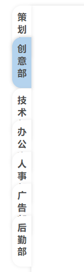
图片演示
HTML代码
每个选择项是一个单独的元素
根据叠加顺序规定层级 后勤部元素z-index = 7
除第一个元素外 每个块都向上偏移30个像素
点击元素块时调用函数 将顺序作为参数传入
<!-- 实际应用时使用数组进行for循环渲染 -->
<div class="selector">
	<div class="items" style="z-index: 1;margin-top: 0;background-color: #B4D3EE;" onclick="onChange(0)">策划部</div>
	<div class="items" style="z-index: 2;" onclick="onChange(1)">创意部</div>
	<div class="items" style="z-index: 3;" onclick="onChange(2)">技术部</div>
	<div class="items" style="z-index: 4;" onclick="onChange(3)">办公室</div>
	<div class="items" style="z-index: 5;" onclick="onChange(4)">人事部</div>
	<div class="items" style="z-index: 6;" onclick="onChange(5)">广告部</div>
	<div class="items" style="z-index: 7;" onclick="onChange(6)">后勤部</div>
</div>
CSS样式
.content-group .selector .items{
	width: 30px;
	height: 80px;
	border-radius: 15px 0 0 15px;
	font-size: 14px;
	background-color: #fff;
	font-weight: 550;
	text-align: center;
	letter-spacing: 5px;
	padding:5px;
	box-sizing: border-box;
	text-align: center;
	color: rgba(80, 80, 80);
	/* 设置文字竖向 */
	writing-mode: vertical-lr;/*从左向右 从右向左是 writing-mode: vertical-rl;*/
    writing-mode: tb-lr;/*IE浏览器的从左向右 从右向左是 writing-mode: tb-rl;*/
    display: flex;
    justify-content: center;
    align-items: center;
    box-shadow:  0 0 5px 1px rgba(180, 180, 180, 0.2);
    box-shadow-right: none;
    transition: linear 0.5s;/*添加过渡*/
    margin-top: -30px;
    position: relative;/*固定位置方便产生滑动效果*/
}
JS代码
点击元素调用onChange函数
传入当前元素位置
onChange函数调用moveDown函数 获取到所有选项元素块 并根据顺序位置进行循环 通过判断每个元素块和触发函数的元素块的位置关系 改变获取到的元素块的行间样式
利用transform属性 对当前元素的上级元素块进行30像素的偏移 下层元素快恢复0偏移量
利用position relative的性质 每次移动都基于最原始的位置 从而产生瞬移动画的效果
function moveDown(e){
	console.log(e);
	var items = document.getElementsByClassName("items");
	console.log(items);
	for(var i=0;i<items.length;i++){
		if(i < e){
			items[i].style = "background-color: white;";
		}else if(i == e){
			items[i].style = "background-color: #B4D3EE;";
		}else{
			items[i].style = "transform: translate(0,30px);";
		}
		if(i == 0){
			items[i].style = "margin-top: 0;" + items[i].style.cssText;
		}
		console.log(i);
	}
}
function onChange(e){
	moveDown(e);
}
文章转载于:我被鲨鱼瞪了


 1366
1366


 被折叠的 条评论
为什么被折叠?
被折叠的 条评论
为什么被折叠?
 到【灌水乐园】发言


