


<!DOCTYPE html>
<html lang="en">
<head>
<meta charset="UTF-8">
<meta http-equiv="X-UA-Compatible" content="IE=edge">
<meta name="viewport" content="width=device-width, initial-scale=1.0">
<title>使用背景图像属性定义列表样式</title>
</head>
<style>
li:first-child{
font-size: 23px;
/* 清除列表的默认样式 */
background: url(3.jpg) no-repeat left center;
list-style: none;
height: 37px;
line-height: 36px;
padding-left: 34px;
background-size: 23px;
}
li:nth-child(2){ font-size: 23px;
/* 清除列表的默认样式 */
list-style: none;
background: url(0.png) no-repeat left center;
height: 37px;
line-height: 36px;
padding-left: 34px;
background-size: 23px;}
li:nth-child(3){ font-size: 23px;
/* 清除列表的默认样式 */
list-style: none;
height: 37px;
line-height: 36px;
padding-left: 34px;
background: url(7.png) no-repeat left center;
background-size: 23px;}
li:nth-child(4){ font-size: 23px;
/* 清除列表的默认样式 */
list-style: none;
height: 37px;
line-height: 36px;
padding-left: 34px;
background: url(5.png) no-repeat left center;
background-size: 23px;}
</style>
<body>
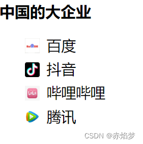
<h2><strong>中国的大企业</strong></h2>
<ul>
<li >百度</li>
<li >抖音</li>
<li >哔哩哔哩</li>
<li >腾讯</li>
</ul>
</body>
</html>


结果:
------------------------这是一条分割线------------------------------------------------
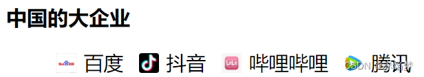
实现上面这种横排效果,只要加上 float:left;和 margin-left: 18px;
------------------------这是一条分割线------------------------------------------------blog.csdnimg.cn/ecf7d05b908e4128a0cafe99dd52bd8d.png#pic_center)
另外:我还发现一个问题:
li元素就算是清除了样式,原来那个小黑点占据的位置依旧还在
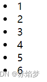
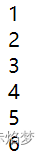
但是,我发现还是不对,如果不写ul元素,清除样式后,小圆点就不会占用位置
所以,问题在于ul元素:
<style>
        li{list-style: none;}
    </style>
</head>
<body>
    <ul style="padding-left: 0;">
        <li>1</li>
        <li>2</li>
        <li>3</li>
        <li>4</li>
        <li>5</li>
        <li>6</li>

    </ul>
清除掉ul的占用:
"<ul style="padding-left: 0;">"
加上这个,就可以让导航栏紧贴这浏览器左边:


 3426
3426


 被折叠的 条评论
为什么被折叠?
被折叠的 条评论
为什么被折叠?
 到【灌水乐园】发言


