


问题描述
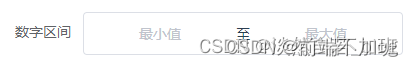
在开发时遇到一个数字区间输入框的需求,如下图:
项目使用的是vue,组件库用的是element UI,但是element UI并没有提供数字区间组件,只提供了InputNumber 计数器输入框,如果用两个计数器输入框进行拼接也能满足需求,但是样式调试起来太过于复杂且不够灵活,不能令人满意,并且该数字区间输入框在其它界面也有这种需求,于是就在element input输入框的基础上自行封装了一个数字区间组件使用。
实现效果
实现效果如下:
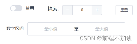
使用方式如下:
<input-number-range :disabled="isDisabled" :precision="num" v-model="value"></input-number-range>
其中disabled属性控制是否禁用,precision属性控制精度默认为0即只能输入整数,v-model双向绑定要传递的值,该值是一个数组类型 [最小值,最大值]
另外该组件只能输入数字,输入其他非数字,或错误数字(多个小数)都会默认为空;在先输入最小值时,如果后输入的最大值小于最小值,则最大值默认为最小值,同理先输入最大值时,如果后输入的最小值大于最大值,则最小值默认为最大值
实现代码
实现代码可以分为两块一块为组件的封装代码,一块为上述实现效果的演示代码
数字区间组件代码
<template>
  <div>
    <div class="input-number-range" :class="{ 'is-disabled': disabled }">
      <div class="flex">
        <div class="from">
          <el-input
            ref="input_from"
            v-model="userInputForm"
            :disabled="disabled"
            placeholder="最小值"
            @blur="handleBlurFrom"
            @focus="handleFocusFrom"
            @input="handleInputFrom"
            @change="handleInputChangeFrom"
          ></el-input>
        </div>
        <div class="center">
          <span>至</span>
        </div>
        <div class="to">
          <el-input
            ref="input_to"
            v-model="userInputTo"
            :disabled="disabled"
            placeholder="最大值"
            @blur="handleBlurTo"
            @focus="handleFocusTo"
            @input="handleInputTo"
            @change="handleInputChangeTo"
          ></el-input>
        </div>
      </div>
    </div>
  </div>
</template>

<script>
export default {
  name: 'InputNumberRange',

  props: {
  	// 初始化范围
    value: { required: true },

    // 是否禁用
    disabled: {
      type: Boolean,
      default: false
    },

    // 精度参数
    precision: {
      type: Number,
      default: 0,
      validator(val) {
        return val >= 0 && val === parseInt(val, 10)
      }
    }
  },

  data() {
    return {
      userInputForm: null,
      userInputTo: null
    }
  },

  watch: {
    value: {
      immediate: true,
      handler(value) {
      	/** 初始化范围 */
        if (value instanceof Array && this.precision !== undefined) {
          this.userInputForm = typeof value[0] === 'number' ? value[0] : null
          this.userInputTo = typeof value[1] === 'number' ? value[1] : null
        }
      }
    }
  },

  methods: {
    // 根据精度保留数字
    toPrecision(num, precision) {
      if (precision === undefined) precision = 0
      return parseFloat(
        Math.round(num * Math.pow(10, precision)) / Math.pow(10, precision)
      )
    },

    handleBlurFrom(event) {
      this.$emit('blurfrom', event)
    },

    handleFocusFrom(event) {
      this.$emit('focusfrom', event)
    },

    handleBlurTo(event) {
      this.$emit('blurto', event)
    },

    handleFocusTo(event) {
      this.$emit('focusto', event)
    },

    handleInputFrom(value) {
      this.$emit('inputfrom', value)
    },

    handleInputTo(value) {
      this.$emit('inputto', value)
    },

    // from输入框change事件
    handleInputChangeFrom(value) {
      // 如果是非数字空返回null
      if (isNaN(value) || value === '') {
        this.$emit('input', [null, this.userInputTo])
        this.$emit('changefrom', this.userInputForm)
        return
      }

      // 初始化数字精度
      this.userInputForm = this.setPrecisionValue(value)

      // 如果from > to 将from值替换成to
      if (typeof this.userInputTo === 'number') {
        this.userInputForm =
          parseFloat(this.userInputForm) <= parseFloat(this.userInputTo)
            ? this.userInputForm
            : this.userInputTo
      }
      this.$emit('input', [this.userInputForm, this.userInputTo])
      this.$emit('changefrom', this.userInputForm)
    },

    // to输入框change事件
    handleInputChangeTo(value) {
      // 如果是非数字空返回null
      if (isNaN(value) || value === '') {
        this.$emit('input', [this.userInputForm, null])
        this.$emit('changefrom', this.userInputTo)
        return
      }

      // 初始化数字精度
      this.userInputTo = this.setPrecisionValue(value)

	  // 如果to < tfrom 将to值替换成from
      if (typeof this.userInputForm === 'number') {
        this.userInputTo =
          parseFloat(this.userInputTo) >= parseFloat(this.userInputForm)
            ? this.userInputTo
            : this.userInputForm
      }
      this.$emit('input', [this.userInputForm, this.userInputTo])
      this.$emit('changeto', this.userInputTo)
    },

    // 设置成精度数字
    setPrecisionValue(value) {
      if (this.precision !== undefined) {
        const val = this.toPrecision(value, this.precision)
        return val
      }
      return null
    }
  }
}
</script>
<style lang="scss" scoped>
// 取消element原有的input框样式
::v-deep .el-input--mini .el-input__inner {
  border: 0px;
  margin: 0;
  padding: 0 15px;
  background-color: transparent;
}
.input-number-range {
  background-color: #fff;
  border: 1px solid #dcdfe6;
  border-radius: 4px;
}
.flex {
  display: flex;
  flex-direction: row;
  width: 100%;
  justify-content: center;
  align-items: center;
  .center {
    margin-top: 1px;
  }
}
.is-disabled {
  background-color: #eef0f6;
  border-color: #e4e7ed;
  color: #c0c4cc;
  cursor: not-allowed;
}
</style>
上述就是完整的组件代码,写好组件代码后,就是在项目中使用,有两种方式,一种是使用时在通过引用进行使用如下:
<template>
  <div>
   <InputNumberRange></InputNumberRange>
  </div>
</template>

<script>
import InputNumberRange from './components/inputNumberRange.vue'
export default {
    name: "XXXX"
    components: {
    InputNumberRange,
  },
  data() {}
}
</script>
另一种方式是在main.js中进行全局组测,这样就可以自由使用标签,如下:
import InputNumberRange from './components/inputNumberRange.vue'
Vue.component(InputNumberRange.name, InputNumberRange)
示例演示代码
<template>
  <div class="main">
    <!-- 演示操作按钮模块 -->
    <div class="caseHeader">
      <div>
        <el-switch
          v-model="isDisabled"
          size="small"
          active-text="禁用"
          @change="switchChange"
        >
        </el-switch>
      </div>
      <div style="display: flex">
        <span>精度:</span>
        <el-input-number
          size="small"
          v-model="num"
          @change="precisionChange"
          :min="0"
          :max="10"
          label="描述文字"
        ></el-input-number>
      </div>
      <div>
        <el-button type="link" size="small" @click="reset">重置</el-button>
      </div>
    </div>
    <!-- 数字区间使用模块 -->
    <div class="numberRange">
      <el-form ref="form" :model="formData" label-width="80px">
        <el-form-item label="数字区间">
          <input-number-range
            :disabled="isDisabled"
            :precision="num"
            v-model="formData.numberRange"
          ></input-number-range>
        </el-form-item>
      </el-form>
    </div>
  </div>
</template>

<script>
export default {
  name: "TestCase",
  data() {
    return {
      isDisabled: false, // 是否禁用
      num: 0, // 精度
      formData: {
        numberRange: [],
      },
    };
  },
  methods: {
    /** 重置方法 */
    reset() {
      this.formData.numberRange = [];
    }
  },
};
</script>

<style lang="scss" scoped>
.main {
  width: 100%;
  margin: 16px;
  position: relative;
}

.numberRange {
  width: 400px;
}

.caseHeader {
  width: 400px;
  display: flex;
  justify-content: space-between;
  margin: 24px;
}
</style>


 4764
4764


 被折叠的 条评论
为什么被折叠?
被折叠的 条评论
为什么被折叠?
 到【灌水乐园】发言


