


QML之轮播效果(两种方法实现)
- 想要实现的效果,我们本章要实现的是酷狗歌单界面中轮播效果,首先展示酷狗特效:

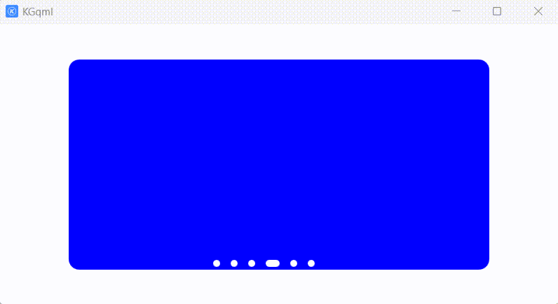
方法一:
首先展示我们的效果:
上代码:
import QtQuick.Window 2.2
import QtQuick.Controls 2.15
import QtQuick 2.15

ApplicationWindow {
    id: window
    width:800
    height: 400
    visible: true
    Rectangle{
        id:view
        width:600
        height:300
        radius:15
        property string lastColor: "red"
        property int lastIndex: 0
        anchors.centerIn: parent
        clip:true
        property int  count: 0
        ListModel{
            id:myLunBoListModel
            ListElement{
                mycolor:"red"
            }
            ListElement{
                mycolor:"green"
            }
            ListElement{
                mycolor:"black"
            }
            ListElement{
                mycolor:"blue"
            }
            ListElement{
                mycolor:"grey"
            }
            ListElement{
                mycolor:"yellow"
            }
        }
        //左边隐藏的矩形向右移动到中间位置,用来模拟点击indicator控件按钮向右移动的动画
        Rectangle{
            id:leftRect
            height: 300
            width: 600
            radius:15
            x:-600
            z:1
            color:myLunBoListModel.get(indicator.currentIndex).mycolor
        }
        PropertyAnimation{
            id: myRightMovingAnimation
            target: leftRect
            duration: 50
            property: "x"
            to: 0
            onFinished: {
                myShowRect.color=myLunBoListModel.get(indicator.currentIndex).mycolor
                leftRect.x=-600
            }
        }

        //控件可视范围内需要显示的矩形
        Rectangle{
            id:myShowRect
            height: 300
            width: 600
            radius:15
            x:0
            z:0
            color:view.lastColor
        }

        //右边隐藏的矩形向左移动到中间位置,用来模拟点击indicator控件按钮向左移动的动画
        Rectangle{
            id:rightRect
            height: 300
            width: 600
            radius:15
            x:600
            z:1
            color:myLunBoListModel.get(indicator.currentIndex).mycolor
        }
        PropertyAnimation{
            id: myLeftMovingAnimation
            target: rightRect
            duration: 50
            property: "x"
            to: 0
            onFinished: {
                myShowRect.color=myLunBoListModel.get(indicator.currentIndex).mycolor
                rightRect.x=600
            }
        }


        //用于监测鼠标进入轮播界面,显示左右移动按钮
        MouseArea{
            z:1
            anchors.fill: parent
            hoverEnabled: true
            onEntered: {
                leftImage.source="qrc:/images/turnLeft0.png";
                rightImage.source="qrc:/images/turnRight0.png";
            }
            onExited: {
                leftImage.source="";
                rightImage.source="";
            }
        }
        //左边按钮
        MouseArea{
            id:leftBtn
            width:20
            height:50
            z:1.5
            hoverEnabled: true
            anchors.left: parent.left
            anchors.verticalCenter: parent.verticalCenter
            onClicked: {
                var idx=indicator.currentIndex-1
                if(idx<0)
                    indicator.currentIndex=myLunBoListModel.count-1
                else
                    indicator.currentIndex=idx
                myLeftMovingAnimation.running=true
                view.lastColor=myLunBoListModel.get(indicator.currentIndex).mycolor
            }
            Image{
                id:leftImage
                anchors.fill: parent
            }
            //加入进入和退出效果
            onEntered: {
                leftImage.source="qrc:/images/turnLeft1.png"
                rightImage.source="qrc:/images/turnRight0.png";
            }
            onExited: {
                leftImage.source=""
                rightImage.source="";
            }
        }
        //右边按钮
        MouseArea{
            id:rightBtn
            width:20
            height:50
            z:1.5
            anchors.right: parent.right
            anchors.verticalCenter: parent.verticalCenter
            hoverEnabled: true
            onClicked: {
                var idx=indicator.currentIndex+1
                if(idx>=myLunBoListModel.count)
                    indicator.currentIndex=0
                else
                    indicator.currentIndex=idx
                myRightMovingAnimation.running=true
                view.lastColor=myLunBoListModel.get(indicator.currentIndex).mycolor
                console.log("当前myCurrentIndex:",indicator.currentIndex,"color: ", view.lastColor)
            }
            //加入进入和退出效果
            onEntered: {
                console.log("进入右键")
                leftImage.source="qrc:/images/turnLeft0.png"
                rightImage.source="qrc:/images/turnRight1.png";
            }
            onExited: {
                console.log("退出右键")
                leftImage.source=""
                rightImage.source="";
            }
            Image{
                id:rightImage
                anchors.fill: parent
            }
        }
    }

    PageIndicator {
        id: indicator
        count: myLunBoListModel.count
        interactive: false
        spacing:15
        width:200
        height:20
        hoverEnabled: true
        //加入鼠标悬浮,显示左右移动按钮效果
        onHoveredChanged: {
            leftImage.source=hovered?"qrc:/images/turnLeft0.png":""
            rightImage.source=hovered?"qrc:/images/turnRight0.png":""
        }
        anchors.bottom: view.bottom
        anchors.horizontalCenter: parent.horizontalCenter
        delegate: Rectangle{
            width:index==indicator.currentIndex?20:10
            height:10
            radius:5
            color:"white"
            MouseArea{
                anchors.fill: parent
                hoverEnabled: true
                onClicked: {
                    console.log("lastIndex:",view.lastIndex,"index:",index)
                    indicator.currentIndex=index
                    if(view.lastIndex<index){
                        myRightMovingAnimation.running=true}
                    else if(view.lastIndex>index){
                        myLeftMovingAnimation.running=true}
                    view.lastIndex=index
                }
            }
        }
    }
}
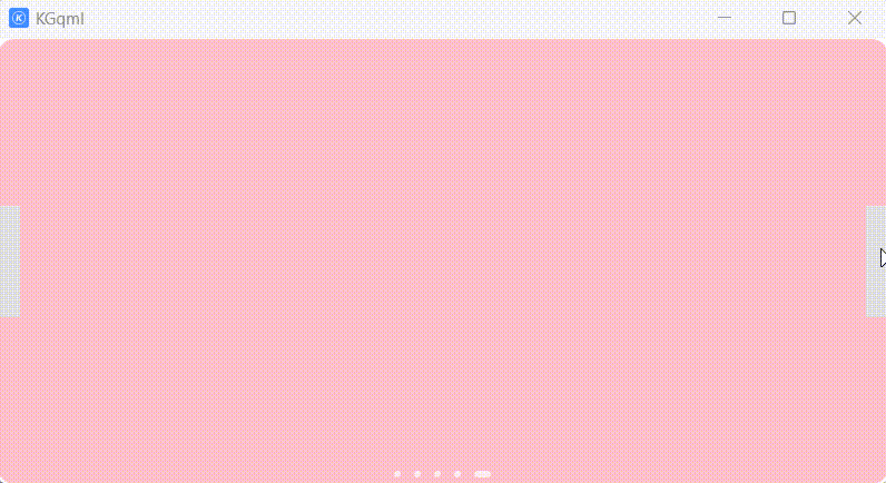
方法二:
效果展示:
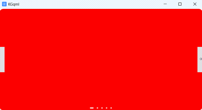
瑕疵是当currentIndex==mySwipeView.count-1时就会出现,如下所示:
import QtQuick.Window 2.2
import QtQuick.Controls 2.15
import QtQuick 2.15

ApplicationWindow {
    id: window
    width:800
    height: 400
    visible: true
    SwipeView {
        id:mySwipeView
        anchors.fill: parent
        currentIndex: myIndicator.currentIndex
        clip:true
        Rectangle{
            color:"red"
            height:190
            width:500
            radius:15
            antialiasing :true
        }
        Rectangle{
            color:"green"
            radius:15
            height:190
            width:500
            antialiasing :true
        }
        Rectangle{
            color:"blue"
            radius:15
            height:190
            width:500
            antialiasing :true
        }
        Rectangle{
            color:"black"
            height:190
            width:500
            radius: 15
        }
        Rectangle{
            color:"pink"
            radius:15
            height:190
            width:500
            antialiasing :true
        }
    }
    Button{
        width:20
        height:100
        anchors.right: parent.right
        anchors.verticalCenter: parent.verticalCenter
        onClicked: {
            var idx=mySwipeView.currentIndex+1
            if(idx<mySwipeView.count)  //其中SwipeView的count值=5
                mySwipeView.currentIndex=idx
            else
                mySwipeView.currentIndex=0
        }
    }
    Button{
        width:20
        height:100
        anchors.left: parent.left
        anchors.verticalCenter: parent.verticalCenter
        onClicked: {
            var idx=mySwipeView.currentIndex-1
            if(idx<0)
                mySwipeView.currentIndex=mySwipeView.count-1
            else
                mySwipeView.currentIndex=idx
        }
    }
    PageIndicator{
        id:myIndicator
        count: mySwipeView.count
        currentIndex: mySwipeView.currentIndex
        interactive: false
        anchors.bottom: mySwipeView.bottom
        anchors.horizontalCenter: parent.horizontalCenter
        spacing:12
        delegate: Rectangle{
            width:myIndicator.currentIndex===index?15:6
            height:6
            radius:3
            color:Qt.rgba(1,1,1,0.7)
            MouseArea{
                anchors.fill: parent
                onClicked:{
                    myIndicator.currentIndex=index
                    mySwipeView.currentIndex=index
                }
            }
        }
    }
}
方法三:
使用PathView亦可实现


 1393
1393


 被折叠的 条评论
为什么被折叠?
被折叠的 条评论
为什么被折叠?
 到【灌水乐园】发言


