


from pyecharts.charts import HeatMap
from pyecharts.render import make_snapshot
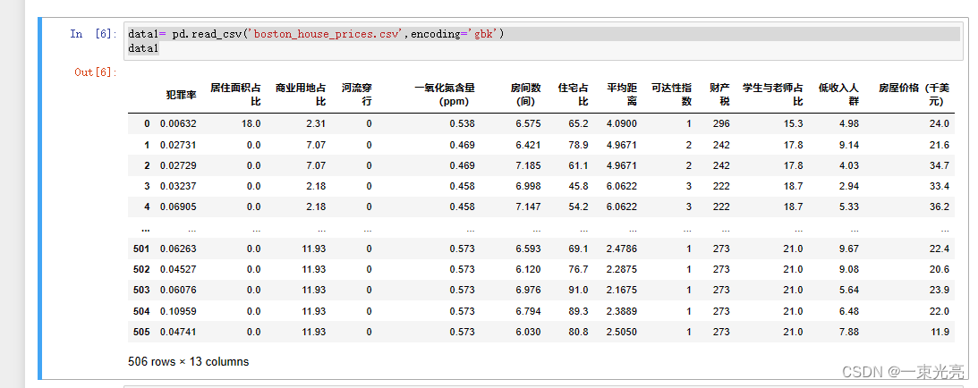
data1= pd.read_csv('boston_house_prices.csv',encoding='gbk')
data1
数据如图所示:
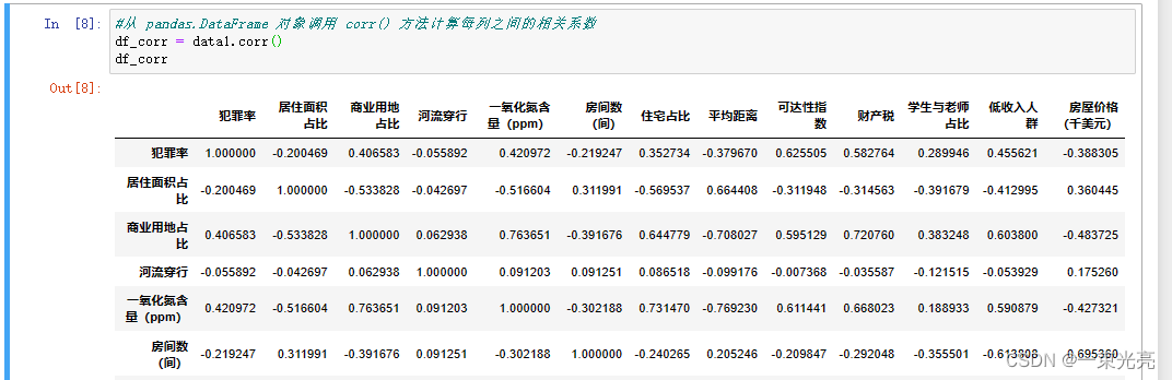
#从 pandas.DataFrame 对象调用 corr() 方法计算每列之间的相关系数
df_corr = data1.corr()
df_corr
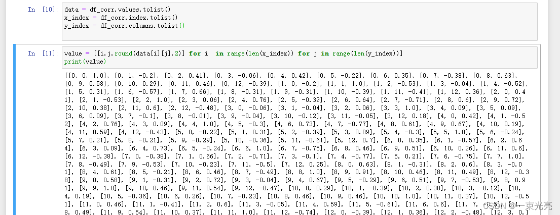
data = df_corr.values.tolist()
x_index = df_corr.index.tolist()
y_index = df_corr.columns.tolist()
value = [[i,j,round(data[i][j],2)] for i  in range(len(x_index)) for j in range(len(y_index))]
print(value)
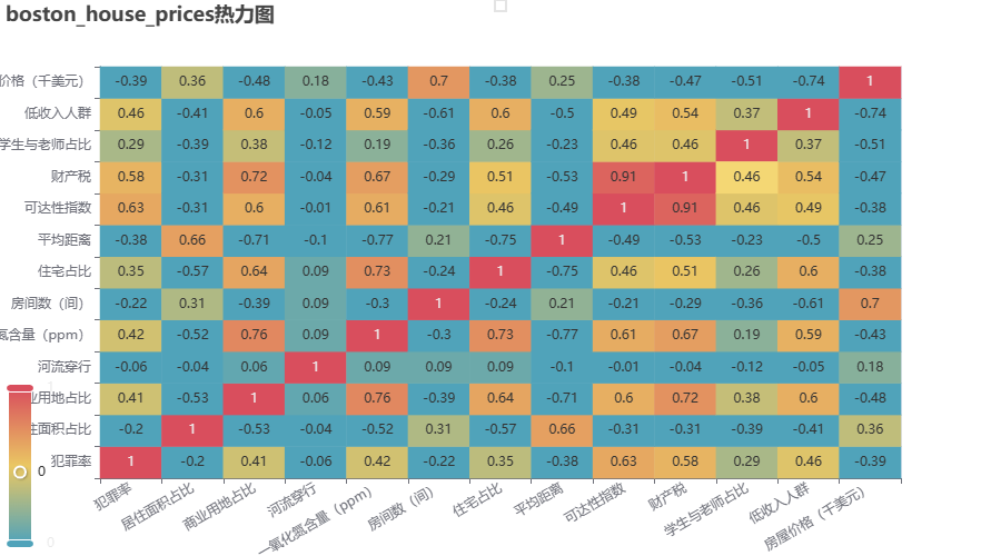
热力图设置
heatmap = HeatMap(init_opts=opts.InitOpts())
heatmap.add_xaxis(y_index)
heatmap.add_yaxis("", x_index, value,label_opts=opts.LabelOpts(is_show=True, position="inside"))
heatmap.set_global_opts( title_opts=opts.TitleOpts(title="boston_house_prices热力图"),
                        visualmap_opts=opts.VisualMapOpts(max_=1),         # 视觉映射配置

                        xaxis_opts=opts.AxisOpts(axislabel_opts=opts.LabelOpts(rotate=30)))      # 将x轴标签旋转
heatmap.render_notebook()
效果如下图所示:
整体代码如下:
import pandas as pd
from pyecharts import options as opts
from pyecharts.charts import HeatMap
from pyecharts.render import make_snapshot
data1= pd.read_csv('boston_house_prices.csv',encoding='gbk')
#从 pandas.DataFrame 对象调用 corr() 方法计算每列之间的相关系数
df_corr = data1.corr()
data = df_corr.values.tolist()
x_index = df_corr.index.tolist()
y_index = df_corr.columns.tolist()
value = [[i,j,round(data[i][j],2)] for i  in range(len(x_index)) for j in range(len(y_index))]
heatmap = HeatMap(init_opts=opts.InitOpts())
heatmap.add_xaxis(y_index)
heatmap.add_yaxis("", x_index, value,label_opts=opts.LabelOpts(is_show=True, position="inside"))
heatmap.set_global_opts( title_opts=opts.TitleOpts(title="boston_house_prices热力图"),
                        visualmap_opts=opts.VisualMapOpts(max_=1),         # 视觉映射配置

                        xaxis_opts=opts.AxisOpts(axislabel_opts=opts.LabelOpts(rotate=30)))      # 将x轴标签旋转
heatmap.render_notebook()


 313
313


 被折叠的 条评论
为什么被折叠?
被折叠的 条评论
为什么被折叠?
 到【灌水乐园】发言


