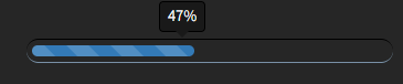
展示图:
css
//进度条
.progress {
    height: 17px;
    background: #262626;
    padding: 3px;
    overflow: visible;
    border-radius: 20px;
    border-top: 1px solid #000;
    border-bottom: 1px solid #7992a8;
    margin-top: 50px;


    .progress-bar {
        border-radius: 20px;
        position: relative;
        animation: animate-positive 2s;
        float: left;
        width: 0;
        height: 100%;
        font-size: 12px;
        line-height: 20px;
        color: #fff;
        text-align: center;
        background-color: #2962f9;
        -webkit-transition: width .6s ease;
        -o-transition: width .6s ease;
        transition: width .6s ease;

    }

    .active {
        animation: reverse stripes 0.40s linear infinite, animate-positive 2s;
    }

    .progress-value {
        display: none;
        padding: 3px 7px;
        font-size: 13px;
        color: #fff;
        border-radius: 4px;
        background: #191919;
        border: 1px solid #000;
        position: absolute;
        top: -40px;
        right: -10px;
    }

    .progress-value:after {
        content: "";
        border-top: 10px solid #191919;
        border-left: 10px solid transparent;
        border-right: 10px solid transparent;
        position: absolute;
        bottom: -6px;
        left: 26%;
    }
}

.progress-bar-striped {
    background-image: -webkit-linear-gradient(45deg, rgba(255, 255, 255, .15) 25%, transparent 25%, transparent 50%, rgba(255, 255, 255, .15) 50%, rgba(255, 255, 255, .15) 75%, transparent 75%, transparent);
    background-image: -o-linear-gradient(45deg, rgba(255, 255, 255, .15) 25%, transparent 25%, transparent 50%, rgba(255, 255, 255, .15) 50%, rgba(255, 255, 255, .15) 75%, transparent 75%, transparent);
    background-image: linear-gradient(45deg, rgba(255, 255, 255, .15) 25%, transparent 25%, transparent 50%, rgba(255, 255, 255, .15) 50%, rgba(255, 255, 255, .15) 75%, transparent 75%, transparent);
    -webkit-background-size: 40px 40px;
    background-size: 40px 40px;
}


@-webkit-keyframes stripes {
    from {
        background-position: 40px 0
    }

    to {
        background-position: 0 0
    }
}

@-o-keyframes stripes {
    from {
        background-position: 40px 0
    }

    to {
        background-position: 0 0
    }
}

@keyframes stripes {
    from {
        background-position: 40px 0
    }

    to {
        background-position: 0 0
    }
}

@-webkit-keyframes animate-positive {
    0% {
        width: 0;
    }
}

@keyframes animate-positive {
    0% {
        width: 0;
    }
}
html
<div class="progress">
	<div class="progress-bar progress-bar-danger progress-bar-striped active" style="width:60%;">
		<div class="progress-value">60%</div>
	</div>
</div>


 1万+
1万+


 被折叠的 条评论
为什么被折叠?
被折叠的 条评论
为什么被折叠?
 到【灌水乐园】发言


