


picker
picker
众所周知 小程序给了一个属性,很好的为我们提供了点击下拉弹出
普通 多列 时间 日期 省市
但是我们要点击获取对应的值如何写
请点击查看

更改picker日期自带的日期格式
但是日期的默认格式为
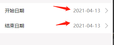
我们如何把默认的变成这种格式嘞

实现效果
在这里插入代码片
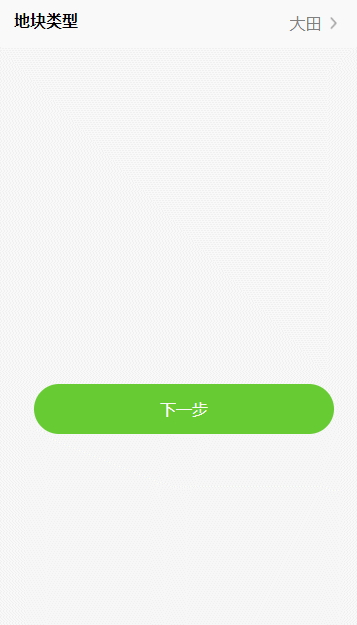
自定义点击选择普通弹出框
上一篇专门讲解这个的请点击
一般要的效果与picker自带的普通弹出框样式不同,这个时候我们要自己造轮子来定义。
如下所示
效果图
代码
wxml
<view class="wrap">
  <view bindtap="showModal">
    <text class="content--text">{{value}}</text>
  </view>
  <!-- modal -->
  <view class="modal modal-bottom-dialog" hidden="{{hideFlag}}">
    <view class="modal-cancel" bindtap="hideModal"></view>
    <view class="bottom-dialog-body bottom-positon" animation="{{animationData}}">
      <!-- -->
      <view class='Mselect'>
        <view wx:for="{{optionList}}" wx:key="unique" data-value='{{item}}' bindtap='getOption'>
          {{item}}
        </view>
      </view>
      <view></view>
      <view class='Mcancel' bindtap='mCancel'>
        <text>取消</text>
      </view>

    </view>
  </view>

</view>
wxss
.content--text input{
  width: 274rpx;
  height: 100rpx;
  text-align: center;
  line-height: 100rpx;
  text-align: center;
  margin-left: 20px;
}
.modal-cancel {
  position: absolute;
  z-index: 2000;
  top: 0;
  right: 0;
  bottom: 0;
  left: 0;
  background: rgba(0, 0, 0, 0.3);
}
.bottom-dialog-body {
  width: 100%;
  position: absolute;
  z-index: 3000;
  bottom: 0;
  left: 0;
  background: #dfdede;
}

/*动画前初始位置*/
.bottom-positon {
  -webkit-transform: translateY(100%);
  transform: translateY(100%);
}


/* 底部弹出框 */
.bottom-positon {
  text-align: center;
}

.Mselect {
  margin-bottom: 15rpx;
}

.Mselect view {
  padding: 6rpx 0;
  background: #fff;
}

.Mselect view:not(:last-of-type) {
  border-bottom: 1px solid #dfdede;
}
.Mcancel {
  background: #fff;
  padding: 26rpx 0;
}
js
Page({

  /**
   * 页面的初始数据
   */
  data: {
    optionList: ['大田', '大棚', '果园', '水塘', '山区', '养殖地'],
    value: '大田',
    hideFlag: true,//true-隐藏 false-显示
    animationData: {},//动画
  },
   // 点击选项
   getOption: function (e) {
    var that = this;
    that.setData({
            value: e.currentTarget.dataset.value,
            hideFlag: true
    })
},
  mCancel: function () {
    var that = this;
    that.hideModal();
},
  // 显示遮罩层
  showModal: function () {
    var that = this;
    that.setData({
            hideFlag: false
    })
    var animation = wx.createAnimation({
            duration: 500,//动画的持续时间
            timingFunction: 'ease',//动画的效果 默认值是linear->匀速,ease->动画以低速开始,然后加快,在结束前变慢
    })
    this.animation = animation; //将animation变量赋值给当前动画
    var time1 = setTimeout(function () {
            that.slideIn();//调用动画--滑入
            clearTimeout(time1);
            time1 = null;
    }, 100)
},

// 隐藏遮罩层
hideModal: function () {
    var that = this;
    var animation = wx.createAnimation({
            duration: 400,//动画的持续时间 默认400ms
            timingFunction: 'ease',//动画的效果 默认值是linear
    })
    this.animation = animation
    that.slideDown();//调用动画--滑出
    var time1 = setTimeout(function () {
            that.setData({
                    hideFlag: true
            })
            clearTimeout(time1);
            time1 = null;
    }, 220)//先执行下滑动画,再隐藏模块

},
//动画 -- 滑入
slideIn: function () {
    this.animation.translateY(0).step() // 在y轴偏移,然后用step()完成一个动画
    this.setData({
            //动画实例的export方法导出动画数据传递给组件的animation属性
            animationData: this.animation.export()
    })
},
//动画 -- 滑出
slideDown: function () {
    this.animation.translateY(300).step()
    this.setData({
            animationData: this.animation.export(),
    })
},
  /**
   * 生命周期函数--监听页面加载
   */
  onLoad: function (options) {

  },

  /**
   * 生命周期函数--监听页面初次渲染完成
   */
  onReady: function () {

  },

  /**
   * 生命周期函数--监听页面显示
   */
  onShow: function () {

  },

  /**
   * 生命周期函数--监听页面隐藏
   */
  onHide: function () {

  },

  /**
   * 生命周期函数--监听页面卸载
   */
  onUnload: function () {

  },

  /**
   * 页面相关事件处理函数--监听用户下拉动作
   */
  onPullDownRefresh: function () {

  },

  /**
   * 页面上拉触底事件的处理函数
   */
  onReachBottom: function () {

  },

  /**
   * 用户点击右上角分享
   */
  onShareAppMessage: function () {

  }
})


 1627
1627


 被折叠的 条评论
为什么被折叠?
被折叠的 条评论
为什么被折叠?
 到【灌水乐园】发言


