


中间标题左右横线
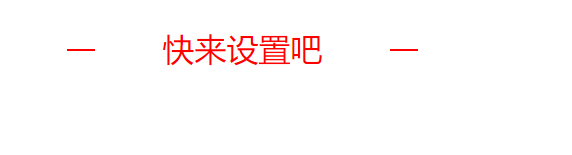
效果图
代码
这边是利用伪元素来实现的
<!DOCTYPE html>
<html lang="en">

<head>
    <meta charset="UTF-8">
    <meta http-equiv="X-UA-Compatible" content="IE=edge">
    <meta name="viewport" content="width=device-width, initial-scale=1.0">
    <title>Document</title>
    <style>
        .title {
            position: relative;
            font-size: 32px;
            color: red;
            height: 45px;
            line-height: 45px;
            text-align: center;
            top: 60px;
        }

        .title:before {
            content: "";
            position: absolute;
            width: 28px;
            height: 2px;
            top: 50%;
            background-color: red;
            left: 32%;
        }

        .title:after {
            content: "";
            position: absolute;
            width: 28px;
            height: 2px;
            top: 50%;
            background-color: red;
            right: 32%;
        }
    </style>
</head>
<body>
    <div class="title">快来设置吧</div>
</body>
</html>
图片中间加号
一般往往写图片时写入

https://www.php.cn/css-tutorial-413001.html
菱形
效果图

代码
<!DOCTYPE html>
<html>

<head>
<meta charset="UTF-8">
<title></title>
<style type="text/css">
.one {
border: 20px solid transparent;
width: 0;
border-bottom: 20px solid red;
}

.two {
border: 20px solid transparent;
width: 0;
border-top: 20px solid red;
}
</style>
</head>

<body>
<div class="one"></div>
<div class="two"> </div>

</body>

</html>
三角形
效果图
代码
多边形
效果图
代码
圆形
效果图
代码
关闭按钮
效果图
代码
大于号
代码
 font-size: 0.3em; /*大小*/
  padding: 0.4em;
  width: 14px;
  height: 14px;
  margin: 15px 10px ;
  vertical-align: middle !important;
  border-top: 2px solid white; /*上面的线条*/
  border-right: 2px solid white; /*右边线条*/
  transform: rotate(45deg); /*主要是这个旋转45度*/
小于号
效果图
<
代码
 font-size: 0.3em; /*大小*/
  padding: 0.4em;
  width: 14px;
  height: 14px;
  margin: 15px 10px ;
  vertical-align: middle !important;
  border-bottom: 2px solid white; /*上面的线条*/
  border-left: 2px solid white; /*右边线条*/
  transform: rotate(45deg); /*主要是这个旋转45度*/
可旋转三角箭头
效果图
代码
背景图片设置
覆盖全屏背景
 background: url('../assets/img/bg.png') no-repeat;
 background-position: center;
  background-size: cover;
使图片全屏平铺不改变位置
background: url("../assets/image/背景1@3x.png") no-repeat center center;
 background-size: 100% 100%;
单独一个区域图片覆盖区域
 background: url("../../../static/img/grop6.png") no-repeat center;
      background-size: cover;
       background-size: 100% 100%;//等比例拉伸


 387
387


 被折叠的 条评论
为什么被折叠?
被折叠的 条评论
为什么被折叠?
 到【灌水乐园】发言


