


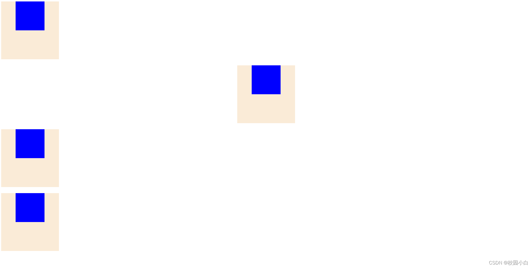
1. `.one` 和 `.one-son`:
- `.one` 使用 `text-align: center;` 属性将父元素中的文本内容水平居中对齐。
- `.one-son` 使用 `display: inline-block;` 属性将子元素变为行内块元素,以便使其在一行内显示。
2. `.two` 和 `.two-son`:
- `.two` 使用 `margin: auto;` 属性来使父元素水平和垂直居中。然而,这个方法仅对具有固定宽度和高度的块元素生效。
- `.two-son` 使用 `margin: auto;` 属性使子元素在父元素中水平和垂直居中。然而,这种方法会影响其他元素的布局。
3. `.three` 和 `.three-son`:
- `.three` 使用 `position: relative;` 属性将父元素设置为相对定位,为子元素的绝对定位提供参考。
- `.three-son` 使用 `position: absolute;` 属性将子元素设置为绝对定位,并使用 `left: 50%;` 和 `margin-left: -50px;` 属性使子元素在父元素中水平居中。`left: 50%;` 将子元素的左边缘移动到父元素的水平中心,而 `margin-left: -50px;` 则通过负的子元素宽度的一半将其居中。
4. `.four` 和 `.four-son`:
- `.four` 使用 `display: flex;` 属性将父元素设置为弹性盒子,以便对其子元素进行灵活的布局。
- `.four` 使用 `justify-content: center;` 属性将子元素在主轴上居中对齐。
<!DOCTYPE html>
<html lang="en">
<head>
    <meta charset="UTF-8">
    <meta http-equiv="X-UA-Compatible" content="IE=edge">
    <meta name="viewport" content="width=device-width, initial-scale=1.0">
    <title>Document</title>
    <style>
        #dad{
            width: 200px;
            height: 200px;
            background-color: antiquewhite;
        }
        #son{
            width: 100px;
            height: 100px;
            background-color: blue;
        }
        /* 父级居中,子集变块 */
        .one{
            text-align: center;
        }
        .one-son{
            display: inline-block;
        }
        /* margin: auto;会影响其他元素 */
        .two{
            margin: auto;
        }
        .two-son{
            margin: auto;
        }
        /* position方法 */
        .three{
            position: relative;
        }
        .three-son{
            position: absolute;
            left: 50%;
            margin-left: -50px;
        }
        /* 弹性盒子 */
        .four{
            display: flex;
            justify-content: center;
        }
    </style>
</head>
<body>
    <!-- 第一种 -->
    <div id="dad" class="one">
        <div id="son" class="one-son" ></div>
    </div>
    <br>
    <!-- 第二种 -->
    <div id="dad" class="two">
        <div id="son" class="two-son"></div>
    </div>
    <br>
    <!-- 第三种 -->
    <div id="dad" class="three">
        <div id="son" class="three-son"></div>
    </div><br>
        <!-- 第四种 -->
    <div id="dad" class="four">
        <div id="son" class="four-son"></div>
    </div><br>
</body>
</html>
效果图:


 778
778


 被折叠的 条评论
为什么被折叠?
被折叠的 条评论
为什么被折叠?
 到【灌水乐园】发言


