


目录
(3)解决 EditText 随着输入内容增多不断被拉长的问题
(4)可以结合使用EditText 和 Button 完成一些功能
过去Android应用程序的界面主要是通过编写 XML 的方式来实现的。最近几年 Googel 又推出了一个全新的界面布局:ConstrainLayout,ConstrainLayout更适合在可视化编辑器中使用拖放控件的方式来进行操作。
常用控件的使用方法
1、TextView
(1)android:layout_width和android:layout_height 单位dp(一种屏幕密度无关的尺寸单位,可以保证在不同分辨率的手机上显示效果尽量一样)。
(2) match_parent 表示让当前控件的大小和父布局的大小一样,也就是由父布局来决定当前控件的大小。warp_content 表示让当前控件的大小能够包含里面的内容。
(3)文字默认左上角对齐,可以通过android:gravity修改TextView的对齐方式,可选值有top、buttom、start、end、center等,可以用‘|’来同时指定多个值。如"center"的效果等同于"center_vertical | center_horizontal"。
(4) 此外还可以对TestView中文字的颜色和大小进行修改。android:textSize 属性可以指定文字的大小,使用sp作为单位。
创建一个Hi项目,然后右键 com.example.hi -> New -> Activity -> Empty Activity
在 activity_text_view.xml 中添加 TextView
<?xml version="1.0" encoding="utf-8"?>
<LinearLayout xmlns:android="http://schemas.android.com/apk/res/android"
    xmlns:app="http://schemas.android.com/apk/res-auto"
    xmlns:tools="http://schemas.android.com/tools"
    android:layout_width="match_parent"
    android:layout_height="match_parent"
    tools:context=".ui.TextView">

    <TextView
        android:id="@+id/textView1"
        android:layout_width="match_parent"
        android:layout_height="wrap_content"
        android:textColor="#00ff00"
        android:textSize="24sp"
        android:gravity="center"
        android:text="Hello World!"/>

</LinearLayout>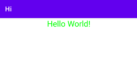
2、Button
(1) 在 activity_main.xml 中添加button
<Button
  android:id="@+id/button"
  android:layout_width="match_parent"
  android:layout_height="wrap_content"
  android:text="Button"/>
ps: Android 系统默认会将按钮上的英文字母全部转换成大写,可以在xml中添加android:textAllCaps="false" 这个属性,系统就会保留你所指定的原始文字内容了。
(2)实现对按钮点击事件的监听
① 方法一(实现接口):让MainActivity实现View.onClickListner接口,并重写onClick( )方法。然后调用button的setOnClickListner()方法将MainActivity实例传进去。这样每当点击按钮时,就会执行onClick( )方法中的代码了。
class MainActivity:AppCompatActivity(),View.OnClickListener{
    override fun onCreate(savedInstanceState:Bundle?){
    	super.onCreate(savedInstanceState)
    	setContentView(R.layout.activity_main)
    	button.setOnClickListener(this)
    }

	override fun onClick(v:View?){
        when(v?.id){
            R.id.button -> {
                //在此处添加逻辑
            }
        }
    }
}②方法二(函数式API):在MainActivity中为button注册一个监听器,调用button的setOnClickListner( )方法。调用该方法时利用了Java单抽象方法接口的特性,从而可以使函数式API的写法来监听按钮的点击事件。我们只需要在lambda表达式中添加待定的逻辑就可以了。
override fun onCreate(savedInstanceState:Bundle?){
    super.onCreate(savedInstanceState)
    setContentView(R.layout.activity_main)
    button.setOnClickListener{
        // 在此处添加逻辑
    }
}
3、EditText
EditText 是程序用于和用户进行交互的另一个重要控件,它允许用户在控件里输入和编辑内容,并可以在程序中对这些内容进行处理。EditText 的应用场景非常普遍,发短信、发微博、聊QQ等等。
(1)在 xml 中加入 EditText
<?xml version="1.0" encoding="utf-8"?>
<LinearLayout xmlns:android="http://schemas.android.com/apk/res/android"
  xmlns:app="http://schemas.android.com/apk/res-auto"
  xmlns:tools="http://schemas.android.com/tools"
  android:layout_width="match_parent"
  android:layout_height="match_parent"
  android:orientation="vertical"
  tools:context=".MainActivity">

  <EditText
    android:id="@+id/editText"
    android:layout_width="match_parent"
    android:layout_height="wrap_content"/>

</LinearLayout>
(2)添加一些提示性文字
android:hint 属性指定了一段提示性的文本。
<EditText
        android:id="@+id/editText"
        android:layout_width="match_parent"
        android:layout_height="wrap_content"
        android:hint="Type something here"/>
(3)解决 EditText 随着输入内容增多不断被拉长的问题
使用 android:maxLines 属性,指定 EditText 的最大行数为两行,这样当输入的内容超过两行时,文本就会向上滚动,EditText 则不会再继续拉伸。
<EditText
        android:id="@+id/editText"
        android:layout_width="match_parent"
        android:layout_height="wrap_content"
        android:hint="Type something here"
        android:maxLines="2"/>
(4)可以结合使用EditText 和 Button 完成一些功能
在按钮的点击事件里调用 EditText 的 getText( ) 方法获取输入的内容,再调用 toString( ) 方法将内容转换成字符串,最后使用 Toast 将输入的内容显示出来。
class MainActivity:AppCompatActivity(),View.OnClickListener{
    override fun onCreate(savedInstanceState:Bundle?){
        super.onCreate(savedInstanceState)
        setContentView(R.layout.activity_main)
        button.setOnClickListener(this)
    }

    override fun onClick(v:View?){
        when(v?.id){
            R.id.button -> {
                val inputEditText = editText.text.toString()
                Toast.makeText(this,inputEditText,Toast.LENGTH_SHORT).show()
            }
        }
    }
}
4、ImageView
ImageView 是用于在界面上展示一些图片的控件。图片通常是放在以 drawable 开头的目录下的,并且要带上具体的分辨率。现在主流的手机屏幕分辨率大多是 xxhdpi 的,所以我们在 res 目录下再新建一个 drawable-xxhdpi 目录,然后将事先准备好的两张图片 img_1.png 和 img_2.png 复制到该目录中。
<ImageView
        android:id="@+id/imageView"
        android:layout_width="wrap_content"
        android:layout_height="wrap_content"
        android:src="@drawable/img_1"/>
android:src 属性给 ImageView 指定了一张照片,宽和高都设定为 wrap_content ,这样保证了不管图片的尺寸是多少,都可以完整的体现出来。

还可以在程序中动态地更改 ImageView 中的图片。在按钮的点击事件里,通过调用 ImageView 的 setImageResource( ) 方法将显示的图片改成 img_2 。
override fun onClick(v:View?){
        when(v?.id){
            R.id.button -> {
               imageView.setImageResource(R.drawable.img_2)
            }
        }
    }
5、ProgressBar
ProgressBar 用于在界面上显示一个进度条 , 表示我们的程序正在加载一些数据。
(1)在 xml 中添加 ProgressBar
<ProgressBar
        android:id="@+id/progressBar"
        android:layout_width="match_parent"
        android:layout_height="wrap_content"/>
(2)重新运行程序
会看到屏幕中有一个圆形进度条正在旋转。
(3)Android 控件的可见属性
如何让进度条在数据加载完成的时候消失:Android 控件的可见属性。
所有的 Android 控件都具有这个属性,可以通过 android:visibility 进行指定,可选值有三种:visible、invisible 和 gone。visible (默认值)表示控件是可见的;invisible 表示控件不可见,但仍然占据这原来的位置和大小;gone 则表示控件不仅不可见,而且不再占用任何屏幕空间。
可以通过代码来设置控件的可见性,使用的是 setVisibility( ) 方法,允许传入 View.VISIBLE、View.INVISIBLE、View.GONE 这三种值。
if(progressBar.visibility == View.VISIBLE){
    progressBar.visibility = View.GONE
}else{
    progressBar.visibility = View.VISIBLE
}
在按钮的点击事件中,我们通过 getVisibility( ) 方法来判断 ProgressBar 是否可见,如果可见就将 ProgressBar 隐藏掉,如果不可见就将 ProgressBar 显示出来。
(4)给ProgressBar 指定不同的样式
通过 style 属性可以将它指定成水平进度条。
 <ProgressBar
        android:id="@+id/progressBar"
        android:layout_width="match_parent"
        android:layout_height="wrap_content"
        style="?android:attr/progressBarStyleHorizontal"
        android:max="100"/>
(5)在代码中动态地更改进度条的进度
override fun onClick(v:View?){
    when(v?.id){
        R.id.button -> {
            // 每点击一次按钮,进度条+10
            progressBar.progress = progressBar.progress+10
        }
    }
}


 5179
5179

 被折叠的 条评论
为什么被折叠?
被折叠的 条评论
为什么被折叠?
 到【灌水乐园】发言


