


web三大定位机制
1.普通流---文档流
2.浮动--脱离文档流(完全)
3.定位---position:top,right,bottom,left(各个方向都可以设置偏移量)
a.static--静态
b.absolute--绝对定位
完全脱离文档流,不占位偏移,相对已经定位了的父级元素定位,如果父级元素没有明确定位或者
没有明确的父级,则相对整个body(整个浏览器页面的左上角为起点)定位(偏移)
实际开发时,建议父级使用相对定位,自己使用绝对定位
c.relative--相对定位
半脱离文档流,占位偏移,相对自己原来的位置偏移
d.fixed--固定定位,相对浏览器窗口定位
但凡使用到position属性,就会有层叠关系(所有的元素都使用到position),
修改层叠关系的属性z-index:;(数字类型,没有单位,值越大,层叠关系越高)
<!DOCTYPE html>
<html lang="en">
<head>
    <meta charset="UTF-8">
    <meta http-equiv="X-UA-Compatible" content="IE=edge">
    <meta name="viewport" content="width=device-width, initial-scale=1.0">
    <title>Document</title>
    <style>
        div{width: 300px;height: 300px;float: left;}
        .box1{
            background: red;
        }
        .box2{
            background: blue;
            position: relative;
            left: 100px;
            top: 100px;
        }
        .box3{
            background: green;
        }
    </style>
</head>
<body>
    <div class="box1">参考物</div>
    <div class="box2"></div>
    <div class="box3">参考物</div>
</body>
</html>
效果图

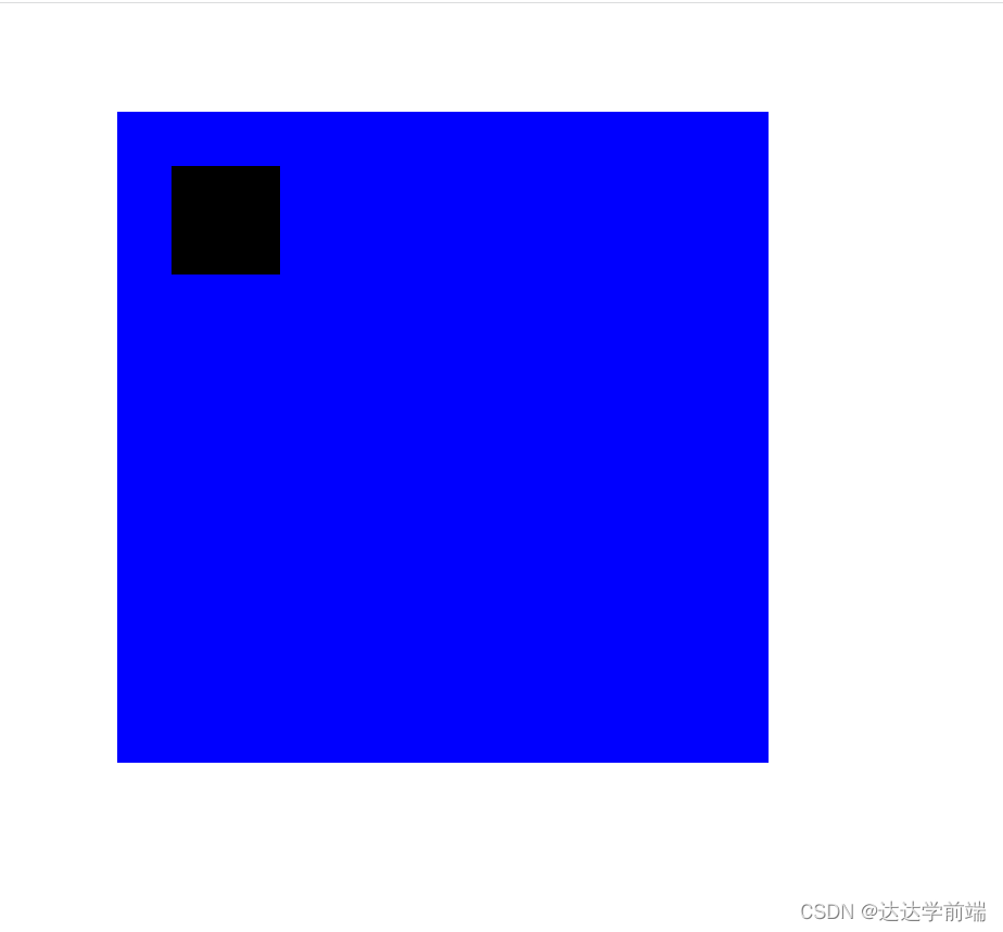
<!DOCTYPE html>
<html lang="en">
<head>
    <meta charset="UTF-8">
    <meta http-equiv="X-UA-Compatible" content="IE=edge">
    <meta name="viewport" content="width=device-width, initial-scale=1.0">
    <title>Document</title>
    <style>
        .box1{width: 600px;height: 600px;background: blue;margin: 100px 0 0 100px;position: relative;}
        .box2{width: 100px;height: 100px;background: black;position: absolute;top: 50px;left: 50px;}
    </style>
</head>
<body>
    <div class="box1">
        <div class="box2"></div>
    </div>
</body>
</html>
效果图
<!DOCTYPE html>
<html lang="en">
<head>
    <meta charset="UTF-8">
    <meta http-equiv="X-UA-Compatible" content="IE=edge">
    <meta name="viewport" content="width=device-width, initial-scale=1.0">
    <title>Document</title>
    <style>
        .box1{width: 200px;height: 20000px;background: black;
            z-index: 200;position: relative;}
        .box2{width: 200px;height: 200px;background: red;
            position: fixed;top: 200px;left: 150px;

        }
    </style>
</head>
<body>
    <div class="box1"></div>
    <div class="box2"></div>
</body>
</html>
效果图


 164
164


 被折叠的 条评论
为什么被折叠?
被折叠的 条评论
为什么被折叠?
 到【灌水乐园】发言


