


目录

🌸属性容器
🥀justify-content(在垂直方向上)
(主轴) :默认X
(交叉轴):默认Y
转动的是,所有的东西是挂在轴上的,虽然看不见
🥀justify-content(在水平方向上)
	<body>
		<style type="text/css">
			.box{
				display: flex;/*定义一个flex弹性盒子*/
				flex-direction: row-reverse;/*设置flex盒子的主轴方向,这里为反向(90°主轴占到了原来交叉轴的位置)*/
				justify-content: center;/*所有盒子对齐*/
				justify-content: space-between;/*两端的默顶格,中间的空间平分*/
			}
			.box>div{
				width: 25%;
			}
			.d1{
				background-color: #00aaff;
			}
			.d2{
				background-color: #00FF00;
			}
			.d3{
				background-color: #ff557f;
			}
			.d4{
				background-color: #ffff00;
			}
		</style>
		<div class="box">
			<div class="d1">111</div>
			<div class="d2">222</div>
			<div class="d3">333</div>
			<div class="d4">444</div>
		</div>
	</body>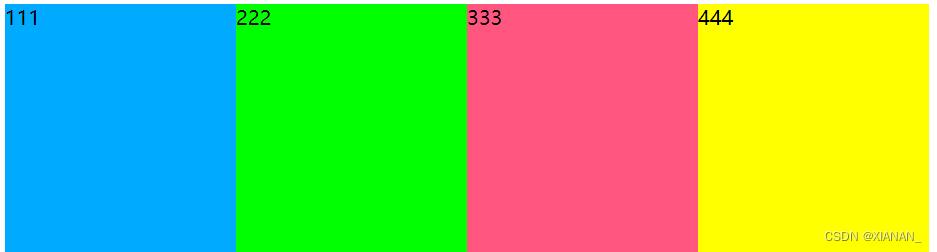
	<body>
		<style type="text/css">
			html,body{
				height: 100%;
			}
			.box{
				height: 100%;
				display: flex;/*定义一个flex弹性盒子*/
				flex-direction: row;/*设置flex盒子的主轴方向,这里为反向(90°主轴占到了原来交叉轴的位置)*/
				justify-content: center;/*所有盒子对齐*/
				justify-content: space-between;/*两端的默顶格,中间的空间平分*/
			}
			.box>div{
				width: 25%;
			}
			.d1{
				background-color: #00aaff;
			}
			.d2{
				background-color: #00FF00;
			}
			.d3{
				background-color: #ff557f;
			}
			.d4{
				background-color: #ffff00;
			}
		</style>
		<div class="box">
			<div class="d1">111</div>
			<div class="d2">222</div>
			<div class="d3">333</div>
			<div class="d4">444</div>
		</div>
	</body>
文字最小宽度才会换行
	<body>
		<style type="text/css">
			.box{
				display: flex;
			}
			.box>div{
				width: 50%;
			}
			.d1 {
				background-color: #00aaff;
				flex-shrink:1 ;
			}

			.d2 {
				background-color: #00FF00;
				flex-shrink:1 ;
			}

			.d3 {
				background-color: #ff557f;
				flex-shrink:2;
			}

			.d4 {
				background-color: #ffff00;
				flex-shrink:1;
			}
		</style>
		<div class="box">
			<div class="d1">111</div>
			<div class="d2">222</div>
			<div class="d3">333</div>
			<div class="d4">444</div>
		</div>
</body>🥀flex-grow(空间的放大比例)
	<body>
		<style type="text/css">
			.box{
				display: flex;
			}
			.box>div{
				width: 50%;
			}
			.d1 {
				flex-grow:1 ;/*空间的分配比例(放大)*/
			}

			.d2 {
				flex-grow:1 ;
			}

			.d3 {
				flex-grow:2;
			}
		</style>
		<div class="box">
			<div class="d1">111</div>
			<div class="d2">222</div>
			<div class="d3">333</div>
			<div class="d4">444</div>
		</div>
</body>🥀order
	<body>
		<style type="text/css">
			*{
				margin:0;
				padding: 0;
			}
			div{
				width: 40px;
				height: 20px;
				background-color: red;
			}
			.box>div{
				flex-grow:2;
			}
		</style>
		<div class="box">
			<div class="d1">111</div>
			<div class="d2">222</div>
			<div class="d3">333</div>
			<div class="d4">444</div>
		</div>
	</body>


 734
734


 被折叠的 条评论
为什么被折叠?
被折叠的 条评论
为什么被折叠?
 到【灌水乐园】发言


