


【PromptCoder + Trae】三分钟复刻任何页面
官网:[PromptCoder](Prompt Coder)
在现代前端开发中,将设计稿转化为可运行的代码是一项耗时的工作。然而,借助人工智能工具,这一过程可以变得更加高效和简单。本文将介绍如何结合 PromptCoder 和 Trae,从设计截图生成页面和对应的路由,极大提升开发效率。
Trae:AI驱动的代码编辑器
Trae 是一款基于 VS Code 构建的 AI 智能代码编辑器,集成了强大的AI功能,旨在优化开发者的编码体验。它不仅提供传统的代码补全,还能通过自然语言交互生成代码、理解项目上下文,并助力开发者快速实现复杂的开发任务。
Trae 的核心特点
- 智能补全:通过 Tab 功能,Trae 能根据上下文预测并提供多行代码建议。
- 聊天交互:内置聊天窗口,开发者可以直接与 AI 对话,请求生成特定代码或解决问题。
- 项目理解:Trae 能够分析整个项目结构,确保生成的代码与现有代码无缝衔接。
- 多框架支持:支持多种语言和框架,如 React、Next.js、Vue 等,适应不同开发需求。
与传统编辑器相比,Trae 的 AI 能力让开发者能够以更自然的方式与代码交互,显著减少手动编写的时间。
PromptCoder:智能代码提示词生成
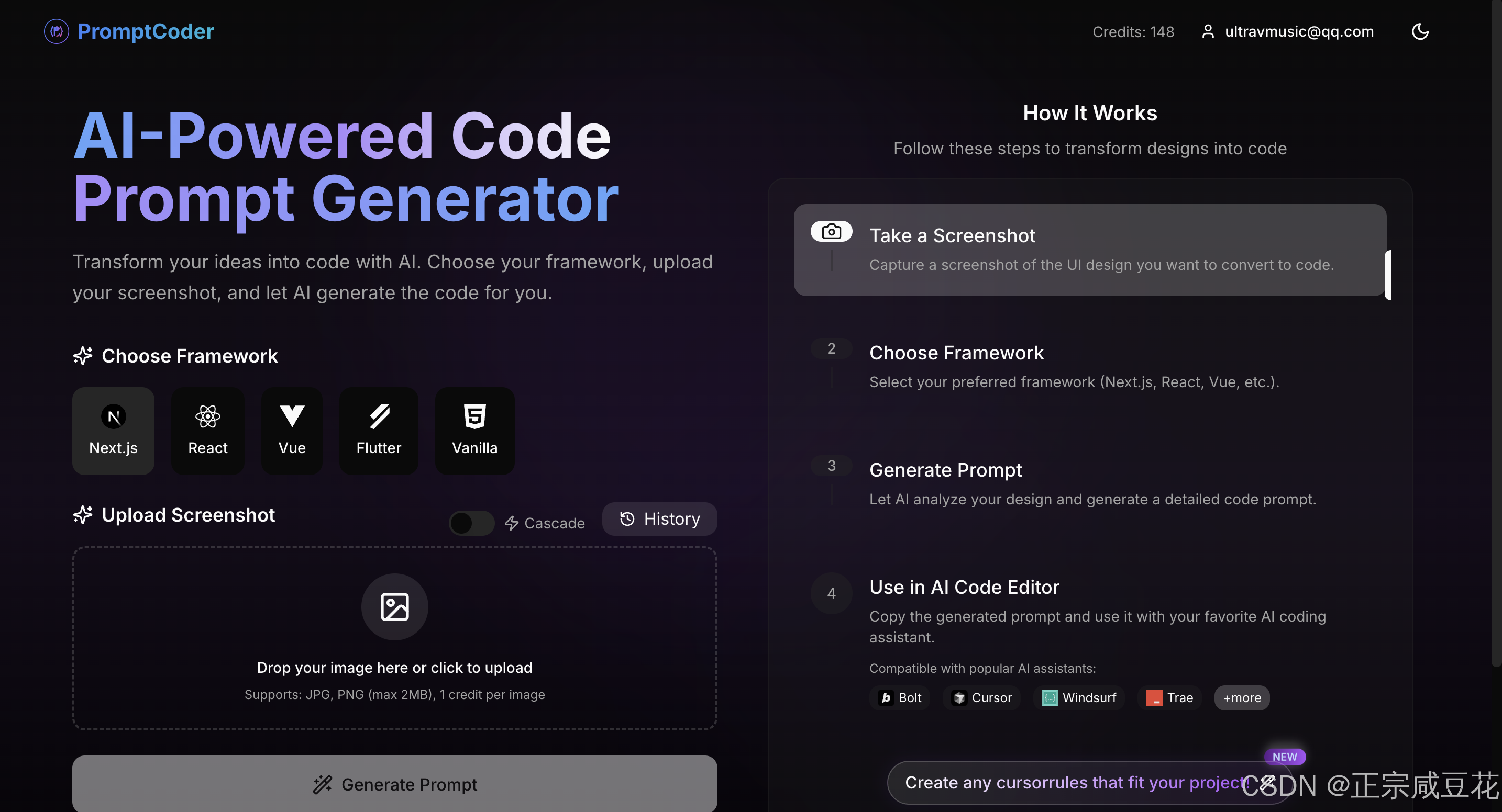
PromptCoder 是一款利用人工智能的代码生成工具,能够识别设计图或截图,并生成匹配的前端代码提示词。无论是复杂的交互组件还是简洁的页面布局,PromptCoder 都能帮助开发者快速复刻设计稿,提升效率并减少错误。
PromptCoder 的核心特点
- 交互简单易用:通过先进的图像识别技术,只需上传设计图即可生成精确的代码提示词。
- 从免费开始:提供免费注册体验,低门槛尝试其强大功能。
- 多框架支持:兼容 React、Vue、Flutter 等多种前端框架,轻松集成到现有项目。
- 多种模式选择:普通模式生成单页提示词,而 cascade 模式 能分析潜在路由并生成多页面提示词。
实战案例:从 Dribbble 中复制一个 Dashboard 页面
下面,我们将通过一个实战案例,展示如何使用 PromptCoder 和 Trae,从 Dribbble 的设计稿生成一个功能完整的 Dashboard 页面,并设置相关路由。
步骤 1:选择设计稿
首先,前往 Dribbble 寻找一个心仪的设计稿。例如,我们选择了一个简洁清新的 LinkTree 设计,只需截图即可。
步骤 2:使用 PromptCoder 生成提示词
将设计截图上传至 PromptCoder,选择 cascade 模式。工具会自动识别设计中的元素(如导航栏、主内容区等),分析潜在路由(如 ‘x’、‘ins’),并生成详细的代码提示词。
步骤 3:使用 Trae 生成代码
- 启动 Trae:打开 Trae 编辑器,新建一个 Next.js 项目(本例使用 Next.js)。
- 输入提示词:在 Trae 的聊天窗口中,粘贴 PromptCoder 生成的提示词部分。例如,输入:
Create detailed Next.js components with these requirements:
1. Use 'use client' directive for client-side components
2. Style with Tailwind CSS utility classes for responsive design
3. Use Lucide React for icons (from lucide-react package). Do NOT use other UI libraries unless requested
4. Use stock photos from picsum.photos where appropriate, only valid URLs you know exist
5. Configure next.config.js image remotePatterns to enable stock photos from picsum.photos
6. Avoid duplicate components
7. Automatically source and display logos from a CDN in design placeholders
8. Follow proper import practices:
   - Use @/ path aliases
   - Keep component imports organized
   - Update current src/app/page.tsx with new comprehensive code
   - Don't forget root route (page.tsx) handling
   - You MUST complete the entire prompt before stopping
- 生成代码:AI 会生成对应的代码片段,点击接受后插入到项目中。
- 逐一构建组件:继续通过聊天功能生成其他组件,如 WalletSummary、TransactionsSection 等。
- 智能补全:在手动调整代码时,使用 Tab 功能获取 AI 的上下文建议,加速编码。
- 配置路由:根据 AI 的建议,在
app目录下创建对应页面。 - 完成项目:最终,我们不仅复刻了设计稿,还实现了路由跳转。
通过这种方式,我们利用 Trae 的 AI 能力,将 PromptCoder 的提示词转化为功能完整的代码。
提示词示例
以下是 PromptCoder 生成的详细提示词示例,您可以在 Trae 的聊天窗口中使用它来指导代码生成:
Create detailed Next.js components with these requirements:
1. Use 'use client' directive for client-side components
2. Style with Tailwind CSS utility classes for responsive design
3. Use Lucide React for icons (from lucide-react package). Do NOT use other UI libraries unless requested
4. Use stock photos from picsum.photos where appropriate, only valid URLs you know exist
5. Configure next.config.js image remotePatterns to enable stock photos from picsum.photos
6. Avoid duplicate components
7. Automatically source and display logos from a CDN in design placeholders
8. Follow proper import practices:
   - Use @/ path aliases
   - Keep component imports organized
   - Update current src/app/page.tsx with new comprehensive code
   - Don't forget root route (page.tsx) handling
   - You MUST complete the entire prompt before stopping

1.  Layout Overview

    -   **Page Structure:**
        -   Centrally aligned content using a container with `margin: 0 auto;`.
        -   Vertical stacking of elements: Profile Image, Name, Description, Action Buttons, Social Icons, Copyright.
        -   Main container likely uses `display: flex; flex-direction: column; align-items: center;`.  This provides the core vertical layout and horizontal centering.
        -   Buttons container uses `display: flex; flex-wrap: wrap; justify-content: center; gap: 1rem;` (or similar spacing value). This allows buttons to wrap on smaller screens while maintaining consistent spacing.
        -   Social icons container also uses `display: flex; justify-content: center; gap: 1rem;`.

    -   **Component Hierarchy:**
        ```
        <PageContainer>
          <ProfileImage />
          <NameHeading />
          <DescriptionText />
          <ButtonsContainer>
            <ActionButton /> {/* Repeated for each button */}
          </ButtonsContainer>
          <SocialIconsContainer>
            <SocialIcon /> {/* Repeated for each icon */}
          </SocialIconsContainer>
          <CopyrightText />
        </PageContainer>
        ```

    -   **Responsive Design Considerations:**
        -   The centered layout inherently adapts to different screen sizes.
        -   The `flex-wrap: wrap;` property on the `ButtonsContainer` is crucial for responsiveness, allowing buttons to stack vertically on smaller screens.
        -   Media queries are likely *not* needed for major layout changes, but might be used for fine-tuning font sizes or spacing on very small screens.  The core layout is inherently responsive.
        -   Profile image should have a `max-width: 100%; height: auto;` to prevent overflow and maintain aspect ratio.  A fixed width (e.g., `width: 150px; height: 150px; border-radius: 50%;`) is likely used to create the circular shape.

2.  Styling Specifications

    -   **Color Schemes:**
        -   `background`: Light purple gradient (e.g., `linear-gradient(to bottom, #f0e6ff, #e0d4ff);`).
        -   `buttonBackgrounds`: Array of pastel colors: `['#e6f0ff', '#e6ffe6', '#f0e6ff', '#f0f0ff', '#fff0e6', '#ffffe6']`.  Each button uses a different color from this array.
        -   `buttonText`: Dark grey or dark blue (e.g., `#333333` or `#2a4365`).  High contrast with button backgrounds.
        -   `icons`: White (`#ffffff`).
        -   `nameText`: Dark grey or dark blue (same as button text, for consistency).
        -   `descriptionText`: Slightly lighter than `nameText` (e.g., `#555555`).
        -   `copyrightText`:  Lighter still (e.g., `#777777`).  Low contrast.

    -   **Typography:**
        -   `fontFamily`:  Sans-serif (e.g., `'Inter', sans-serif` or `'Open Sans', sans-serif`).  A modern, clean font.
        -   `nameHeading`:  `fontSize: 2rem; fontWeight: 700;` (or similar, larger and bolder).
        -   `descriptionText`: `fontSize: 1rem; fontWeight: 400;` (regular weight).
        -   `buttonText`: `fontSize: 1rem; fontWeight: 500;` (slightly bolder than description).
        -   `copyrightText`: `fontSize: 0.8rem; fontWeight: 400;`.

    -   **Spacing and Alignment:**
        -   Consistent vertical spacing between elements (e.g., `margin-bottom: 1.5rem;` on most elements).
        -   Buttons: `padding: 0.75rem 1.5rem;` (consistent internal padding).
        -   Button icon and text spacing: `margin-right: 0.5rem;` (on the icon).
        -   `gap: 1rem;` (or similar) on the `ButtonsContainer` and `SocialIconsContainer`.
        -   All text is left-aligned within its container, but the containers themselves are centered.

    -   **Animations and Transitions:**
        -   `transition: background-color 0.2s ease;` on the buttons.  This provides a smooth color change on hover.
        -   No other explicit animations are specified, keeping the design clean and performant.

3.  Interactive Elements

    -   **User Inputs:**
        -   None explicitly shown in the design.

    -   **Navigation:**
        -   The buttons and social icons act as navigation links.
        -   Each button should use an `<a>` tag with the appropriate `href` attribute.
        -   Social icons should also use `<a>` tags.

    -   **Loading States:**
        -   Not depicted, but consider adding a spinner or placeholder to the buttons if they trigger asynchronous actions.

    -   **Micro-interactions:**
        -   **Button Hover:**  `&:hover { background-color: darken(currentColor, 10%); }` (using a CSS-in-JS approach like styled-components or Emotion).  This darkens the button's background color on hover, providing visual feedback.  `currentColor` will refer to the button's current background color.
        -   **Button Active:** `&:active { background-color: darken(currentColor, 20%); }` (further darken on click/tap).
        -   **Focus States:**  Use `&:focus { outline: 2px solid blue; outline-offset: 2px; }` (or a color that matches the design) to provide clear visual focus for keyboard navigation.  This is crucial for accessibility.

4.  Component Architecture

    -   **Layout Components:**
        -   `PageContainer`:  The top-level container, responsible for centering the content and providing the background.
        -   `ButtonsContainer`:  Manages the layout of the action buttons (wrapping and spacing).
        -   `SocialIconsContainer`: Manages the layout of the social icons.

    -   **Feature Components:**
        -   None explicitly defined, as this is a single-purpose page.

    -   **Shared Components:**
        -   `ActionButton`:  Reusable component for each button.  Props: `text`, `icon`, `href`, `backgroundColor`.
        -   `SocialIcon`:  Reusable component for each social icon. Props: `icon`, `href`, `altText`.
        -   `ProfileImage`:  Handles the circular image. Props: `src`, `alt`.
        -   `NameHeading`:  Reusable heading component.
        -   `DescriptionText`: Reusable paragraph component.
        -   `CopyrightText`: Reusable copyright text component.

    -   **Container Components:**
        -   The `PageContainer` could be considered a container component, as it manages the overall layout.  However, in this simple example, the distinction between layout and container components is minimal.
        - No data fetching is visible.
通过 PromptCoder 和 Trae 的协作,开发者可以快速将设计稿转化为可运行的代码。PromptCoder 负责从截图生成详细提示词,而 Trae 则通过其 AI 功能帮助实现代码编写和路由配置。相比传统开发,这种方式不仅高效,还赋予开发者更多控制权。
立即访问官网:[PromptCoder](Prompt Coder),获取免费试用!您也可以前往 Trae.ai 下载这款强大的 AI 编辑器,开启智能编码之旅。


 扫一扫
扫一扫


 544
544

 被折叠的 条评论
为什么被折叠?
被折叠的 条评论
为什么被折叠?
 到【灌水乐园】发言


