


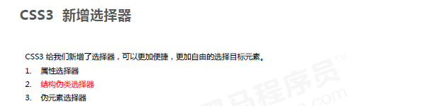
CSS3新特性


权重是11
展示代码:
<head>
	<style>
		.a{
            display: inline-block;
            width: 200px;
            height: 200px;
            background-color: pink;
        }
        div[class]{
            display: inline-block;
            width: 200px;
            height: 200px;
            background-color: green;
        }/*这个有用*/
        div[class="b"]{
            display: inline-block;
            width: 200px;
            height: 200px;
            background-color: pink;
        }/*鸡肋*/
        div[class^="c"]{
            display: inline-block;
            width: 200px;
            height: 200px;
            background-color: red;
        }
        div[class$="g"]{
            display: inline-block;
            width: 200px;
            height: 200px;
            background-color: yellow;
        }
        div[class*="v"]{
            display: inline-block;
            width: 200px;
            height: 200px;
            background-color: blue;
        }
   </style>
</head>
<body>
    <div class="a"></div>
    <div class="a"></div>
    <div class="b"></div>
    <div class="cat"></div>
    <div class="dog"></div>
    <div class="love"></div>
</body>
效果图:


代码展示:
<!DOCTYPE html>
<html lang="en">
<head>
    <meta charset="UTF-8">
    <title>Title</title>
    <style>
        *{
            margin: 0;
            padding: 0;
            box-sizing: border-box;
        }
        li{
            width: 100px;
            height: 100px;
            float: left;
            list-style: none;
        }
        ul li:first-child{
            background-color: red;
        }
        ul li:last-child{
            background-color: yellow;
        }
        /*ul li:nth-child(even){*/
        /*    background-color: blue;*/
        /*}*/
        /*ul li:nth-child(odd){*/
        /*    background-color: blue;*/
        /*}*/
        /*ul li:nth-child(2n+1){*/
        /*    background-color: blue;*/
        /*}*/
        ul li:nth-child(2n){
            background-color: blue;
        }
        ul li:first-of-type{
            background-color: pink;
        }
        ul li:first-of-type{
            background-color: pink;
        }
        ul li:nth-of-type(2n){
            background-color: pink;
        }

    </style>
</head>
<body>
    <ul>
      <li>1</li>
      <li>2</li>
      <li>3</li>
      <li>4</li>
      <li>5</li>
      <li>6</li>
      <li>7</li>
    </ul>
</body>
</html>
nth-child和nth-of-type的区别:
<!DOCTYPE html>
<html lang="en">
<head>
    <meta charset="UTF-8">
    <title>Title</title>
<!--    区别一下nth-child和nth-of-type-->
    <style>
        *{
            margin: 0;
            padding: 0;
            box-sizing: border-box;
        }
        li{
            list-style: none;
        }
        /*选编号为1的li*/
        ul li:first-child{
            width: 200px;
            height: 200px;
            background-color: pink;
        }
        /*很明显上面的方法选不出来,那就试试另一种方法*/
        ul li:first-of-type{
            width: 200px;
            height: 200px;
            background-color: pink;
        }
        /*这种方法选出来了*/
        /*
        区别: ul li:first-child{}会先匹配ul下的第一个孩子,再判断是不是li,如果不是则无法选择。(顺序优先)*/
        ul li:first-of-type{}会先匹配ul下的li,再选择该类型下的第一个孩子(类型优先)*/
        /*
    </style>
</head>
<body>
<ul>
    <div>0</div>
    <li>1</li>
    <li>2</li>
    <li>3</li>
    <li>4</li>
    <li>5</li>
    <div>6</div>
</ul>
</body>
</html>


创建的元素是一个初始空元素,我们必须使用content=’’;来指明,如果需要填充内容只需要在’'里声明即可!
注:伪元素不止这些,这两个只能称为技巧性伪元素!
重点:before和after伪元素是在父盒子内容的前后创建;element为父盒子!!!


代码展示:
<!DOCTYPE html>
<html lang="en">
<head>
    <meta charset="UTF-8">
    <title>Title</title>
    <style>
        div::before{
            content:'';
            position: absolute;
            top: 0;
            left: 0;
            width: 100%;
            height: 100%;
            background-color: rgba(0,0,0,.4);
            background-image: url(bf.png);
            background-repeat: no-repeat;
            background-position: 50% ;
            background-size: 5%;
            border-radius: 15px;
            display: none;
        }
        div{
            display: inline-block;
            width: 520px;
            height: 280px;
            margin: 100px;
            background-image: url(tb01.jpg);
            position: relative;
            border-radius: 15px;
        }
        div:hover::before{
            display: block;
        }
    </style>
</head>
<body>

    <div></div>

</body>
</html>


<!DOCTYPE html>
<html lang="en">
<head>
    <meta charset="UTF-8">
    <title>Title</title>
    <style>
        *{
            margin: 0;
            padding: 0;
            box-sizing: border-box;
        }
        li{
            list-style: none;
            width: 200px;
            height: 200px;
            background-color: red;
             float: left;
        }
        ul{
            background-color: pink;
        }
        ul::after{      /*ul::before是清除不了浮动的哦*/
            content: '';
            /*display: block;*/
            display: table;
            clear: both;
            /*为了兼容性下面代码可写*/
            visibility: hidden;
            height: 0;
        }
    </style>
</head>
<body>
<ul>
    <li></li>
    <li></li>
    <li></li>
</ul>

</body>
</html>
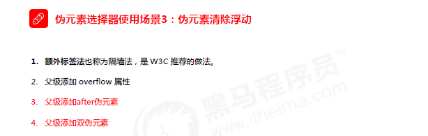
拓展:display你不知道的值:
- none 此元素不会被显示。
- block 此元素将显示为块级元素,此元素前后会带有换行符。
- inline 此元素会被显示为内联(行内)元素,元素前后没有换行符。
- inline-block 行内块元素。(CSS2.1 新增的值)
- list-item 此元素会作为列表显示。
- run-in 此元素会根据上下文作为块级元素或内联元素显示。
- table 此元素会作为块级表格来显示(类似 <table>),表格前后带有换行符
- inline-table 此元素会作为内联表格来显示(类似 <table>),表格前后没有换行符。
- table-row 此元素会作为一个表格行显示(类似 <tr>)。
- compact CSS 中有值 compact,不过由于缺乏广泛支持,已经从 CSS2.1 中删除。
- marker CSS 中有值 marker,不过由于缺乏广泛支持,已经从 CSS2.1 中删除
- table-row-group 此元素会作为一个或多个行的分组来显示(类似 <tbody>)。
- table-header-group 此元素会作为一个或多个行的分组来显示(类似 <thead>)
- table-footer-group 此元素会作为一个或多个行的分组来显示(类似 <tfoot>)。
- table-column-group 此元素会作为一个或多个列的分组来显示(类似 <colgroup>)。
- table-column 此元素会作为一个单元格列显示(类似 <col>)
- table-cell 此元素会作为一个表格单元格显示(类似 <td> 和 <th>)
- table-caption 此元素会作为一个表格标题显示(类似 <caption>)
- inherit 规定应该从父元素继承 display 属性的值。


<!DOCTYPE html>
<html lang="en">
<head>
    <meta charset="UTF-8">
    <title>Title</title>
    <style>
        *{
            margin: 0;
            padding: 0;
            box-sizing: border-box;
        }
        div{
            width: 100px;
            height: 100px;
            background-color: pink;
        }
        div:hover{
            width: 200px;
            height: 200px;
            /*
            标准写法:要过渡的属性 花费的时间 运动曲线 何时开始
            transition: width 5s ease 2s,height 3s ease-out 0s;
             */
            transition: width 5s ,height 4s 1s;

        }

    </style>
</head>
<body>
    <div></div>
</body>
</html>

<!DOCTYPE html>
<html lang="en">
<head>
    <meta charset="UTF-8">
    <title>Title</title>
    <style>
        *{
            margin: 0;
            padding: 0;
            box-sizing: border-box;
        }
        div{
            margin: 50px 100px;
            width: 120px;
            height: 10px;
            border: 1px solid red;
            border-radius: 15px;
        }
        p{
            border-radius: 15px;
            width: 60px;
            height: 8px;
            background-color: red;
        }
        div:hover p{
            width: 118px;
            transition: width 2s;
        }

    </style>
</head>
<body>
    <div>
        <p></p>
    </div>
</body>
</html>


小练习(手绘彩虹和云朵,并利用过渡让云朵动起来):
<!DOCTYPE html>
<html lang="en">

<head>
    <meta charset="UTF-8">
    <meta http-equiv="X-UA-Compatible" content="IE=edge">
    <meta name="viewport" content="width=device-width, initial-scale=1.0">
    <title>直播课老师写的</title>
    <style>
        body {
            background-color: #494A5F;
            /* 背景色 */
            overflow: hidden;
            /* 超出部分隐藏 */
        }

        .all {
            position: relative;
            /* 相对定位  七匹狼 */
            width: 1200px;
            height: 800px;
            /* background-color: #0ff; */
            margin: 50px auto;
            /* 外边距 上下 左右 水平居中 */
        }

        .rainbow {
            width: 750px;
            /* 宽 */
            height: 750px;
            /* 高 */
            /* background-color: #0ff; */

            /* 影子  偏移量X,Y  模糊 大小 颜色 */
            box-shadow:
                    -6px -6px 0 5px #fb323c,
                    -11px -11px 0 10px #f99716,
                    -16px -16px 0 15px #fee124,
                    -21px -21px 0 20px #afde2e,
                    -26px -26px 0 25px #6ad7f8,
                    -31px -31px 0 30px #60b1f5,
                    -36px -36px 0 35px #a3459b;

            border-radius: 750px 0 0 0;
            /* 圆角  */
            transform: rotate(45deg);
            /* css3变换属性 旋转 度数 */
            margin: 30px auto;
        }

        .cloud {
            position: absolute;
            /* 绝对定位 叛逆 */

            width: 100px;
            height: 100px;
            background-color: #fff;
            border-radius: 50px;
            /* 圆角  父亲长度一半 */
            box-shadow:
                    120px 0px 0 0px #fff,

                    95px 20px 0 0px #fff,
                    30px 30px 0 10px #fff,
                    90px -20px 0 0px #fff,
                    40px -40px 0 0px #fff;
        }

        .cloud1 {
            top: 330px;
            left: -50px;
        }

        .cloud2 {
            top: 330px;
            right: 20px;
        }

        .cloud3 {
            top: 10px;
            left: -190px;

        }

        .cloud4 {
            top: 30px;
            right: -190px;

        }

        .cloud5 {
            bottom: 10px;
            left: -270px;

            /* 插入动画  动画名  时间 无限交替 */
        }

        .cloud6 {
            bottom: 130px;
            left: 50px;
        }

        .cloud7 {
            bottom: 200px;
            left: 600px;

        }

        .cloud8 {
            bottom: 100px;
            right: -100px;

        }

        @keyframes left {  /* 设计动画 */
            0%{
                transform: translateX(0px);
            }
            50%{
                transform: translateX(-100px);
            }
            100%{
                transform: translateX(0px);
            }
        }

        @keyframes right {  /* 设计动画 */
            0%{
                transform: translateX(0px);
            }
            50%{
                transform: translateX(100px);
            }
            100%{
                transform: translateX(0px);
            }
        }

       /* .cloud3,
        .cloud5,   并集选择器
        .cloud7*/
        div div:nth-child(2n+3){
            animation: left 10s infinite;
        }

       /* .cloud4,
        .cloud6,
        .cloud8*/
        div div:nth-child(2n+4){
            animation: right 10s infinite;
        }
    </style>
</head>

<body>
<div class="all">
    <div class="rainbow"></div>
    <div class="cloud cloud1"></div>
    <div class="cloud cloud2"></div>
    <div class="cloud cloud3"></div>
    <div class="cloud cloud4"></div>
    <div class="cloud cloud5"></div>
    <div class="cloud cloud6"></div>
    <div class="cloud cloud7"></div>
    <div class="cloud cloud8"></div>
</div>
</body>
</html>


 2513
2513


 被折叠的 条评论
为什么被折叠?
被折叠的 条评论
为什么被折叠?
 到【灌水乐园】发言


