


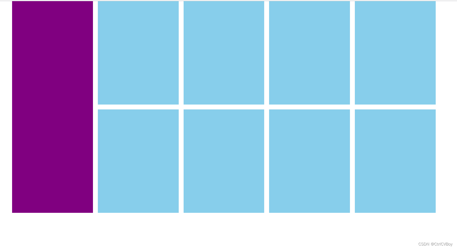
最近在做项目的时候碰到了一个小问题,是要实现如下图所示的一个效果:代码也很简单,一开始并没有想太多:想着是给右边的八个小方块分别设置margin-right和margin-bottom,然后再
<!DOCTYPE html>
<html lang="en">
<head>
    <meta charset="UTF-8">
    <meta http-equiv="X-UA-Compatible" content="IE=edge">
    <meta name="viewport" content="width=device-width, initial-scale=1.0">
    <title>Document</title>
    <style>
        /* 这一步是为了清除所有的默认内、外边距 */
        *{
            margin: 0;
            padding: 0;
        }
        .father{
            width: 1226px;
            height: 614px;
            margin: 0 auto;
            background-color: white;
        }
        .son1{
            width: 234px;
            height: 614px;
            background-color: #800080;
            float: left;
        }
        .son2{
            width: 978px;
            height: 614px;
            background-color: white;
            float: right;
        }
        /* 企业当中一般都是用8个li实现方块 */
        ul{
            /* 去掉无序列表前面的小圆点 */
            list-style: none;
        }
        .son2 li{
            width: 234px;
            height: 300px;
            background-color: #87ceeb;
            float: left;
            margin-right: 14px;
            margin-bottom: 14px;
        }
        /* 清除第4、8个li的右边距 */
        .son2 li:nth-child(4n)
        {
            margin-right: 0;
        }
    </style>
</head>
<body>
    <div class="father">
        <div class="son1"></div>
        <div class="son2">
            <ul>
                <li></li>
                <li></li>
                <li></li>
                <li></li>
                <li></li>
                <li></li>
                <li></li>
                <li></li>
            </ul>
        </div>
    </div>
</body>
</html>
利用结构伪类选择器选中第四和第八个小方块,将其margin-right再设为0,防止出现一排只排三个的情况,但奇怪的是,第二排的四个小方块的margin-bottom没有再设为0却也达到了预期的效果,这令我匪夷所思。
于是我便再写了一个div盒子(简称为test)换行去测试,因为如果第二排的四个子盒子的margin-bottom传给了父元素(大盒子)的话,那test和原来那个大盒子之间应该会换行的,然而
<!DOCTYPE html>
<html lang="en">
<head>
    <meta charset="UTF-8">
    <meta http-equiv="X-UA-Compatible" content="IE=edge">
    <meta name="viewport" content="width=device-width, initial-scale=1.0">
    <title>Document</title>
    <style>
        /* 这一步是为了清除所有的默认内、外边距 */
        *{
            margin: 0;
            padding: 0;
        }
        .father{
            width: 1226px;
            height: 614px;
            margin: 0 auto;
            background-color: white;
        }
        .son1{
            width: 234px;
            height: 614px;
            background-color: #800080;
            float: left;
        }
        .son2{
            width: 978px;
            height: 614px;
            background-color: white;
            float: right;
        }
        /* 企业当中一般都是用8个li实现方块 */
        ul{
            /* 去掉无序列表前面的小圆点 */
            list-style: none;
        }
        .son2 li{
            width: 234px;
            height: 300px;
            background-color: #87ceeb;
            float: left;
            margin-right: 14px;
            margin-bottom: 14px;
        }
        /* 清除第4、8个li的右边距 */
        .son2 li:nth-child(4n)
        {
            margin-right: 0;
        }
        .test{
            width: 1226px;
            height: 614px;
            margin: 0 auto;
            background-color: green
        }
    </style>
</head>
<body>
    <div class="father">
        <div class="son1"></div>
        <div class="son2">
            <ul>
                <li></li>
                <li></li>
                <li></li>
                <li></li>
                <li></li>
                <li></li>
                <li></li>
                <li></li>
            </ul>
        </div>
    </div>
    <div class="test"></div>
</body>
</html>
结果却恰恰相反:没有换行。
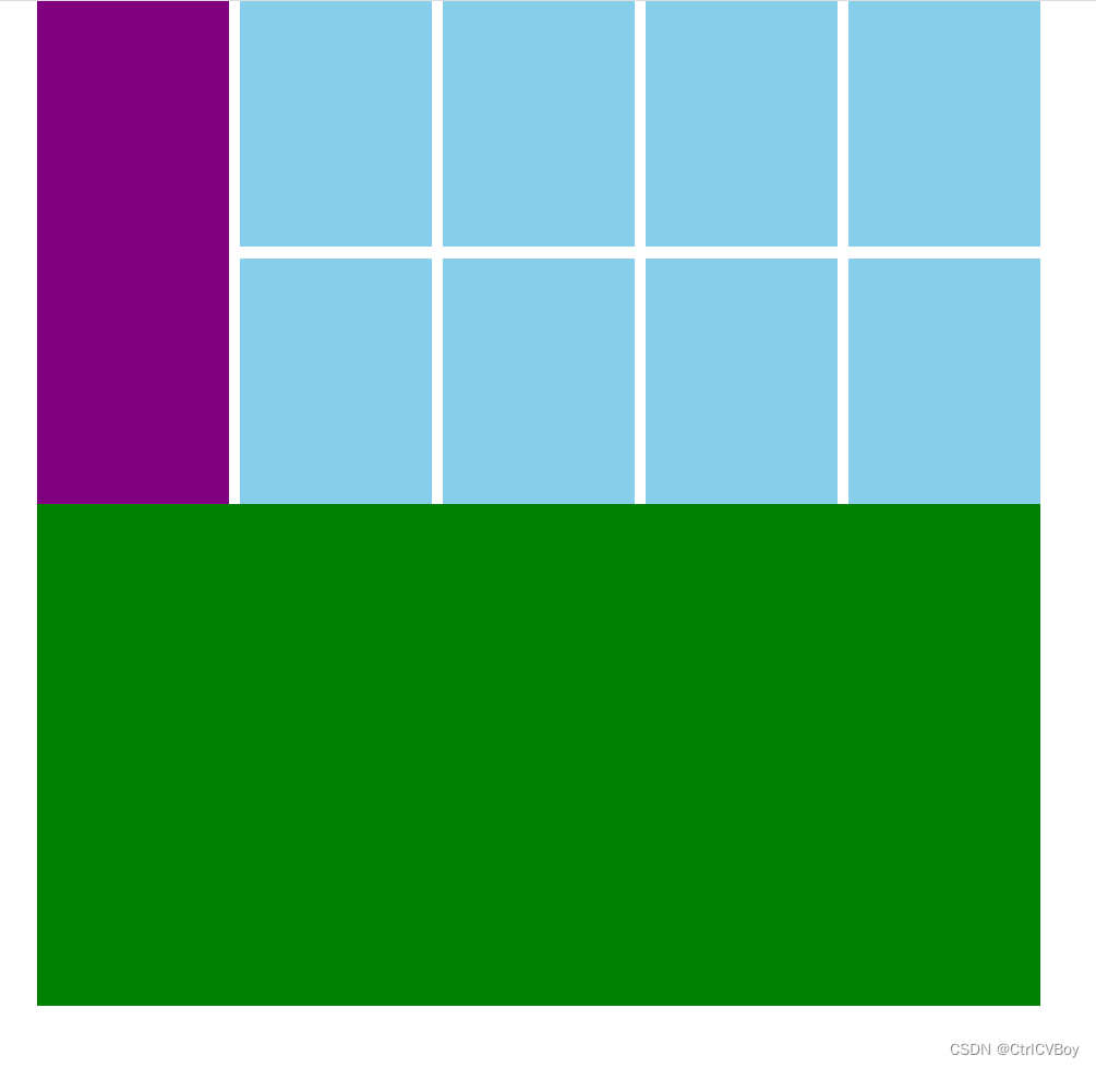 然后我结合盒子模型的两个外边距经典问题——合并现象和塌陷现象思考到,如果我把father的height设置成auto会不会就能成功,我们来看看:
<!DOCTYPE html>
<html lang="en">
<head>
    <meta charset="UTF-8">
    <meta http-equiv="X-UA-Compatible" content="IE=edge">
    <meta name="viewport" content="width=device-width, initial-scale=1.0">
    <title>Document</title>
    <style>
        /* 这一步是为了清除所有的默认内、外边距 */
        *{
            margin: 0;
            padding: 0;
        }
        .father{
            width: 1226px;
            height: 614px;
            margin: 0 auto;
            background-color: white;
        }
        .son1{
            width: 234px;
            height: 614px;
            background-color: #800080;
            float: left;
        }
        .son2{
            width: 978px;
            height: auto;
            background-color: white;
            float: right;
        }
        /* 企业当中一般都是用8个li实现方块 */
        ul{
            /* 去掉无序列表前面的小圆点 */
            list-style: none;
        }
        .son2 li{
            width: 234px;
            height: 300px;
            background-color: #87ceeb;
            float: left;
            margin-right: 14px;
            margin-bottom: 14px;
        }
        /* 清除第4、8个li的右边距 */
        .son2 li:nth-child(4n)
        {
            margin-right: 0;
        }
        .test{
            width: 1226px;
            height: 614px;
            margin: 0 auto;
            background-color: green
        }
    </style>
</head>
<body>
    <div class="father">
        <div class="son1"></div>
        <div class="son2">
            <ul>
                <li></li>
                <li></li>
                <li></li>
                <li></li>
                <li></li>
                <li></li>
                <li></li>
                <li></li>
            </ul>
        </div>
    </div>        <div class="test"></div>
</body>
</html>
可以看到,我们预期的间距确实是出现了,不得不说CSS真的是奇妙的东西,知识的海洋是无尽的。


 1219
1219


 被折叠的 条评论
为什么被折叠?
被折叠的 条评论
为什么被折叠?
 到【灌水乐园】发言


