


 本文介绍如何在Qt Quick中设计并实现一个功能丰富的QML自定义侧边栏,无需深入代码细节,旨在提升用户体验。
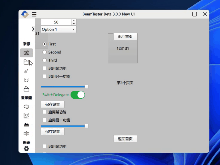
在现代用户界面设计中,侧边栏作为一种常用的导航和信息展示手段,扮演着至关重要的角色。使用Qt Quick和QML在应用程序中实现一个既美观又实用的自定义侧边栏,可以极大地提升用户体验。本文将探讨如何在不涉及具体代码的前提下,设计和实现一个功能丰富的QML自定义侧边栏。
项目结构:
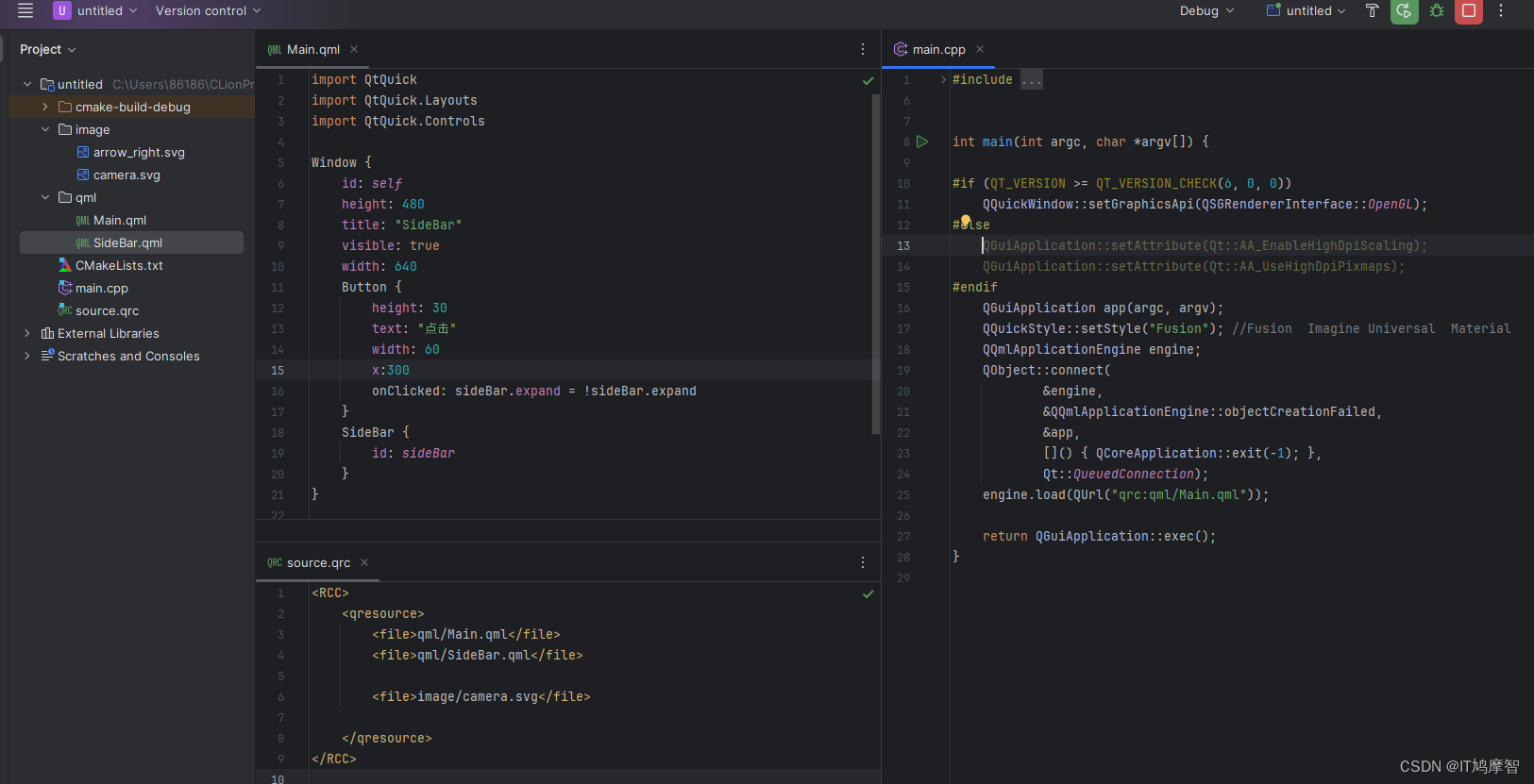
//SideBar.qml
import QtQuick
import QtQuick.Controls
import QtQuick.Layouts

Rectangle {
    property bool expand: false
    property bool compact: true

    height: parent.height
    width: expand ? parent.width : 0
    color: "transparent"


    Rectangle {

        id: menu
        width: compact ? 160 : 55
        height: parent.height
        x: expand ? 0 : -width
        Behavior on x {
            SpringAnimation {
                spring: 2
                damping: 0.2
            }
        }
        Behavior on width {
            NumberAnimation {
                duration: 400;
                easing.type: Easing.InOutExpo
            }
        }
        ListView {
            id: view
            width: parent.width
            height: parent.height
            clip: true
            headerPositioning: ListView.PullBackHeader
            footerPositioning: ListView.OverlayHeader
            model: models
            highlight: Rectangle {
                anchors.left: parent.left
                anchors.right: parent.right
                anchors.leftMargin: 5
                anchors.rightMargin: 5
                radius: 5
                color: "#3d000000"
                z: 3
            }
            header: Rectangle {
                height: 70
                width: parent.width
                z: 3
                Button {
                    anchors.right: parent.right
                    anchors.verticalCenter: parent.verticalCenter
                    width: 10
                    height: 20
                    text: "点击收起"
                    onClicked: compact = !compact
                }
            }
            footer: Rectangle {
                height: 30
                width: parent.width
                z: 3
                Image {
                    id: settingIcon
                    anchors.verticalCenter: parent.verticalCenter
                    x: compact ? 15 : (parent.width - width) / 2

                    Behavior on x {
                        NumberAnimation {
                            duration: 400;
                            easing.type: Easing.InOutExpo
                        }
                    }
                    source: theme.settingIcon
                    sourceSize.height: 20
                    fillMode: Image.PreserveAspectFit
                }
                Text {
                    anchors.left: settingIcon.right
                    anchors.verticalCenter: parent.verticalCenter
                    anchors.leftMargin: 10
                    text: "设置"
                    opacity: compact ? 1 : 0
                    Behavior on opacity {
                        NumberAnimation {
                            duration: 300
                        }
                    }
                }
                MouseArea {
                    anchors.fill: parent
                    onClicked: swipe.setCurrentIndex(swipe.count - 1)
                }
            }

            section.property: "cluster"
            section.criteria: ViewSection.FullString
            section.delegate: Rectangle {
                property bool expanded: true
                property bool hover: false
                id: wrapper
                clip: true
                anchors.left: parent.left
                anchors.right: parent.right
                anchors.leftMargin: 5
                anchors.rightMargin: 5
                height: section ? 30 : 0
                opacity: section ? 1 : 0
                color: "transparent"
                Text {
                    text: section
                    scale: hover ? 1.3 : 1
                    font.bold: true
                    anchors.verticalCenter: parent.verticalCenter
                    x: compact ? 5 : (parent.width - width) / 2
                    Behavior on x {
                        NumberAnimation {
                            duration: 400
                            easing.type: Easing.InOutQuad
                        }
                    }
                    Behavior on scale {
                        NumberAnimation {
                            duration: 200
                        }
                    }
                }
                Image {
                    opacity: compact ? 1 : 0
                    anchors.right: parent.right
                    anchors.verticalCenter: parent.verticalCenter
                    source: theme.arrowRightIcon
                    sourceSize.height: 10
                    fillMode: Image.PreserveAspectFit
                    rotation: expanded ? 270 : 90
                    Behavior on rotation {
                        NumberAnimation {
                            duration: 200
                        }
                    }
                    Behavior on opacity {
                        NumberAnimation {
                            duration: 300
                        }
                    }
                }
                MouseArea {
                    id: mouse
                    anchors.fill: parent
                    hoverEnabled: true
                    onClicked: {
                        wrapper.expanded = !wrapper.expanded
                        for (let i = 0; i < models.count; ++i) {
                            const item = models.get(i);
                            if (item.cluster === section) item.visible = wrapper.expanded
                        }
                    }
                    onEntered: hover = true
                    onExited: hover = false
                }
            }

            delegate: Rectangle {
                anchors.left: parent.left
                anchors.right: parent.right
                anchors.leftMargin: 5
                anchors.rightMargin: 5
                height: model.visible ? 30 : 0
                opacity: model.visible ? 1 : 0
                color: "transparent"
                Behavior on opacity {
                    NumberAnimation {
                        duration: 300;
                        easing.type: Easing.InOutExpo
                    }
                }
                Behavior on height {
                    NumberAnimation {
                        duration: 400;
                        easing.type: Easing.InOutQuad
                    }
                }
                Image {
                    id: itemIcon
                    anchors.verticalCenter: parent.verticalCenter
                    x: compact ? cluster ? 15 : 5 : (parent.width - width) / 2

                    Behavior on x {
                        NumberAnimation {
                            duration: 400;
                            easing.type: Easing.InOutExpo
                        }
                    }
                    source: icon
                    sourceSize.height: 20
                    fillMode: Image.PreserveAspectFit
                }
                Text {
                    anchors.left: itemIcon.right
                    anchors.verticalCenter: parent.verticalCenter
                    anchors.leftMargin: 10
                    text: name
                    opacity: compact ? 1 : 0
                    Behavior on opacity {
                        NumberAnimation {
                            duration: 300
                        }
                    }
                }
                MouseArea {
                    anchors.fill: parent
                    onClicked: view.currentIndex = index
                }
            }
        }
    }
    ListModel {
        id: models
        // 如果 cluster 是空就当作根节点
        Component.onCompleted: {
            models.append({cluster: "来源", name: "相机", icon: "qrc:image/camera.svg", visible: true});
            models.append({cluster: "来源", name: "文件", icon: "qrc:image/camera.svg", visible: true});
            models.append({cluster: "来源", name: "合成光束", icon: "qrc:image/camera.svg", visible: true});

            models.append({cluster: "", name: "校正", icon: "qrc:image/camera.svg", visible: true});
            models.append({cluster: "", name: "采集", icon: "qrc:image/camera.svg", visible: true});

            models.append({cluster: "显示器", name: "调色板", icon: "qrc:image/camera.svg", visible: true});
            models.append({cluster: "显示器", name: "图形", icon: "qrc:image/camera.svg", visible: true});
            models.append({cluster: "显示器", name: "表面", icon: "qrc:image/camera.svg", visible: true});
            models.append({cluster: "显示器", name: "分区", icon: "qrc:image/camera.svg", visible: true});

            models.append({cluster: "", name: "测试报告", icon: "qrc:image/camera.svg", visible: true});
            models.append({cluster: "", name: "日志记录", icon: "qrc:image/camera.svg", visible: true});

        }
    }
    SwipeView {
        id: swipe
        clip: true
        anchors.left: menu.right
        anchors.right: parent.right
        height: parent.height
        currentIndex: view.currentIndex
        orientation: Qt.Vertical
        interactive: false
        Page {
            background: Rectangle {
                color: "#3d000000"
            }
            Flickable {
                anchors.fill: parent
                boundsBehavior: Flickable.DragOverBounds
                contentHeight: container.height

                Button {
                    width: 100
                    height: 30
                    text: "相机页面"
                }
            }
        }

        Page {
            background: Rectangle {
                color: "#3d0000ff"
            }
            Flickable {
                anchors.fill: parent
                boundsBehavior: Flickable.DragOverBounds
                contentHeight: container.height

                Button {
                    width: 100
                    height: 30
                    text: "文件页面"
                }
            }
        }
    }
}


 扫一扫
扫一扫


 742
742

 被折叠的 条评论
为什么被折叠?
被折叠的 条评论
为什么被折叠?
 到【灌水乐园】发言


