


目录
css三大特性
1、继承性
2、层叠性
3、优先级
优先级
不同的选择器具有不同的优先级,优先级高的选择器样式会覆盖优先级低的选择器样式。
优先级公式:
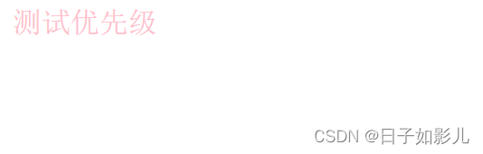
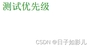
继承<通配符选择器(*)<标签选择器<类选择器<id选择器<行内样式<!important
注意:
1、!important写在属性值的后面,分号的前面!
2、!important不能提升继承的优先级,只要是继承优先级最低!
3、实际开发中不建议使用!important
通配符选择的范围比标签广 标签更精确所以优先级更高
选择器的选中范围越广 它的优先级就越低
<!DOCTYPE html>
<html lang="en">
<head>
<meta charset="UTF-8">
<meta http-equiv="X-UA-Compatible" content="IE=edge">
<meta name="viewport" content="width=device-width, initial-scale=1.0">
<title>Document</title>
<style>
/* 继承 */
body {
color:red;
}
#box {
color:blue;
}
.box {
color:orange;
}
/* 标签 */
div {
color:green;
}
</style>
</head>
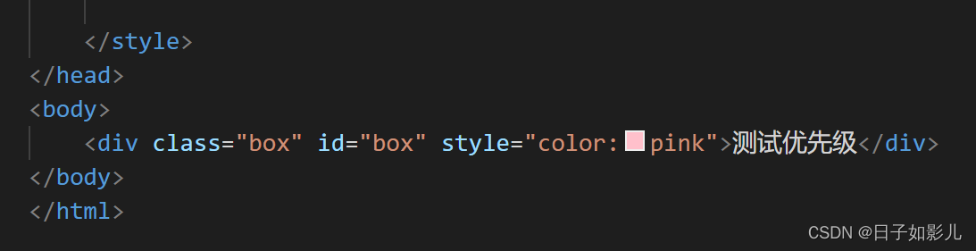
<body>
<div class="box" id="box">测试优先级</div>
</body>
</html>

!important不要给继承的添加,自己有样式无法继承父级样式。
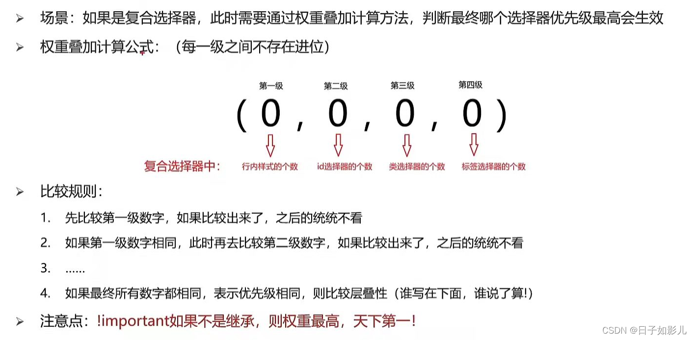
权重叠加计算
<!DOCTYPE html>
<html lang="en">
<head>
    <meta charset="UTF-8">
    <meta http-equiv="X-UA-Compatible" content="IE=edge">
    <meta name="viewport" content="width=device-width, initial-scale=1.0">
    <title>Document</title>
    <style>
        /* (行内,id,类,标签) */

        /* (0,1,0,1) */
        div #one {
            color:orange;
        }
        /* (0,0,2,0) */
        .father .son {
            color:skyblue;
        }
        /* (0,0,1,1) */
        .father p {
            color:purple;
        }
        /* (0,0,0,2) */
        div p {
            color:pink;
        }

    </style>
</head>
<body>
    <div class="father">
        <div class="son" id="one">我是一个标签</div>
    </div>
</body>
</html> 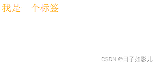
!important慎用
!important是最高的 继承最低
     #father {
            color:green !important;
        }

    </style>
</head>
<body>
    <div class="father">
        <div class="son" id="one">我是一个标签</div>
    </div>
</body>
</html>
!important加在继承上 也没用 继承就是权重最低的 不生效
如果选择器权重一样 那么谁在后边谁生效
如果选择器都是继承,那么看继承哪个父级,哪个父级高,哪个选择器生效。
<!DOCTYPE html>
<html lang="en">
<head>
    <meta charset="UTF-8">
    <meta http-equiv="X-UA-Compatible" content="IE=edge">
    <meta name="viewport" content="width=device-width, initial-scale=1.0">
    <title>Document</title>
    <style>
        /* 都是继承的特殊情况 */
        div p {
            color:red;
        }

        .father {
            color:blue;
        }
    </style>
</head>
<body>
    <div class="father">
        <p class="son">
            <span>文字</span>
        </p>
    </div>
</body>
</html>
是红色
优先继承亲爹
chrome调试工具
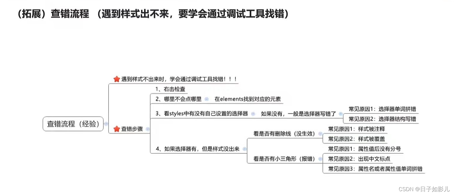
css上一行出错,下一行会受影响。
PxCook软件:
psd图用开发模式
盒子模型
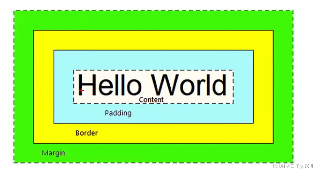
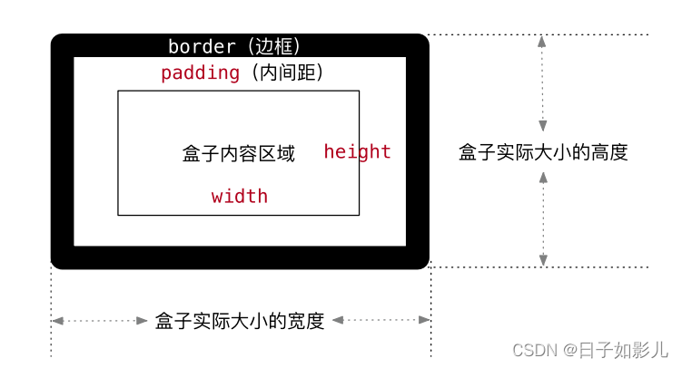
1.1 盒子模型的介绍
页面中的每一个标签,都可看做是一个盒子。
css中规定每个盒子分别由:内容区域(content)、内边距区域(padding)、边框区域(border)、外边距区域(margin)构成,这就是盒子模型。
<!DOCTYPE html>
<html lang="en">
<head>
    <meta charset="UTF-8">
    <meta http-equiv="X-UA-Compatible" content="IE=edge">
    <meta name="viewport" content="width=device-width, initial-scale=1.0">
    <title>Document</title>
    <style>
        div {
            width: 300px;
            height: 300px;
            background-color: pink;
            /* 边框线 */
            border: 1px solid #000;
            /* 内边距:内容和盒子边缘之间*/
            padding: 20px;
            /* 外边距 :出现在两个盒子之间,出现在盒子的外面*/
            margin: 50px;
        }
    </style>
</head>
<body>
    <div>
        内容
    </div>
    <div>
        内容
    </div>
</body>
</html>
2.1内容的宽度和高度
盒子内容区域的大小
属性:width/height
3.1边框(border)
border:10px solid red;
快捷键:bd + tab
dashed是虚线
solid是实线
dotted是点线
不分先后顺序
3.2边框-单方向设置
border-方位名词
例如:
border-left:5px dotted #000;
3.3边框-单个属性
| 作用 | 属性名 | 属性值 |
| 边框粗细 | border-width | 数字+px |
| 边框样式 | border-style | 实线solid、虚线dashed、点线dotted |
| 边框颜色 | border-color | 颜色取值 |
用复合更简单 这个了解即可
<!DOCTYPE html>
<html lang="en">
<head>
    <meta charset="UTF-8">
    <meta http-equiv="X-UA-Compatible" content="IE=edge">
    <meta name="viewport" content="width=device-width, initial-scale=1.0">
    <title>Document</title>
    <style>
        /* 盒子尺寸=width / height +边框线 */
        /* 如果400*400尺寸 */
        /* border撑大盒子尺寸 */
        div {
            width: 380px;
            height: 380px;
            background-color: green;
            border:10px solid #000;
        }
    </style>
</head>
<body>
    <div>div</div>
</body>
</html>
综合案例一(新浪导航)
布局顺序:从外往内,从上往下
从外向内:宽高背景色 放内容 调节内容位置 控制文字(位置 大小细节)
<!DOCTYPE html>
<html lang="en">
<head>
    <meta charset="UTF-8">
    <meta http-equiv="X-UA-Compatible" content="IE=edge">
    <meta name="viewport" content="width=device-width, initial-scale=1.0">
    <title>Document</title>
    <style>
        .box {
            height: 40px;
            border-top:3px solid #ff8500;
            border-bottom: 1px solid #edeef0;
        }
        /* 后代选择器 选择box里的a */
        .box a {
            width: 80px;
            height: 40px;
            /* 推荐先加上:清楚的看到文字在什么位置 */
            /* background-color: #edeef0; */
            display:inline-block;
            /* 水平居中 */
            text-align: center;
            /* 垂直居中 */
            line-height: 40px;
            font-size: 12px;
            color:#4c4c4c;
            text-decoration: none;
        }
        .box a:hover {
            background-color: #edeef0;
            color:#ff8400;
        }
    </style>
</head>
<body>
    <div class="box">
        <a href="#">新浪导航</a>
        <a href="#">新浪导航</a>
        <a href="#">新浪导航</a>
        <a href="#">新浪导航</a>
    </div>
</body>
</html>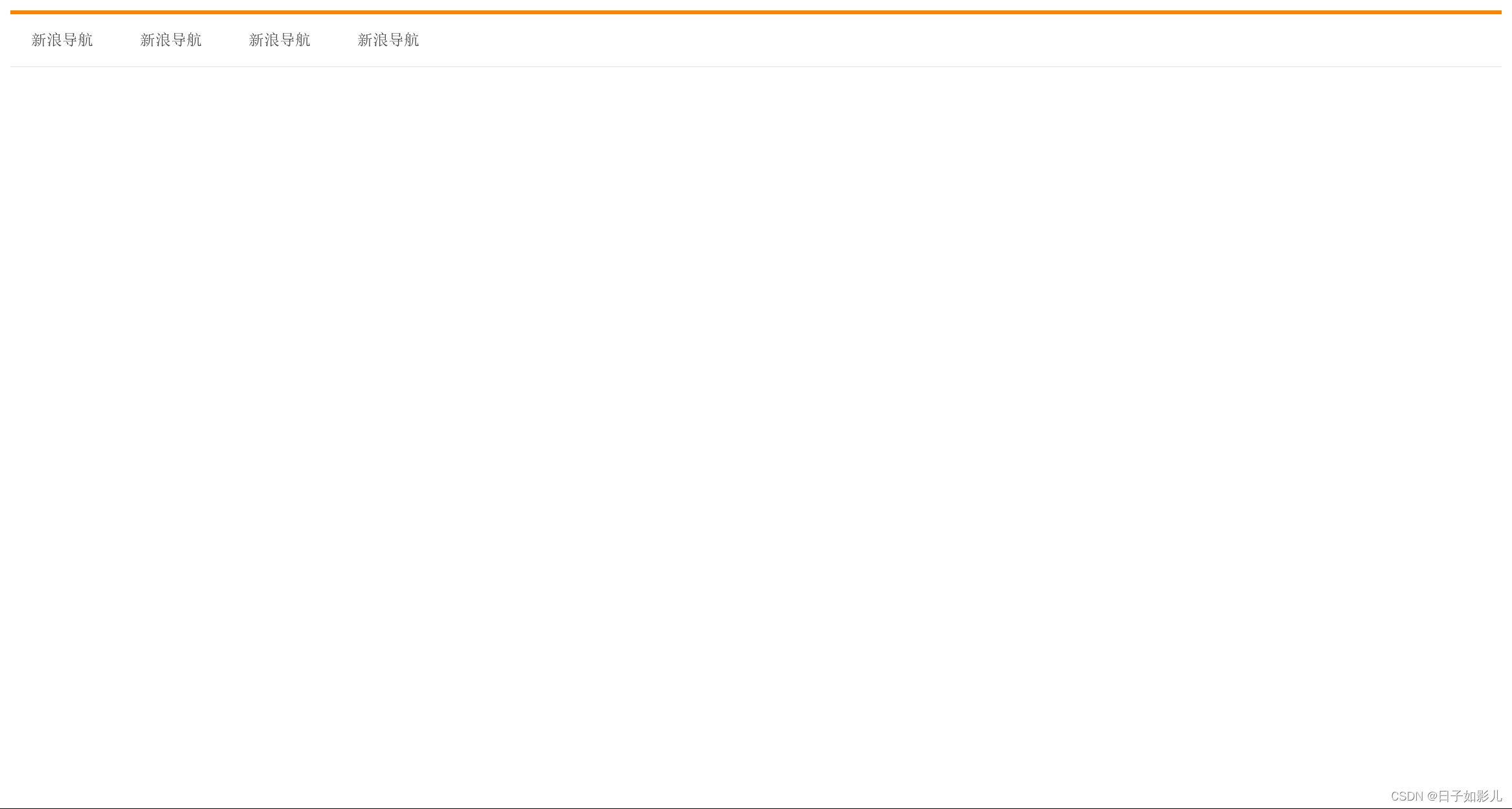
新浪导航优化:
<!DOCTYPE html>
<html lang="en">
<head>
    <meta charset="UTF-8">
    <meta http-equiv="X-UA-Compatible" content="IE=edge">
    <meta name="viewport" content="width=device-width, initial-scale=1.0">
    <title>Document</title>
    <style>
        .box {
            height: 40px;
            border-top:3px solid #ff8500;
            border-bottom: 1px solid #edeef0;
        }
        /* 后代选择器 选择box里的a */
        .box a {
            /* width: 80px; */
            padding:0 16px;
            height: 40px;
            /* 推荐先加上:清楚的看到文字在什么位置 */
            /* background-color: #edeef0; */
            display:inline-block;
            /* 水平居中 */
            text-align: center;
            /* 垂直居中 */
            line-height: 40px;
            font-size: 12px;
            color:#4c4c4c;
            text-decoration: none;
        }
        .box a:hover {
            background-color: #edeef0;
            color:#ff8400;
        }
    </style>
</head>
<body>
    <div class="box">
        <a href="#">新浪导航</a>
        <a href="#">新浪导航啦啦啦啦</a>
        <a href="#">新浪导航</a>
        <a href="#">新浪导航</a>
    </div>
</body>
</html> 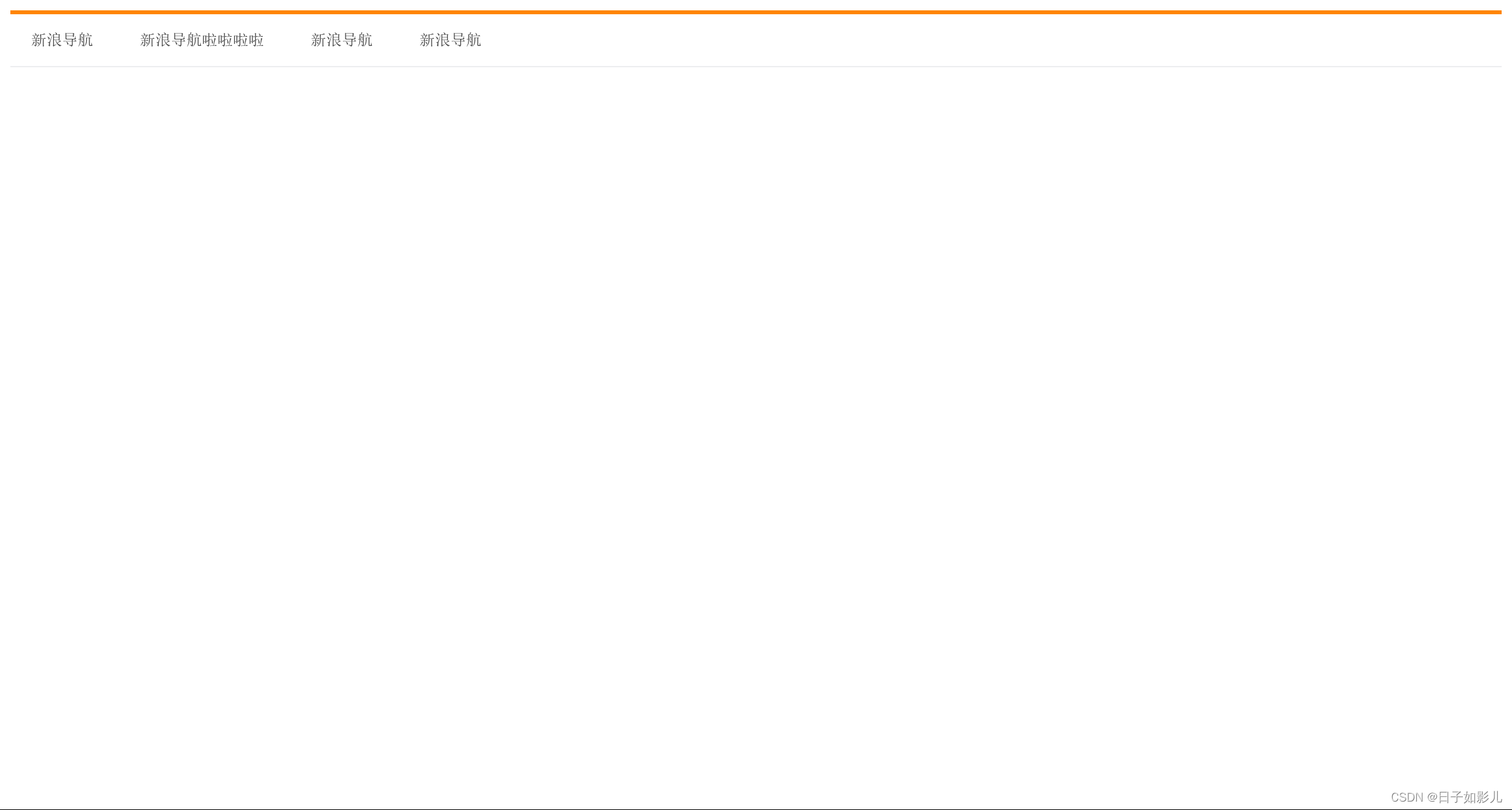
4.1 内边距(padding)- 取值
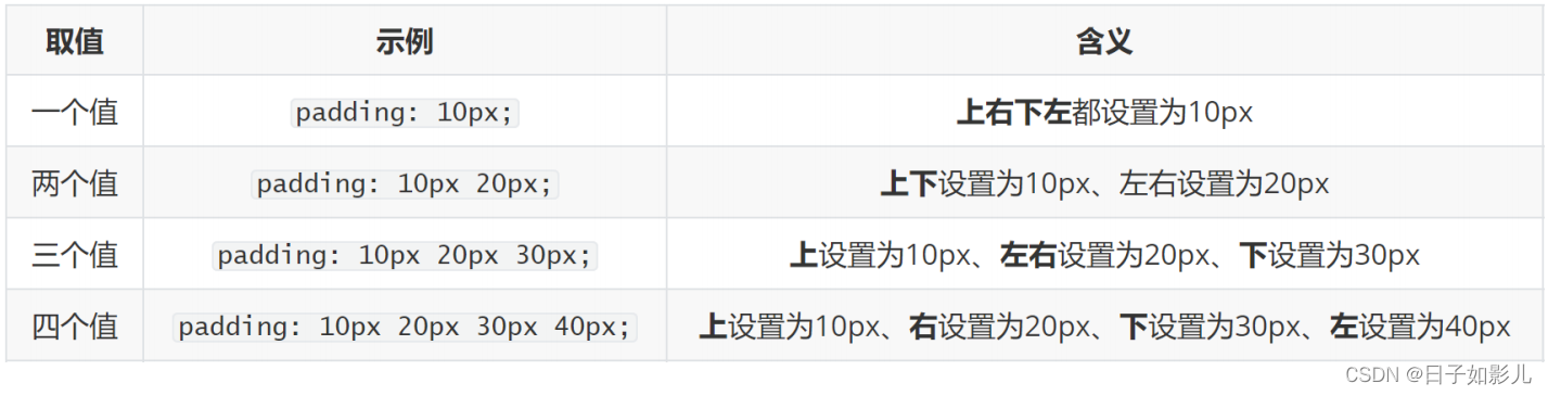
·盒子实际大小计算公式:
<!DOCTYPE html>
<html lang="en">
<head>
    <meta charset="UTF-8">
    <meta http-equiv="X-UA-Compatible" content="IE=edge">
    <meta name="viewport" content="width=device-width, initial-scale=1.0">
    <title>Document</title>
    <style>
        div {
            width: 240px;
            height: 240px;
            background-color: pink;
            border:10px solid #000;
            padding:20px;
        }
    </style>
</head>
<body>
    <div>文字</div>
</body>
</html>
4.2 内边距(padding)- 单方向设置
(拓展)不会撑大盒子的特殊情况
4.5 CSS3盒模型(自动内减)
<!DOCTYPE html>
<html lang="en">
<head>
    <meta charset="UTF-8">
    <meta http-equiv="X-UA-Compatible" content="IE=edge">
    <meta name="viewport" content="width=device-width, initial-scale=1.0">
    <title>Document</title>
    <style>
        div {
            width: 100px;
            height: 100px;
            background-color: pink;
            border:1px solid #000;
            padding: 20px;
             /* 内减模式 */
            /* 变成css3的盒子模型 不需要手动做减法 */
            box-sizing: border-box;
        }
    </style>
</head>
<body>
    <div>文字</div>
</body>
</html>
5.1 外边距(margin)- 取值
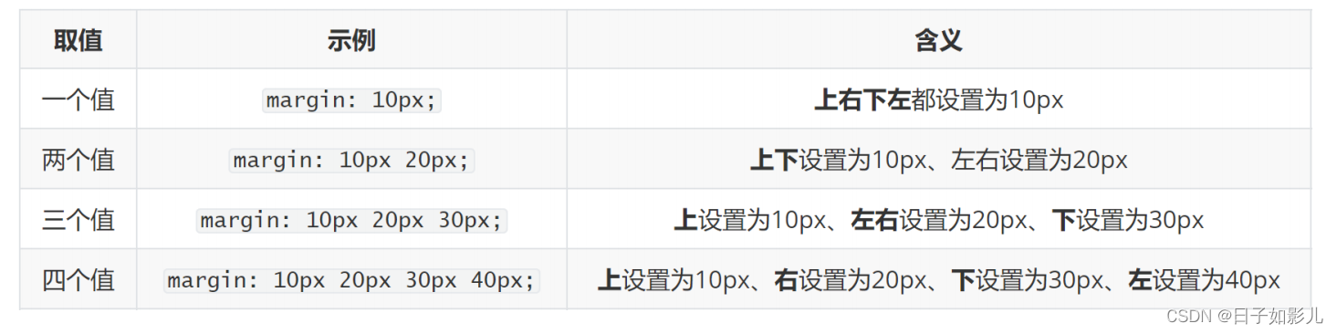
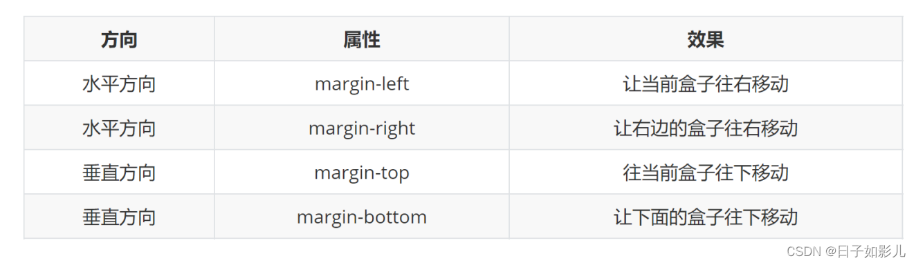
5.2 外边距(margin) - 单方向设置
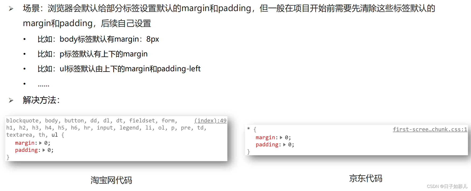
5.4 清除默认内外边距
版心居中
<!DOCTYPE html>
<html lang="en">
<head>
    <meta charset="UTF-8">
    <meta http-equiv="X-UA-Compatible" content="IE=edge">
    <meta name="viewport" content="width=device-width, initial-scale=1.0">
    <title>Document</title>
    <style>
        div {
            width: 1000px;
            height: 300px;
            background-color: pink;
            margin: 0 auto;
            /* 要保证左右auto */
        }
    </style>
</head>
<body>
    <div>版心</div>
</body>
</html>
综合案例二(新闻列表)
网站logo才用h1
/* 去掉列表的符号 */
ul {
list-style: none;
}
<!DOCTYPE html>
<html lang="en">
<head>
    <meta charset="UTF-8">
    <meta http-equiv="X-UA-Compatible" content="IE=edge">
    <meta name="viewport" content="width=device-width, initial-scale=1.0">
    <title>Document</title>
    <style>
        * {
            margin: 0;
            padding: 0;
            /* 所有的标签都可能添加内边距或border,都内减模式 */
            box-sizing: border-box;
        }

        .news {
            width: 500px;
            height: 400px;
            border:1px solid #ccc;
            margin:52px auto;
            padding:42px 30px 0;
        }
        .news h2 {
            border-bottom:1px solid #ccc;
            font-size: 30px;
            /* 行高是1倍,就是字号的大小 */
            line-height: 1;
            padding-bottom: 10px;
        }
        /* 去掉列表的符号 */
        ul {
            list-style: none;
        }
        .news li {
            height: 50px;
            border-bottom: 1px dashed #ccc;
            padding-left: 28px;
            line-height: 50px;
        }
        .news a {
            text-decoration: none;
            color:#666;
            font-size: 18px;
        }
    </style>
</head>
<body>
    <div class="news">
        <h2>最新文章/New Articles</h2>
        <ul>
            <li><a href="#">北京招聘网页设计,平面设计,php</a></li>
            <li><a href="#">北京招聘网页设计,平面设计,php</a></li>
            <li><a href="#">北京招聘网页设计,平面设计,php</a></li>
            <li><a href="#">北京招聘网页设计,平面设计,php</a></li>
            <li><a href="#">北京招聘网页设计,平面设计,php</a></li>
        </ul>
    </div>
</body>
</html>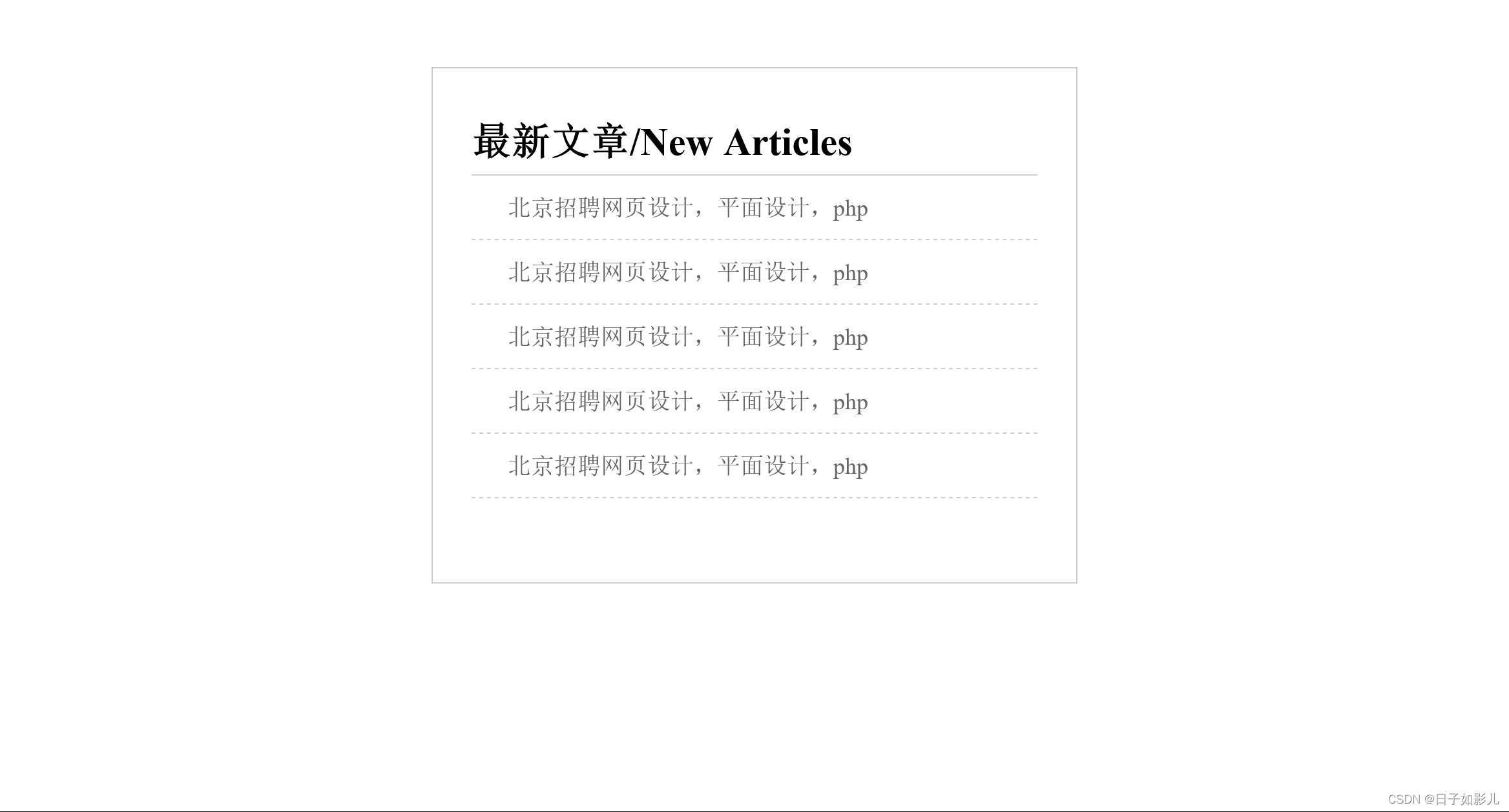


 126
126

 被折叠的 条评论
为什么被折叠?
被折叠的 条评论
为什么被折叠?
 到【灌水乐园】发言


