


 本文介绍了用户消费行为分析,重点讲解了RFM模型(最近消费时间、消费频率和消费金额)在用户分类中的应用。通过Pandas库的透视表功能,对用户数据进行深入分析,探讨了新用户、活跃用户、回流用户和流失用户的区分,并展示了lambda函数在数据分析中的常见用法,如map()函数的应用。
#user_id:用户id,order_dt:购买日期,order_products:购买产品数量,order_amount:购买金额
#数据时间:1997年1月-1998年6月的行为数据
import numpy as np
import pandas as pd
import matplotlib.pyplot as plt
from datetime import datetime
%matplotlib inline
#在行内显示
plt.style.use('ggplot')#更改绘图风格
plt.rcParams['font.sans-serif'] = ['Arial Unicode MS']#设置字体#导入数据
columns=['user_id','order_dt','order_products','order_amount']
df=pd.read_table('cd_ma.txt',names=columns,sep='\s+') #sep=s'\s+'代表匹配任意空格
df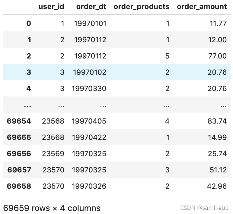
#1.日期格式需要转换
#2.存在一个用户一天内购买多次

df.describe()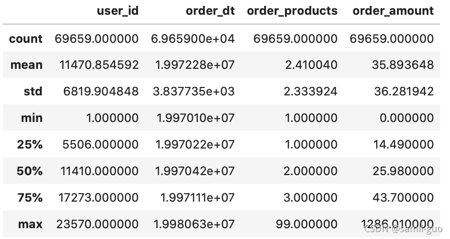
df['order_date']=pd.to_datetime(df['order_dt'],format='%Y%m%d')
#format='%Y%m%d'按照指定格式转成数据列,%Y代表四位的年,%m代表两位月,%d代表两位日,%y代表两位年,%h代表两位小时,%M代表两位分钟
df['month']=df['order_date'].astype('datetime64[M]')
#将order_date转化成精度为月份的数据列,astype('datetime64[M]')精度转换,转成月份进度
df.head() 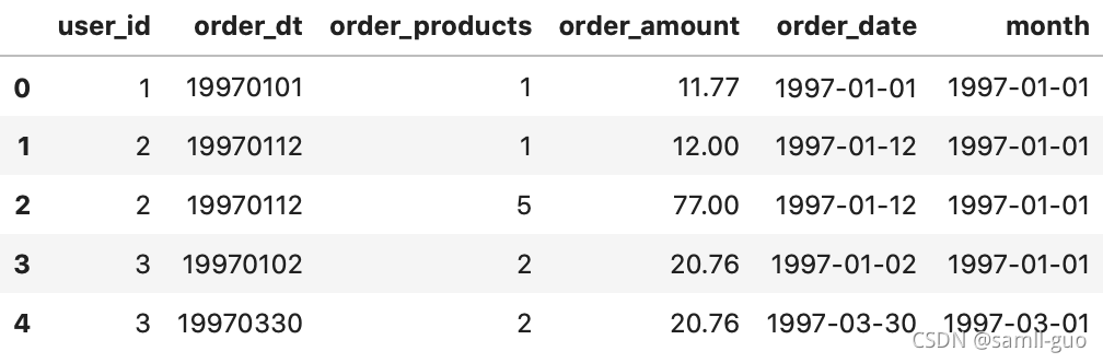
#按照月份统计购买产品数量,消费金额,消费次数,消费人数
plt.figure(figsize=(20,15))#单位时英寸
#每月产品购买数量
plt.subplot(2,2,1)#绘制在两行两列第一个图中
df.groupby('month')['order_products'].sum().plot()#默认折线图
plt.title('每月产品购买数量')
#每月的消费金额
plt.subplot(2,2,2)#绘制在两行两列第二个图中
df.groupby('month')['order_amount'].sum().plot()#默认折线图
plt.title('每月的消费金额')
#每月消费次数
plt.subplot(2,2,3)#绘制在两行两列第三个图中
df.groupby('month')['user_id'].count().plot()#默认折线图
plt.title('月消费次数')
#每月消费人数(根据'user_id'去重统计)
plt.subplot(2,2,4)#绘制在两行两列第三个图中
df.groupby(by='month')['user_id'].apply(lambda x:len(x.drop_duplicates())).plot()
#apply(lambda x:len(x.drop_duplicates()))去重作用,然后用len()长度计算,作为人数数量的统计
plt.title('月消费次数')

#分析结果:前三个月销量非常高,后面下降然后基本趋于平稳 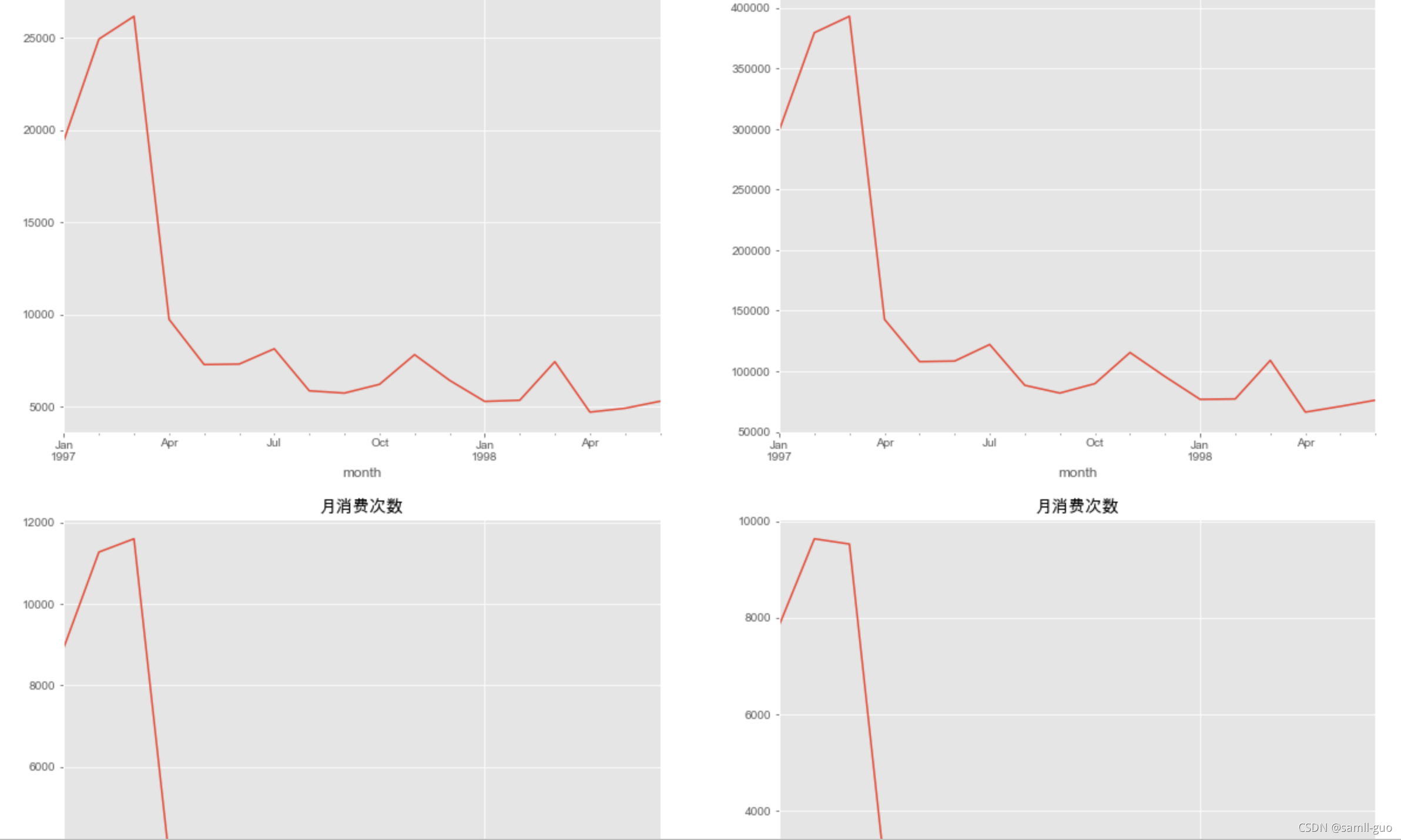
用户个体的消费分析
#1.用户消费金额,消费次数(产品数量)描述统计
user_grouped=df.groupby(by='user_id').sum()
user_grouped.describe()
#用户数237570,每个用户平均购买7个,但是中位数只有3个,并且最大值1033个,平均值大于中位数,明显右偏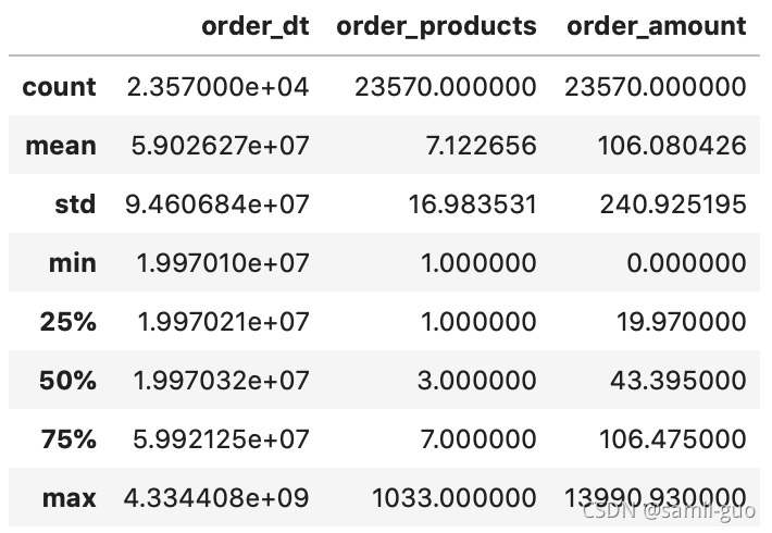
#绘制用户的产品的购买数量与消费金额的散点图
df.plot(kind='scatter',x='order_products',y='order_amount')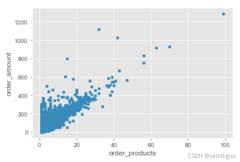
#用户的消费分布图
plt.figure(figsize=(12,4))
plt.subplot(1,2,1)
plt.xlabel('每个订单的消费金额')
df['order_amount'].plot(kind='hist',bins=50)
#bins区间分数,影响柱子的宽度,值越大柱子越细
plt.subplot(1,2,2)
plt.xlabel('每个uid购买数量')
df.groupby(by='user_id')['order_products'].sum().plot(kind='hist',bins=50)
#每个用户购买数量非常少
#总结,购买量低,价格小于50的占绝大多数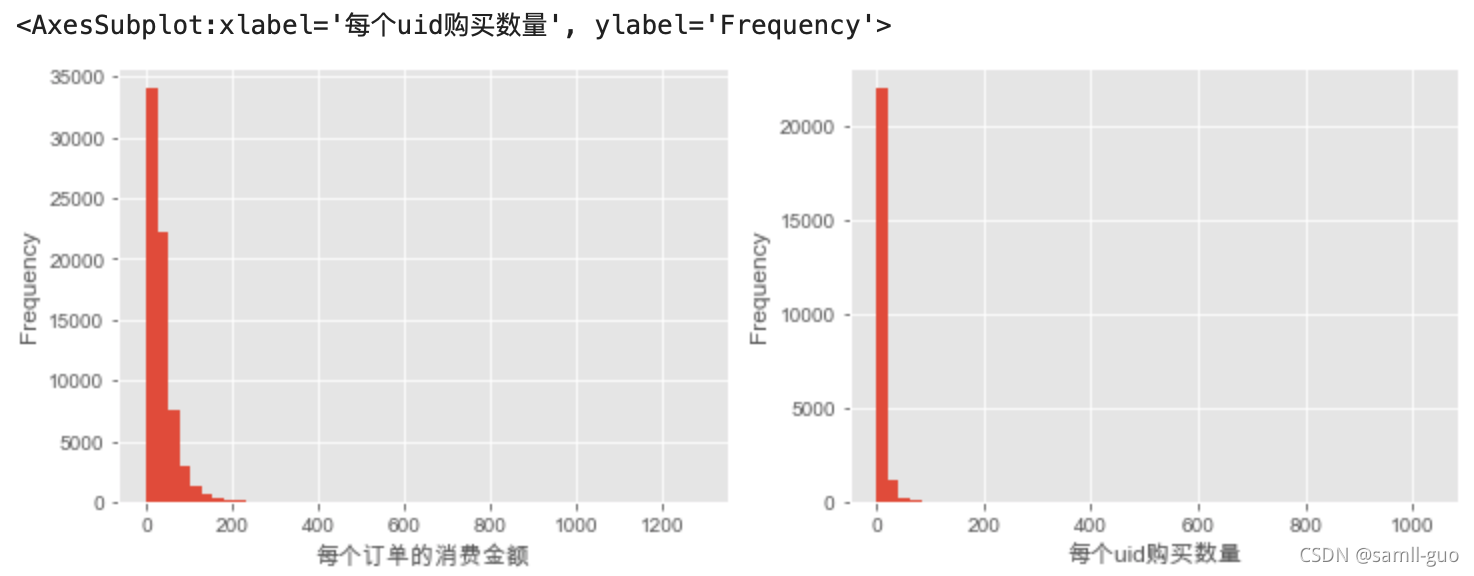 用户的累积消费金额占比分析
 最低0.47元/天 解锁文章


 被折叠的 条评论
为什么被折叠?
被折叠的 条评论
为什么被折叠?
 到【灌水乐园】发言


