


用js中的Date日期对象来实现:
获取时间的方法是 new Date()
获取年:getFullYear()
获取月:getMonth() 获取的月份是从0开始的,所以记得 +1
获取日:getdate()
获取星期:getDay()
获取时:getHours()
获取分:getMinutes()
获取秒:getSeconds()
首先先写html结构
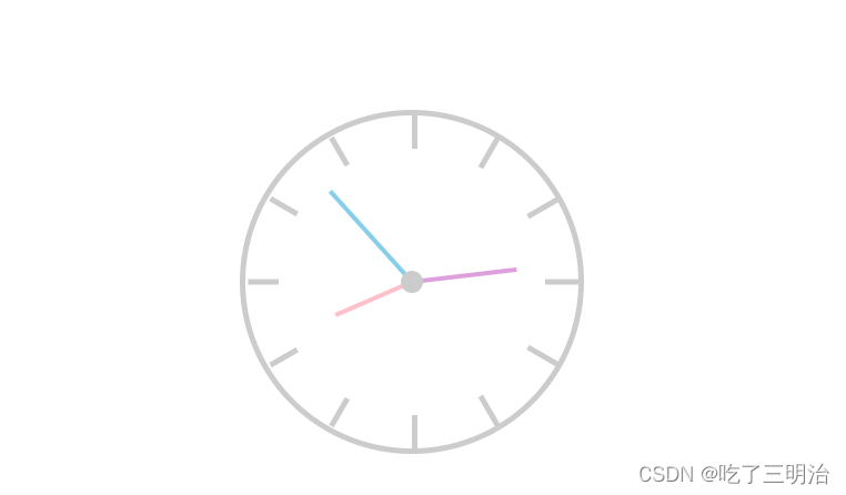
 <div class="clock">
        <!-- 刻度线 -->
        <div class="line line1"></div>
        <div class="line line2"></div>
        <div class="line line3"></div>
        <div class="line line4"></div>
        <div class="line line5"></div>
        <div class="line line6"></div>

        <!-- 表盘 -->
        <div class="panel"></div>

        <!-- 小圆点 -->
        <div class="circle"></div>

        <!-- 时分秒针 -->
        <div class="h"></div>
        <div class="m"></div>
        <div class="s"></div>
    </div>
然后写css样式:
<style>
    * {
        margin: 0;
        padding: 0;
    }

    .clock {
        width: 300px;
        height: 300px;
        border: 5px solid #cccccc;
        margin: 100px auto;
        border-radius: 50%;
        position: relative;
    }

    .clock .line {
        width: 5px;
        height: 300px;
        background: #cccccc;
        position: absolute;
        left: 50%;
        top: 0px;
        transform: translateX(-50%);
    }

    .clock .line1 {
        transform: rotate(0deg);
    }

    .clock .line2 {
        transform: rotate(30deg);
    }

    .clock .line3 {
        transform: rotate(60deg);
    }

    .clock .line4 {
        transform: rotate(90deg);
    }

    .clock .line5 {
        transform: rotate(120deg);
    }

    .clock .line6 {
        transform: rotate(150deg);
    }

    .clock .panel {
        width: 240px;
        height: 240px;
        background: white;
        border-radius: 50%;
        position: absolute;
        left: 50%;
        top: 50%;
        transform: translate(-50%, -50%);
    }

    .clock .circle {
        width: 20px;
        height: 20px;
        background: #cccccc;
        border-radius: 50%;
        position: absolute;
        left: 50%;
        top: 50%;
        transform: translate(-50%, -50%);
        z-index: 10;
    }

    .clock .h {
        width: 4px;
        height: 75px;
        background: pink;
        position: absolute;
        left: 50%;
        top: 50%;
        transform: translate(-50%, -100%) rotate(0deg);
        transform-origin: center bottom;
    }

    .clock .m {
        width: 4px;
        height: 95px;
        background: plum;
        position: absolute;
        left: 50%;
        top: 50%;
        transform: translate(-50%, -100%);
        transform-origin: center bottom;
    }

    .clock .s {
        width: 4px;
        height: 110px;
        background: skyblue;
        position: absolute;
        left: 50%;
        top: 50%;
        transform: translate(-50%, -100%);
        transform-origin: center bottom;

    }
</style>
然后就是最重要的js代码了;
作者分了面向对象和面向过程两个版本:
版本一 --- 面向过程版:
<script>
        var pointer_h = document.querySelector('.h')
        var pointer_m = document.querySelector('.m')
        var pointer_s = document.querySelector('.s')

        var second_hand = setInterval(function () {
            var dt = new Date()
            var hh = dt.getHours();
            var mm = dt.getMinutes();
            var ss = dt.getSeconds();
            var turn_s = ss * 6;
            var turn_m = mm * 6;
            var turn_d = hh  * 30;

            pointer_s.style.transform = ` translate(-50%, -100%) rotate(${turn_s}deg)`;
            pointer_h.style.transform = ` translate(-50%, -100%) rotate(${turn_d}deg)`;
            pointer_m.style.transform = ` translate(-50%, -100%) rotate(${turn_m}deg)`;
        }, 1000)
    </script>
版本二 --- 面向对象版:
<script>
        function clock() {
            this.dt = new Date();
            //时
            this.hh = this.dt.getHours();
            //分
            this.mm = this.dt.getMinutes();
            //秒
            this.ss = this.dt.getSeconds();
        }

        //获取标签
        clock.prototype.getPointer = function () {
            this.pointer_h = document.querySelector('.h');
            this.pointer_m = document.querySelector('.m');
            this.pointer_s = document.querySelector('.s');
        }

        clock.prototype.getTime = function () {
            // this.turn_s = this.ss * 6;
            this.turn_m = this.mm + this.ss / 60;
            this.turn_d = this.hh + this.mm / 60;

        }
        //获取转动角度+修改style
        clock.prototype.getCycle = function () {
            this.pointer_h.style.transform = `translate(-50%, -100%) rotate(${this.turn_d * 30}deg)`;
            this.pointer_m.style.transform = ` translate(-50%, -100%) rotate(${ this.turn_m * 6}deg)`;
            this.pointer_s.style.transform = ` translate(-50%, -100%) rotate(${this.ss * 6}deg)`;
        }

        //初始化
        clock.prototype.init = function () {
            this.getPointer();
            this.getTime();
            this.getCycle();

        }

        //初始化~~~
        new clock().init();

        //每秒执行一次
        var t = setInterval(function () {
            new clock().init();
        }, 1000)
    </script>
以上js代码二选一即可,功能都是一样的。
以上便是我的学习中用到的知识点,如果有错误的地方,请别骂我,可以告诉我,一起学习❥(^_-)


 571
571


 被折叠的 条评论
为什么被折叠?
被折叠的 条评论
为什么被折叠?
 到【灌水乐园】发言


