


大家好,我是MTJ。本期是一个较为简单的个人网页制作,结合HTML,CSS以及JavaScript基础知识。涉及到无缝轮播图,大家可以自取代码学习。


html,javascript代码
<!DOCTYPE html>
<html>
<head>
<meta charset="utf-8" />
<meta http-equiv="X-UA-Compatible" content="IE=edge">
<meta name="viewport" content="widt=device,initial-scale=1.0">
<title>我的个人网页</title>
<link rel="stylesheet" href="https://cdnjs.cloudflare.com/ajax/libs/font-awesome/6.1.1/css/all.min.css">
<link rel="stylesheet" href="css/style.css">
</head>
<body>
<audio src="img/周杰伦-稻香.mp3" controls="controls" autoplay="autoplay" loop="loop"></audio>
<div id="menu-bars" class="fas fa-bars"></div>
<!--导航栏-->
<header>
<a href="#" class="logo"><span>M</span> tj </a>
<nav class="navbar">
<a href="#home">home</a>
<!--主页-->
<a href="#about">about</a>
<!--关于-->
<a href="#experience">experience</a>
<!--经历-->
<a href="#portfolio">portfolio</a>
<!--作品集合-->
<a href="#contact">contact</a>
<!--联系方式-->
</nav>
<div class="follow">
<a href="#" class="fab fa-qq"></a>
<a href="https://weibo.com/u/7490074947/home?wvr=5&sudaref=cn.bing.com" class="fab fa-weibo"></a>
<a href="https://www.bilibili.com/" class="fab fa-bilibili"></a>
<a href="https://s2.loli.net/2022/06/10/2s7ZxNnfeAPEzTQ.jpg" class="fab fa-weixin"></a>
</div>
</header>
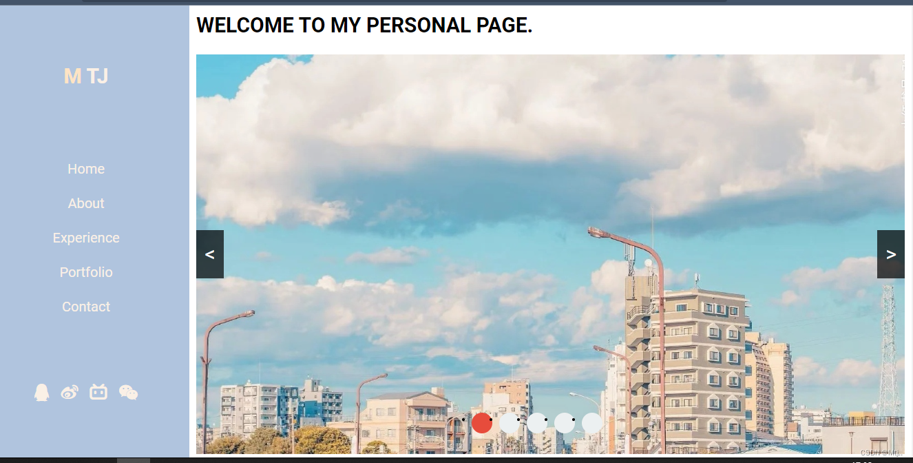
<section class="home" id="home">
<div class="content">
<span class="hi">I am MTJ</span>
<h3><span>Welcome to my personal page.</span></h3>
</div>
<div id="wrap">
<!-- 图片列表 -->
<div class="img-list">
<img src="img/bj-1.jpg" />
<img src="img/bj-2.jpg" />
<img src="img/bj-3.jpg" />
<img src="img/bj-4.jpg" />
<img src="img/bj-5.jpg" />
</div>
<!-- 小箭头 -->
<div class="arrow">
<a href="javascript:;" class="left">
<</a>
<a href="javascript:;" class="right">></a>
</div>
<!-- 小圆点 -->
<ul class="circle-list">
<li class="circle active" data-n="0"></li>
<li class="circle" data-n="1"></li>
<li class="circle" data-n="2"></li>
<li class="circle" data-n="3"></li>
<li class="circle" data-n="4"></li>
</ul>
</div>
<div class="content2">
<p class="text">If you want to know me, come here and enjoy your visit.</p>
<a href="#about" class="btn">About me</a>
</div>
</section>
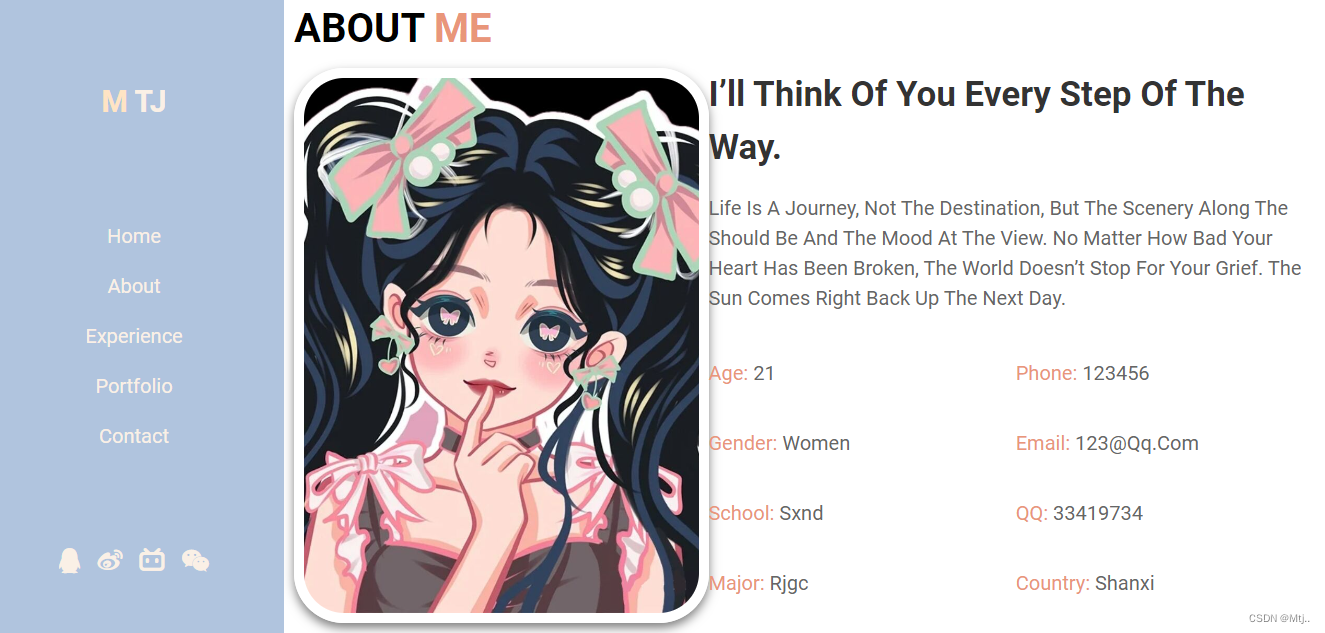
<section class="about" id="about">
<h1 class="heading"> about <span> me </span></h1>
<div class="row-1">
<div class="image">
<img src="img/home.jpg" />
</div>
<div class="content">
<h3>I’ll think of you every step of the way.</h3>
<p>Life is a journey, not the destination, but the scenery along the should be and the mood at the view. No matter how bad your heart has been broken, the world doesn’t stop for your grief. The sun comes right back up the next day.</p>
<div class="box-container">
<div class="box">
<p> <span> age: </span> 21 </p>
<p> <span> gender: </span> women </p>
<p> <span> school: </span> sxnd </p>
<p> <span> major: </span> rjgc </p>
</div>
<div class="box ">
<p> <span> phone: </span> 123456 </p>
<p> <span> email: </span> 123@qq.com </p>
<p> <span> QQ: </span> 33419734 </p>
<p> <span> country: </span> shanxi </p>
</div>
</div>
</div>
</section>
<section class="experience" id="experience">
<h1 class="heading"> <span> my </span> experience </h1>
<div class="box-container ">
<div class="box ">
<div class="content ">
<span>freshan</span>
<h3>New environment.</h3>
<p>Time goes by so fast, people go in and out of your life. You must never miss the opportunityto tell these people how much they mean to you.Time goes by so fast, people go in and out of your life. You must never miss the opportunityto tell </p>
</div>
</div>
<div class="box ">
<div class="content ">
<span>The second year</span>
<h3>My experience..</h3>
<p>Time goes by so fast, people go in and out of your life. You must never miss the opportunityto tell these people how much they mean to you.Time goes by so fast, people go in and out of your life. You must never miss the opportunityto tell </p>
</div>
</div>
<div class="box">
<div class="content ">
<span>My learning.</span>
<h3>My experience..</h3>
<p>Time goes by so fast, people go in and out of your life. You must never miss the opportunityto tell these people how much they mean to you.Time goes by so fast, people go in and out of your life. You must never miss the opportunityto </p>
</div>
</div>
<div class="box">
<div class="content">
<span>My life.</span>
<h3>My experience..</h3>
<p>Time goes by so fast, people go in and out of your life. You must never miss the opportunityto tell these people how much they mean to you.Time goes by so fast, people go in and out of your life. You must never miss the </p>
</div>
</div>
<div class="box">
<div class="content ">
<span>My dream.</span>
<h3>My experience..</h3>
<p>Time goes by so fast, people go in and out of your life. You must never miss the opportunityto tell these people how much they mean to you. </p>
</div>
</div>
<div class="box">
<div class="content ">
<span>My goals.</span>
<h3>My experience..</h3>
<p>Time goes by so fast, people go in and out of your life. You must never miss the opportunityto tell these people how much they mean to you.Time goes by so fast</p>
</div>
</div>
</div>
</section>
<section class="portfolio" id="portfolio">
<h1 class="heading"> <span> my </span> portfolio </h1>
<div class="box-container">
<div class="box">
<img src="img/img-1.jpg" />
<h3>project 1</h3>
<div class="icons ">
<a href="# " class="fas fa-link "></a>
<a href="# " class="fas fa-share "></a>
<a href="# " class="fas fa-search "></a>
</div>
</div>
<div class="box">
<img src="img/img-2.jpg " />
<h3>project 2</h3>
<div class="icons ">
<a href="# " class="fas fa-link "></a>
<a href="# " class="fas fa-share "></a>
<a href="# " class="fas fa-search "></a>
</div>
</div>
<div class="box ">
<img src="img/img-3.jpg " />
<h3>project 3</h3>
<div class="icons ">
<a href="# " class="fas fa-link "></a>
<a href="# " class="fas fa-share "></a>
<a href="# " class="fas fa-search "></a>
</div>
</div>
<div class="box ">
<img src="img/img-4.jpg " />
<h3>project 4</h3>
<div class="icons ">
<a href="# " class="fas fa-link "></a>
<a href="# " class="fas fa-share "></a>
<a href="# " class="fas fa-search "></a>
</div>
</div>
<div class="box ">
<img src="img/img-5.jpg " />
<h3>project 5</h3>
<div class="icons ">
<a href="# " class="fas fa-link "></a>
<a href="# " class="fas fa-share "></a>
<a href="# " class="fas fa-search "></a>
</div>
</div>
<div class="box ">
<img src="img/img-6.jpg " />
<h3>project 6</h3>
<div class="icons ">
<a href="# " class="fas fa-link "></a>
<a href="# " class="fas fa-share "></a>
<a href="# " class="fas fa-search "></a>
</div>
</div>
</div>
</section>
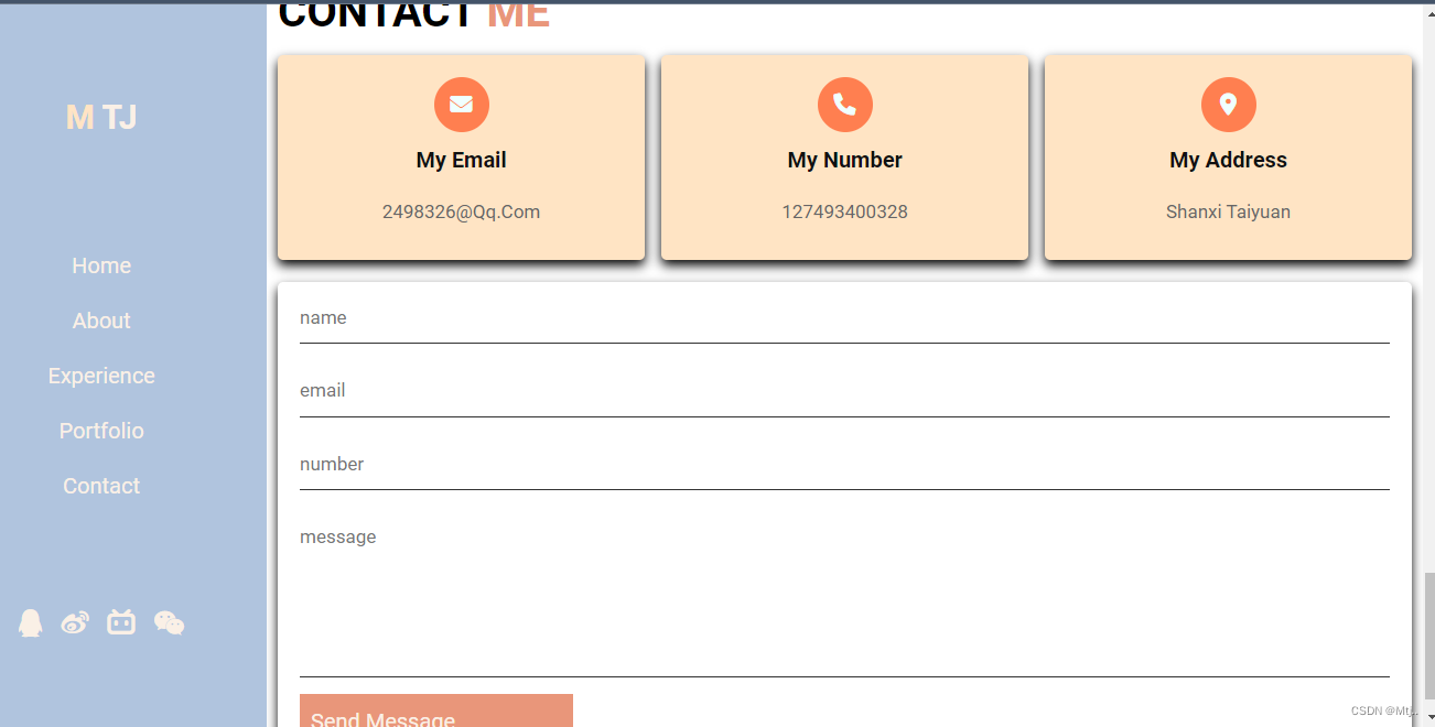
<section class="contact" id="contact">
<h1 class="heading"> contact<span> me </span></h1>
<div class="icons-container ">
<div class="icons ">
<i class="fas fa-envelope "></i>
<h3>my email</h3>
<p>2498326@qq.com</p>
</div>
<div class="icons">
<i class="fas fa-phone "></i>
<h3>my number</h3>
<p>127493400328</p>
</div>
<div class="icons ">
<i class="fas fa-map-marker-alt "></i>
<h3>my address</h3>
<p>shanxi taiyuan</p>
</div>
</div>
<div class="row">
<form action=" ">
<input type="text " placeholder="name " class="box " />
<input type="email " placeholder="email " class="box " />
<input type="number " placeholder="number " class="box " />
<textarea name=" " placeholder="message " id=" " cols="30 " rows="10 "></textarea>
<input type="submit " class="btn " value="send message " />
</form>
</div>
</section>
<script>
// 获取左右按钮和图片列表
let oLeft = document.querySelector(".left");
let oRight = document.querySelector(".right");
let oImgList = document.querySelector(".img-list");
// 克隆第一张图片
let clonefirstImg = oImgList.firstElementChild.cloneNode();
// 将第一张图片添加至图片列表的末尾
oImgList.appendChild(clonefirstImg);
// 图片索引 代表当前是第几张图片 index:0代表第一张图片
let index = 0;
// 设置函数节流锁
let lock = true;
function handleRightBtn() {
if(!lock) return;
index++;
oImgList.style.left = index * -1026 + "px";
// 为什么要加过渡? 因为切换到了最后一张假图时会将过渡去掉
oImgList.style.transition = "0.5s ease";
if(index === 5) {
index = 0;
setTimeout(() => {
oImgList.style.left = 0;
// 取消过渡 500毫秒之后切换第一张
oImgList.style.transition = "none";
}, 500);
}
// 设置小圆点的高亮
setCircles();
// 关锁
lock = false;
setTimeout(() => {
lock = true;
}, 500);
}
// 右按钮的实现
oRight.addEventListener("click", handleRightBtn);
// 左按钮的实现 瞬间切换到假图然后拉到真实最后一张图片
oLeft.addEventListener("click", () => {
if(!lock) return;
index--;
if(index === -1) {
oImgList.style.left = 5 * -1026 + "px";
oImgList.style.transition = "none";
index = 4;
setTimeout(() => {
oImgList.style.left = index * -1026 + "px";
oImgList.style.transition = "0.5s ease";
}, 0);
} else {
oImgList.style.left = index * -1026 + "px";
}
// 设置小圆点的高亮
setCircles();
lock = false;
setTimeout(() => {
lock = true;
}, 500);
});
// 获取五个小圆点
const circles = document.querySelectorAll(".circle");
// 小圆点高亮的显示
function setCircles() {
for(let i = 0; i < circles.length; i++) {
if(i === index) {
circles[i].classList.add("active");
} else {
circles[i].classList.remove("active");
}
}
}
// 小圆点点击切换图片 使用事件代理
const oCircle = document.querySelector(".circle-list");
oCircle.addEventListener("click", (e) => {
// 当我点击小圆点的时候
if(e.target.nodeName.toLowerCase() === "li") {
// 当前元素的data-n对应得值 和index一一对应
const n = Number(e.target.getAttribute("data-n"));
index = n;
setCircles();
oImgList.style.transition = "0.5s ease";
oImgList.style.left = index * -1026 + "px";
}
});
// 自动轮播
let autoplay = setInterval(handleRightBtn, 2000);
const oWrap = document.getElementById("wrap");
// 移入停止轮播
oWrap.addEventListener("mouseenter", () => {
clearInterval(autoplay);
});
// 移出继续轮播
oWrap.addEventListener("mouseleave", () => {
// 设表先关
clearInterval(autoplay);
autoplay = setInterval(handleRightBtn, 2000);
});
</script>
</body>
</html>css代码
@import url('https://fonts.font.im/css?family=Roboto:100,300,400,500,700');
:root {
	-moz-border-end-color: brown;
}

* {
	font-family: 'Roboto', sans-serif;
	margin: 0;
	padding: 0;
	box-sizing: border-box;
	outline: none;
	border: none;
	text-decoration: none;
	text-transform: capitalize;
	transition: all .2s linear;
	line-height: 1.5;
}

html {
	font-size: 62.5%;
	overflow-x: hidden;
}

body {
	background: white;
	padding-left: 30rem;
}

section {
	padding: 1rem;
	min-height: 50vh;
}

.heading {
	font-size: 4rem;
	padding-bottom: 1rem;
	color: #000000;
	text-transform: uppercase;
}

.heading span {
	color: #E9967A;
	text-transform: uppercase;
}

.btn {
	display: inline-block;
	margin-top: 1rem;
	padding: 1rem 1rem;
	background: #E9967A;
	color: #FAF0E6;
	cursor: pointer;
	font-size: 2rem;
}

.btn:hover {
	background: coral;
	letter-spacing: .1rem;
}

header {
	position: fixed;
	top: 0;
	left: 0;
	bottom: 0;
	background: lightsteelblue;
	display: flex;
	align-items: center;
	justify-content: space-between;
	z-index: 1000;
	flex-flow: column;
	padding: 8rem 2rem;
	width: 30rem;
	text-align: center;
}

header .logo {
	text-transform: uppercase;
	color: #FAF0E6;
	font-size: 3rem;
	font-weight: bolder;
}

header .logo span {
	text-transform: uppercase;
	color: bisque;
}

header .navbar a {
	display: block;
	font-size: 2rem;
	color: #FAF0E6;
	margin: 2rem 0;
}

header .navbar a:hover {
	letter-spacing: .2rem;
	color: coral;
}

header .follow a {
	font-size: 2.5rem;
	color: #FAF0E6;
	margin: 0 .7rem;
}

header .follow a:hover {
	color: coral;
}

.home {
	display: flex;
	align-items: center;
	flex-wrap: wrap;
}

#wrap {
	overflow: hidden;
	position: relative;
	width: 1260px;
	height: 580px;
	margin: 20px auto 0;
}

#wrap .img-list {
	display: flex;
	position: relative;
	left: 0px;
	width: 100%;
	height: 100%;
	transition: 0.5s ease;
}

#wrap .img-list img {
	width: 100%;
	cursor: pointer;
}

#wrap a {
	position: absolute;
	top: 50%;
	transform: translate(0, -50%);
	display: block;
	width: 40px;
	height: 70px;
	background-color: rgba(0, 0, 0, 0.7);
	color: white;
	user-select: none;
	font-size: 30px;
	text-align: center;
	line-height: 70px;
	text-decoration: none;
}

#wrap a.left {
	left: 0;
}

#wrap a.right {
	right: 0;
}

.circle-list {
	display: flex;
	position: absolute;
	bottom: 20px;
	left: 50%;
	transform: translate(-50%, 0);
	width: 240px;
	height: 40px;
	z-index: 8;
}

.circle-list>.circle {
	margin: 0 5px;
	width: 30px;
	height: 30px;
	background-color: #ecf0f1;
	border-radius: 50%;
}

.circle-list>.circle.active {
	background-color: #e74c3c;
}

.home .content {
	flex: 5 5 25rem;
}

.home .content .hi {
	font-size: 4.5rem;
	color: #E9967A;
}

.home .content .h3 {
	font-size: 3rem;
	color: #000000;
	text-transform: uppercase;
}

.home .content h3 span {
	font-size: 3rem;
	color: #000000;
	text-transform: uppercase;
}

.home .content .info {
	font-size: 3.5rem;
	color: #000000;
	/*padding: 2rem 0;*/
}

.home .content2 .text {
	font-size: 2.5rem;
	color: #222222 padding: 2rem 0;
}

#menu-bars {
	position: fixed;
	top: 1rem;
	right: 1rem;
	z-index: 10000;
	background: #B0C4DE;
	color: #FAF0E6;
	border-radius: .5rem;
	padding: 1rem 1.5rem;
	font-size: 3rem;
	cursor: pointer;
	display: none;
}

.about .row-1 {
	display: flex;
	flex-wrap: wrap;
	padding-bottom: 2rem;
}

.about .row-1 .image {
	flex: 1 1 20rem;
}

.about .row-1 .image img {
	height: 100%;
	width: 100%;
	object-fit: cover;
	border: 1rem solid #fff;
	border-radius: 5rem;
	box-shadow: 0 .5rem 1rem rgba(0, 0, 0, 0.5);
}

.about .row-1 .content {
	flex: 1 1 40rem;
}

.about .row-1 .content h3 {
	color: #333;
	font-size: 3.5rem;
}

.about .row-1 .content p {
	color: #666;
	font-size: 2rem;
	padding: 2rem 0;
}

.about .row-1 .content .box-container {
	display: flex;
	flex-wrap: wrap;
	padding: 0.5rem 0;
}

.about .row-1 .content .box-container .box {
	flex: 1 1 20rem;
}

.about .row-1 .content .box-container .box span {
	color: darksalmon;
}

.experience .box-container {
	display: flex;
	flex-wrap: wrap;
	/*gap:1.5rem;*/
}

.experience .box-container .box {
	position: relative;
	flex: 1 1 50rem;
	border-left: 2rem solid coral;
	padding-left: 2rem;
	padding-right: 2rem;
	padding-bottom: 2rem;
}

.experience .box-container .box .content {
	background: khaki;
	padding: 1.5rem;
	box-shadow: 0 .5rem 1rem rgba(0, 0, 0, 1);
	border-radius: .5rem;
}

.experience .box-container .box .content span {
	font-size: 2rem;
	color: #111;
}

.experience .box-container .box .content h3 {
	font-size: 1.5rem;
	color: #222;
}

.experience .box-container .box .content p {
	font-size: 1.5rem;
	color: #666;
}

.experience .box-container .box {
	padding-left: 0;
}

.portfolio .box-container {
	display: flex;
	flex-wrap: wrap;
	gap: 1.5rem;
}

.portfolio .box-container .box {
	flex: 1 1 20rem;
	height: 25rem;
	position: relative;
	overflow: hidden;
	border: 1rem solid #fff;
	box-shadow: 0 .5rem 1rem rgba(0, 0, 0, 1);
}

.portfolio .box-container .box img {
	height: 100%;
	width: 100%;
	object-fit: cover;
	border-radius: .5rem;
	position: relative;
	z-index: 1;
}

.portfolio .box-container .box:hover img {
	height: 75%;
	width: 75%;
}

.portfolio .box-container .box h3 {
	position: absolute;
	bottom: 1rem;
	left: 0.5rem;
	font-size: 2rem;
	color: black;
	text-transform: uppercase;
}

.portfolio .box-container .box .icons {
	position: absolute;
	top: 1rem;
	right: 1rem;
}

.portfolio .box-container .box .icons a {
	display: block;
	height: 3rem;
	width: 3rem;
	border-radius: .5rem;
	background: #eee;
	color: #333;
	font-size: 1.5rem;
	line-height: 3rem;
	text-align: center;
	margin-bottom: 1rem;
}

.portfolio .box-container .box .icons a:hover {
	background: antiquewhite;
	color: black;
}

.contact .icons-container {
	display: flex;
	gap: 1.5rem;
	flex-wrap: wrap;
	padding-bottom: 2rem;
}

.contact .icons-container .icons {
	flex: 1 1 25rem;
	text-align: center;
	padding: 2rem;
	background: bisque;
	box-shadow: 0 .5rem 1rem rgba(0, 0, 0, 1);
	border-radius: .5rem;
}

.contact .icons-container .icons i {
	height: 5rem;
	width: 5rem;
	line-height: 5rem;
	font-size: 2rem;
	background: coral;
	color: azure;
	border-radius: 50%;
}

.contact .icons-container .icons h3 {
	color: #111;
	font-size: 2rem;
	padding: 1rem 0;
}

.contact .icons-container .icons p {
	color: #666;
	font-size: 1.7rem;
	padding: 1rem 0;
}

.contact .row {
	display: flex;
	flex-wrap: wrap;
	grp: 1.5rem;
}

.contact .row form {
	flex: 1 1 55rem;
	background: #fff;
	padding: 0 2rem;
	box-shadow: 0 .5rem 1rem rgba(0, 0, 0, 1);
	border-radius: .5rem;
}

.contact .row form .box,
.contact .row form textarea {
	width: 100%;
	border-bottom: .1rem solid #333;
	color: #333;
	text-transform: none;
	font-size: 1.7rem;
	padding: 1rem 0;
	margin: 1rem 0;
}

.contact .row form .box:focus .contact .row form textarea:focus {
	border-color: blanchedalmond;
}

.contact .row form .box:placeholder,
.contact .row form textarea:placeholder {
	text-transform: capitalize;
}

.contact .row form textarea {
	height: 15rem;
	resize: none;
}

.contact .row form .btn {
	margin-top: 0;
	margin-bottom: 1.5rem;
}
源码链接链接: https://pan.baidu.com/s/1MbLMUvH4nbnfeQVOYqzq-w?pwd=7nnm 提取码: 7nnm


 1031
1031


 被折叠的 条评论
为什么被折叠?
被折叠的 条评论
为什么被折叠?
 到【灌水乐园】发言


