


目录
input:not([type="submit"]) {border: 1px solid red;}IE6-8浏览器不支持:not()选择器
相邻兄弟选择器
EF两元素具有一个相同的父元素,而且F元素在E元素后面,而且相邻
<style>
        ul .on+li{
            color: red;
        }
        ul .box+a{
            color: red;
        }
    </style>
</head>
<body>
    <ul>
        <li class="on">列表1</li>
        <li>列表2</li>
        <li>列表3</li>
        <li>列表4</li>
        <span class="box">内容</span>
        <a href="#">内容1</a>
    </ul>
</body>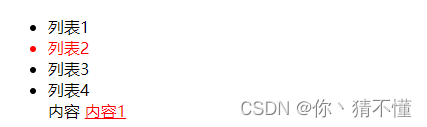
通用兄弟选择器(E 〜 F)
E和F元素是属于同一父元素之内,并且F元素在E元素之后,那么E ~ F 选择器将选择
所有E元素后面的F元素。
    <style>
        .list .box~.bon{
            color: red;
        }
    </style>
</head>
<body>
    <div class="list">
        <span class="box">内容</span>
        <a href="#">超链接</a><br>
        <span class="bon">内容2</span>
        <span class="bon">内容3</span>
         </div>
</body>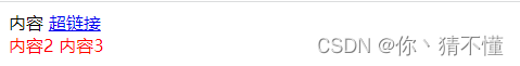
属性选择器
<style>
        input[name]{
            border: 1px solid red;
        }
        /*属性选择器*/
        /* input[type="text"]{
            background-color: aqua;
        }
        input[class=box]{
            background-color: blue;
        } */
    </style>
</head>
<body>
    <input type="text" name="uname" class="box">
    <input type="password" name="pwd" class="box item">
    <input type="submit" value="提交">
</body>
    <style>
        /* input[name]{
            border: 1px solid red;
        } */
        /*属性选择器*/
        input[type="submit"]{
            background-color: aqua;
        }
        input[class=box]{
            background-color: blue;
        }
        /*完全匹配选择器*/
    </style>
</head>
<body>
    <input type="text" name="uname" class="box">
    <input type="password" name="pwd" class="box item">
    <input type="submit" value="提交">
</body>
E[attr$="value"]
元素attr属性,并且他的属性值是以value结尾的
常用在网站给pdf,png,doc等不同文件加上不同icon
.demo a[href$="png"]::before{
background:orange;color:green;
}
E[attr*="value"]
所选择的属性,其属性值中有这个"value"值都将被选中
.demo a[title*="site"]{
background:black;color:white;
}
E[attr|="value"]
选择器会选择attr属性值等于value或以value-开头的所有元素
.demo a[lang^="zh"]{
background:gray;color:yellow;
}
七种属性选择器中E[attr="value"]和E[attr*="value"]是最实用的,其中E[attr="value"]能帮我们定位
不同类型的元素,特别是表单form元素的操作,比如说input[type="text"],input[type="checkbox"]
等,而E[attr*="value"]能在网站中帮助我们匹配不同类型的文件,比如说你的网站上不同的文件类型的链接需要使用不同的icon图标,用来帮助你的网站提高用户体验,就像前面的实例,可以通过这个属性给".doc",".pdf",".png",".ppt"配置不同的icon图标。
一、动态伪类
a:link a:visited a:hover a:active
遵循爱(LoVe)恨(HAte)
:hover用于当用户把鼠标移动到元素上面时的效果;
:active用于用户点击元素那一下的效果(正发生在点的那一下,松开鼠标左键此动作也就完成了)
:focus用于元素成为焦点,这个经常用在表单元素上。
	   input[type="text"]{
		width: 500px;
		height: 100px;
		outline: none;
		background: url("img/left.png") no-repeat center center;
		background-color: aquamarine;
		transition: 0.3s;
		}
		input[type="text"]:focus{
		box-shadow: 0 0 10px rgba(0,0,0,0.5);   /*鼠标点击文本框时,背景图片向右移动
		background-position: right center;
		}
UI元素状态伪类
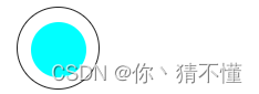
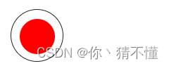
:enabled :disabled :checked
主要是针对于HTML中的Form元素操作
    <style>
        /*可用状态:enable{}*/
        /*不可用状态:disabled*/
        input[type="checkbox"]{
            appearance: none;
            width: 60px;
            height: 60px;
            border-radius: 50%;
            border: 1px solid #222;
        }
        input[type="checkbox"]::after{
            display: block;
            content: "";
            width: 40px;
            height: 40px;
            border-radius: 50%;
            margin: 10px auto;
            background-color: aqua;
        }
        input[type="checkbox"]:checked::after{
            background-color: red;
        }
    </style>
</head>
<body>
    <input type="checkbox">
</body>
未选中状态: 选中状态:
<style>
input[type="checkbox"]{ /*这个是复选框*/
/* -webkit-appearance:none; */
/*谷歌 苹果safari*/
/* -moz-appearance: none; */
/*火狐firefox ff*/
/* -ms-appearance:none ; */
/*IE*/
appearance: none;
position: relative;
width: 100px;
height: 40px;
border: 1px solid black;
border-radius: 20px;
background-color: darkkhaki;
transition: .5s;
}
input[type="checkbox"]::after{ /*复选框内部之后加了一个小圆*/
position: absolute;
top: 0;
left: 0;
display: block;
content: "";
width: 38px;
height: 38px;
border-radius: 50%;
background-color: pink;
transition: .5s;
}
input[type="checkbox"]:checked{ /*复选框被点击后加了一个背景*/
background-color: aquamarine;
}
input[type="checkbox"]:checked::after{ /*复选框内部的小圆被点击后更换背景颜色*/
background-color: chocolate;
left: 60px;
}
input[type="checkbox"]+label{
display: inline-block;
position: relative;
width: 40px;
height: 40px;
}
input[type="checkbox"]+label span{ /*外部文字定位*/
position: absolute;
left: 0;
top: 6px;
}
input[type="checkbox"]+label .off{ /*未点击时关闭文字 透明度为1*/
opacity: 1;
}
input[type="checkbox"]+label .on{ /*未点击时开启文字的透明度为0 */
opacity: 0;
}
input[type="checkbox"]:checked+label .off{ /*点击后文字透明度*/
opacity: 0;
}
input[type="checkbox"]:checked+label .on{ /*点击后文字透明度*/
opacity: 1;
}
</style>
</head>
<body>
<input type="checkbox" id="btn">
<label for="btn">
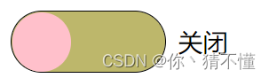
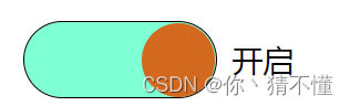
<span class="off">关闭</span>
<span class="on">开启</span>
</label>
</body>未选中状态 选中状态
消息推送开启或关闭
<style>
        .bon{
            width: 700px;
            height: 100px;
            background-color: aqua;
            margin: 0 auto;
        }
        .bon a{
            text-decoration: none;
            color: #000;
            line-height: 100px;
            margin-left: 10px;
            font-size: 18px;
        }
        input[type="checkbox"]{
            display: none;
        }
        input[type="checkbox"]+label{
            float: right;
            margin-top: 15px;
            width: 108px;
            height: 72px;
            background-image: url(../img/css_sprites.png);
            background-position: -138px -10px;
            background-repeat: no-repeat;
        }
        input[type="checkbox"]:checked+label{
            background-image: url(../img/css_sprites.png);
            background-position:-10px -10px ;
            background-repeat: no-repeat;
        }
    </style>
</head>
<body>
    <div class="bon">
        <a href="">消息推送</a>
        <input type="checkbox" id="con">
        <label for="con"></label>

    </div>
</body>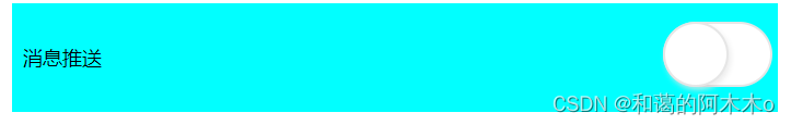
CSS3的:nth选择器(伪类选择器)
1、:first-child{} 父元素下方的第一个子元素(个数)
2、:last-child
3、:nth-child(n) 数字、even偶数、odd奇数 2n 代表取所有偶数 2n+1取奇数
4、:nth-last-child(n)
5、:only-child:nth-child(n),其中n是一个简单的表达式,那么"n"取值从“1”开始计算,不能取负值
5、:nth-of-type() :nth-child() 第几个孩子
6、:nth-last-of-type() :nth-last-child()
7、:first-of-type(同种类型里的第一个元素)和:last-of-type :first-child :last-child
8、:only-of-type :only-child
9、:empty p:empty {display: none;}
IE6-8浏览器不支持:only-child选择器;
IE6-8和FF3.0-浏览器不支持:only-of-type选择器。
IE6-8浏览器不支持:empty选择器
否定选择器 :not()
input:not([type="submit"]) {border: 1px solid red;}
IE6-8浏览器不支持:not()选择器
伪元素 CSS 伪元素用于将特殊的效果添加到某些选择器
::first-letter 首字母
::first-line 首行
::before
::after
::selection 改变网页被选中文本的样式
 p::selection {
     background: red;
     color: #fff;
     font-size: 15px;
   }


 6870
6870


 被折叠的 条评论
为什么被折叠?
被折叠的 条评论
为什么被折叠?
 到【灌水乐园】发言


