


效果图
1. 竖直条纹
2. 倾斜条纹
3. 渐变条纹
4.横向条纹
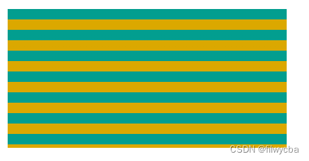
主要使用background的linear-gradient来实现条纹样式
<!DOCTYPE html>
<html lang="en">
  <head>
    <meta charset="UTF-8" />
    <meta name="viewport" content="width=device-width, initial-scale=1.0" />
    <title>css条纹</title>
    <style>
      * {
        margin: 0;
        padding: 0;
      }
      .content-box {
        margin: 150px auto;
        width: 400px;
      }
      .progress {
        width: 100%;
        height: 14px;
        background: linear-gradient(-45deg, #02849e 36%, #0e97b3 28%, #0e97b3 67%, #02849e 25%);
        background-size: 24px 14px;
        -webkit-animation: animation_load 2s;
        animation: animation_load 2s;
        margin-bottom: 20px;
        border-radius: 7px;
      }
      .progress1 {
        width: 100%;
        height: 14px;
        background: linear-gradient(to left, #3bdfdc 36%, #1f728b 28%, #1f728b 67%, #3bdfdc 25%);
        background-size: 6px 2px;
        -webkit-animation: animation_load 2s;
        animation: animation_load 2s;
        margin-bottom: 20px;
        border-radius: 7px;
      }
      .progress2 {
        width: 100%;
        height: 14px;
        background: linear-gradient(-45deg, #009688 36%, #1f728b 28%, #1f728b 67%, #009688 25%);
        background-size: 24px 12px;
        -webkit-animation: animation_load 3s;
        animation: animation_load 3s;
        position: relative;
        margin-bottom: 20px;
        border-radius: 7px;
      }
      .progress2 .inner {
        position: absolute;
        left: 0;
        right: 0;
        top: 0;
        bottom: 0;
        opacity: 0.8;
        background: linear-gradient(90deg, #3bdfdc 20%, #fff 100%);
        border-radius: 7px;
      }
      .progress3 {
        width: 100%;
        height: 200px;
        margin-bottom: 20px;
        background: linear-gradient(#029e8f 50%, #dba800 50%);
        background-size: 100% 30px;
      }
      @keyframes animation_load {
        0% {
          width: 0;
        }
      }
    </style>
  </head>
  <body>
    <div class="content-box">
      <div class="progress"></div>
      <div class="progress1"></div>
      <div class="progress2">
        <div class="inner"></div>
      </div>
      <div class="progress3"></div>
    </div>
  </body>
</html>


 1333
1333

 被折叠的 条评论
为什么被折叠?
被折叠的 条评论
为什么被折叠?
 到【灌水乐园】发言


