


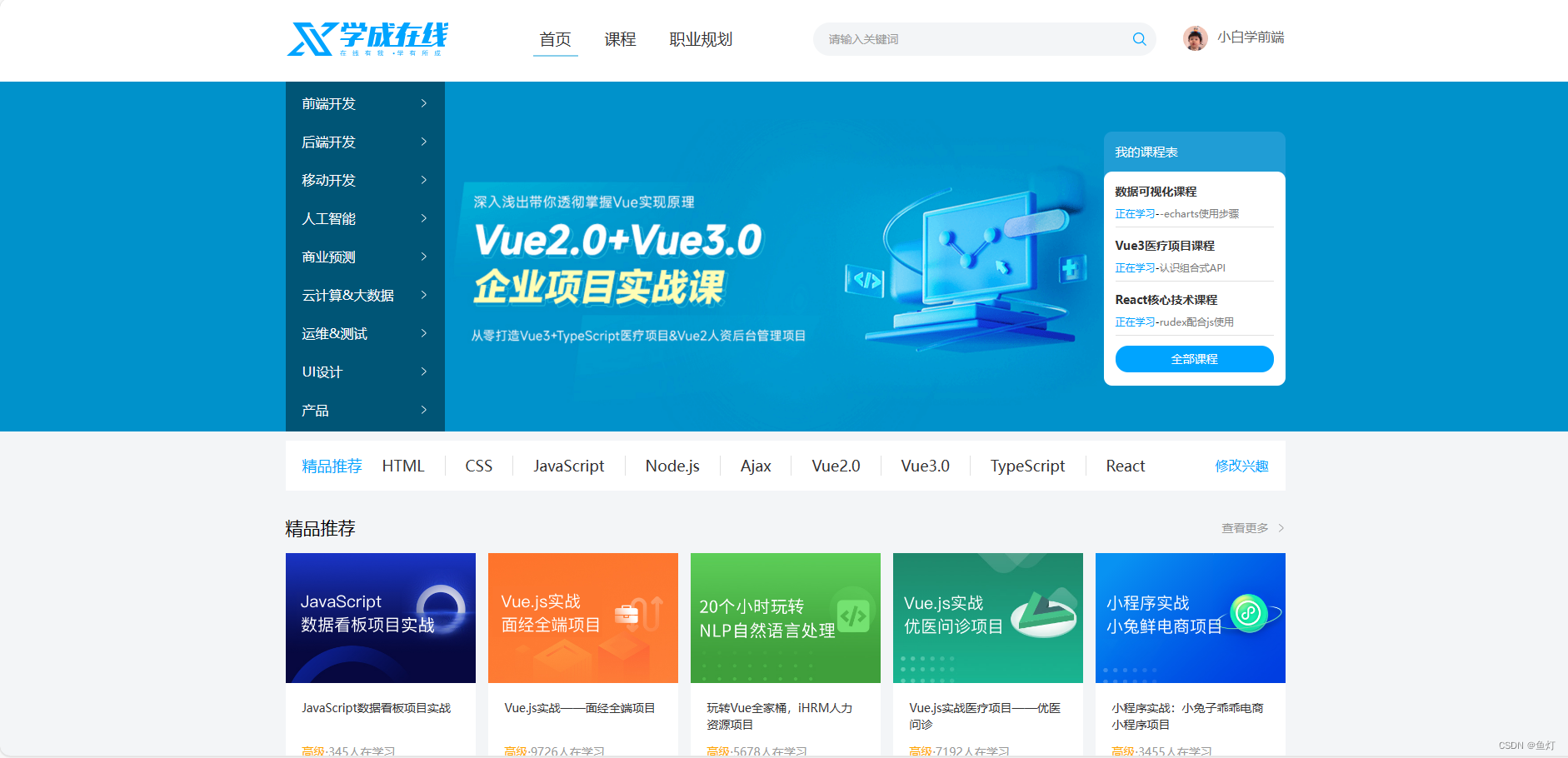
 该博客围绕网页制作展开,介绍了布局和CSS实现思路,包括先整体后局部等布局原则。详细阐述了header、banner等各区域的布局与实现方法,如标签结构、CSS样式设置等,还提及精品推荐、课程等板块,最终完成一个完整网页。
网页制作思路
布局思路
先整体再局部,从外到内,从上到下,从左到右
css实现思路
- 画盒子,调整盒子范围->宽高背景色
- 调整盒子位置->flex布局、内外边距
- 控制图片、文字内容样式
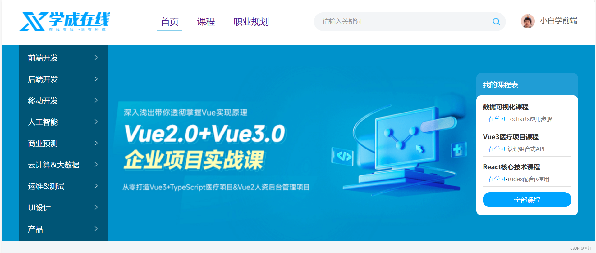
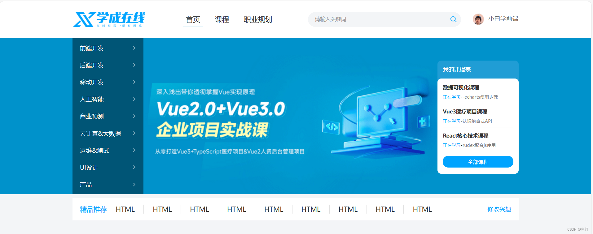
header区域——布局
通栏:盒子宽度于浏览器窗口相同
标签结构:通栏>版心>logo+导航+搜索+用户

<!DOCTYPE html>
<html lang="en">
<head>
    <meta charset="UTF-8">
    <meta name="viewport" content="width=device-width, initial-scale=1.0">
    <title>Document</title>
    <!--link标签引入css文件,顺序不能改变,首先使用清除默认样式的css-->
    <link rel="stylesheet" href="./css/base.css">
    <link rel="stylesheet" href="./css/index.css">
</head>
<body>
    <!-- 头部区域 -->
    <div class="header">
        <div class="wrapper">
            <!-- 该区域应有四个盒子 -->
            <!-- 1、logo -->
            <div class="logo">logo</div>
            <!-- 2、导航 -->
            <div class="nav">nav</div>
            <!-- 3、搜索 -->
            <div class="search">search</div>
            <!-- 4、用户 -->
            <div class="user">user</div>

        </div>
    </div>
</body>
</html>
css
/* 实现首页的版心居中,定义一个wrapper类 */
.wrapper{
    margin:0 auto;
    width:1200px;
}

body{
    background-color: #f3f5f7;
}
.header{  /*通栏*/
    height:100px;
    background-color: white;
}
.header .wrapper{    /*版心里四个盒子的排列方式*/
    display: flex;
    padding:29px;
}
header区域——logo
logo功能·:
- 单击跳转到首页
- 搜索引擎优化:提示网站百度搜索排名
实现方法
- 标签结构:h1>a>网站名称(搜索关键字)
- css样式:
.logo a{
    display: block;
    width:195px;
    height:40px;
    /*把图片作为a标签的链接模式*/
    background-image: url(../images/logo.png);
    /* 隐藏文字,只要图片作为链接 */
    font-size: 0;
}
<!DOCTYPE html> <html lang="en"> <head> <meta charset="UTF-8"> <meta name="viewport" content="width=device-width, initial-scale=1.0"> <title>Document</title> <!--link标签引入css文件,顺序不能改变,首先使用清除默认样式的css--> <link rel="stylesheet" href="./css/base.css"> <link rel="stylesheet" href="./css/index.css"> </head> <body> <!-- 头部区域 --> <div class="header"> <div class="wrapper"> <!-- 该区域应有四个盒子 --> <!-- 1、logo --> <div class="logo"> <h1><a href="#">学成在线</a></h1> </div> <!-- 2、导航 --> <div class="nav">nav</div> <!-- 3、搜索 --> <div class="search">search</div> <!-- 4、用户 --> <div class="user">user</div> </div> </div> </body> </html>
导航制技巧
导航功能 :实现单击跳页面
实现方法:
- 标签结构:ul>li*3>a
- 优势:避免堆砌a标签,网站搜索排名降级
- 布局思路
li设置右侧margin
a设置左右padding(因为点击这个链接的时候,底下有一条线)
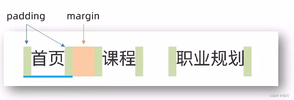
 <!-- 2、导航 -->
            <div class="nav">
                <ul><!--首页默认有蓝色底框,在这里给他一个类名以设置样式-->
                    <li><a href="#" class="active">首页</a></li>
                    <li><a href="#">课程</a></li>
                    <li><a href="#">职业规划</a></li>
                </ul>
            </div>
/*导航盒子的样式设置*/ .nav{ padding-left: 102px; } .nav ul{ display: flex; } .nav li{ margin-right: 24px; } .nav li a{ display: block; padding:6px 8px; line-height: 27px; font-size:19px; } /* active类选择器,表示默认选择的链接a 这里设置的样式为默认首页和鼠标悬停时的样式 */ .nav li .active, .nav ul a:hover{ border-bottom: 2px solid skyblue; }
search搜索区域
实现方法:
- 标签结构:.search>input+a/botton
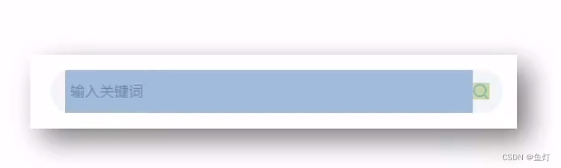
 <!-- 3、搜索 -->
            <div class="search">
                <input type="text" placeholder="请输入关键词">
                <a href="#"></a>
            </div>
/* 搜索区域的css样式 */ .search{ /* search区域里有输入和搜索两个盒子 */ display: flex; width:412px; height: 40px; background-color: #f3f5f7; border-radius:20px; margin-left: 64px; padding-left:19px; padding-right:12px; } .search input{ flex:1; /* 消除输入框的边框 */ border:0; /* 设置背景颜色为透明 */ background-color: transparent; /* 取消表单控件的焦点框,否则点击输入时还是会出现边框 */ outline: none; } /* ::placeholder选中就是placeholder属性文字样式 */ .search input::placeholder{ font-size:14px; color:#999; } /* 父级是flex布局,故子级变成了弹性盒子,可以设置宽高了 */ .search a{ width:16px; height: 16px; background-image: url(../images/search.png); /* 放大镜侧轴居中,只控制一个弹性盒子 */ align-self: center; }
用户区域
实现方法:
- 标签结构:.user>a>img(用户头像)+span(与用户名在同一行)
  <!-- 4、用户 -->
            <div class="user">
                <a href="#">
                    <img src="./uploads/user.png" alt="">
                    <span>小白学前端</span>
                </a>
            </div>
.user{ margin-left:32px; margin-top: 4px; } .user img{ /* 设置图片与文字的右边距 */ margin-right: 7px; /* vertical-align用于调整行内块和行内垂直方向对齐方式 */ vertical-align: middle; } .user span{ font-size: 16px; color:#666; }

banner区域——布局
结构:通栏->版心->左盒子+右盒子
    <!-- banner区域 -->
    <div class="banner">
        <div class="wrapper">
            <div class="left">1</div>
            <div class="right">2</div>
        </div>
    </div>
/* banner区域 */
.banner{
    height: 420px;
    background-color: #0092cb;
}

/*banner版心区域*/
.banner .wrapper{
    /*左右盒子的排列方式*/
    display: flex;
    justify-content: space-between;
    height: 420px;
    /*版心背景图片*/
    background-image: url(../uploads/banner.png);
}
左侧盒子导航栏
实现方法
- 标签结构:.left>ul>li*9>a
- 布局思路:a默认状态(背景图为白色右箭头)
<!-- banner区域 -->
    <div class="banner">
        <div class="wrapper">
            <div class="left">
                <ul>
                    <li><a href="#">前端开发</a></li>
                    <li><a href="#">后端开发</a></li>
                    <li><a href="#">移动开发</a></li>
                    <li><a href="#">人工智能</a></li>
                    <li><a href="#">商业预测</a></li>
                    <li><a href="#">云计算&大数据</a></li>
                    <li><a href="#">运维&测试</a></li>
                    <li><a href="#">UI设计</a></li>
                    <li><a href="#">产品</a></li>

                </ul>
            </div>
/* banner区域 */
.banner{
    height: 420px;
    background-color: #0092cb;
}
/*banner的版心区域*/
.banner .wrapper{
    display: flex;
    justify-content: space-between;
    height: 420px;
    background-image: url(../uploads/banner.png);
}
/* 左盒子 */
.banner .left{
    /* 内边距 */
    padding: 3px 20px;
    width: 191px;
    height: 420px;
    background-color: rgba(0,0,0,0.42);
}
.banner .left a{
    /* 块级的宽度会默认是父级的百分百 */
    display: block;
    height: 46px;
 /* 这里不用background-image: url()是因为要设置repeat属性,去掉平铺 */
 /* 鼠标没有悬停时右边灰色箭头图片 */
    background: url(../images/right.png) no-repeat right center;
    line-height: 46px;
    font-size:16px;
    color:#fff;
}
.banner .left a:hover{
    /* 鼠标悬停时右边蓝色箭头图片 */
    /* 设置单个背景图片标签可以不设置平铺 */
    background-image: url(../images/right-hover.png);
    color:#00a4ff;
}
右盒子
实现方法:
- 标签结构:.right>h3+.content
dl>dt+dd为标题加内容的格式
 <!-- 右盒子区域 -->
            <div class="right">
                <h3>我的课程表</h3>
                <div class="content">
                    <dl>
                        <dt>数据可视化课程</dt>  <!--标题内容-->
                        <dd><span>正在学习</span>-<strong>-echarts使用步骤</strong></dd>       <!--正文内容-->
                    </dl>
                    <dl>
                        <dt>Vue3医疗项目课程</dt>  <!--标题内容-->
                        <dd><span>正在学习</span>-<strong>认识组合式API</strong></dd>       <!--正文内容-->
                    </dl>
                    <dl>
                        <dt>React核心技术课程</dt>  <!--标题内容-->
                        <dd><span>正在学习</span>-<strong>rudex配合js使用</strong></dd>       <!--正文内容-->
                    </dl>
                    <!-- a标签链接 -->
                    <a href="#">全部课程</a>
                </div>
            </div>
/* 右盒子区域 */ .banner .right{ width: 218px; height: 305px; background-color: #209dd5; margin-top: 60px; border-radius: 10px; } .banner .right h3{ margin-left: 14px; height: 48px; line-height: 48px; font-size: 15px; color:#fff; /* 设置400是去除加粗 */ font-weight: 400; } .banner .right .content{ height: 257px; background-color: #fff; border-radius: 10px; padding: 14px; } .banner .right dl{ margin-bottom: 12px; border-bottom: 1px solid #e0e0e0; } .banner .right dt{ color:#333333; margin-bottom:8px; font-size: 14px; line-height: 20px; font-weight: 700; } .banner .right dd{ margin-bottom: 8px; font-size: 12px; line-height: 16px; } .banner .right dd span{ color:#00a4ff; } .banner .right dd strong{ color:#7d7d7d; font-weight: 400; } .banner .right a{ display: block; height: 32px; background-color: #00a4ff; line-height: 32px; text-align: center; border-radius: 15px; font-size:14px; color: #fff; }
精品推荐区域
实现方法:
- 标签结构:.recommand>h3+ul+a.modify
- 布局思路:flex布局
<!-- 精品推荐区域 -->
<!-- 同时使用wrapper类是因为该区域和版心宽度一样 -->
    <div class="recommand wrapper">
        <h3>精品推荐</h3>
        <ul>
            <li><a href="#">HTML</a></li>
            <li><a href="#">HTML</a></li>
            <li><a href="#">HTML</a></li>
            <li><a href="#">HTML</a></li>
            <li><a href="#">HTML</a></li>
            <li><a href="#">HTML</a></li>
            <li><a href="#">HTML</a></li>
            <li><a href="#">HTML</a></li>
            <li><a href="#">HTML</a></li>
        </ul>
        <a href="#" class="modify">修改兴趣</a>
    </div>
/* 精品推荐区域 */ .recommand{ /* 设置该区域里的标题和ul和a链接排列方式为flex模式 */ display: flex; height: 60px; background-color: #fff; margin-top: 11px; padding:0 20px; line-height: 60px; box-shadow: 0px 1px 2px 0px rgba(211,211,211,0,5); } .recommand h3{ font-size: 18px; color:#00a4ff; font-weight: 400; } .recommand ul{ /* 除去标题和修改兴趣的部分,剩余尺寸全给ul,把修改兴趣挤到最右 */ flex:1; display: flex; } /* 右边线的高度和a标签中的文字一样,所以在a标签里设置样式 */ .recommand ul li a{ padding:0 24px; border-right: 1px solid #e0e0e0; font-size: 18px; } /* 把最后一个li里面的a标签的右边框去掉 */ .recommand ul li:last-child a{ border-right: none; } .recommand .modify{ font-size: 16px; color:#00a4ff; }
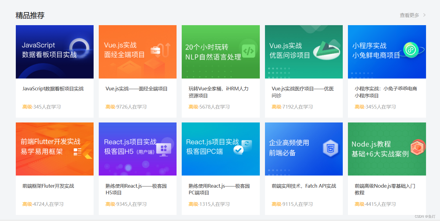
精品课程区域
实现方法:
- 标签结构:.hd(标题)+.bd(内容)
- 布局思路:盒子模型
总体效果

<!-- 精品推荐课程 -->
    <div class="course wrapper">
        <!-- 标题 -->
        <div class="hd">
            <h3>精品推荐</h3>
            <a class="more">查看更多</a>
        </div>
        <!-- 内容 -->
        <div class="bd">23423</div>
    </div>
/* 推荐课程区域 */ .course{ margin-top:15px; } /* 标题区域有文字和a链接,分别在一左一右 */ /* 标题公共类,与其他区域共同使用 */ .hd{ display: flex; justify-content: space-between; height:60px; line-height: 60px; } /* 设置标题样式 */ .hd h3{ font-size: 21px; font-weight: 400; } /* 设置a链接即查看更多的样式 */ .hd .more{ font-size: 14px; color:#999; /* 设置padding-right使背景图片能露出来 */ padding-right:20px; background: url(../images/more.png) no-repeat right center; }
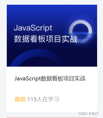
<!-- 内容:图片+文本 --> <div class="bd"> <ul> <!-- 每一个li里面有两个盒子,一个放图片,一个放文本内容 --> <li><a href="#"> <div class="pic"> <img src="./uploads/course01.png"> </div> <div class="text"> <h4>JavaScript数据看板项目实战</h4> <p> <span>高级</span>·<i>115</i>人在学习 </p> </div> </a></li>
十个盒子如下 :(上面示意的是一个盒子的写法,剩下九个也是如此
<!-- 内容 --> <div class="bd"> <ul> <!-- 每一个li里面有两个盒子,一个放图片,一个放文本内容 --> <li><a href="#"> <div class="pic"> <img src="./uploads/course01.png"> </div> <div class="text"> <h4>JavaScript数据看板项目实战</h4> <p> <span>高级</span>·<i>345</i>人在学习 </p> </div> </a></li> <li><a href="#"> <div class="pic"> <img src="./uploads/course02.png"> </div> <div class="text"> <h4>Vue.js实战——面经全端项目</h4> <p> <span>高级</span>·<i>9726</i>人在学习 </p> </div> </a></li> <li><a href="#"> <div class="pic"> <img src="./uploads/ai03.png"> </div> <div class="text"> <h4>玩转Vue全家桶,iHRM人力资源项目</h4> <p> <span>高级</span>·<i>5678</i>人在学习 </p> </div> </a></li> <li><a href="#"> <div class="pic"> <img src="./uploads/course04.png"> </div> <div class="text"> <h4>Vue.js实战医疗项目——优医问诊</h4> <p> <span>高级</span>·<i>7192</i>人在学习 </p> </div> </a></li> <li><a href="#"> <div class="pic"> <img src="./uploads/course05.png"> </div> <div class="text"> <h4>小程序实战:小兔子乖乖电商小程序项目</h4> <p> <span>高级</span>·<i>3455</i>人在学习 </p> </div> </a></li> <li><a href="#"> <div class="pic"> <img src="./uploads/course06.png"> </div> <div class="text"> <h4>前端框架Fluter开发实战</h4> <p> <span>高级</span>·<i>4724</i>人在学习 </p> </div> </a></li> <li><a href="#"> <div class="pic"> <img src="./uploads/course07.png"> </div> <div class="text"> <h4>熟练使用React.js——极客园H5项目</h4> <p> <span>高级</span>·<i>9345</i>人在学习 </p> </div> </a></li> <li><a href="#"> <div class="pic"> <img src="./uploads/course08.png"> </div> <div class="text"> <h4>熟练使用React.js——极客园PC端项目</h4> <p> <span>高级</span>·<i>1315</i>人在学习 </p> </div> </a></li> <li><a href="#"> <div class="pic"> <img src="./uploads/course09.png"> </div> <div class="text"> <h4>前端实用技术,Fatch API实战</h4> <p> <span>高级</span>·<i>9115</i>人在学习 </p> </div> </a></li> <li><a href="#"> <div class="pic"> <img src="./uploads/course10.png"> </div> <div class="text"> <h4>前端高级Node.js零基础入门教程</h4> <p> <span>高级</span>·<i>4415</i>人在学习 </p> </div> </a></li> </ul> </div> </div>
css样式
/* 推荐课程区域 */ .course{ margin-top:15px; } /* 标题区域有文字和a链接,分别在一左一右 */ /* 标题公共类,与其他区域共同使用 */ .hd{ display: flex; justify-content: space-between; height:60px; line-height: 60px; } /* 设置标题样式 */ .hd h3{ font-size: 21px; font-weight: 400; } /* 设置a链接即查看更多的样式 */ .hd .more{ font-size: 14px; color:#999; /* 设置padding-right使背景图片能露出来 */ padding-right:20px; background: url(../images/more.png) no-repeat right center; } /* 设置所有盒子的排列方式为flex和换行 */ .bd ul{ display: flex; flex-wrap: wrap; justify-content: space-between; } /* 设置盒子的样式 */ .bd li{ width: 228px; height: 271px; margin-bottom: 14px; background-color: #d16161; } /* 盒子图片部分的样式 */ .bd li .pic{ height:156px; } /* 盒子文本部分的样式 */ .bd li .text{ padding:20px; height: 115px; background-color: #fff; } /* 盒子文本部分标题的样式 */ .bd li .text h4{ height: 40px; margin-bottom: 13px; font-size: 14px; line-height: 20px; font-weight: 400; } /* 盒子文本部分内容的样式 */ .bd li .text p{ font-size: 14px; line-height: 20px; color:#999; } /* 设置内容部分高级两个字的颜色 */ .bd li .text p span{ color:orange; } /* 设置不倾斜 */ .bd li .text p i{ font-style: normal; }
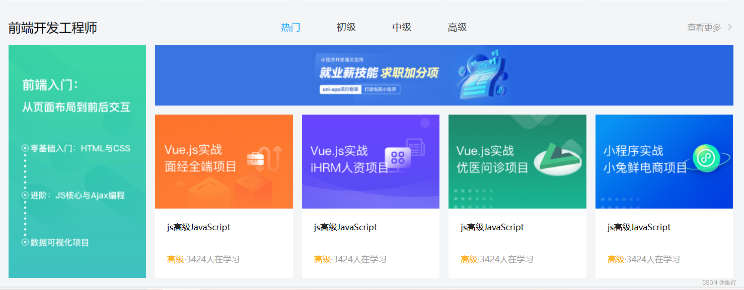
前端开发工程师区域
与精品课程区域差不多,只是一个大盒子更加细化了,分为左盒子和右盒子,右盒子的小盒子也是用ul>li实现。该板块也是在版心
相关的html代码
<!-- 前端工程师区域 -->
<!-- 该区域分3个部分:h3、ul、a -->
<div class="wrapper">
    <div class="hd">
        <h3>前端开发工程师</h3>
        <ul>
            <li><a href="#" class="active">热门</a></li>
            <li><a href="#">初级</a></li>
            <li><a href="#">中级</a></li>
            <li><a href="#">高级</a></li>
        </ul>
        <a href="#" class="more">查看更多</a>
    </div>
<!-- 内容 -->
    <div class="bd">
        <!-- 两个盒子,一左一右 -->
        <div class="left">
            <img src="./uploads/web_left.png">
        </div>
        <!-- 右盒子区域 -->
        <div class="right">
            <!-- 上区域 -->
            <div class="top"><img src="./uploads/web_top.png"></div>
            <!-- 下区域:5个li盒子,li盒子分图片和内容两部分 -->
            <div class="bottom">
                <ul>
                    <li>
                <div class="pic"><img src="./uploads/course02.png"></div>
                <div class="text">
                    <h4>js高级JavaScript</h4>
                    <p><span>高级</span>·<i>3424</i>人在学习</p>
                </div>
            </li>
            <li>
                <div class="pic"><img src="./uploads/course03.png"></div>
                <div class="text">
                    <h4>js高级JavaScript</h4>
                    <p><span>高级</span>·<i>3424</i>人在学习</p>
                </div>
            </li>
            <li>
                <div class="pic"><img src="./uploads/course04.png"></div>
                <div class="text">
                    <h4>js高级JavaScript</h4>
                    <p><span>高级</span>·<i>3424</i>人在学习</p>
                </div>
            </li>
            <li>
                <div class="pic"><img src="./uploads/course05.png"></div>
                <div class="text">
                    <h4>js高级JavaScript</h4>
                    <p><span>高级</span>·<i>3424</i>人在学习</p>
                </div>
            </li>
                </ul>
            </div>
        </div>
    </div>
</div>
css代码
/* 前端工程师部分的标题区域 */
.hd ul{
    display: flex;

}
.hd ul li{
    margin-right: 60px;
    font-size: 16px;
}
/* 设置第一个li字体默认为蓝色 */
.hd li .active{
    color:#00a4ff;
}

/* 内容区域 */
.bd{
    display: flex;
    justify-content: space-between;
}
/* 左盒子 */
.bd .left{
    width:228px;
}
/* 右盒子 */
.bd .right{
    width:957px;
}
/* 右盒子上部 */
.bd .right .top{
    margin-bottom: 15px;
    height:100px;
}
/* 右盒子下部照片部分 */
.bd .right .bottom .pic{
    height: 156px;
}
/* 右盒子下部内容部分 */
.bd .right .bottom .text {
    padding:20px;
    height: 115px;
    background-color: #fff;
}
/* 右盒子下部内容标题部分 */
.bd .right .bottom .text h4{
    height: 40px;
    margin-bottom: 13px;
    font-size: 14px;
    line-height: 20px;
    font-weight: 400;
}
/* 右盒子下部内容正文部分 */
.bd .right .bottom .text p{
    font-size: 14px;
    line-height: 20px;
    color:#999;
}
/* 正文部分的前部 */
.bd .right .bottom .text p span{
    color:orange;
}
/* 正文部分的后部 */
.bd .right .bottom .text p i{
    font-style: normal;
}
Python大数据开发区域
再写一个和上面上面格式一样的就不用再添加css样式了
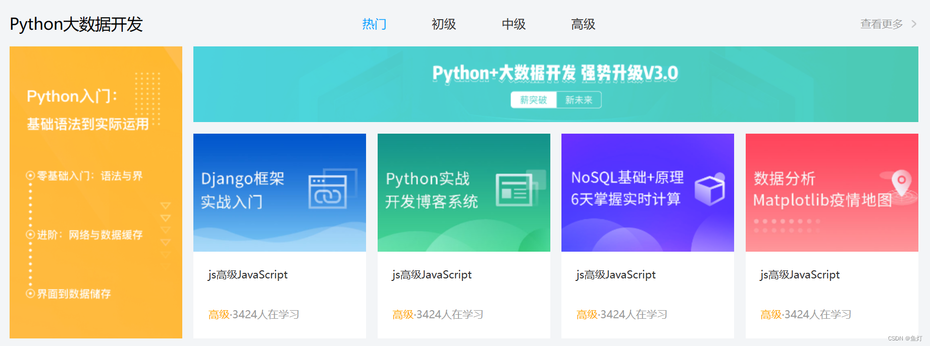
<!-- Python大数据开发区域 -->
<div class="wrapper">
    <div class="hd">
        <h3>Python大数据开发</h3>
        <ul>
            <li><a href="#" class="active">热门</a></li>
            <li><a href="#">初级</a></li>
            <li><a href="#">中级</a></li>
            <li><a href="#">高级</a></li>
        </ul>
        <a href="#" class="more">查看更多</a>
    </div>
<!-- 内容 -->
    <div class="bd">
        <!-- 两个盒子,一左一右 -->
        <div class="left">
            <img src="./uploads/python_left.png">
        </div>
        <!-- 右盒子区域 -->
        <div class="right">
            <!-- 上区域 -->
            <div class="top"><img src="./uploads/python_top.png"></div>
            <!-- 下区域:5个li盒子,li盒子分图片和内容两部分 -->
            <div class="bottom">
                <ul>
                    <li><a href="#">
                <div class="pic"><img src="./uploads/python01.png"></div>
                <div class="text">
                    <h4>js高级JavaScript</h4>
                    <p><span>高级</span>·<i>3424</i>人在学习</p>
                </div>
            </a></li>
            <li><a href="#">
                <div class="pic"><img src="./uploads/python02.png"></div>
                <div class="text">
                    <h4>js高级JavaScript</h4>
                    <p><span>高级</span>·<i>3424</i>人在学习</p>
                </div>
            </a></li>
            <li><a href="#">
                <div class="pic"><img src="./uploads/python03.png"></div>
                <div class="text">
                    <h4>js高级JavaScript</h4>
                    <p><span>高级</span>·<i>3424</i>人在学习</p>
                </div>
            </a></li>
            <li><a href="#">
                <div class="pic"><img src="./uploads/python04.png"></div>
                <div class="text">
                    <h4>js高级JavaScript</h4>
                    <p><span>高级</span>·<i>3424</i>人在学习</p>
                </div>
            </a></li>
                </ul>
            </div>
        </div>
    </div>
</div>
人工智能板块
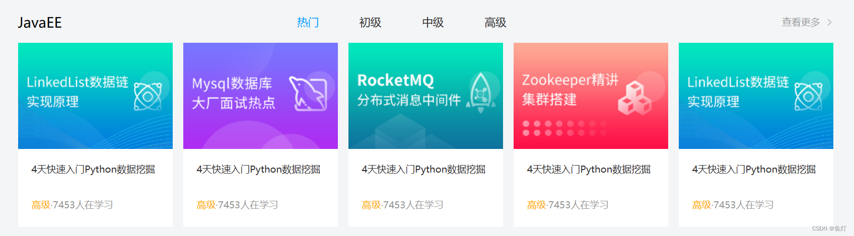
这个区域和精品课程课程区域相似,可参考精品课程区域的模版,但是由于我在做的时候,五个盒子排列没有间隔,十个才有,所以我把bd标签改为cd,再把盒子的格式写一遍(也可以复制前面写好的,把bd改为cd即可)
<!-- JavaEE板块 -->
<div class="wrapper">
    <div class="hd">
        <h3>JavaEE</h3>
        <ul>
            <li><a href="#" class="active">热门</a></li>
            <li><a href="#" >初级</a></li>
            <li><a href="#" >中级</a></li>
            <li><a href="#" >高级</a></li>
        </ul>
        <a class="more">查看更多</a>
    </div>
    <div class="cd">
        <ul>
            <li><a href="#">
                <div class="pic"><img src="./uploads/java02.png"></div>
                <div class="text">
                    <h4>4天快速入门Python数据挖掘</h4>
                    <p><span>高级</span>·<i>7453</i>人在学习</p>
                </div>
            </a></li>
            <li><a href="#">
                <div class="pic"><img src="./uploads/java02.png"></div>
                <div class="text">
                    <h4>4天快速入门Python数据挖掘</h4>
                    <p><span>高级</span>·<i>7453</i>人在学习</p>
                </div>
            </a></li>
            <li><a href="#">
                <div class="pic"><img src="./uploads/java02.png"></div>
                <div class="text">
                    <h4>4天快速入门Python数据挖掘</h4>
                    <p><span>高级</span>·<i>7453</i>人在学习</p>
                </div>
            </a></li>
            <li><a href="#">
                <div class="pic"><img src="./uploads/java02.png"></div>
                <div class="text">
                    <h4>4天快速入门Python数据挖掘</h4>
                    <p><span>高级</span>·<i>7453</i>人在学习</p>
                </div>
            </a></li>
            <li><a href="#">
                <div class="pic"><img src="./uploads/java02.png"></div>
                <div class="text">
                    <h4>4天快速入门Python数据挖掘</h4>
                    <p><span>高级</span>·<i>7453</i>人在学习</p>
                </div>
            </a></li>
        </ul>
    </div>
</div>
版权区域
实现方法:通栏>版心>左盒子(a img:logo+p+a)>右盒子(dl>dt(标题)+dd(内容))
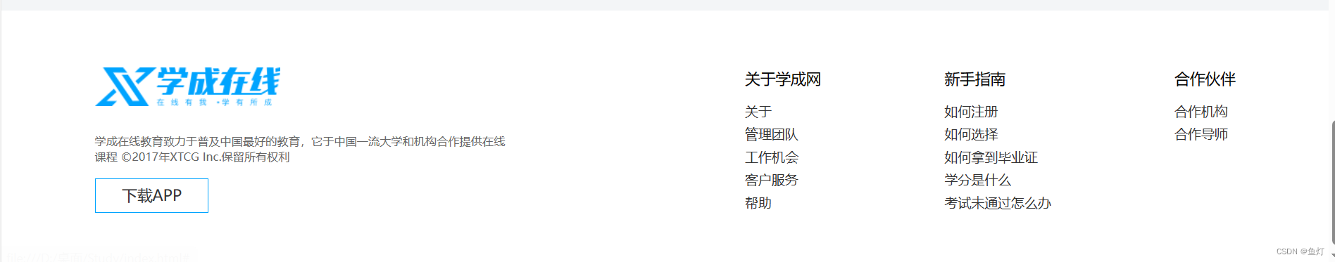
<!-- 版权区域 -->
<div class="footer">
    <div class="wrapper">
        <div class="left">
            <a href="#" class="logo"><img src="./images/logo.png"></a>
            <p>学成在线教育致力于普及中国最好的教育,它于中国一流大学和机构合作提供在线课程
                ©2017年XTCG Inc.保留所有权利
            </p>
            <a class="download">下载APP</a>
        </div>
        <div class="right">
            <dl>
                <dt>关于学成网</dt>
                <dd><a href="#">关于</a></dd>
                <dd><a href="#">管理团队</a></dd>
                <dd><a href="#">工作机会</a></dd>
                <dd><a href="#">客户服务</a></dd>
                <dd><a href="#">帮助</a></dd>

            </dl>
            <dl>
                <dt>新手指南</dt>
                <dd><a href="#">如何注册</a></dd>
                <dd><a href="#">如何选择</a></dd>
                <dd><a href="#">如何拿到毕业证</a></dd>
                <dd><a href="#">学分是什么</a></dd>
                <dd><a href="#">考试未通过怎么办</a></dd>
            </dl>
            <dl>
                <dt>合作伙伴</dt>
                <dd><a href="#">合作机构</a></dd>
                <dd><a href="#">合作导师</a></dd>
            </dl>
        </div>
    </div>
</div>
/* 版权区域 */
.footer{
    height: 273px;
    background-color: #fff;
    margin-top: 60px;
    padding-top: 60px;
}
.footer .wrapper{
    display: flex;
    justify-content: space-between;
}

.footer .left{
    width:440px;
}
.footer .left p{
    margin-top: 24px;
    margin-bottom: 14px;
    font-size: 12px;
    line-height: 17px;
    color:#666;
}
.footer .left .download{
    display: block;
    width:120px;
    height: 36px;
    text-align: center;
    /* 上下边距各为1px,36-1-1=34 */
    line-height: 34px;
    color:00a4ff;
    border:1px solid #00a4ff;

}
.footer .right{
    display: flex;
}
.footer .right dl{
    margin-left:130px;
}
.footer .right dl dt{
    margin-bottom: 12px;
    font-size: 16px;
    line-height: 23px;
}
.footer .right dd{
    font-size: 14px;
    line-height: 24px;
    color: #666666;
}
至此,一个完整的网页已完成


 扫一扫
扫一扫


 被折叠的 条评论
为什么被折叠?
被折叠的 条评论
为什么被折叠?
 到【灌水乐园】发言


