


💭💭
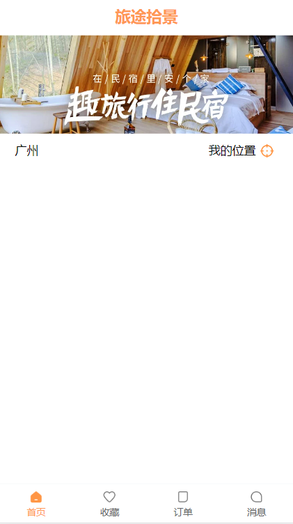
✨:搭建项目基本框架、底部tabbar、头部banner| 路途拾景 | 基于Vue3全家桶
💟:东非不开森的主页
💜: 因为很多东西来不及去做去看可是时间很快总是赶不上,所以要去成长呀💜💜
🌸: 如有错误或不足之处,希望可以指正,非常感谢😉
旅途拾景初始准备工作
前言
💜💜💜
前言:这个项目之前有跟着老师做过一遍,但是对里面很多知识、还有逻辑并不是很清晰、跟着做的时候总会想当然的会。所以想要再做一遍,这一遍我是先自己跟着自己想法能做多少是多少,然后再看老师视频来对比一下自己的,当然不会的也会看视频嘿嘿,我太菜啦呜呜呜。
参考资料:codewhy
项目名称:《旅途拾景》
含义:无论我们身在何处,都要把自己的旅程当做成一次旅途,人生如逆旅,我亦是行人。希望我们都能在自己的旅途中收获最美的风景,愿我们,春去秋来清风至,岁月静好多喜乐(我瞎扯的哈哈~)
技术栈:基于vue-cli搭建的Vue3项目,里面用了Vue3全家桶,pinia、vue-router、axios,还有组件库vant
一、搭建项目基本框架
1.1.创建项目
⭐⭐⭐
这里是Vue3的,Vue2项目一般要指定版本的QAQ
- 基于vue-cli
步骤:
- vue create xxx
- cd xxx
- npm run serve
- 基于vite
步骤:
- 基于vite工具
- 命令:npm init vue@latest
- npm install
- npm run dev
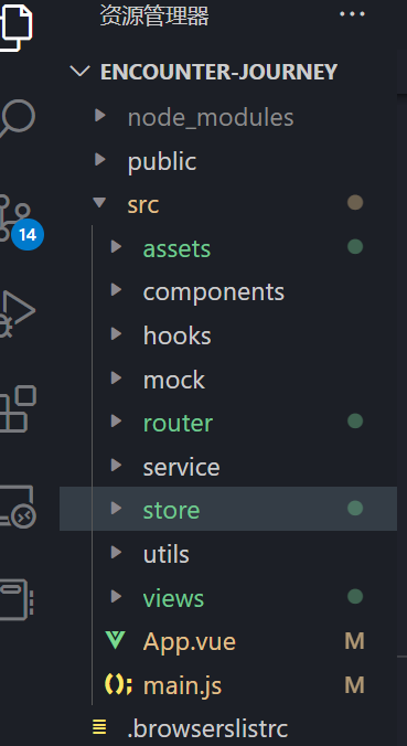
1.2.对项目基本目录进行划分
我们可以想一下大概需要啥,就先配置一下目录
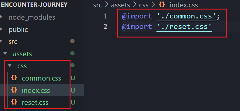
1.3.CSS样式的重置
对默认CSS样式进行重置
- normalize.css (npm install normalize.css)
- reset.css
- common.css
- index.css
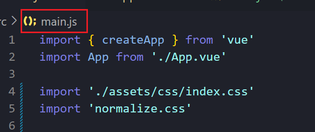
在main.js引入normal.css、index.css
1.4.配置路由
安装Vue Router:
npm install vue-router
想一下大概需要几个主页面,在路由里面配置一下
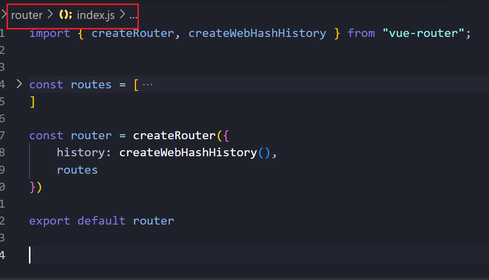
在main.js中引入
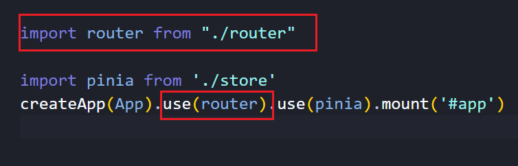
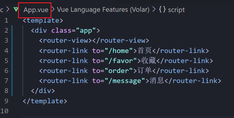
路由配置还需要用router-view占位
这里我们也可以先想一下,需要几个主页面,用router-link先模拟一下(很喜欢why老师说的,我们做一件事情要先把自己能想到的先做出来嘿嘿)
app.vue
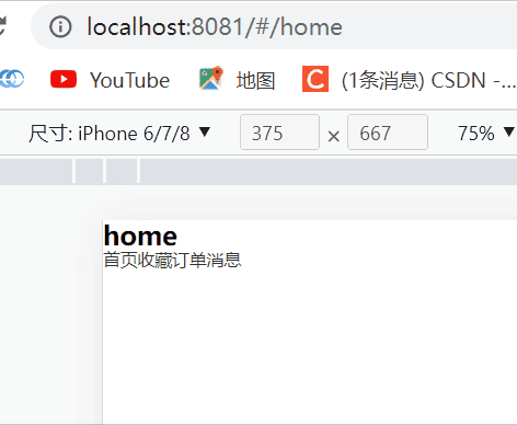
效果大概如下
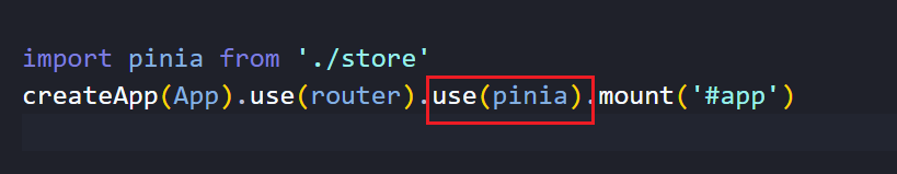
1.5.配置状态管理
这里Vue3里面使用pinia
安装
npm install pinia
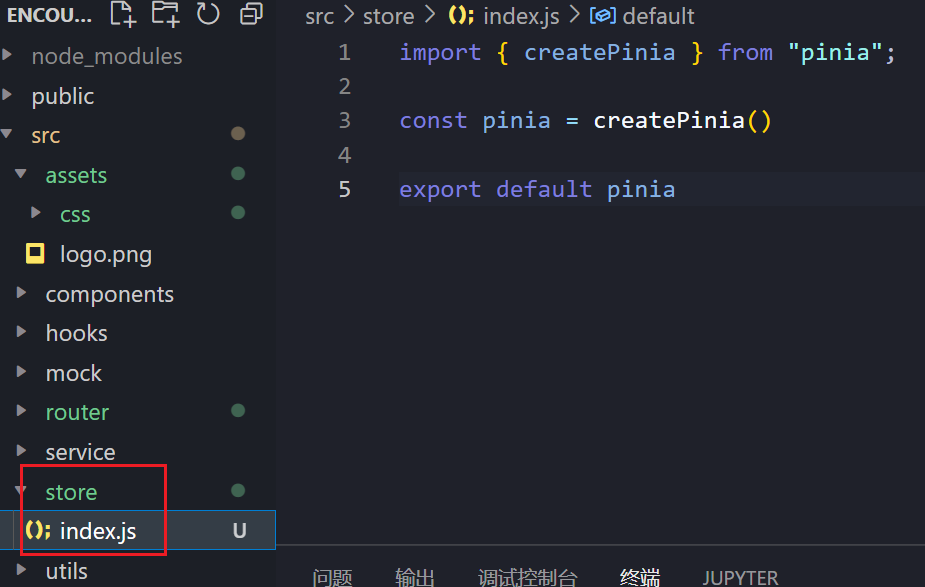
main.js
二、搭建tabbar
2.1.我自己的初步搭建
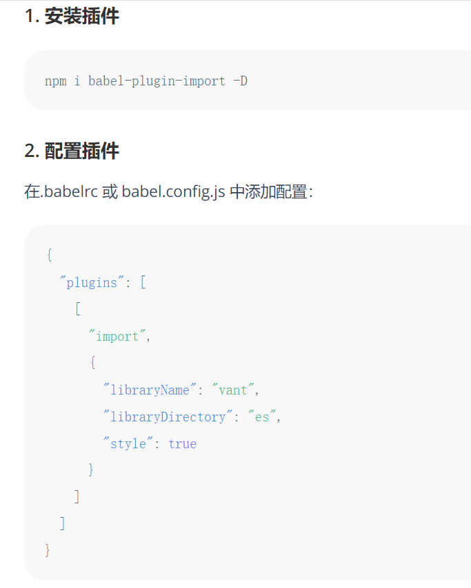
我想的是用vant组件库
npm i vant
(请一定注意版本,在Vue3一般就直接下载的就能用,Vue2中是要注意版本的)
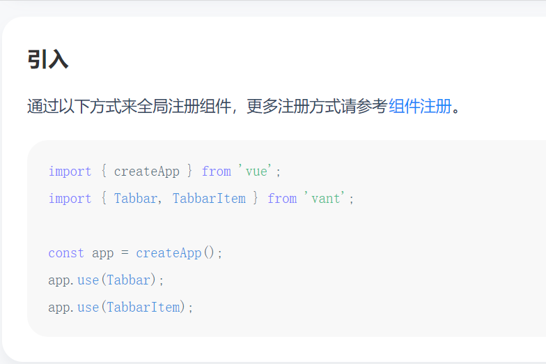
然后再根据官网配置一下插件按需引用
然后我想的比较简单,就是配置一下路由还有图标就可以嘿嘿
(官方说的:vant组件库中的tabbar中使用路由,(标签栏支持路由模式,用于搭配 vue-router 使用。路由模式下会匹配页面路径和标签的 to 属性,并自动选中对应的标签。)
使用一个组件一定先引入
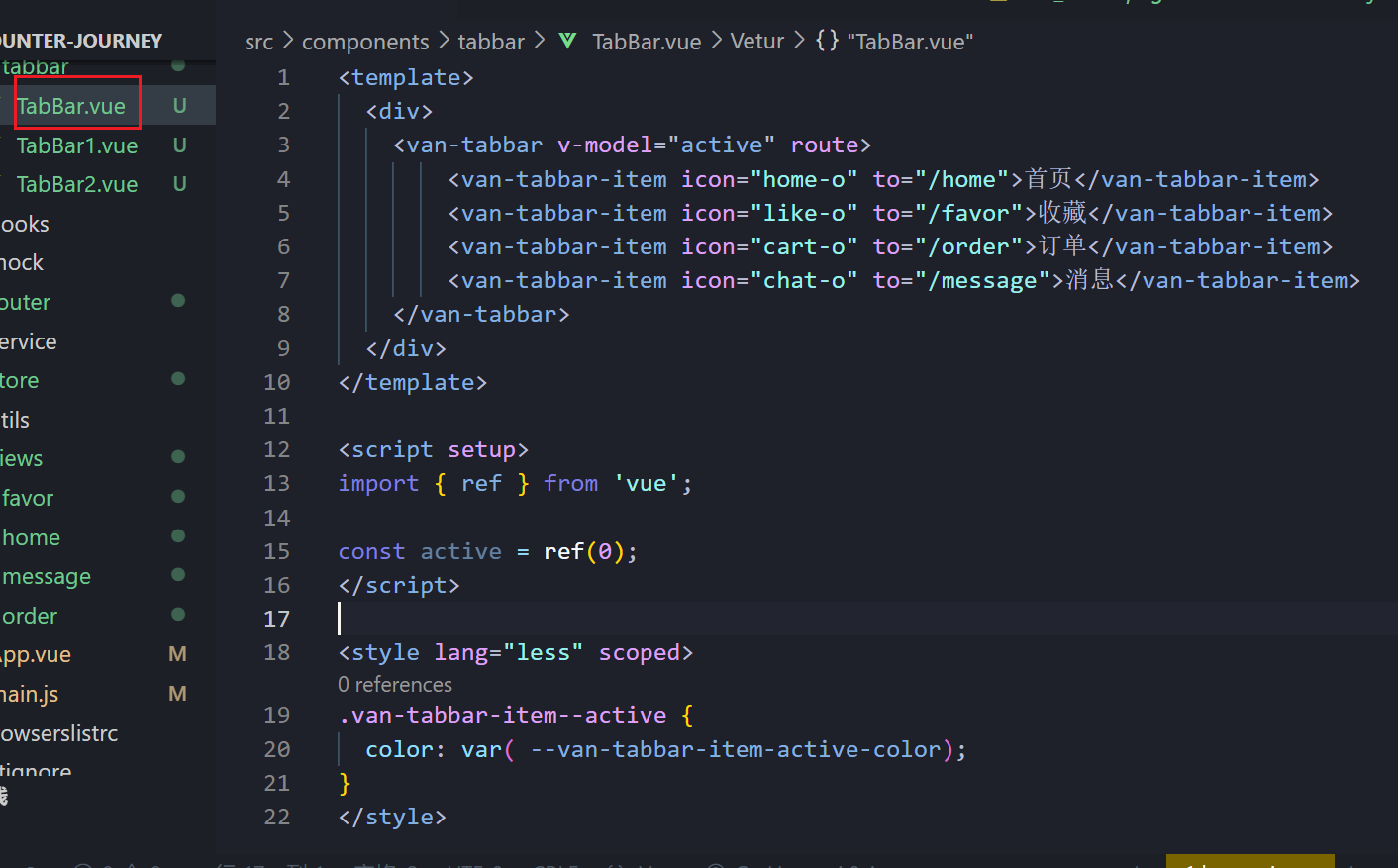
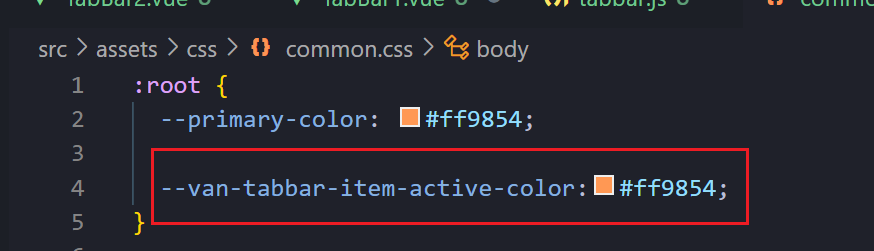
颜色可以在全局注册一下就可以通过var使用(我们可以通过调试找到图标颜色所在位置)
预览效果:

其实也还行吧哈哈哈哈。勉强还能眼
2.2.完善的封装搭建
这个我觉得还是很有必要练习的,逻辑还有css等,都是很好的练习
- 我们通过for循环遍历数组
- 然后src动态获取本地图片
- 绑定点击事件
- 使用userRouter(),配置路由
- 基本变量变为响应式引用,所以要使用ref
- css主要使用了flex布局
代码:
<template>
<div class="tab-bar">
<template v-for="(item, index) in tabbarData">
<div class="tab-item" :class="{active: currentIndex === index}"
@click="itemClick(item, index)"
>
<img v-if="currentIndex !== index" :src="require('@/assets/img/'+item.image)" alt="">
<img v-else :src="require('@/assets/img/'+item.imageActive)" alt="">
<span class="text">{{item.text}}</span>
</div>
</template>
</div>
</template>
<script setup>
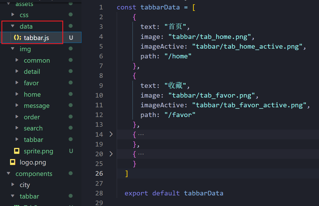
import tabbarData from '@/assets/data/tabbar';
import { ref } from "vue"
import { useRouter } from 'vue-router';
const currentIndex = ref(0)
const router = useRouter()
const itemClick = (item, index) => {
currentIndex.value = index
router.push(item.path)
}
</script>
<style lang="less" scoped>
.tab-bar {
position: fixed;
bottom: 0;
left: 0;
right: 0;
display: flex;
height: 50px;
border-top: 1px solid #f3f3f3;
.tab-item {
flex: 1;
display: flex;
flex-direction: column;
justify-content: center;
align-items: center;
&.active {
color: var(--primary-color);
}
img {
width: 36px;
}
.text {
font-size: 18px;
margin-top: 2px;
flex: 1;
}
}
}
</style>
2.3.完整的组件搭建
使用vant组件库
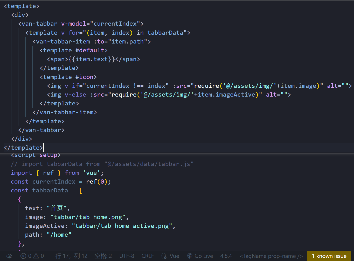
我们可以考虑吧tabbar抽离出去,当然不抽离也没有关系
抽离就是这样,记得导出还有在组件中使用就可以了
- v-model绑定变量
- :to路由配置
- #default默认插槽的使用,官方也有介绍
- require()拼接路径。src动态引用本地图片
代码如下
<template>
  <div>
    <van-tabbar v-model="currentIndex">
      <template v-for="(item, index) in tabbarData">
        <van-tabbar-item :to="item.path">
          <template #default>
            <span>{{item.text}}</span>
          </template>
          <template #icon>
            <img v-if="currentIndex !== index" :src="require('@/assets/img/'+item.image)" alt="">
            <img v-else :src="require('@/assets/img/'+item.imageActive)" alt="">
          </template>
        </van-tabbar-item>
      </template>
    </van-tabbar>
  </div>
</template>
<script setup>
import tabbarData from "@/assets/data/tabbar.js"
import { ref } from 'vue';
const currentIndex = ref(0);
</script>
预览效果:
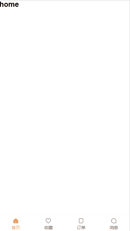
确实比我自己做的好哈哈
三、头部banner
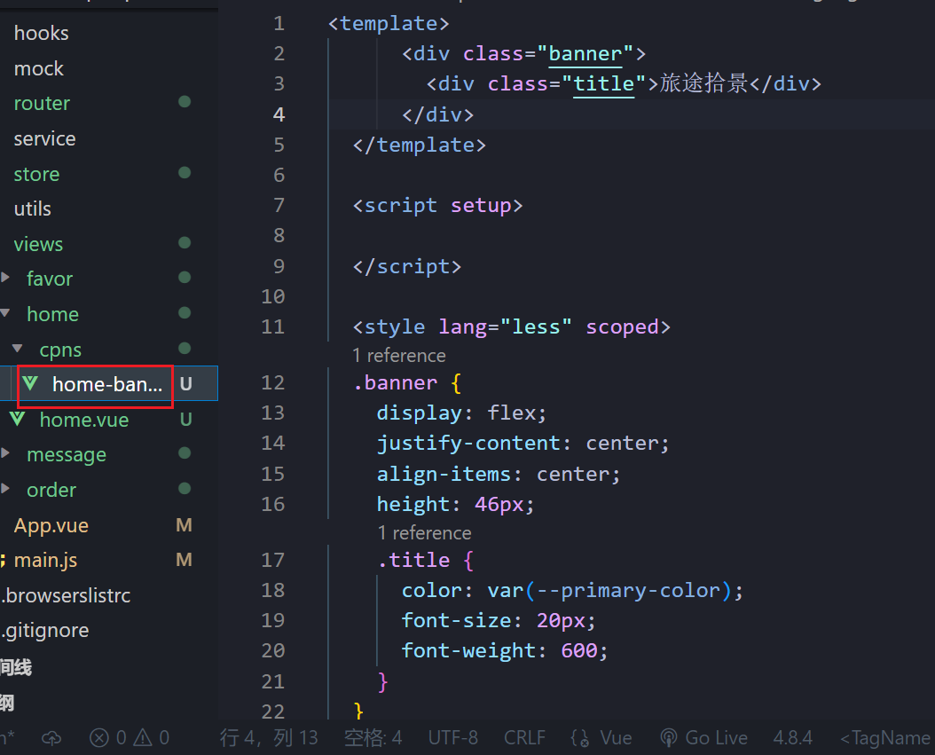
3.1.banner标题
把它封装成一个组件,在home里面使用
- 颜色用的是全局定义的
3.2.位置区域
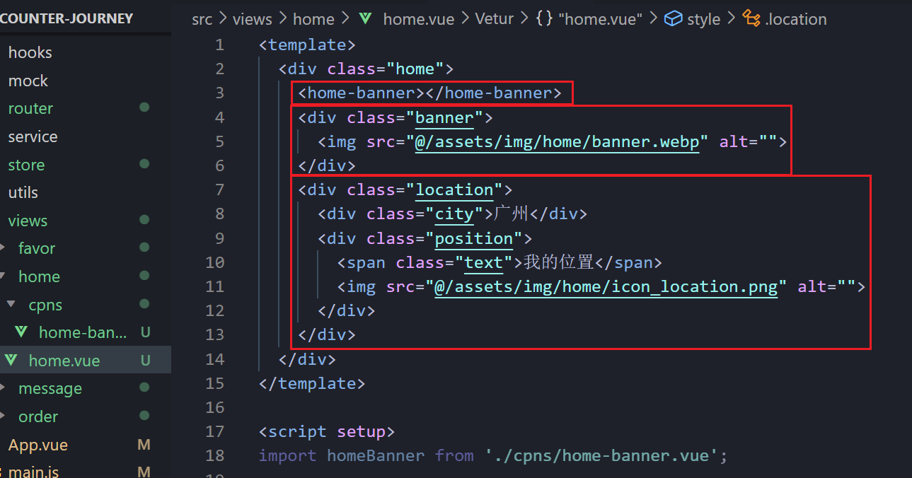
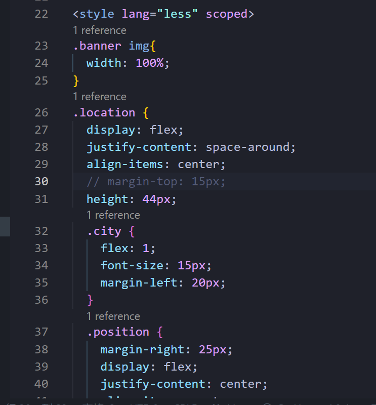
css就是自己看着调
(一般导航栏我们要给它个高度)
效果图:
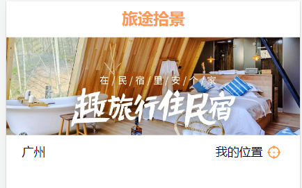
这部分整体效果:


 281
281


 被折叠的 条评论
为什么被折叠?
被折叠的 条评论
为什么被折叠?
 到【灌水乐园】发言


