


圣杯布局
一、组成:header,left,center,right,footer
二、要求:
- header和footer各自占领屏幕所有宽度,高度固定
- 中间的container是一个三栏布局
- 三栏布局两侧宽度固定不变,中间部分自动填充整个区域
- 中间部分的高度是三栏中最高的区域的高度
三、实现方式:
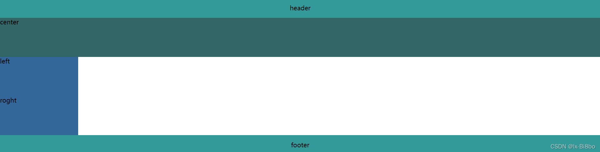
浮动
- 创建header,container(left,center,right,先定义center),footer
<body>
    <div id="float"><h1>float</h1>
        <div class="header">header</div>
        <div class="container">
            <div class="center">center</div>
            <div class="left">left</div>
            <div class="right">right</div>
        </div>
        <div class="footer">footer</div>
    </div>
</body>
- 定义header和footer的样式,使之横向铺满,同时footer清除浮动
    .header,
    .footer {
        background: #339999;
        text-align: center;
        height: 50px;
        line-height: 50px;
    }

    .footer {
        clear: both;
    }
- 在container中的left,center,right设置为浮动,相对定位left放在center左边,right放在center右边
    .center {
        background: #336666;
        height: 100px;
        width: 100%;
        float: left;
    }

    .left {
        background: #336699;
        height: 100px;
        width: 200px;
        float: left;
    }

    .right {
        background: #336699;
        height: 100px;
        width: 200px;
        float: right;
    }
-
由于浮动的关系,谁先浮动谁就会在最上方,而且center设置为width:100%,所以,left和right就只能浮动在center的下方

-
利用浮动的原理,接下来将left的margin-left设置为-100%,让left回到上层

-
这时,left虽然移上去了,但是center的内容会被遮挡,此时我们要将container设置左右padding为left和right的宽度,为其腾出位置
-
设置相对定位,通过left将其拉回到最左侧
    .container {
        padding-left: 200px;
        padding-right: 200px;
        text-align: center;
        line-height: 100px;
    }

    .center {
        background: #336666;
        height: 100px;
        width: 100%;
        float: left;
        position: relative;
    }

    .left {
        background: #336699;
        height: 100px;
        width: 200px;
        float: left;
        margin-left: -100%;
        position: relative;
        right: 200px;
    }

    .right {
        background: #336699;
        height: 100px;
        width: 200px;
        float: right;
    }

- 右侧同理
完整代码如下:
<!DOCTYPE html>
<html lang="en">

<head>
    <meta charset="UTF-8">
    <meta http-equiv="X-UA-Compatible" content="IE=edge">
    <meta name="viewport" content="width=device-width, initial-scale=1.0">
    <title>float</title>
</head>
<style>
    * {
        margin: 0;
        padding: 0;
    }
    .header,
    .footer {
        background: #339999;
        text-align: center;
        height: 50px;
        line-height: 50px;
    }

    .footer {
        clear: both;
    }

    .container {
        padding-left: 200px;
        padding-right: 200px;
        text-align: center;
        line-height: 100px;
    }

    .center {
        background: #336666;
        height: 100px;
        width: 100%;
        float: left;
        position: relative;
    }

    .left {
        background: #336699;
        height: 100px;
        width: 200px;
        float: left;
        margin-left: -100%;
        position: relative;
        right: 200px;
    }

    .right {
        background: #336699;
        height: 100px;
        width: 200px;
        float: right;
        margin-right: -200px;
        position: relative;
    }
</style>
<body>
 <div id="float"><h1>float</h1>
        <div class="header">header</div>
        <div class="container">
            <div class="center">center</div>
            <div class="left">left</div>
            <div class="right">right</div>
        </div>
        <div class="footer">footer</div>
    </div>
</body>
</html>
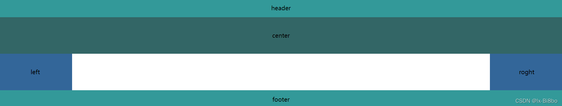
flex弹性盒子
- 创建header,container(left,center,right,依次排布即可),footer
- 定义header和footer的样式,使之横向铺满
- 给container设置弹性布局display:flex;
 .container1 {
       display: flex;
   }
- left和right区域顶宽,center设置flex:1;
.center1 {
        flex: 1;
    }

    .left1 {
        flex:1;
    }

    .right1 {
        flex:1;
    }
完整代码如下:
<!DOCTYPE html>
<html lang="en">

<head>
    <meta charset="UTF-8">
    <meta http-equiv="X-UA-Compatible" content="IE=edge">
    <meta name="viewport" content="width=device-width, initial-scale=1.0">
    <title>flex</title>
</head>
<style>
    * {
        margin: 0;
        padding: 0;
    }
    .header1,
    .footer1 {
        background: #339999;
        text-align: center;
        height: 50px;
        line-height: 50px;
    }

    .container1 {
        text-align: center;
        line-height: 100px;
        height: 100px;
        display: flex;
    }

    .center1 {
        background: #336666;
        flex: 1;
    }

    .left1 {
        width: 200px;
        background: #336699;
    }

    .right1 {
        width: 200px;
        background: #336699;
    }
</style>
<body>
	<div id="flex"><h1>flex</h1>
        <div class="header1">header1</div>
        <div class="container1">
            <div class="left1">left1</div>
            <div class="center1">center1</div>
            <div class="right1">right1</div>
        </div>
        <div class="footer1">footer1</div>
    </div>
</body>
</html>
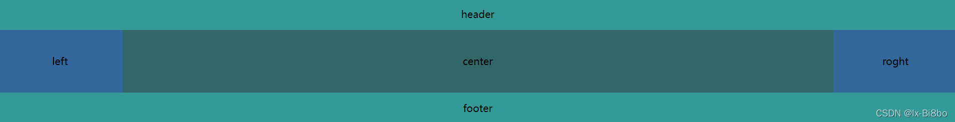
position
- 将left和right的宽度设为20%,中间60%自适应
- 将父元素设为相对定位,再将left,right,center设置为绝对定位
完整代码如下:
<!DOCTYPE html>
<html lang="en">

<head>
    <meta charset="UTF-8">
    <meta http-equiv="X-UA-Compatible" content="IE=edge">
    <meta name="viewport" content="width=device-width, initial-scale=1.0">
    <title>position</title>
</head>
<style>
    * {
        margin: 0;
        padding: 0;
    }

    .header2,
    .footer2{
        height: 50px;
        background: #339999;
        text-align: center;
        height: 50px;
        line-height: 50px;
    }

    .container2{
        height: 100px;
        position: relative;
        text-align: center;
        height: 100px;
        line-height: 100px;
    }

    .container2 .left2{
        width: 20%;
        height: 100%;
        background: #336699;
        position: absolute;
        top: 0;
        left: 0;
    }

    .container2 .center2{
        height: 100%;
        width: 60%;
        background: #336666;
        position: absolute;
        top: 0;
        left: 20%;
    }

    .container2 .right2{
        width: 20%;
        height: 100%;
        background: #336699;
        position: absolute;
        top: 0;
        right: 0;
    }
</style>
<body>
<div id="position"><h1>position</h1>
        <div class="header2">header2</div>
        <div class="container2">
            <div class="left2">left2</div>
            <div class="center2">center2</div>
            <div class="right2">right2</div>
        </div>
        <div class="footer2">footer2</div>
    </div>
</body>
</html>
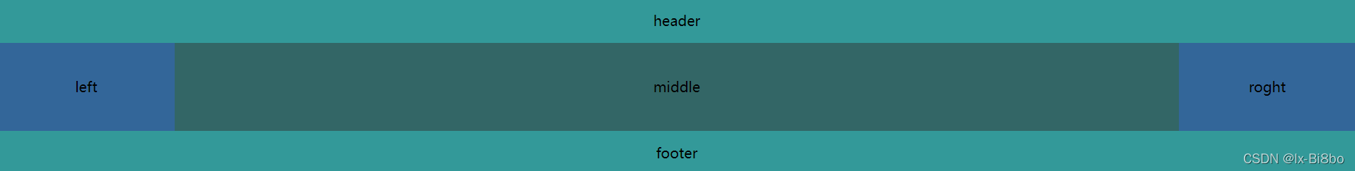
grid网格布局
- 给body元素添加display: grid;属性变成一个grid(网格)
- 给header元素设置grid-row: 1; 和 grid-column: 1/5;
意思是占据第一行网格的从第一条列网格线开始到第五条列网格线结束 - 给footer元素设置grid-row: 3; 和 grid-column: 1/5;
意思是占据第三行网格的从第一条列网格线开始到第五条列网格线结束 - 给left元素设置grid-row: 2; 和 grid-column: 1/2;
意思是占据第二行网格的从第一条列网格线开始到第二条列网格线结束 - 给center元素设置grid-row: 2; 和 grid-column: 2/4;
意思是占据第二行网格的从第二条列网格线开始到第四条列网格线结束 - 给right元素设置grid-row: 2; 和 grid-column: 4/5;
意思是占据第二行网格的从第四条列网格线开始到第五条列网格线结束
完整代码如下:
<!DOCTYPE html>
<html lang="en">

<head>
    <meta charset="UTF-8">
    <meta http-equiv="X-UA-Compatible" content="IE=edge">
    <meta name="viewport" content="width=device-width, initial-scale=1.0">
    <title>圣杯布局和双飞翼布局</title>
</head>
<style>
    * {
        margin: 0;
        padding: 0;
    }
    .header3,
    .footer3 {
        background: #339999;
        text-align: center;
        height: 50px;
        line-height: 50px;
    }

    .header3 {
        grid-row: 1;
        grid-column: 1/5;
    }

    .footer3 {
        grid-row: 3;
        grid-column: 1/5;
    }

    .container3{
        text-align: center;
        height: 100px;
        line-height: 100px;
        display: grid;
    }

    .left3 {
        grid-row: 2;
        grid-column: 1/2;
        background: #336699;
    }

    .center3 {
        grid-row: 2;
        grid-column: 2/4;
        background: #336666;

    }

    .right3 {
        grid-row: 2;
        grid-column: 4/5;
        background: #336699;
    }
</style>
<body>
    <div id="grid"><h1>grid</h1>
        <div class="header3">header3</div>
        <div class="container3">
            <div class="left3">left3</div>
            <div class="center3">center3</div>
            <div class="right3">right3</div>
        </div>
        <div class="footer3">footer3</div>
    </div>
</body>

</html>
双飞翼布局
双飞翼布局最早是由淘宝团队提出的,是针对圣杯局部优化的解决方案,主要是优化了圣杯布局中的开启定位问题
一、要求
- header和footer各自占满屏幕所有宽度,高度固定
- 中间的container是一个三栏布局
- 三栏布局两侧宽度固定不变,中间部分自动填充整个区域
- 中间部分的高度是三栏中最高区域的高度
二、实现方式
- 创建header,container(left,center,right,先定义center),footer
- 接下来要将left放在middle左边,right放在middle的右边,将left,middle,设置为左浮动,将right设置为右浮动
- 设置left的 margin-left: -100%; right的 margin-left: -200px;
- 此时left,right, cente 都已经叠在一起了,那么不同于圣杯布局的操作是在center内放一个盒子,这个盒子设置padding为left,right盒子的宽度
完整代码如下:
<!DOCTYPE html>
<html lang="en">
<head>
    <meta charset="UTF-8">
    <meta http-equiv="X-UA-Compatible" content="IE=edge">
    <meta name="viewport" content="width=device-width, initial-scale=1.0">
    <title>Document</title>
</head>

<style>

    *{
        margin: 0;
        padding: 0;
    }

    .header,
    .footer {
        background: #339999;
        text-align: center;
        height: 50px;
        line-height: 50px;
    }

    .footer {
        clear: both;
    }

    .container {
        text-align: center;
        line-height: 100px;
    }

    .center {
        background: #336666;
        height: 100px;
        width: 100%;
        float: left;
    }

    .middlle {
        padding: 0 200px 0 200px;
    }

    .left {
        background: #336699;
        height: 100px;
        width: 200px;
        float: left;
        margin-left: -100%;
    }

    .right {
        background: #336699;
        height: 100px;
        width: 200px;
        float: right;
        margin-left: -200px; ;
    }

</style>

<body>
    <div class="header">header</div>
    <div class="container">
        <div class="center">
            <div class="middle">middle</div>
        </div>
        <div class="left">left</div>
        <div class="right">roght</div>
    </div>
    <div class="footer">footer</div>
</body>
</html>
对比
相同
- 圣杯布局和双飞翼布局达到的效果基本相同,都是侧边两栏宽度固定,中间栏宽度自适应的三栏布局
- 两种布局方式都是把主列放在文档流最前面,使主列优先加载
- 在实现方式上也有相同之处,都是让三列浮动,通过负外边距形成三列布局
不同
不同之处就是在解决中间部分被挡住的问题
- 圣杯布局是利用父容器的左、右内边距+两列的相对定位
- 双飞翼布局是把主列嵌套在一个新的父级块中利用主列的左右外边距进行布局调整


 183
183


 被折叠的 条评论
为什么被折叠?
被折叠的 条评论
为什么被折叠?
 到【灌水乐园】发言


