


行内样式表
通过
style
属性
,
来指定某个标签的样式
.
只适合于写简单样式
.
只针对某个标签生效
.
缺点
:
不能写太复杂的样式
.
这种写法优先级较高
,
会覆盖其他的样式
.
<style>
    div {
        color: red;
   }
</style>
<div style="color:green">想要生活过的去, 头上总得带点绿</div>
在外部写css,需要一般在head标签使用link标签来引入对应css文件
<!-- <!DOCTYPE html>声明是html文件 -->
<!DOCTYPE html>
<html lang="en">
<head>
    <!-- 有些只有单标签比如meta -->
    <meta charset="UTF-8">
    <meta http-equiv="X-UA-Compatible" content="IE=edge">
    <meta name="viewport" content="width=device-width, initial-scale=1.0">
    <!-- 改变标签页 -->
    <title>超级暴龙王</title>
    <link rel="stylesheet" href="../style.css">
</head>
<body>
    <p>this is test css html</p>
</body>
</html>
p{
color: rgb(9, 226, 237);
}
css定义类需要.开头
.one{} 调用时需要 class=“one”
还能通过id选择器给每一个元素设置一个ID
#one{
       color: red;
    }
 #two{
        color: rgb(0, 255, 81);
     }
 #three{
         color: rgb(140, 0, 255);
     }


<p id="one">this id test1 </p>
<p id="two">this id test2 </p>
<p id="three">this id test3 </p>
类选择器能让多个选择一个,但是id选择器只能一个对应一个
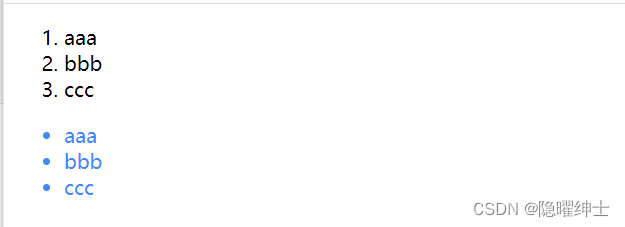
除了上述三个之外,还有后代迭代选择器
<style>
        ul li{
            color: rgb(15, 136, 248);
        }
    </style>


<ol>
        <li>aaa</li>
        <li>bbb</li>
        <li>ccc</li>
    </ol>
    <ul>
        <li>aaa</li>
        <li>bbb</li>
        <li>ccc</li>
    </ul>
含义是先找ul,再找li。也可以是.one li,这时就要在需要的地方加上class=“one” 不仅仅是子元素,还能是孙子元素
子元素选择器
使用.one>a即可
<style>
        .one > a{
            color: rgb(255, 0, 8);
        }
    </style>
<div class="one">
<a href="#">href 1</a>
<p>
<a href="#">href 2</a>
</p>
</div>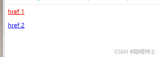
此时href 1为one的子元素,所以改变了颜色
href 2为one的孙元素,所以没有改变颜色
并集选择器
当两个差不多时,可以使用并集选择器
.one,.two,.three{
            font-size: 30px;
        }
伪类选择器
鼠标悬停:hover
.one:hover{
            color: #5708ce;
            font-size: 300px;
        }
当鼠标放上去时就会变色和放大
鼠标点击:active 加上下面的代码就可以实现点击变色
.one:active{
            color: gold;
        }
文字属性
<style>
        .one{
            font-family: '宋体';/* 设置字体 */
            font-size: 30px;/*设置大小*/
            font-weight: bold;/*设置字体粗细 bold 加粗 lighter从父类继承过来更细 bolder从父类继承过来更粗*/
            font-style: italic;/*设置文字文字样式 比如倾斜就向 i 标签*/
        }
    </style>
文本属性
颜色
color: red;
color: #ff0000;
color: rgb(255, 0, 0);
文本对齐
text-align: [值];
center: 居中对齐
left: 左对齐
right: 右对齐
文本装饰
underline 下划线. [常用]
none 啥都没有. 可以给 a 标签去掉下划线.
overline 上划线. [不常用]
line-through 删除线 [不常用]
文本缩进
text-indent: [值];
单位可以使用 px 或者 em.
使用 em 作为单位更好. 1 个 em 就是当前元素的文字大小.
缩进可以是负的, 表示往左缩进. (会导致文字就冒出去了)
行高
行高指的是上下文本行之间的基线距离
line-height: [值];
行高 = 上边距 + 下边距 + 字体大小
~~px背景属性
背景颜色
background-color: [指定颜色]

背景图片
background-image: url(...);
注意:
1. url 不要遗漏.
2. url 可以是绝对路径, 也可以是相对路径
3. url 上可以加引号, 也可以不加.


背景平铺
background-repeat: [平铺方式]
重要取值:
repeat: 平铺
no-repeat: 不平铺
repeat-x: 水平平铺
repeat-y: 垂直平铺


背景位置
background-position: x y;
参数有三种风格:
1. 方位名词: (top, left, right, bottom)
2. 精确单位: 坐标或者百分比(以左上角为原点)
3. 混合单位: 同时包含方位名词和精确单位
注意
如果参数的两个值都是方位名词, 则前后顺序无关. (top left 和 left top 等效)
如果只指定了一个方位名词, 则第二个默认居中. (left 则意味着水平居中, top 意味着垂直居中. )
如果参数是精确值, 则的的第一个肯定是 x , 第二个肯定是 y. (100 200 意味着 x 为 100, y 为 200)
如果参数是精确值, 且只给了一个数值, 则该数值一定是 x 坐标, 另一个默认垂直居中.
如果参数是混合单位, 则第一个值一定为 x, 第二个值为 y 坐标. (100 center 表示横坐标为 100, 垂
直居中)

背景尺寸
background-size: length|percentage|cover|contain;

可以填具体的数值: 如 40px 60px 表示宽度为 40px, 高度为 60px
也可以填百分比: 按照父元素的尺寸设置.
cover: 把背景图像扩展至足够大,以使背景图像完全覆盖背景区域。背景图像的某些部分也许无法
显示在背景定位区域中。
contain: 把图像图像扩展至最大尺寸,以使其宽度和高度完全适应内容区域.
圆角矩形
border-radius: length;
length 是内切圆的半径. 数值越大, 弧线越强烈


生成圆形
让 border-radius 的值为正方形宽度的一半即可
div {
    width: 200px;
    height: 200px;
    border: 2px solid green;
    border-radius: 100px;
    /* 或者用 50% 表示宽度的一半 */
    border-radius: 50%;
}

生成圆角矩形
让 border-radius 的值为矩形高度的一半即可
div {
    width: 200px;
    height: 100px;
    border: 2px solid green;
    border-radius: 50px;
}

border-radius 是一个复合写法. 实际上可以针对四个角分别设置.
按照顺时针排列
border-top-left-radius:10px;
border-top-right-radius:20px;
border-bottom-right-radius:30px;
border-bottom-left-radius:40px;
边框
border属性.直接设置了四个方向
还可以使用
border-right
border-top
border-bottom
border-left
设置边框要设置三个方面
1.边框的粗细
2.边框的颜色
3.边框的风格(实线虚线,其他的线...
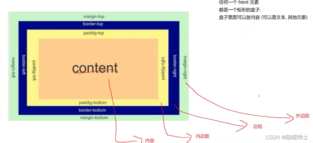
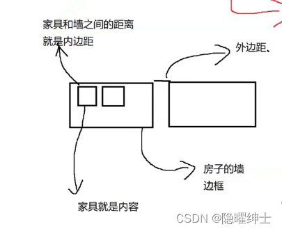
heigth和width是设置内容的宽高,边框设置会默认撑大盒子大概10像素
通过 box-sizing 属性可以修改浏览器的行为, 使边框不再撑大盒子


 1236
1236


 被折叠的 条评论
为什么被折叠?
被折叠的 条评论
为什么被折叠?
 到【灌水乐园】发言


