


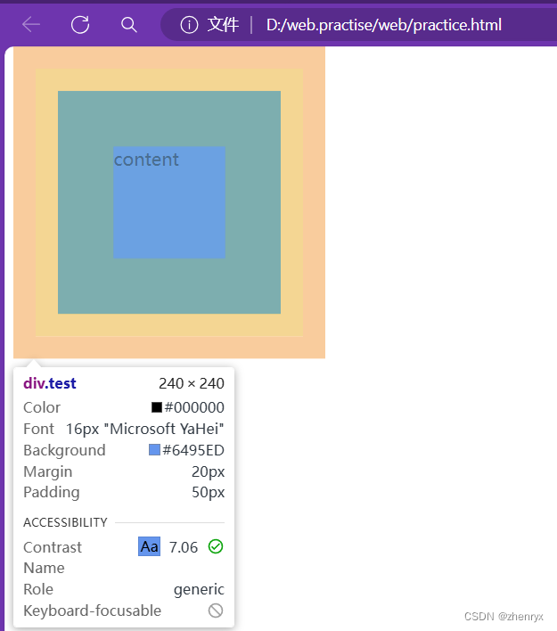
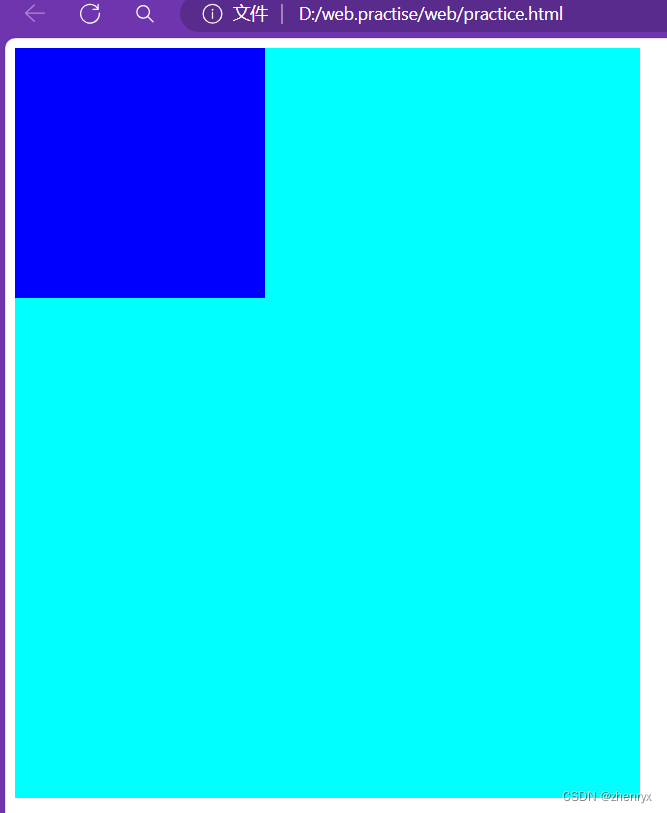
1、CSS盒子模型
四个元素
margin(外边距)
border(边框) :类似表格
padding(内边距):
padding 属性接受 1~4 个值:
指定一个值,应用到全部四个边的内边距。
指定两个值,上边和下边的内边距,第二个值应用于左边和右边。
指定三个值,第一个值应用于上边,第二个值应用于右边和左边,第三个则应用于下边的内边距。
指定四个值时,依次(顺时针方向)作为上边,右边,下边,和左边的内边距
content(内容)
<head>
    <meta charset="UTF-8">
    <meta name="viewport" content="width=device-width, initial-scale=1.0">
    <title>Document</title>
    <style>
      div{
        width: 100px;
        height: 100px;
        background-color: cornflowerblue;
        padding: 50px;
        border: 20px solid burlywood;
        margin: 20px;
      }
    </style>
</head>
<body>
<div class="test">
    content
</div>
效果
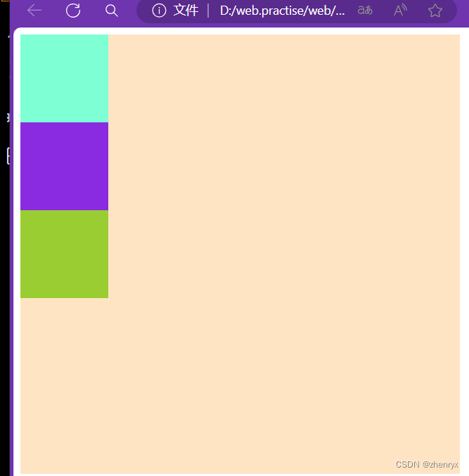
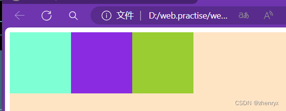
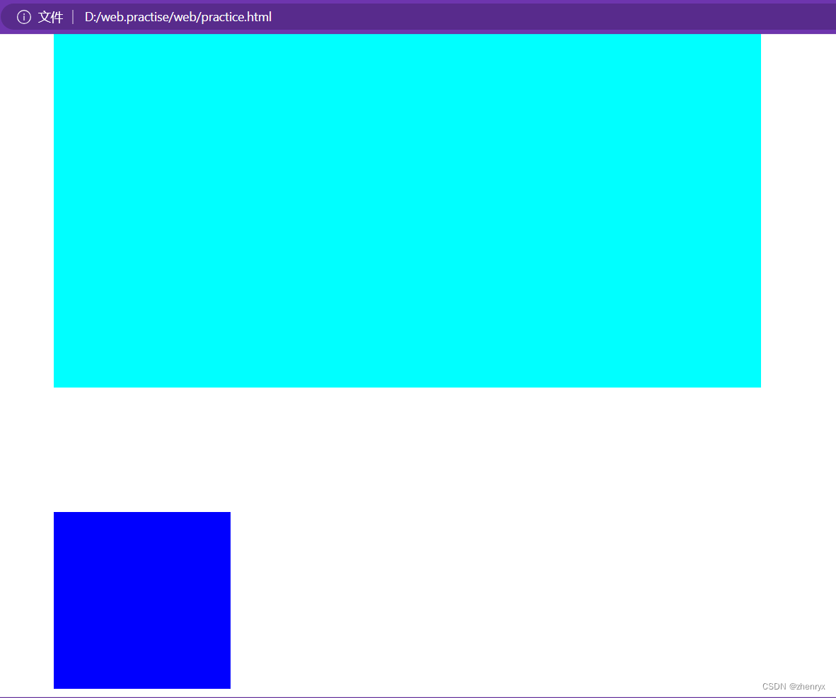
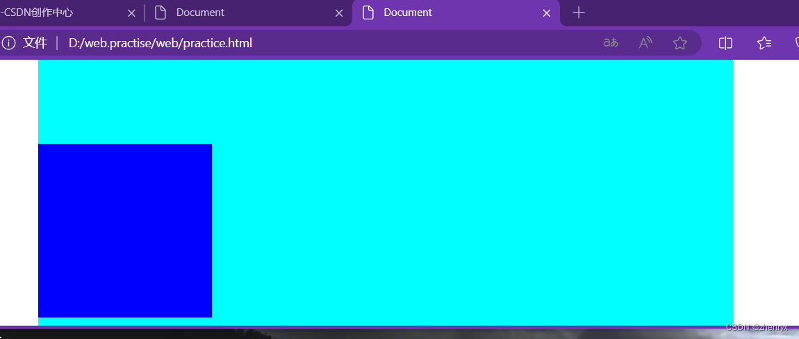
2、CSS3弹性盒子
display:flex 使用弹性盒子(子元素默认水平排列)
flex-direction 指定子元素的位置
row:横向从左到右,也是默认方式
row-reverse:反转横向排列(靠右对齐,最后一项排列在前面)
column:纵向排列
column-reverse:反转纵向排列
    <style>
      .test{
        width: 500px;
        height: 500px;
        background-color: bisque;
      }
      .box1{
        width: 100px;
        height: 100px;
        background-color: aquamarine;
      }
      .box2{
        width: 100px;
        height: 100px;
        background-color:blueviolet
      }
      .box3{
        width: 100px;
        height: 100px;
        background-color:yellowgreen
      }

    </style>
</head>
<body>
<div class="test">
   <div class="box1"></div>
   <div class="box2"></div>
   <div class="box3"></div>
</div>
</body>
正常效果:
使用弹性盒子:
.test{
width: 500px;
height: 500px;
background-color: bisque;
display: flex;
}
其他效果感兴趣可以自行尝试
两种对齐方式:justify-content(垂直方向) align-items(水平方向),在父级元素上定义
①.justify-content: 子元素沿X轴排列
justify-content: flex-star; 子元素从左向右排
justify-content: flex-end; 子元素水平靠右排列
justify-content: center; 子元素水平居中排列
justify-content: space-between; 子元素水平居中散开排列
justify-content: space-around; 第一个子元素靠左,第二个子元素居中,第三个子元素靠右排列
②.align-items: 子元素沿y轴排列
align-items: flex-start; 子元素垂直于父级盒子顶部排列
align-items: flex-end; 子元素垂直于父级盒子底部排列
align-items: center; 子元素垂直居中排列
align-items: baseline; 子元素以第一行文字为基准线进行排列
align-items: strech; 当某个子元素没有设置高度时,会自动撑满子元素所在的那一列
设置子元素权重:flex
    <style>
      .test{
        width: 500px;
        height: 500px;
        background-color: bisque;
        display: flex;
      }
      .box1{
        width: 100px;
        height: 100px;
        background-color: aquamarine;
        flex: 3
      }
      .box2{
        width: 100px;
        height: 100px;
        background-color:blueviolet;
        flex:2
      }
      .box3{
        width: 100px;
        height: 100px;
        background-color:yellowgreen;
        flex:1
      }

    </style>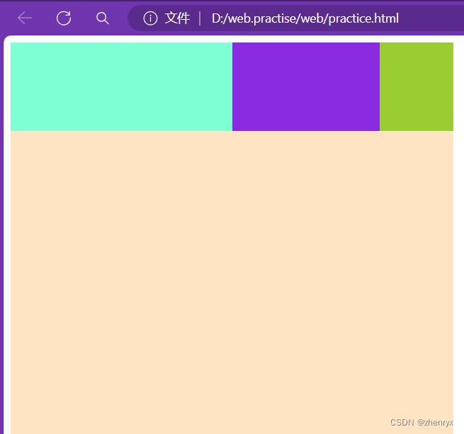
3、浮动float
浮动操作通俗来说就是在页面增加一个浮层来放置内容,出现折叠现象,脱离文档流。
4、CSS3新属性
boder_radius属性 ,可以给元素制作圆角
四个值:顺时针 左上 右上 右下 左下
三个值:左上,右上和左下,右下(对角)
两个值:左上右下,右上左下(对角)
一个值:四角
box-shadow:给框添加阴影。
box-shadow:h-shadow v-shadow blur color
h-shadow:水平阴影位置
v-shadow:垂直阴影位置
blur:模糊距离
color:阴影颜色
5、动画
6、position定位
常用三种值:
relative:相对定位,相对于当前元素的当前位置进行定位。元素会在原本文档流的位置进行定位
absolute:绝对定位,相对于最近已经定位的祖先元素进行定位,如果不存在已经定位的祖先元素,则相对于初始包含块进行定位。
fixed:固定定位,相对于浏览器窗口进行定位,元素会随着页面滚动而保持固定位置。
三种方式都用到四个偏移量:top bottom left right
position:absolute
.box1{
background-color: aqua;
width: 800px;
height: 400px;
position: relative;
left: 200px;
}
.box2{
background-color: rgb(255, 0, 251);
width: 700px;
height: 300px;
}
.box3{
width: 200px;
height: 200px;
background-color: blue;
position: absolute;
bottom: 10px;
}

可以看出box3不是根据父元素box2进行定位而是相对于最近已经定位的祖先元素进行定位。
position:fixed
.box1{
background-color: aqua;
width: 800px;
height: 400px;
position: relative;
left: 200px;
}
.box2{
width: 200px;
height: 200px;
background-color: blue;
position: fixed;
bottom: 10px;
}
可以看出fiexd定位是根据body判定而不是根据父元素box1
并且进行缩放后始终是相对于浏览器窗口的。
7.Grid布局
<div class="tes">
  <div class="box1"></div>
  <div class="box2"></div>
  <div class="box3"></div>
</div>
</template>
<style lang="scss">
.tes{
  width: 100%;
  height: 100vh;
  display: grid;
  grid-template-columns: 1fr 2fr 1fr;//列的宽度自定义为父元素的1:2:1
  .box1{
    height: 100px;
    background-color: aqua;
  }
  .box2{
    height: 100px;
    background-color: rgb(255, 196, 230);
  }
  .box3{
    height: 100px;
    background-color: rgb(210, 196, 255);
  }
}
</style>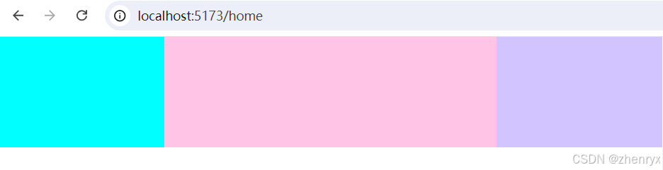
响应式布局:
8.字体图标
注册阿里巴巴字体库下载图标代码后放到你的项目目录下使用
网页内有使用说明
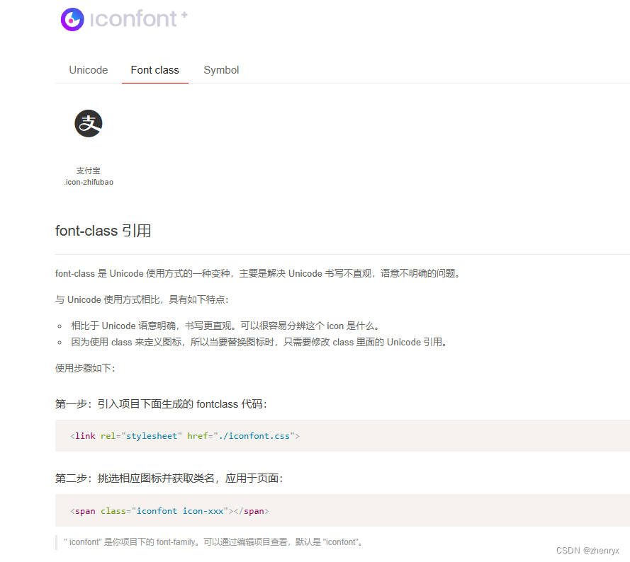
推荐使用symbol方式


 213
213

 被折叠的 条评论
为什么被折叠?
被折叠的 条评论
为什么被折叠?
 到【灌水乐园】发言


